本文主要給大家介紹了bootstrap表單樣式的使用知識,非常不錯,一起看看吧!
表單
<form role="form">
<div class="form-group">
<label for="exampleInputEmail1">郵箱:</label>
<input type="email" class="form-control" id="exampleInputEmail1" placeholder="請輸入您的郵箱地址">
</div>
<div class="form-group">
<label for="exampleInputPassword1">密碼</label>
<input type="password" class="form-control" id="exampleInputPassword1" placeholder="請輸入您的郵箱密碼">
</div>
<div class="checkbox">
<label>
<input type="checkbox"> 記住密碼
</label>
</div>
<button type="submit" class="btn btn-default">進入郵箱</button>
</form>
效果圖:

class: form-control
1、寬度變成了100%,2、設置了一個淺灰色(#ccc)的邊框,3、具有4px的圓角,4、設置陰影效果,並且元素得到焦點之時,陰影和邊框效果會有所變化,5、設置了placeholder的顏色為#999
2、水平表單:
Bootstrap框架默認的表單是垂直顯示風格,但很多時候我們需要的水平表單風格(標簽居左,表單控件居右)
<form class="form-horizontal" role="form">
<div class="form-group">
<label for="inputEmail3" class="col-sm-2 control-label">郵箱</label>
<div class="col-sm-10">
<input type="email" class="form-control" id="inputEmail3" placeholder="請輸入您的郵箱地址">
</div>
</div>
<div class="form-group">
<label for="inputPassword3" class="col-sm-2 control-label">密碼</label>
<div class="col-sm-10">
<input type="password" class="form-control" id="inputPassword3" placeholder="請輸入您的郵箱密碼">
</div>
</div>
<div class="form-group">
<div class="col-sm-offset-2 col-sm-10">
<div class="checkbox">
<label>
<input type="checkbox"> 記住密碼
</label>
</div>
</div>
</div>
<div class="form-group">
<div class="col-sm-offset-2 col-sm-10">
<button type="submit" class="btn btn-default">進入郵箱</button>
</div>
</div>
</form>
效果圖:

在Bootstrap框架中要實現水平表單效果,必須滿足以下兩個條件:
1、在元素是使用類名“form-horizontal”。
2、配合Bootstrap框架的網格系統。
在元素上使用類名“form-horizontal”主要有以下幾個作用:
- 設置表單控件padding和margin值。
- 改變“form-group”的表現形式,類似於網格系統的“row”。
3、水平表單:
在Bootstrap框架中實現這樣的表單效果是輕而易舉的,你只需要在元素中添加類名“form-inline”即可。
內聯表單實現原理非常簡單,欲將表單控件在一行顯示,就需要將表單控件設置成內聯塊元素(display:inline-block)。
<form class="form-inline" role="form">
<div class="form-group">
<label class="sr-only" for="exampleInputEmail2">郵箱</label>
<input type="email" class="form-control" id="exampleInputEmail2" placeholder="請輸入你的郵箱地址">
</div>
<div class="form-group">
<label class="sr-only" for="exampleInputPassword2">密碼</label>
<input type="password" class="form-control" id="exampleInputPassword2" placeholder="請輸入你的郵箱密碼">
</div>
<div class="checkbox">
<label>
<input type="checkbox"> 記住密碼
</label>
</div>
<button type="submit" class="btn btn-default">進入郵箱</button>
</form>
效果圖:

4、輸入框input
單行輸入框,常見的文本輸入框,也就是input的type屬性值為text。在Bootstrap中使用input時也必須添加type類型,如果沒有指定type類型,將無法得到正確的樣式.
<form role="form">
<div class="form-group">
<input type="email" class="form-control" placeholder="Enter email">
</div>
<div class="form-group">
<input type="text" class="form-control" placeholder="請輸入用戶名"/>
</div>
</form>
效果圖:

5、下拉選擇框select
Bootstrap框架中的下拉選擇框使用和原始的一致,多行選擇設置multiple屬性的值為multiple。Bootstrap框架會為這些元素提供統一的樣式風格。
<form role="form">
<div class="form-group">
<select class="form-control">
<option>1</option>
<option>2</option>
<option>3</option>
<option>4</option>
<option>5</option>
</select>
</div>
<div class="form-group">
<select multiple class="form-control">
<option>1</option>
<option>2</option>
<option>3</option>
<option>4</option>
<option>5</option>
</select>
</div>
</form>
效果圖:

6、文本域textarea
文本域和原始使用方法一樣,設置rows可定義其高度,設置cols可以設置其寬度。但如果textarea元素中添加了類名“form-control”類名,則無需設置cols屬性。因為Bootstrap框架中的“form-control”樣式的表單控件寬度為100%或auto。
<form role="form">
<div class="form-group">
<textarea class="form-control" rows="3"></textarea>
</div>
</form>
效果圖:

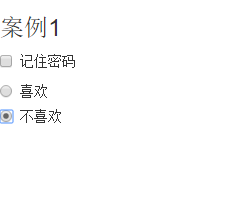
7.復選框checkbox和單選擇按鈕radio
Bootstrap框架中checkbox和radio有點特殊,Bootstrap針對他們做了一些特殊化處理,主要是checkbox和radio與label標簽配合使用會出現一些小問題(最頭痛的是對齊問題)。使用Bootstrap框架,開發人員無需考慮太多,只需要按照下面的方法使用即可。
<form role="form">
<h3>案例1</h3>
<div class="checkbox">
<label>
<input type="checkbox" value="">
記住密碼
</label>
</div>
<div class="radio">
<label>
<input type="radio" name="optionsRadios" id="optionsRadios1" value="love" checked>
喜歡
</label>
</div>
<div class="radio">
<label>
<input type="radio" name="optionsRadios" id="optionsRadios2" value="hate">
不喜歡
</label>
</div>
</form>
效果圖:
8.復選框和單選按鈕水平排列
有時候,為了布局的需要,將復選框和單選按鈕需要水平排列。Bootstrap框架也做了這方面的考慮:
1、如果checkbox需要水平排列,只需要在label標簽上添加類名“checkbox-inline”
2、如果radio需要水平排列,只需要在label標簽上添加類名“radio-inline”
<form role="form">
<div class="form-group">
<label class="checkbox-inline">
<input type="checkbox" value="option1">游戲
</label>
<label class="checkbox-inline">
<input type="checkbox" value="option2">攝影
</label>
<label class="checkbox-inline">
<input type="checkbox" value="option3">旅游
</label>
</div>
<div class="form-group">
<label class="radio-inline">
<input type="radio" value="option1" name="sex">男性
</label>
<label class="radio-inline">
<input type="radio" value="option2" name="sex">女性
</label>
<label class="radio-inline">
<input type="radio" value="option3" name="sex">中性
</label>
</div>
</form>
效果圖:

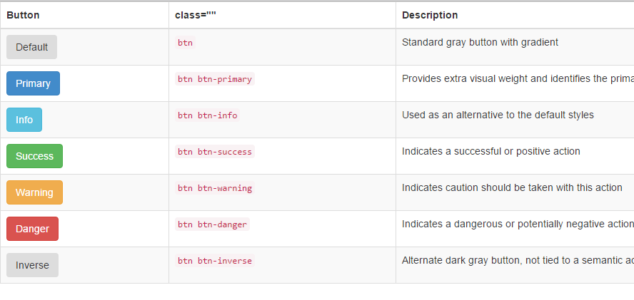
9.按鈕
在Bootstrap框架中的按鈕都是采用來實現
<table class="table table-bordered table-striped">
<thead>
<tr>
<th>Button</th>
<th>class=""</th>
<th>Description</th>
</tr>
</thead>
<tbody>
<tr>
<td><button class="btn" href="#">Default</button></td>
<td><code>btn</code></td>
<td>Standard gray button with gradient</td>
</tr>
<tr>
<td><button class="btn btn-primary" href="#">Primary</button></td>
<td><code>btn btn-primary</code></td>
<td>Provides extra visual weight and identifies the primary action in a set of buttons</td>
</tr>
<tr>
<td><button class="btn btn-info" href="#">Info</button></td>
<td><code>btn btn-info</code></td>
<td>Used as an alternative to the default styles</td>
</tr>
<tr>
<td><button class="btn btn-success" href="#">Success</button></td>
<td><code>btn btn-success</code></td>
<td>Indicates a successful or positive action</td>
</tr>
<tr>
<td><button class="btn btn-warning" href="#">Warning</button></td>
<td><code>btn btn-warning</code></td>
<td>Indicates caution should be taken with this action</td>
</tr>
<tr>
<td><button class="btn btn-danger" href="#">Danger</button></td>
<td><code>btn btn-danger</code></td>
<td>Indicates a dangerous or potentially negative action</td>
</tr>
<tr>
<td><button class="btn btn-inverse" href="#">Inverse</button></td>
<td><code>btn btn-inverse</code></td>
<td>Alternate dark gray button, not tied to a semantic action or use</td>
</tr>
</tbody>
</table>
效果圖:
10.表單控件大小
前面看到的表單控件都正常的大小。可以通過設置控件的height,line-height,padding和font-size等屬性來實現控件的高度設置。不過Bootstrap框架還提供了兩個不同的類名,用來控制表單控件的高度。這兩個類名是:
1、input-sm:讓控件比正常大小更小
2、input-lg:讓控件比正常大小更大
這兩個類適用於表單中的input,textarea和select控件.
<form role="form">
<div class="form-group">
<label class="control-label">控件變大</label>
<input class="form-control input-lg" type="text" placeholder="添加.input-lg,控件變大">
</div>
<div class="form-group">
<label class="control-label">正常大小</label>
<input class="form-control" type="text" placeholder="正常大小">
</div>
<div class="form-group">
<label class="control-label">控件變小</label>
<input class="form-control input-sm" type="text" placeholder="添加.input-sm,控件變小">
</div>
</form>
效果圖:

11.表單控件狀態(禁用狀態)
Bootstrap框架的表單控件的禁用狀態和普通的表單禁用狀態實現方法是一樣的,在相應的表單控件上添加屬性“disabled”。具體的看下面的代碼
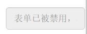
禁用單個表單標簽,只需要在標簽的屬性中加入disabled
<form role="form" class="form-horizontal">
<div class="form-group">
<div class="col-xs-6">
<input class="form-control input-lg" id="disabledInput" type="text" placeholder="表單已被禁用,不可輸入" disabled>
</div>
</div>
</form>
效果圖:
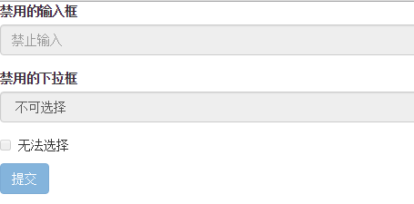
在Bootstrap框架中,如果fieldset設置了disabled屬性,整個域都將處於被禁用狀態。
<form role="form">
<fieldset disabled>
<div class="form-group">
<label for="disabledTextInput">禁用的輸入框</label>
<input type="text" id="disabledTextInput" class="form-control" placeholder="禁止輸入">
</div>
<div class="form-group">
<label for="disabledSelect">禁用的下拉框</label>
<select id="disabledSelect" class="form-control">
<option>不可選擇</option>
</select>
</div>
<div class="checkbox">
<label>
<input type="checkbox"> 無法選擇
</label>
</div>
<button type="submit" class="btn btn-primary">提交</button>
</fieldset>
</form>
效果圖:
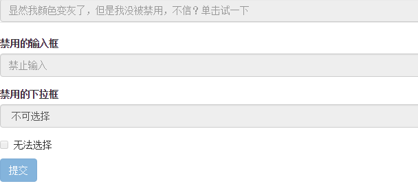
據說對於整個禁用的域中,如果legend中有輸入框的話,這個輸入框是無法被禁用的。
form role="form">
<fieldset disabled>
<legend><input type="text" class="form-control" placeholder="顯然我顏色變灰了,但是我沒被禁用,不信?單擊試一下" /></legend>
<div class="form-group">
<label for="disabledTextInput">禁用的輸入框</label>
<input type="text" id="disabledTextInput" class="form-control" placeholder="禁止輸入">
</div>
<div class="form-group">
<label for="disabledSelect">禁用的下拉框</label>
<select id="disabledSelect" class="form-control">
<option>不可選擇</option>
</select>
</div>
<div class="checkbox">
<label>
<input type="checkbox"> 無法選擇
</label>
</div>
<button type="submit" class="btn btn-primary">提交</button>
</fieldset>
</form>
效果圖:
表單驗證狀態
在制作表單時,不免要做表單驗證。同樣也需要提供驗證狀態樣式,在Bootstrap框架中同樣提供這幾種效果。
1、.has-warning:警告狀態(黃色)
2、.has-error:錯誤狀態(紅色)
3、.has-success:成功狀態(綠色)
很多時候,在表單驗證的時候,不同的狀態會提供不同的 icon,比如成功是一個對號(√),錯誤是一個叉號(×)等。在Bootstrap框中也提供了這樣的效果。如果你想讓表單在對應的狀態下顯示 icon 出來,只需要在對應的狀態下添加類名“has-feedback”。請注意,此類名要與“has-error”、“has-warning”和“has-success”在一起:
<form role="form">
<div class="form-group has-success">
<label class="control-label" for="inputSuccess1">成功狀態</label>
<input type="text" class="form-control" id="inputSuccess1" placeholder="成功狀態">
</div>
<div class="form-group has-warning">
<label class="control-label" for="inputWarning1">警告狀態</label>
<input type="text" class="form-control" id="inputWarning1" placeholder="警告狀態">
</div>
<div class="form-group has-error">
<label class="control-label" for="inputError1">錯誤狀態</label>
<input type="text" class="form-control" id="inputError1" placeholder="錯誤狀態">
</div>
</form>
<br>
<br>
<br>
<form role="form">
<div class="form-group has-success has-feedback">
<label class="control-label" for="inputSuccess1">成功狀態</label>
<input type="text" class="form-control" id="inputSuccess1" placeholder="成功狀態">
<span class="glyphicon glyphicon-ok form-control-feedback"></span>
</div>
<div class="form-group has-warning has-feedback">
<label class="control-label" for="inputWarning1">警告狀態</label>
<input type="text" class="form-control" id="inputWarning1" placeholder="警告狀態">
<span class="glyphicon glyphicon-warning-sign form-control-feedback"></span>
</div>
<div class="form-group has-error has-feedback">
<label class="control-label" for="inputError1">錯誤狀態</label>
<input type="text" class="form-control" id="inputError1" placeholder="錯誤狀態">
<span class="glyphicon glyphicon-remove form-control-feedback"></span>
</div>
</form>
效果圖:

表單提示信息
平常在制作表單驗證時,要提供不同的提示信息。在Bootstrap框架中也提供了這樣的效果。使用了一個”help-block”樣式,將提示信息以塊狀顯示,並且顯示在控件底部。
<form role="form">
<div class="form-group has-success has-feedback">
<label class="control-label" for="inputSuccess1">成功狀態</label>
<input type="text" class="form-control" id="inputSuccess1" placeholder="成功狀態">
<span class="help-block">你輸入的信息是正確的</span>
<span class="glyphicon glyphicon-ok form-control-feedback"></span>
</div>
<div class="form-group has-warning has-feedback">
<label class="control-label" for="inputWarning1">警告狀態</label>
<input type="text" class="form-control" id="inputWarning1" placeholder="警告狀態">
<span class="help-block">請輸入正確信息</span>
<span class="glyphicon glyphicon-warning-sign form-control-feedback"></span>
</div>
<div class="form-group has-error has-feedback">
<label class="control-label" for="inputError1">錯誤狀態</label>
<input type="text" class="form-control" id="inputError1" placeholder="錯誤狀態">
<span class="help-block">你輸入的信息是錯誤的</span>
<span class="glyphicon glyphicon-remove form-control-feedback"></span>
</div>
</form>
效果圖:

以上所述是小編給大家介紹的Bootstrap表單樣式的使用,希望對大家有所幫助,如果大家有任何疑問請給我留言,小編會及時回復大家的。在此也非常感謝大家對網站的支持!