我們之前已經知道了可調整大小的背景圖片的概念。但是讀者Doug Shults發給了我一個鏈接,其中使用了非常酷的技術,我覺得這種技術要比之前的任何技術都要好。
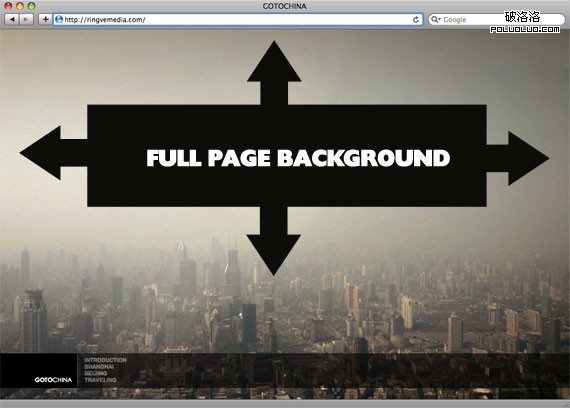
上圖所展示的背景圖片以及所應用的這種技術來源於這個網站。
以下是這種技術所要達到的效果:
- 使用圖片填充整個頁面,沒有空白
- 根據需要依比例顯示圖片
- 保持圖片比例
- 圖片居中於頁面
- 不會有滾動條
- 跨浏覽器的兼容性
- 不是某種華麗的伎倆例如Flash
這是非常高的要求,我們將使用各種技術來達到這樣的效果。首先,由於圖片要依比例縮放,傳統的background-image屬性已經不能夠達到這樣的效果了,使得我們只能使用行內圖片。
技術1
這個行內圖片將會被放置於一系列的封裝元素之中,每一個封裝元素都是我們為了達成目標所必不可少的。
<div id="bg">
    <div>
        <table cellspacing="0" cellpadding="0">
            <tr>
                <td>
                    <img src="images/bg.jpg" alt=""/>
                </td>
            </tr>
        </table>
    </div>
</div>
CSS代碼是:
* {
    margin: 0;
    padding: 0;
}

html, body, #bg, #bg table, #bg td {
    height:100%;
    width:100%;
    overflow:hidden;
}

#bg {
    position: fixed;
}

#bg div {
    height:200%;
    left:-50%;
    position:absolute;
    top:-50%;
    width:200%;
}

#bg td {
    text-align:center;
    vertical-align:middle;
}

#bg img {
    margin:0 auto;
    min-height:50%;
    min-width:50%;
}
標記語言和CSS確實有些繁瑣,但是效果卻很好!做完這些已經可以完成工作了,但是如果我們希望頁面上有真實的內容會怎樣呢?將html和body元素的overflow屬性設置為hidden是會讓你對這一點有些擔心的,因為在一個沒有滾動條的網站上,那樣會完全切除超出區域范圍的內容。為了讓可滾動的內容正確顯示,我們將要介紹另外一個封裝元素。它會位於背景的前面,寬度和高度是完全展開的浏覽器的大小,而且將overflow屬性設置回auto(可滾動)。然後我們就可以安全的將內容放入這個封裝元素之中了。
<div id="cont">
    <div class="box">
          <!-- content in here -->
    </div>
</div>
#cont {
    position:absolute;
    top:0;left:0;
    z-index:70;
    overflow:auto;
}

.box {
    margin: 0 auto;
    width: 400px;
    padding: 50px;
    background: white;
    padding-bottom:100px;
    font: 14px/2.2 Georgia, Serif;
}
查看示例 下載文件
目前存在的Bug
在Safar4和Chrome中,min-height屬性不起作用,不能夠垂直適應大小。
技術2
還是像往常一樣,非常感謝Doug Neiner提供了這種方法。
這裡,我們可以不用JavaScript修復,只用CSS就能做到這一點。圖片還是一個行內圖片,class名稱為”bg”,沒有額外的標記語言。這一點會讓所有不喜歡額外標記的人滿意的。
只有一點需要說明的是,這種方法並不能在任何布局下有效,在IE7中它不能居中,在IE6中完全不起作用,而且取決於原始圖片的大小,可能不能總是按照比例顯示。但是,由於這種方法很簡單,而且沒有bug,絕對是可供參考的。下面是CSS:
img.bg {
        /* Set rules to fill background */
        min-height: 100%;
        min-width: 1024px;

        /* Set up proportionate scaling */
        width: 100%;
        height: auto;

        /* Set up positioning */
        position: fixed;
        top: 0;
        left: 0;
}

@media screen and (max-width: 1024px){
        img.bg {
                left: 50%;
                margin-left: -512px; }
}

div#content {
        /* This is the only important rule */
        /* We need our content to show up on top of the background */
        position: relative;

        /* These have no effect on the functionality */
        width: 500px;
        margin: 0 auto;
        background: #fff;
        padding: 20px;
        font-family: helvetica, arial, sans-serif;
        font-size: 10pt;
        line-height: 16pt;
        -moz-box-shadow: #000 4px 4px 10px;
        -webkit-box-shadow: #000 4px 4px 10px;
}

body {
        /* These rules have no effect on the functionality */
        /* They are for styling only */
        margin: 0;
        padding: 20px 0 0 0;
}
查看示例
原文:Perfect full page background image
- 上一頁:設計理論:制作網頁前端開發的文檔
- 下一頁:和大家分享一些與設計師合作的經驗