隨著移動端的用戶越來越多,傳統的web系統架構無法兼容很多移動終端的正常使用。在工作中也會發現,現在很多的客戶都有在手機、平板等移動終端上使用管理系統的需求。如果單獨為每一個終端開發相應的響應網頁,這必定增加項目的成本和開發人員的壓力。這時候了解響應式布局就很有必要,響應式布局就是為解決多終端問題而生的。本次介紹的是輕量級、開源的、免費的bootstrap。
搭建開發環境
首先下載官網的boostrap源碼包:http://www.bootcss.com/. 開發簡單的項目不必加入源碼中的所有css、js和字體等。根據自己的項目需求可以裁剪出自己需要的環境。
必須的文件有以下幾個:jquery.min.js 、bootstrap.min.js、bootstrap.css。如果需要使用到其中的一些字體樣式等,還需要加入字體相關的文件,如下圖所示:

【注】加載js時,必須先加載jquery.min.js,這是因為在bootstrap.min.js會使用到jQuery相關的方法即boostrap.min.js依賴於jquery.min.js。
測試bootsrap環境
寫一個測試文件index.html。測試文件內容如下:
<!DOCTYPE html>
<html>
<head>
 <title>測試boostrap環境</title>
 <link rel="stylesheet" type="text/css" href="./css/bootstrap.css">
 <script type="text/javascript" src="./js/jquery.min.js"></script>
 <script type="text/javascript" src="./js/bootstrap.min.js"></script>
</head>
<body>
</body>
</html>
以上就搭建好了bootsrap開發環境。很簡單吧!
使用boostrap必須要了解的就是boostrap的柵格系統。正是由於這柵格系統才使得更好的兼容不同分辨率的終端設備。
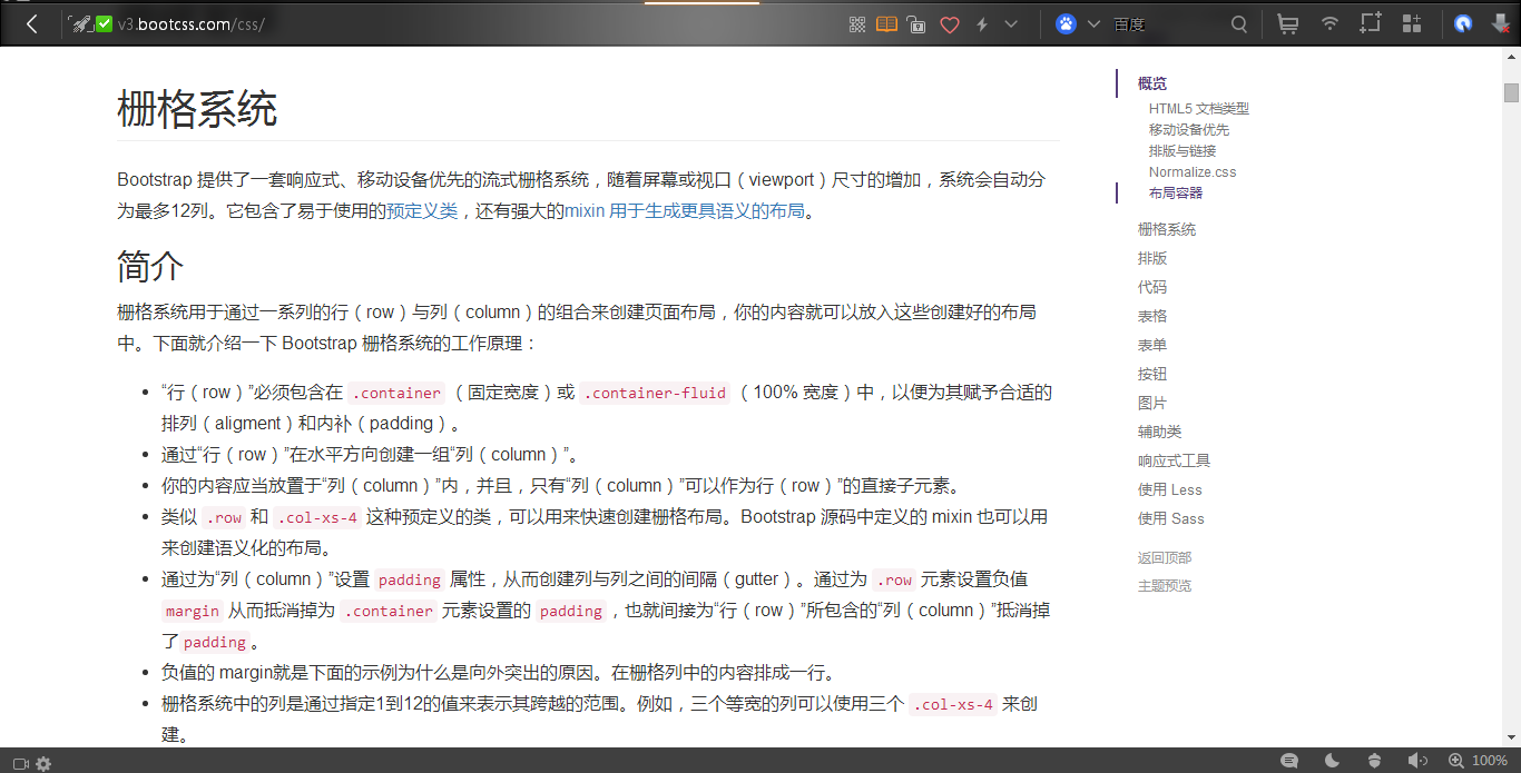
具體的柵格系統官網有清晰的介紹:http://v3.bootcss.com/css/。官網的下圖所在位置:
使用boostrap時,我們主要是使用裡面已定義好的一些樣式。這對一個沒有美工能力的程序而言,快速搭建一個還不錯的頁面是很有幫助的。
在實際使用bootstrap的時候,我們經常查看官網的一些幫助文檔:http://v3.bootcss.com/css/#tables 。
個人建議直接在官網的示例中copy相關的代碼到自己的網頁中,再在此基礎之上做出相關的修改,這樣的開發速度會更快並且准確率會更高。
演示一些boostrap樣式---table樣式。
<!DOCTYPE html>
<html>
<head>
 <title>測試boostrap環境</title>
 <link rel="stylesheet" type="text/css" href="./css/bootstrap.css">
 <script type="text/javascript" src="./js/jquery.min.js"></script>
 <script type="text/javascript" src="./js/bootstrap.min.js"></script>
</head>
<body>
 <table class="table table-hover table-bordered table-striped">
 <tr>
  <td>測試表格</td>
  <td>測試表格</td>
  <td>測試表格</td>
  <td>測試表格</td>
  <td>測試表格</td>
 </tr>
 <tr>
  <td>測試表格</td>
  <td>測試表格</td>
  <td>測試表格</td>
  <td>測試表格</td>
  <td>測試表格</td>
 </tr>
 <tr>
  <td>測試表格</td>
  <td>測試表格</td>
  <td>測試表格</td>
  <td>測試表格</td>
  <td>測試表格</td>
 </tr>
 <tr>
  <td>測試表格</td>
  <td>測試表格</td>
  <td>測試表格</td>
  <td>測試表格</td>
  <td>測試表格</td>
 </tr>
 <tr>
  <td>測試表格</td>
  <td>測試表格</td>
  <td>測試表格</td>
  <td>測試表格</td>
  <td>測試表格</td>
 </tr>
 </table>
</body>
</html>
網頁查看結果如下:

class 裡屬性介紹:
1)table 加上這個就已經有bootsrap的表格樣式
2)table-hover 表示表格鼠標停留的行背景高亮
3)table-bordered 表格出現邊框
4)table-striped 表格條紋
【注】多個屬性相加時,各個屬性之間有空格
2. button
<!--Button-->
 <a class="btn btn-default" href="#" role="button">Link</a>
 <button class="btn btn-default" type="submit">Button</button>
 <input class="btn btn-default" type="button" value="Input">
 <input class="btn btn-default" type="submit" value="Submit">

 <!-- Standard button -->
 <button type="button" class="btn btn-default">(默認樣式)Default</button>

 <!-- Provides extra visual weight and identifies the primary action in a set of buttons -->
 <button type="button" class="btn btn-primary">(首選項)Primary</button>

 <!-- Indicates a successful or positive action -->
 <button type="button" class="btn btn-success">(成功)Success</button>

 <!-- Contextual button for informational alert messages -->
 <button type="button" class="btn btn-info">(一般信息)Info</button>

 <!-- Indicates caution should be taken with this action -->
 <button type="button" class="btn btn-warning">(警告)Warning</button>

 <!-- Indicates a dangerous or potentially negative action -->
 <button type="button" class="btn btn-danger">(危險)Danger</button>

 <!-- Deemphasize a button by making it look like a link while maintaining button behavior -->
 <button type="button" class="btn btn-link">(鏈接)Link</button>
網頁顯示結果如下:

很多其他的一些樣式和組件,還是建議參考官方的幫助文檔。
總結
本文算是一個引導吧,簡單介紹了boostrap是干什麼的和怎麼去使用。並沒有詳細列出所有的組件和樣式,但是……往下看!
這是一篇非常神奇的文章,一定要點進去看一看:值得分享和收藏的Bootstrap學習教程
如果大家還想深入學習,可以點擊這裡進行學習,再為大家附兩個精彩的專題:Bootstrap學習教程 Bootstrap實戰教程
希望對Bootstrap感興趣的能夠自己手動地去測試每一種樣式的效果和各個組件怎麼使用,真正感受Bootstrap帶來的樂趣。