網頁制作Poluoluo文章簡介:UX Booth關於“好的行動召喚按鈕的組成”方面有一篇好文章
With these priority tasks, you need to remove any friction that slows the user’s progress. Call-to-action buttons can be a good way of doing this. They look great, but the reason you’re using them is to grab the user’s attention.
Buttons are for actions, like ‘Get a quote’, ‘Download’, ‘Open an account’, ‘Go to checkout’. The text on the button should begin with a verb. Otherwise it’s not a call-to-action, it’s just a button with some text on it. ‘More information’ for example, is not a call-to-action.
Think about what your user would say if you asked him what he was trying to do. If he would say, ”I want to compare the price” then ‘Compare the price’ is what you write on the button. These are what Jared Spool calls ‘trigger words’.
Using the right words reduces the friction of your key tasks. The most common wording problems are caused when organizations use different words than their customers. Here are some examples:
Cultural subtleties can be the cause of task friction as well. Look at the difference between these two buttons.

Amazon.com and Amazon.co.uk comparison.
British people use trolleys (carts) or baskets when in real stores, so in the UK, Amazon calls the ‘Shopping Cart’ the ‘Shopping Basket’. In a usability test, it’s unlikely that a UK participant would be unable to find the ‘Shopping cart’ button. But ‘Shopping Basket’ reduces the friction in the task.
The effectiveness of your call-to-action button will be affected by your choice of position for it. The example below from Virgin Money has an effective call-to-action. Emphasis is gained by removing clutter from the page and placing the button in the content area.
On lower level pages the button appears on the right-hand-side which is not ideal, but the lack of clutter makes it still clear (below).
If we put ourselves in our user’s shoes, it’s possible to see a point of friction on this page. If I’m considering this credit card and I’m on the costs page, I’m probably going to look at all of the costs. To do this I need to scroll down. Look what happens when I do this (below). The button is gone. Virgin Money is missing a trick here by not repeating the button at the bottom of the page.
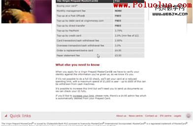
If I want to, I will find the ‘Apply online’ button. But its disappearance causes friction and when you’re dealing in large numbers of potential customers, that friction means lost sales.
Color is very important when trying to create emphasis. I wrote a post on my blog that recommended you let your hyperlinks shine. Well, your call-to-action buttons should shine even brighter. After all, if you’re using them correctly, these buttons will take people to the most important stuff.
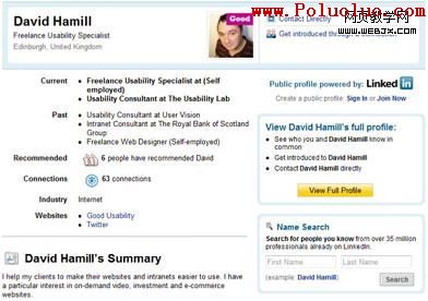
The color you choose for your button can affect its usefulness. The example below is my profile page on LinkedIn.com (I know, a face only a mother could love).
My profile page from LinkedIn.com
The ‘View Full Profile’ button is the one button that LinkedIn want you to click above everything else. When you do so, you’ll be prompted to create an account and this is what they want you to do.
The button on LinkedIn page has a unique color that isn’t shared with any other part of the design. On a page with lots of information, this button still stands out.
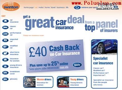
Swinton Car Insurance
It’s not always necessary to reserve a color solely for your call-to-action button. But it’s best not to over-use your button color elsewhere in the design. The page on the right is from Swinton Insurance.
Lots of blue on the page makes the ‘Quote’ button difficult to see. I actually scrolled right past it the first time I looked at this page. If they’d made it orange, it would be a lot better.
Size matters when you’re trying to reduce the friction in your key task. Fitts’ Law tells us that the time taken to point at an object is directly influenced by the size of that object. So big is beautiful when creating a call-to-action button.
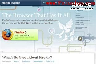
Firefox Page on Mozilla.com
The size of button you choose can be dictated by the button’s importance over everything else on the page. Take the Firefox page for example, Mozilla don’t mess around with subtlety here.
Sub-consciously, a good design communicates priority to us. With one massive button on the page, that priority is obvious. But size can be used a little more subtlely when our page has 2 call-to-action buttons on it.
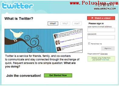
In order to illustrate my point, I’ve been messing about with the Twitter homepage (below). I have removed a call-to-action for ‘Watch a video’ and made the ‘Get Started Now’ button a bit smaller than it actually is.
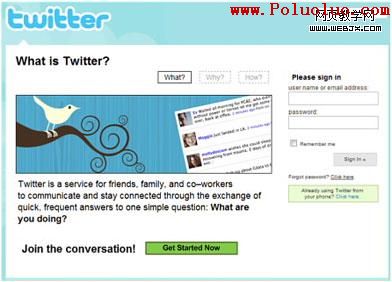
No video Button
With only one call-to-action button, ‘Get Started Now’ Works well. The contrasting green makes it stand out from the page. However, there is a video you can watch if you want to see Twitter in action. I’ve added the button back in on the example below . It’s more difficult to get a sense of the page’s priorities. The two buttons are competing.
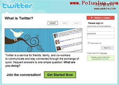
With the Video Button
The video button enjoys the best contrast but the’Get Started Now’ button enjoys better positioning. Something else is required to tip the balance in favor of the ‘Get Started Now’ button.
On the actual homepage, Twitter uses size to do this…
The actual Twitter homepage
The ‘Get started Now’ button now has priority. The design tells us that it’s the most important bit. If we’re not ready to get started, then ‘Watch a video’ is the next thing we are told to look at.
There is an added benefit of using size here. Some of us can’t tell red from green. It is the most common type of color-blindness. So some people will see both of these buttons as being a similar color.

Providing good contrast requires restraint on the part of the designer. Every call-to-action button you add to a page reduces the impact of the ones that already exist. Try to avoid smothering your page in call-to-action buttons and you will preserve the emphasis of your important tasks.
The example on the right comes from TD Waterhouse’s UK site. Notice how the ultra-important ‘Open an account’ button is smothered by login buttons. When your user is already an account holder they aren’t going to leave your website because they can’t instantly find the login. If they get distracted, they will still be a customer.
However the potential customer who gets distracted may never return.
A company called Maxymiser released a case study last year from one of their UK clients to demonstrate the value of their multivariate testing service. The results were very interesting and showed how seemingly subtle changes can make a big difference.
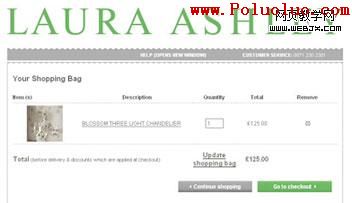
This is their new shopping basket page (see image on right).
Laura Ashley arrived at this design following mulivariate testing of 5 different options on their live website, including their original one. This page enjoyed 11% more clickthroughs to the checkout page than the company’s original basket page.
One of the other options tested was practically identical to this one. The only real differences being:
- The "update shopping bag" link was a grey button, placed in-between the 2 buttons shown here.
- The "Go to checkout" button was dark gray instead of green
It too was more successful than the original page but enjoyed only 3% more clickthroughs. These 2 apparently minor differences, equated to a significant difference (7% uplift) in the number of people proceeding to checkout.
- 上一頁:制作良好的行動召喚按鈕的10個技術
- 下一頁:如何設計完美的行為引導按鈕