使用CSS實現中間镂空的圖片遮罩效果
編輯:CSS詳解
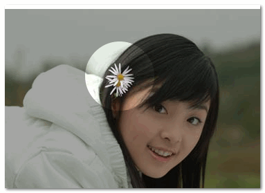
中間镂空的圖片遮罩指的大概就是這樣一個效果:
镂空一個洞的代碼
CSS Code復制內容到剪貼板
- <div id="container" style="position: relative; margin: 550px 0 0 50px;">
- <svg style="position: absolute;" width="400" height="280">
- <defs>
- <mask id="mask3">
- <rect x="0" y="0" width="100%" height="100%" style="stroke:none; fill: #ccc"></rect>
- <circle id="circle1" cx="100" cy="100" r="50" style="fill: #000" />
- </mask>
- </defs>
- <rect x="0" y="0" width="100%" height="100%" style="stroke: none; fill: #ccc; mask: url(#mask3)"></rect>
- </svg>
- <img src="/School/UploadFiles_7810/201603/20160323102435711.jpg" />
- </div>
镂空多個洞的代碼
- <div id="container" style="position: relative;">
- <svg style="position: absolute;" width="400" height="280">
- <defs>
- <mask id="mask3">
- <rect x="0" y="0" width="100%" height="100%" style="stroke:none; fill: #ccc"></rect>
- <circle id="circle1" cx="100" cy="50" r="50" style="fill: #000" />
- <circle id="circle1" cx="300" cy="100" r="50" style="fill: #000" />
- <circle id="circle1" cx="100" cy="200" r="50" style="fill: #000" />
- </mask>
- </defs>
- <rect x="0" y="0" width="100%" height="100%" style="stroke: none; fill: #ccc; mask: url(#mask3)"></rect>
- </svg>
- <img src="/School/UploadFiles_7810/201603/20160323102435711.jpg" />
- </div>
CSS3 版
用 box-shadow ,代碼如下:
CSS Code復制內容到剪貼板- position: fixed;
- left: 150px;
- top: 35px;
- width: 100px;
- height: 100px;
- border-radius: 100px;
- box-shadow: rgba(0,0,0,.8) 0px 0px 0px 2005px;
- z-index: 100;
缺點是只能镂空一個洞。
小編推薦
熱門推薦