本文主要講解的是表單,這個其實對於做過網站的人來說,並不陌生,而且可以說是最為常用的提交數據的Form表單。本文主要來講解一下內容:
1.基本案例
2.內聯表單
3.水平排列的表單
4.被支持的控件
5.靜態控件
6.控件狀態
7.控件尺寸
8.幫助文本
基本案例
單獨的表單控件會被自動賦予一些全局樣式。所有設置了.form-control的<input>、<textarea>和<select>元素都將被默認設置為width: 100%;。將label和前面提到的這些控件包裹在.form-group中可以獲得最好的排列。
<form role="form">
 <div class="form-group">
 <label for="exampleInputEmail1">Email address</label>
 <input type="email" class="form-control" id="exampleInputEmail1" placeholder="Enter email">
 </div>
 <div class="form-group">
 <label for="exampleInputPassword1">Password</label>
 <input type="password" class="form-control" id="exampleInputPassword1" placeholder="Password">
 </div>
 <div class="form-group">
 <label for="exampleInputFile">File input</label>
 <input type="file" id="exampleInputFile">
 <p class="help-block">Example block-level help text here.</p>
 </div>
 <div class="checkbox">
 <label>
 <input type="checkbox"> Check me out
 </label>
 </div>
 <button type="submit" class="btn btn-default">Submit</button>
</form>
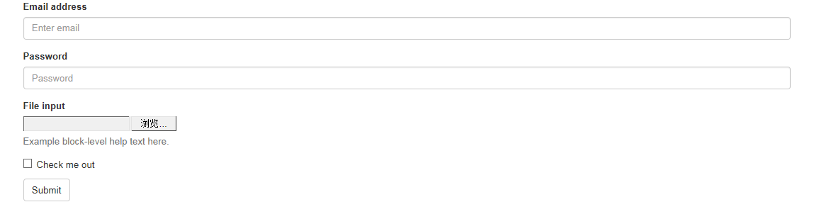
兩個文本框的寬度的確為100%。並且有三個form-group。
內聯表單
為左對齊和inline-block級別的控件設置.form-inline,可以將其排布的更緊湊。
需要設置寬度:在Bootstrap中,input、select和textarea默認被設置為100%寬度。為了使用內聯表單,你需要專門為使用到的表單控件設置寬度。
一定要設置label:如果你沒有為每個輸入控件設置label,屏幕閱讀器將無法正確識讀。對於這些內聯表單,你可以通過為label設置.sr-only已將其隱藏。
<form class="form-inline" role="form">
 <div class="form-group">
 <label class="sr-only" for="exampleInputEmail2">Email address</label>
 <input type="email" class="form-control" id="exampleInputEmail2" placeholder="Enter email">
 </div>
 <div class="form-group">
 <label class="sr-only" for="exampleInputPassword2">Password</label>
 <input type="password" class="form-control" id="exampleInputPassword2" placeholder="Password">
 </div>
 <div class="checkbox">
 <label>
 <input type="checkbox"> Remember me
 </label>
 </div>
 <button type="submit" class="btn btn-default">Sign in</button>
</form>

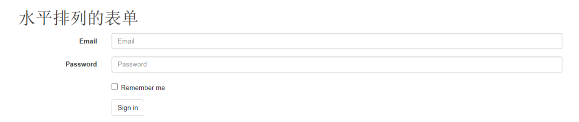
水平排列的表單
通過為表單添加.form-horizontal,並使用Bootstrap預置的柵格class可以將label和控件組水平並排布局。這樣做將改變.form-group的行為,使其表現為柵格系統中的行(row),因此就無需再使用.row了。
<form class="form-horizontal" role="form">
 <div class="form-group">
 <label for="inputEmail3" class="col-sm-2 control-label">Email</label>
 <div class="col-sm-10">
 <input type="email" class="form-control" id="inputEmail3" placeholder="Email">
 </div>
 </div>
 <div class="form-group">
 <label for="inputPassword3" class="col-sm-2 control-label">Password</label>
 <div class="col-sm-10">
 <input type="password" class="form-control" id="inputPassword3" placeholder="Password">
 </div>
 </div>
 <div class="form-group">
 <div class="col-sm-offset-2 col-sm-10">
 <div class="checkbox">
 <label>
 <input type="checkbox"> Remember me
 </label>
 </div>
 </div>
 </div>
 <div class="form-group">
 <div class="col-sm-offset-2 col-sm-10">
 <button type="submit" class="btn btn-default">Sign in</button>
 </div>
 </div>
</form>
被支持的控件
在表單布局案例中展示了其所支持的標准表單控件。
Input
大部分表單控件、文本輸入域控件。包括HTML5支持的所有類型:text、password、datetime、datetime-local、date、month、time、week、number、email、url、search、tel和color。
注意:有正確設置了type的input控件才能被賦予正確的樣式。
文本框示例
復制代碼 代碼如下:<input type="text" class="form-control" placeholder="Text input">

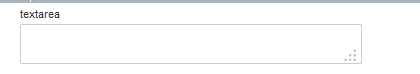
Textarea
支持多行文本的表單控件。可根據需要改變rows屬性。
<h1>textarea</h1>
 <textarea class="form-control" rows="3"></textarea>
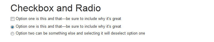
Checkbox 和 radio
Checkbox用於選擇列表中的一個或多個選項,而radio用於從多個選項中只選擇一個。
默認外觀(堆疊在一起)
<div class="checkbox">
 <label>
 <input type="checkbox" value="">
 Option one is this and that—be sure to include why it's great
 </label>
</div>

<div class="radio">
 <label>
 <input type="radio" name="optionsRadios" id="optionsRadios1" value="option1" checked>
 Option one is this and that—be sure to include why it's great
 </label>
</div>
<div class="radio">
 <label>
 <input type="radio" name="optionsRadios" id="optionsRadios2" value="option2">
 Option two can be something else and selecting it will deselect option one
 </label>
</div>
Inline checkboxes
通過將.checkbox-inline 或 .radio-inline應用到一系列的checkbox或radio控件上,可以使這些控件排列在一行。
<label class="checkbox-inline">
 <input type="checkbox" id="inlineCheckbox1" value="option1"> 1
</label>
<label class="checkbox-inline">
 <input type="checkbox" id="inlineCheckbox2" value="option2"> 2
</label>
<label class="checkbox-inline">
 <input type="checkbox" id="inlineCheckbox3" value="option3"> 3
</label>

同理Radio是一樣的,只需要添加一下樣式即可。
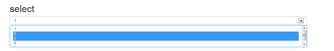
Select
<select class="form-control">
 <option>1</option>
 <option>2</option>
 <option>3</option>
 <option>4</option>
 <option>5</option>
</select>

<select multiple class="form-control">
 <option>1</option>
 <option>2</option>
 <option>3</option>
 <option>4</option>
 <option>5</option>
</select>
靜態控件
在水平布局的表單中,如果需要將一行純文本放置於label的同一行,為<p>元素添加.form-control-static即可。
<form class="form-horizontal" role="form">
 <div class="form-group">
 <label class="col-sm-2 control-label">Email</label>
 <div class="col-sm-10">
 <p class="form-control-static">email@example.com</p>
 </div>
 </div>
 <div class="form-group">
 <label for="inputPassword" class="col-sm-2 control-label">Password</label>
 <div class="col-sm-10">
 <input type="password" class="form-control" id="inputPassword" placeholder="Password">
 </div>
 </div>
</form>

控件狀態
通過為控件和label設置一些基本狀態,可以為用戶提供回饋。
輸入焦點
我們移除了某些表單控件的默認outline樣式,並對其:focus狀態賦予了box-shadow樣式。
復制代碼 代碼如下:<input class="form-control" id="focusedInput" type="text" value="This is focused...">
被禁用的輸入框
為輸入框設置disabled屬性可以防止用戶輸入,並能改變一點外觀,使其更直觀。
復制代碼 代碼如下:<input class="form-control" id="disabledInput" type="text" placeholder="Disabled input here..." disabled>
被禁用的fieldset
為<fieldset>設置disabled屬性可以禁用<fieldset>中包含的所有控件。
<a>標簽的鏈接功能不受影響
這個class只改變<a class="btn btn-default">按鈕的外觀,並不能禁用其功能。建議自己通過JavaScript代碼禁用鏈接功能。
跨浏覽器兼容性
雖然Bootstrap會將這些樣式應用到所有浏覽器上,Internet Explorer 9及以下浏覽器中的<fieldset>並不支持disabled屬性。因此建議在這些浏覽器上通過JavaScript代碼來禁用fieldset
<form role="form">
 <fieldset disabled>
 <div class="form-group">
 <label for="disabledTextInput">Disabled input</label>
 <input type="text" id="disabledTextInput" class="form-control" placeholder="Disabled input">
 </div>
 <div class="form-group">
 <label for="disabledSelect">Disabled select menu</label>
 <select id="disabledSelect" class="form-control">
 <option>Disabled select</option>
 </select>
 </div>
 <div class="checkbox">
 <label>
 <input type="checkbox"> Can't check this
 </label>
 </div>
 <button type="submit" class="btn btn-primary">Submit</button>
 </fieldset>
</form>
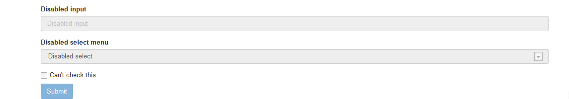
可將鼠標移到各個控件上進行查看效果。
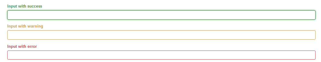
校驗狀態
Bootstrap對表單控件的校驗狀態,如error、warning和success狀態,都定義了樣式。使用時,添加.has-warning、.has-error或.has-success到這些控件的父元素即可。任何包含在此元素之內的.control-label、.form-control和.help-block都將接受這些校驗狀態的樣式。
<div class="form-group has-success">
 <label class="control-label" for="inputSuccess">Input with success</label>
 <input type="text" class="form-control" id="inputSuccess">
</div>
<div class="form-group has-warning">
 <label class="control-label" for="inputWarning">Input with warning</label>
 <input type="text" class="form-control" id="inputWarning">
</div>
<div class="form-group has-error">
 <label class="control-label" for="inputError">Input with error</label>
 <input type="text" class="form-control" id="inputError">
</div>
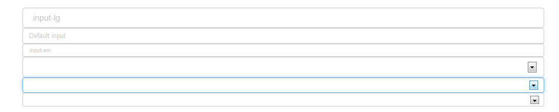
控件尺寸
通過.input-lg之類的class可以為控件設置高度,通過.col-lg-*之類的class可以為控件設置寬度。
高度尺寸
創建大一些或小一些的表單控件以匹配按鈕尺寸。
 <input class="form-control input-lg" type="text" placeholder=".input-lg">
 <input class="form-control" type="text" placeholder="Default input">
 <input class="form-control input-sm" type="text" placeholder=".input-sm">

 <select class="form-control input-lg">...</select>
 <select class="form-control">...</select>
 <select class="form-control input-sm">...</select>
調整列尺寸
用柵格系統中的列包裹input或其任何父元素,都可很容易的為其設置寬度。
<div class="row">
 <div class="col-xs-2">
 <input type="text" class="form-control" placeholder=".col-xs-2">
 </div>
 <div class="col-xs-3">
 <input type="text" class="form-control" placeholder=".col-xs-3">
 </div>
 <div class="col-xs-4">
 <input type="text" class="form-control" placeholder=".col-xs-4">
 </div>
</div>
幫助文本
用於表單控件的塊級幫助文本。
復制代碼 代碼如下:<span class="help-block">自己獨占一行或多行的塊級幫助文本。</span>
本篇文章主要講解表單中各種控件的樣式控制,其中也有看到按鈕的簡單樣式使用,下一篇文章將重點來講解按鈕的樣式。
詳細內容可以參考:
全面解析Bootstrap表單使用方法(表單樣式)
全面解析Bootstrap表單使用方法(表單控件)
全面解析Bootstrap表單使用方法(表單控件狀態)
全面解析Bootstrap表單使用方法(表單按鈕)
如果大家還想深入學習,可以點擊這裡進行學習,再為大家附兩個精彩的專題:Bootstrap學習教程 Bootstrap實戰教程
以上就是本文的全部內容,希望對大家的學習有所幫助,也希望大家多多支持。