Bootstrap如同前台框架,它已經布置好不少的CSS,前端開發的使用需要則直接調用即可。其網站的網址就是http://www.bootcss.com。使用Bootstrap能減少前端開發時候在CSS樣子的布置時間
需要使用Bootstrap先在官網(點擊打開鏈接)下載組件即可,用於生產環境的Bootstrap版本(點擊打開鏈接),Bootstrap3對2並不兼容,建議直接根據其開發文檔使用Bootstrap3。
將Bootstrap解壓之後把得到的3個文件夾css,fonts,js拷貝到站點目錄下面。如果是Eclipse的JSP Web Project的話就把它們放到WebRoot文件夾下面。
之後就能夠在此站點目錄下的任何頁面調用Bootstrap為前端快速建模。
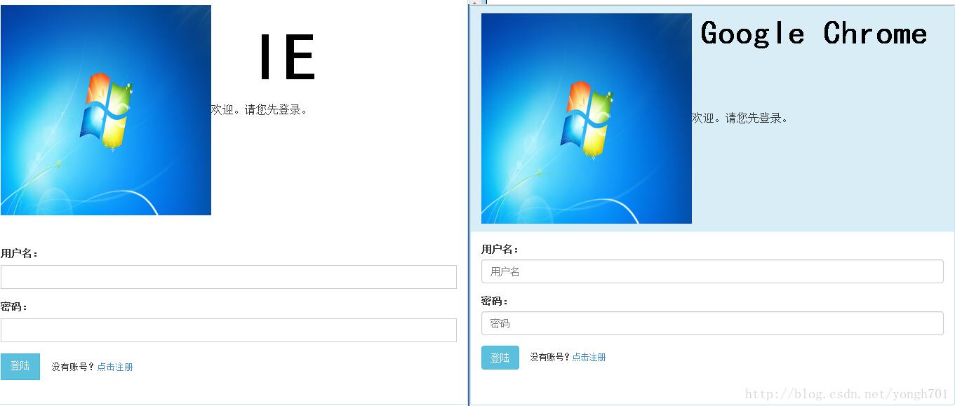
不過值得注意的是,不同浏覽器對於Bootstrap解釋是不一樣的,其中IE對某些樣式讀不出來,但是基本的功能不受影響,頁面丑一點而已。
以下是IE與谷歌浏覽器對同一頁面的對比:
一、基本目標

使用Bootstrap來編寫一個PC、平板、手機同時使用而且美觀的登陸頁面。
在PC上如果拉伸的話,各類元素會自動適應屏幕。

在手機上打開這類的頁面的話,會直接適應手機屏幕,無需用戶自動調節。

二、基本思想
頁面的布局,根據Bootstrap固有的樣式設計如下:

三、制作過程
如下整個頁面具體代碼如下,下面將一個一個標簽來分析:
<!DOCTYPE HTML PUBLIC "-//W3C//DTD HTML 4.01 Transitional//EN">
<html>
 <head>
 <title>登陸頁面</title>
 <meta name="viewport"
 content="width=device-width,initial-scale=1.0,user-scalable=no">
 <link href="css/bootstrap.css" rel="stylesheet" media="screen">
 </head>

 <body>
 <div class="panel panel-info">
 <div class="panel-heading">
 <table frame="void">
 <tr>
 <td>
 <img src="images/img0.jpg" width="300px" height="300px" />
 </td>
 <td>
 歡迎。請您先登錄。
 </td>
 </tr>
 </table>
 </div>
 <div class="panel-body">
 <form class="form-horizontal" role="form" action="1.html"
 method="post">
 <div class="form-group">
 <label for="username" class="col-sm-2 control-label">
 用戶名:
 </label>
 <div class="col-sm-10">
 <input type="text" name="username" class="form-control"
 placeholder="用戶名" id="username" />
 </div>
 </div>
 <div class="form-group">
 <label for="password" class="col-sm-2 control-label">
 密碼:
 </label>
 <div class="col-sm-10">
 <input type="password" name="password" class="form-control"
 placeholder="密碼" id="password" />
 </div>
 </div>
 <div class="form-group">
 <div class="col-sm-offset-2 col-sm-10">
 <button type="submit" class="btn btn-info">
 登陸
 </button>
 <small> 沒有賬號?<a
 href="http://2.com">點擊注冊</a> </small>
 </div>
 </div>
 </form>
 </div>
 </div>
 </body>
</html>
1.<head>標簽
先在<head>標簽中,放入如下兩行代碼:
 <head>
 <title>登陸頁面</title>
 <!--要求頁面自動適應浏覽器的屏幕-->
 <meta name="viewport"
 content="width=device-width,initial-scale=1.0,user-scalable=no">
 <!--聲明我要使用bootstrap-->
 <link href="css/bootstrap.css" rel="stylesheet" media="screen">
 </head>
2.<body>標簽
(1)首先寫入<div class="panel panel-info"></div>,然後在其中放入代碼,其基本說明如下圖:
(2)<div class="panel-heading">標簽
 <div class="panel-heading">
 <!--設置表格對這個CSS圖層進行布局,在img標簽中加入align="left"是不好用的,圖象會向圖層外溢出-->
 <!--同<table border="0">-->
 <table frame="void">
 <tr>
 <td>
 <img src="images/img0.jpg" width="300px" height="300px" />
 </td>
 <td>
 歡迎。請您先登錄。
 </td>
 </tr>
 </table>
 </div>
(3)<div class="panel-body">標簽下,先放入一個表單元素form class="form-horizontal" role="form" action="1.html" method="post">,此表單與HTML的普通表單相比,就是多了class屬性與role屬性,class屬性無需多說,如果值為form的話,表單即使有足夠位置,外標簽與輸入框也不會在同一行,如果值為現在的form-horizontal,那麼則如圖效果所示。role屬性看不出有如何效果,此處僅僅是根據bootstrap的中文文檔添加的。
接下來,各個form表單下的元素如下:
 <div class="panel-body">
 <form class="form-horizontal" role="form" action="1.html"
 method="post">
 <!--每一個屬性的外標簽與輸入框構成一個form-group元組-->
 <div class="form-group">
 <!--如下的class屬性是為了其能夠根據屏幕的大小自動拉伸-->
 <label for="username" class="col-sm-2 control-label">
 用戶名:
 </label>
 <div class="col-sm-10">
 <!--此處的placholder意為不輸入任何東西的說明灰字,當然在IE8中無法解釋。id看不出有什麼作用,僅僅是根據Bootstrap中文文檔的要求而添加的-->
 <input type="text" name="username" class="form-control"
 placeholder="用戶名" id="username" />
 </div>
 </div>
 <div class="form-group">
 <label for="password" class="col-sm-2 control-label">
 密碼:
 </label>
 <div class="col-sm-10">
 <input type="password" name="password" class="form-control"
 placeholder="密碼" id="password" />
 </div>
 </div>
 <div class="form-group">
 <div class="col-sm-offset-2 col-sm-10">
 <!--此處的button與HTML的普通submit按鈕是有區別的,但不影響表單的提交-->
 <button type="submit" class="btn btn-info">
 登陸
 </button>
 <!--<small>標簽保證了這段文字與submit按鈕同一行-->
 <small> 沒有賬號?<a
 href="http://2.com">點擊注冊</a> </small>
 </div>
 </div>
 </form>
 </div>
至此,本頁面的開發完成。
如果大家還想深入學習,可以點擊這裡進行學習,再為大家附3個精彩的專題:
Bootstrap學習教程
Bootstrap實戰教程
Bootstrap插件使用教程
以上就是本文的全部內容,希望對大家的學習有所幫助,也希望大家多多支持。