網頁制作poluoluo文章簡介:表單在web設計中引發的討論已經持續了10年,本文中羅列了多條原則,包括布局,驗證,代碼可讀性,使用jquery來改良表單等。
可用性web表單的設計開發指南。表單在web設計中引發的討論已經持續了10年,本文中羅列了多條原則,包括布局,驗證,代碼可讀性,使用jquery來改良表單等。
Two-Column vs. One
This decision will generally depend on the content of the form, but it’s often preferable to avoid a two-column layout if the form is fairly simple.
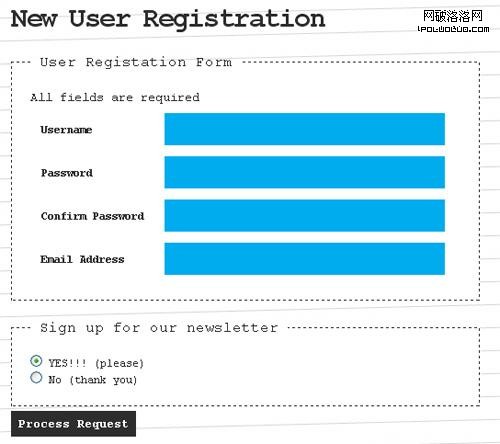
Below is a good example of a simple form that places each label above its related form element.
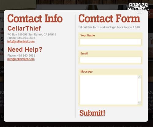
What are the benefits to this type of form layout, as opposed to a two-column form? First, the form labels have plenty of space to allow for future changes to the text inside them. A two-column form could be limited in this regard, and might require the entire form to be restructured if changes are made. Another benefit is that the form is not as cluttered looking, having plenty of whitespace in the label areas, so it’s easy to read and easy to associate the labels with the fields. Additionally, the background color given to each label/field pairing makes the form more visually inviting.
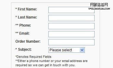
By contrast, look at the two-column form below:
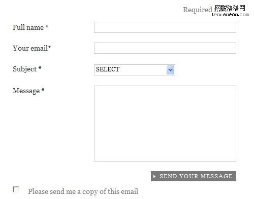
Especially because of the left-aligned text and lack of color, this form doesn’t have the same clean, visual effect as the previous example. In fact, the vertical space between the labels and the fields is somewhat distracting, giving the sense of multiple entities, when in fact a simple form like this should visually be presented as one grouped entity.
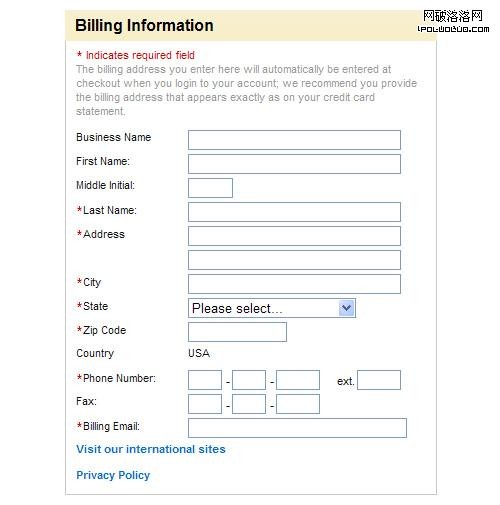
It’s not impossible, however to achieve a clean, organized look with a two-column layout, as shown by the example below from Chapters Indigo Books:

So, although there are no definite rules for the general layout of your form, effective guidelines include avoiding a two-column layout for simple forms, and aligning the text labels right if a two-column layout is used.
Use Inline Form Validation
Recently Luke Wroblewski wrote about the effectiveness of inline form validation on A List Apart. To quote directly from that article:
Our participants were faster, more successful, less error-prone, and more satisfied when they used the forms with inline validation.
jQuery Inline Form Validation, Because Validation is a Mess is a step-by-step tutorial describing how to use jQuery to add inline validation to a lengthy form.
Really Easy Field Validation
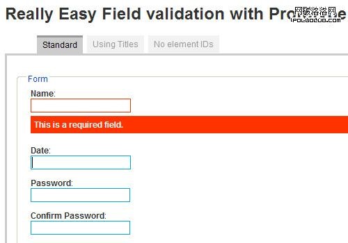
Dexagogo provides a simple script that can be used to add inline validation to your forms. The demo example is not the prettiest, but of course it can be customized to suit your needs. The script uses Scriptaculous for the fade-in effect.
Group Related Fields
With a lengthy form, you’ll be limited as to what you can do to improve its usability, but grouping related fields together to divide the form into manageable visual components will make the form a little less intimidating. Thus, the form will be perceived to be easier to fill out, even though it will probably take about the same amount of time as a form that has no grouping of fields.
To group related fields, use <fieldset> and the optional <legend> element, as shown in the code below:
<form id="form" action="register.php" method="post">

	<fieldset>
		<legend>Basic Info</legend>
		<div>
		<label for="name">Name:</label>
		<input type="text" name="name" id="name" />
		</div>
		<label for="password">Password:</label>
		<input type="text" name="password" id="password" />
		<div>
		<label for="password-confirm">Confirm Password:</label>
		<input type="text" name="password-confirm" id="password-confirm" />
		</div>
	</fieldset>

	<fieldset>
		<legend>Address</legend>
		<label for="address">Address:</label>
		<input type="text" name="address" id="address" />

		<label for="address2">Address (cont'd):</label>
		<input type="text" name="address2" id="address2" />

		<label for="zip">Zip/Postal:</label>
		<input type="text" name="zip" id="zip" />

		<label for="city">City:</label>
		<input type="text" name="city" id="city" />

		<label for="country">Country:</label>
		<input type="text" name="country" id="country" />

	</fieldset>

</form>
The <fieldset> element by default has a border, which can be changed, and is often removed in a CSS reset. Below is an example of a single form that is divided into two sections using <fieldset> and <legend> elements:
Cosmicsoda Registration Form
Unfortunately, the display of the border on the <fieldset> is not the same across all browsers, so it is usually best to disable the border in your stylesheet and create a custom border by some other means. This will also affect the look of the <legend> element, so it’s rare to see the use of these two elements nowadays. But the <fieldset> can still be used to group elements, and custom borders and headings can be included to provide the same basic effect. The <fieldset> and <legend> elements also have the added benefit of contributing to a form’s accessibility.
Clearly Indicate Required Fields
It’s common to indicate required fields by means of the asterisk symbol (*) in a different color than the rest of the text, so the required indicator stands out. Although most sites nowadays include this indicator, some still fail to use it properly.
The explanatory text that describes the purpose of the asterisk should be placed immediately above the form that is to be filled out, so the users see it before they begin filling it out. Some sites have used the asterisk character somewhat like a footnote indicator, placing the description of the asterisk below the form. The example below from the Elderluxe contact page demonstrates this poor placement of the the text that explains the meaning of the asterisk:
Elderluxe Contact Form
The example above has two problems: the asterisks are the same color as the rest of the text, and the explanation of the asterisk is near the bottom of the form. In many instances, asterisks alone would be enough, without any explanation, but if your target audience is not as computer-savvy, you will likely want to include at the top of the form a brief description of what the asterisk means.
The example below from Office Depot’s registration page demonstrates a properly-placed asterisk description:
Office Depot Registration Form
Although the example form above does have problems (left aligned text, small type, little use of whitespace), it clearly indicates required fields and explains the meaning of the asterisk before the user begins filling it out. This is especially important in this example, since the first three fields are not required, thus the user can safely skip them.
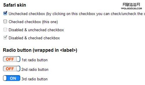
Fancier Checkboxes, Radio Buttons, and Select Elements
Forms can look awfully dull, especially since the styling of <select> elements, checkboxes, and radio buttons is limited in most browsers, and it is impossible to use CSS alone to style those elements to look exactly the same in every browser. Fortunately, there are a number of JavaScript library plugins and code that allow developers to include fancier, cross-browser form elements that degrade gracefully.
jQuery Checkbox allows you to insert custom checkboxes and radio buttons into your forms. I don’t particularly care for the look of the radio buttons in this case (they look nothing like radio buttons), but it’s one option to consider.
jQuery Image Combobox is a fully skinnable image-based replacement for the browser’s usually-ugly <select> element.
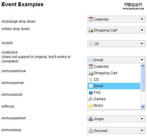
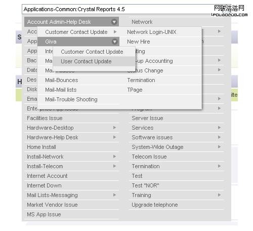
Giva Labs mcDropdown jQuery Plug-in is an intuitive, keyboard-accessible, easy-to-implement replacement for a typical <select> element that allows for nested data.
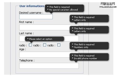
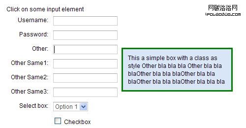
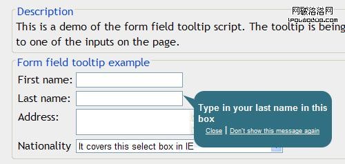
Display a Hint When a Field Gets Focus
Complex forms with many different fields can be easier for the user to fill out if some help text is given. Of course, you don’t want to overwhelm the user with one or more paragraphs of text above the form explaining what the fields are for.
As a simple alternative, you can write some JavaScript (or use a customizable plugin) that will display a custom tooltip-style message to explain form elements that might be confusing, or that require a certain type of input (for example, a username that only allows letters or numbers and must have at least 6 characters).
jQuery Input Floating Hint Box is a simple plugin that displays a fully-customizable floating hint when a field gets focus.
DHTML Goodies Form Field Tooltip is another variation of the form field helper text that displays the helper text based on what is entered in the form field’s title attribute.
Be Generous with Whitespace
As mentioned earlier, forms can look ugly and cluttered if the elements in the form are not displayed in a clean, usable manner. We generally think of the use of whitespace in our overall site design, but the same principle can be applied within a form, even down to the smallest details.
You can improve a form’s design by adding appropriate amounts of space around field elements, giving the elements themselves a larger and more usable size, and also allowing plenty of space inside text fields by using padding in your CSS. For example, try typing some text into the two fields below.
With just a small difference in size and padding, the second input field has a more usable feel. When multiple text fields appear in the same form, this can make quite a difference in how the overall experience is perceived, even though technically it might not make a whole lot of difference as far as how long it takes the user to fill it out.
It also helps to allow text fields to have plenty of visible characters. A name field especially should have plenty of space to allow for longer names. Overflow of characters will start pushing the text out of view, so it’s best to have enough space to accommodate longer names so that the user can more easily spot mistakes. The example field below demonstrates how a longer name would be cut off.
A text field that is similar in size to the ones in the previous example would be more appropriate and would allow for longer input to be entered without the risk of cutting anything off. The same principle would apply to a search box that may potentially receive long queries as input.
Make Your Forms Accessible
The topic of accessible forms could easily encompass an entire article and much more, but here are just a few tips to ensure your forms are more accessible and usable to a diverse audience.
- Use the
titleattribute for inputs, to assist those using screen readers - If a label doesn’t wrap around the field it is associated with, use a
forattribute that matches the accompanying field’sid - Set a tab order using the
tabindexattribute on each element - For the tab order, increment the tab numbers by large amounts (e.g. “10, 20, 30…” instead of “1, 2, 3…”), to allow for later additions that don’t require rewriting all the tab indexes
- For radio buttons and checkboxes, put the label after the associated element so screen readers read the item first and the word “checkbox” or “radio button” second
- Use the
<optgroup>tag to group<select>items - Use the
accesskeyattribute on form elements, to allow keyboard access