在設計中,對稱創造了平衡,平衡了創造和諧、秩序和審美。自然界中對稱無處不在,也許正是這種無處不在的狀態讓我們發現對稱的美。形態學的基本原則之一就是對稱,它是一套人類形為理論,形態學認為人類對看到和遇到的事物本能的產生出秩序和完整性。
However, symmetry can get boring. Asymmetry is a break in symmetry, which when used effectively, can make things more interesting. We will also talk about asymmetry.
然而,對稱也會讓人感到厭倦,這時就出現了不對稱。如果用的好,不對稱可以營造出更有趣的效果。在這裡,我也將會談一談不對稱的用法。
How can designers use symmetry as a tool? In this guide, we’ll look into symmetry as a part of design and cover the basic concepts of symmetry, some symmetry techniques, tips and best practices, and a discussion of a few websites that embody symmetry.
設計人員如何將對稱作為工具?在下面的內容中,我們將涉及設計中的對稱,對稱的基本概念,使用對稱的技巧、秘訣和最佳案例,以及對一些使用對稱設計的網站進行討論。
Types of Symmetry
對稱的種類
There are three types of symmetry: reflection (bilateral), rotational (radial), and translational symmetry. Each can be used in design to create strong points of interest and visual stability.
對稱分三種:反射對稱、 旋轉對稱、平移對稱。不同方法的使用可以創造出強烈的興趣點和視覺穩定性。
Reflection Symmetry
反射對稱
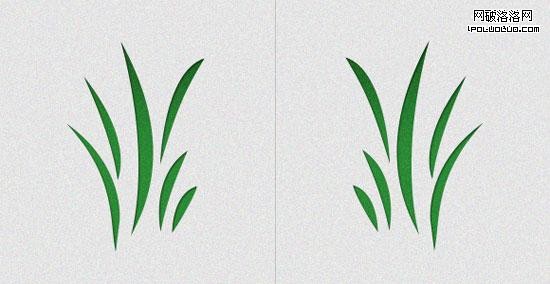
Reflection symmetry is also known as bilateral symmetry. It is the "mirror" effect, or when one object is reflected across a plane to create another instance of itself.
反射對稱也叫做左右對稱。反射對稱就是一種鏡子效映,一個物體在平面內反射後得到另一個自已。
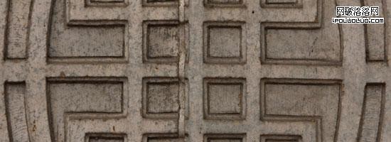
The most common type of reflection we think of, and the most common we see in nature, is horizontal reflection (a butterfly, the human body), with the central axis being vertical.
自然界是最普遍的反射是水平反射,如:蝴蝶、人體,中心軸是垂直的。
Reflection symmetry can take on any direction: vertical, diagonal, and anything in between.
反射對稱可以是任意方向的,垂直的,對角線的,或是界於這兩者之間的任一角度。
Rotational Symmetry
旋轉對稱
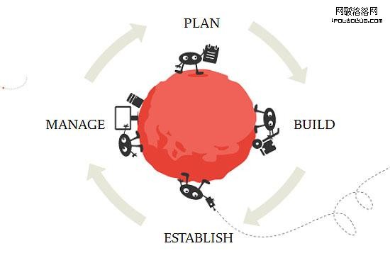
Rotational symmetry (or radial symmetry) is when an object is rotated in a certain direction around a point.
旋轉對稱(或稱放射對稱)是指某一物體繞著某一點在某一方向上做轉動。
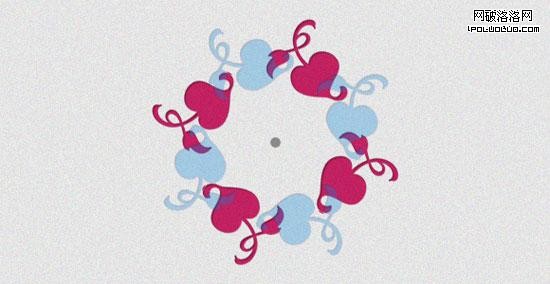
Rotational symmetry in nature is found in everything from the petals of a flower to the topside view of a jellyfish. In art and design, rotational symmetry can be used to portray motion or speed. Even on a static medium, rotational symmetry can convey action.
在自然界中,從花瓣到水母的頂部視角圖,隨處可以發現轉動對稱的存在。在藝術和設計中,轉動對稱可以用來表達動作和速度。即使在一個靜態的介質中,轉動對稱也可以表達出動態的意味。
Translational Symmetry
平移對稱
Translational symmetry is when an object is relocated to another position while maintaining its general or exact orientation. In the example below, we’ve moved one object several times at even intervals. These intervals do not have to be equal in order to maintain translational symmetry; they just need to be proportional.
平移對稱,是將一個物體移動到另外一個位置,物體大體的方向不變。如下圖,物體以相等的間隔移動了若干次。平移對稱的稱動間隔不一定是相等的,只需要成比例移動。
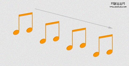
Translational symmetry can be used to create patterns, such as in the case of tiled website backgrounds and repeating design elements. It can also be used strategically and more profoundly to create the feeling of motion and speed just like rotational symmetry.
平稱對稱可用來制作各種圖案,例如平鋪的網站背景和重復的設計元素。如果運用的好,平移對稱完全可以像轉動對稱一樣打造出運動和速度效果。
Asymmetry
不對稱
Asymmetry is the lack of symmetry. Asymmetry can also represent an object that breaks a predefined pattern of symmetry, or an imbalance of design elements.
不對稱即是對稱的缺失。不對稱打破了預先的對稱模式,是設計中不協調的元素。
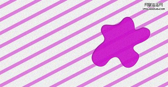
Asymmetry can be used as a design tool to create points of interest and organize visual hierarchy within a group of similar elements. It creates disorder, which can call attention to certain points of a design through distinction.
不對稱的使用可以創造出不同的興趣點,在一組相似的元素中建立視覺層級。不對稱創造出無秩序的效果從而突出設計。
In nature, we can see asymmetry in tree branches, in clouds, and in the fur of animals.
自然界中,樹木的枝杈,雲朵,和動物的皮毛都是不對稱的體現。
We may find asymmetry appealing because of its ability to introduce visual complexity and variations to an otherwise orderly design.
不對稱具有很強的吸引力,因為它可以在統一的設計中營造出視覺的復雜性和多樣性。
Asymmetry vs. Symmetry
不對稱 vs. 對稱
An asymmetrical object is visually heavier than symmetrical objects. Therefore, symmetry is great for patterns, backgrounds, the general layout, content, and anything else that is meant to be visually passive. Asymmetry is effective in drawing attention and breaking monotony.
不對稱物體在視覺上要重於對稱物體。因此,對稱最適合用在圖案、背景、總體布局、內容及一切視覺上被動的設計中。而不對稱可以抓人眼球,打破千篇一律。
Symmetry/Asymmetry Design Tips and Best Practices
對稱/不對稱設計技巧和最佳案例
When working with symmetry (or asymmetry) in design, there are several best practices you should keep in mind.
在使用對稱或不對稱做設計時,以下最佳案例可以用來參考。
Use Symmetry Strategically
適當的使用對稱
Strategic use of symmetry (and the lack of it) is a powerful design tool. Designs that need more stability, a strong organizational structure, and a classic and trusting message, tend to use more symmetry in the design.
合適的使用對稱是一個強大的設計法寶。以下情形中更趨向使用對稱,如:需要更大穩定性的設計中,牢固的組織結構中,或是要傳遞傳統的、令人信賴的信息時。
For risk-loving designs, providing asymmetry can reinforce the message. You can use asymmetry to punctuate an otherwise orderly, boring design.
對於一些大膽、創新的設計,不對稱更可以強化這種效果。不對稱可以使平淡的設計出彩。
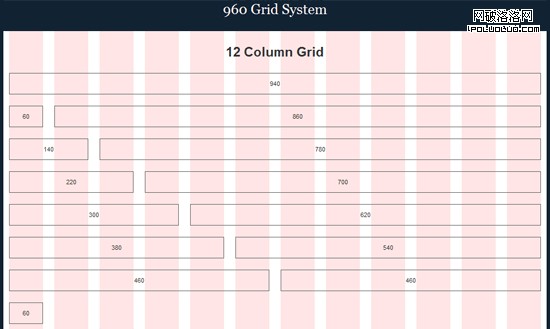
Translational Symmetry is Good for Layout Structure
平移對稱最適合用於結構布局
Keeping pieces of content roughly the same size and spanning them across a web page or print piece is a great way to keep symmetry while maintaining enough space for all of the essential text and imagery.
將內容條塊設置成大約相同的尺寸,擴展至整個頁面,或者輸出內容條塊是實現對稱的最好方法,同時也可以為主要文本和圖像留有足夠的空間。
For example, many grid layout systems (such as the 960 Grid System) exhibit translational symmetry in the way they break up column widths to maintain balance and proportion.
例如,許多網格布局系統通過打破列寬來展示平移對稱,以保持平衡和比例。
Use Rotational Symmetry to Convey Movement and Action
使用旋轉對稱傳達動作和行為
Rotational symmetry can simulate motion even in an otherwise flat and static medium. It can also infer progress or forward movement.
即使在平面靜態的介質中,旋轉對稱也可以模擬運動。旋轉對稱可以推斷發展進程和向前運動的方向。
Use Asymmetry to Draw Attention
利用不對稱突出重點
Asymmetry can make designs more interesting overall, but it serves another primary purpose: to grab attention and create visual hierarchy. Sometimes a design can intentionally be thrown off balance to direct the viewer’s eyes to a certain area.
總的來說,不對稱可以讓設計更有趣,但其另有更基本的功能:抓人眼球和營造視覺層級。有時設計者故意打破平衡以將用戶的注意力引導到某個區域。
Follow Your Gut Instinct
跟著感覺走
Symmetry is natural. If you know of Gestalt principles, then you’ll no doubt already know that our brains are wired to create symmetry and balance in the things we encounter. Our bodies have natural symmetry. Symmetry is in nature and is all around us.
對稱是與生俱來的。如果你熟悉格式塔原理,你必定知道人類的大腦對遇到的事物本能產生對稱和平衡。我們的身體生來就是對稱的,對稱在自然界中,對稱就在我們周圍。
If something looks and feels unbalanced, it probably is.
然而如果什麼東西看起來或感覺起來是不平衡的,這種現象也許是存在的。
Symmetry in Web Design: Examples
案例:網頁設計中的對稱
Below you’ll find 15 examples of how symmetry and asymmetry are used in designs. From the use of symmetry, we can see how each design portrays a certain message, with those designs that have more symmetry being more calming and organized, while those with more asymmetry tend to be more unconventional and organic.
下面的15個案例中,你將學到對稱和不對稱是如何使用的。通過對稱的使用,我們能夠了解到各種設計是如何傳遞特定的信息:使用大量對稱手法的設計看起來更深沉,更有條理;而不對稱的大量運用感覺更個性化。
IWC
IWC
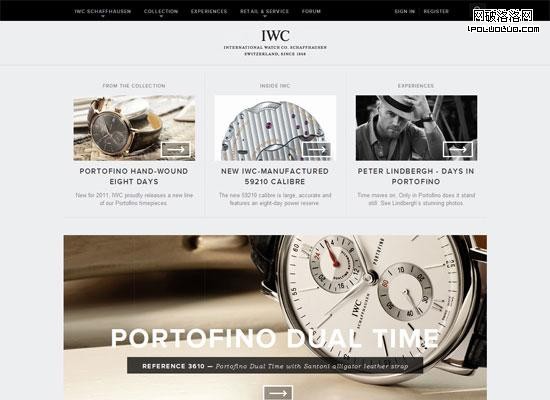
In the IWC website, we see both translational and reflection symmetry. Many elements and blocks of content are centered and are evenly proportional on both sides to create reflection symmetry, and we can see how sections of content are kept to the same size and then translated across the page. With the use of these two forms of symmetry throughout the entire design, this website has a very stable and professional look.
在IWC的網站中,使用了平移對稱和反射對稱。許多內容元素和內容塊居中,並且均勻地成比例的分布在兩邊形成反射對稱。每一塊區域保持相同的尺寸擴展至整個頁面。整個設計中兩種對稱方法的運用,使網站看起來即沉穩又專業。
Regenerator
Regenerator
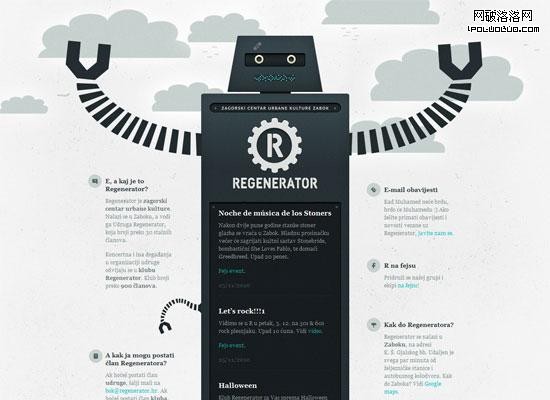
Regenerator is a great example of reflective symmetry in web design. Everything from the logo to the central piece (an illustration of a robot) is reflected horizontally. This fairly simple solution creates a great design.
Regenerator是網站設計中使用反射對稱的極佳的例子。所有設計元素,從logo到中心位置的圖像(機器人圖像)全部水平反射。這種相當簡潔的設計方案卻呈現出極好的效果。
Beanstalk
Beanstalk
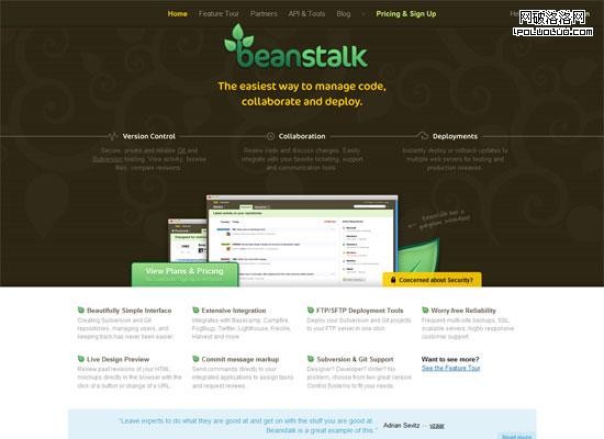
For the most part, this design remains centered and creates a horizontally symmetrical look. Although the imagery is not an exact reflection, the overarching balance of the design is. We also see content elements located at the top and bottom of the layout shifted (translated) horizontally across the page for further symmetry.
總的來說,此設計保持居中並水平對稱。雖然圖像元素並不是完全的反射,但整體設計的平衡卻達到了這個效果。頁面頂部和底部的元素布局呈水平變換,達到了更深層次的對稱的效果。
Pointless Corp
Pointless Corp
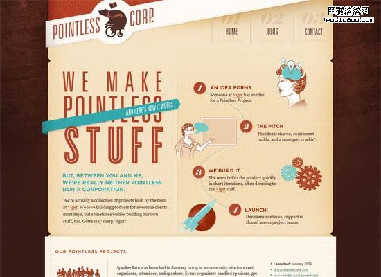
Pointless Corp has a very asymmetrical design, which makes it creative, whimsical, and visually appealing (although there is also symmetry involved to help keep the design cohesive). Note how some shapes and directional flow are repeated (a manifestation of translational symmetry).
這個頁面使用不對稱的設計手法。此種風格使頁面看起來富有創意、天馬行空、視覺上有很大的沖擊力(同時也使用對稱手法以保持設計的一致性)。要學習各種形狀和流程的重復使用(這是平移對稱的展現)。
The Idealists
The Idealists
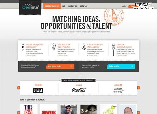
We can see both translational symmetry between the shape and size of content blocks, and reflection symmetry from the main elements centered and evenly spaced across a vertical plane in this web design. This design, however, does a bit more by adding some interest with overflowing elements such as the logo and imagery. Note that even though these two design elements (and a few more throughout the site) add visual interest, they still balance each other out to maintain symmetry in the design. The logo on the left is darker and overlapping, but it is balanced by the more complex and brighter image to the right of the tagline.
可以看到,各個形狀間和內容區塊間均使用了平移對稱。主要元素采用居中反射對稱,並均勻地垂直分布於整個頁面。需要學習的是,雖然個別的幾個設計元素增強了視覺效果,但在設計上它們依然保持對稱以達到平衡。頁面左上角的黑色logo是覆蓋上去的,為了達到視覺的平衡,右側的圖片采用更為復雜和色彩明亮的圖像。
Typographisme
Typographisme
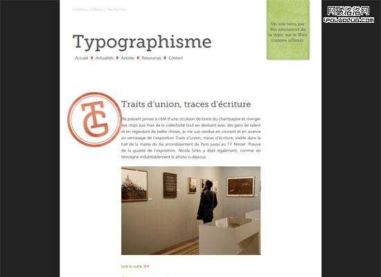
This web design uses reflection symmetry. The main content is evenly centered, and would match up on either side if folded in half. However, we can also see that there are plenty of asymmetrical elements, employing them to create visual hierarchy and distinction in certain areas of the design. The orange "TG" stamp, for example, serves to punctuate the monotonous symmetry.
這個網站設計采用反射對稱,主要內容均勻的居中對齊。如果將頁面對折,兩邊會相互吻合。除此之外,不對稱元素的使用更是創造了視覺層次,用以區分其它部分。例如,黃色TG郵戳狀圖像,就打破了單調的對稱設計。
Coda Automotive
Coda Automotive
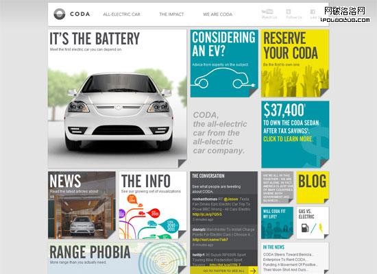
Coda Automotive is a content-heavy site, which means balance and organization is essential to site usability. We can witness a lot of translation symmetry in this design, where the same-sized block shape is repeated in various locations. For interest — and likely due to practical content-related layout purposes as well — the shapes of the squares also vary in size, yet still maintain visual balance on either side by mixing up size versus complexity, color, and density.
這個網站內容很多,因此平衡性和組織性是至關重要的。頁面中大量使用了平移對稱設計,相同大小的形狀重復出現在不同的位置。為了強化視覺,也為了實用性的內容布局,各個方塊在尺寸上也不盡相同。不同尺寸、不同復雜度、不同顏色和密度的方塊混合,達到視覺的平衡。
Jessica Allen
Jessica Allen
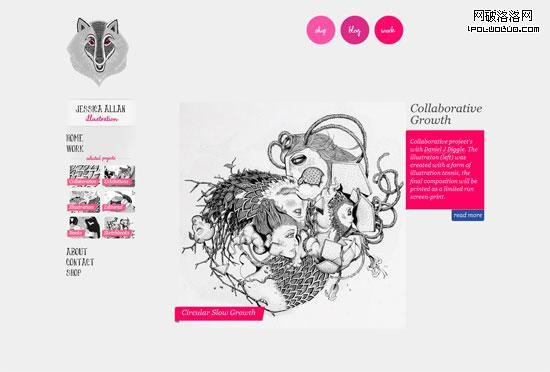
This web portfolio is likely the most asymmetrical design in this showcase. There are a few areas of translational symmetry, and the logo provides perfect reflection symmetry, but beyond that, not much else. As you can see, asymmetry is equally effective as a design tool.
在這個案例中,大量使用了不對稱的設計。除了一小部分使用平移對稱,logo使用了反射對稱之外,全部采用不對稱手法。正如我們所看到的,不對稱同樣是一種高效的設計方法。
Ambassadors for Life
Ambassadors for Life
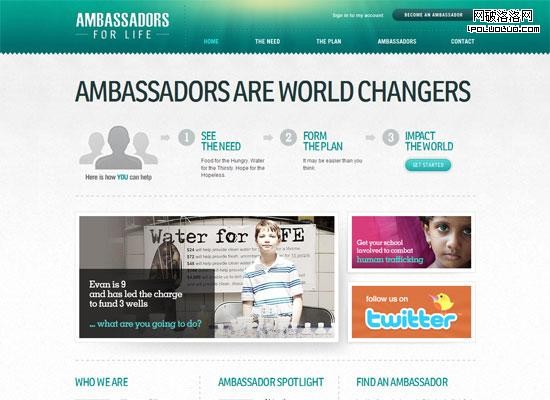
Here again we see a lot of translational symmetry in the content, from the size of the content blocks to the additional imagery surrounding those blocks. There is some reflection symmetry present in the logo, as well as in the image directly below it. What keeps this design interesting is the jarring asymmetry in the main photos below the "process" content, helping draw focus to the site’s featured story.
在這裡,內容上同樣采用了大量的平移對稱,從內容塊的尺寸到內容塊周圍的附加圖像。頁面logo和logo下方的圖形采用了反射對稱。這個設計中最有意思的是主體的照片部分,主體照片大小不一,引導用戶關注網站的專題報道。
QTRLY
QTRLY
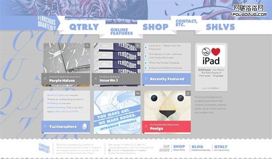
The background and main navigation menu of QTRLY are abstract. However, the main featured pieces of content are repetitive blocks, translated horizontally and vertically for balance and structural integrity.
這個網站的背景和導航菜單采用抽象設計。而主體部分是方塊的重復使用,為了達到平衡與結構的完整水平垂直重復。
Elegant Seagulls
Elegant Seagulls
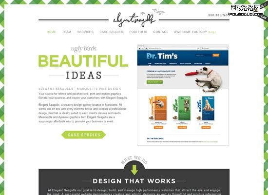
The Elegant Seagulls website is a symmetrical design. The logo, tagline, and navigation are all centered, as are many other header elements. The listed section of services towards the bottom of the layout also displays translational symmetry.
這是個對稱設計的案例。logo、裝飾條、導航以及許多標題元素居中展示。底部的服務列表采用移動對稱設計。
Dark Sky
Dark Sky
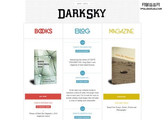
This web design is clean and simple, but embodies a grid layout that maintains translational and reflective symmetry. Where there is a book image on one side, there is another one at the opposite of it.
這個網頁設計干淨、簡潔,采用網格布局區分出平移對稱和反射對稱。左右兩邊均有書籍圖片保持對稱。
Polecat
Polecat
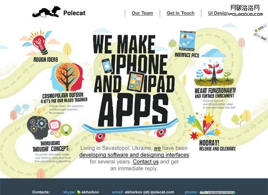
Polecat features rotational symmetry put to use in web design. There is a general use of rotational symmetry up top around the list of features, but also a more concrete use down below by the "Our Team" section. Beyond this, there’s asymmetry going on in the background, while the main elements of content retain balance. This is a great mixture of using visual interest created by asymmetry, with balance, proportion and organization made with strategic symmetry.
這是一個使用旋轉對稱的案例。在頁面上部特性的描述上采用了一般性的旋轉對稱,下面“我們的團隊”一欄中,實實在在的采用旋轉對稱。除此之外,雖然頁面背景采用不對稱設計,主要欄目設置卻保持平衡。這個頁面是不對稱和對稱的完美融合,是視覺趣味與平衡、比例與整體性的完美搭配。
SVN 2 FTP
SVN 2 FTP
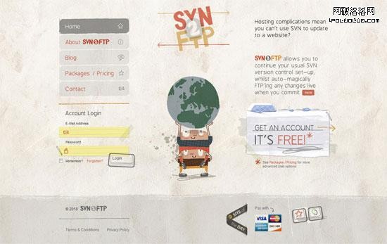
The general layout and imagery of this entire design features reflection symmetry, yet each element individually holds a lot of uniqueness and lack of symmetry. For example, the image of the two characters holding up the Earth graphic is relatively symmetrical, yet has details that would not allow it to line up perfectly. This creates just enough balance and stability, while at the same time preserving uniqueness and creativity.
這個頁面的整體布局和圖像設計特點是反射對稱。然而單獨來看,每個元素又是獨一無二的,不對稱的。例如:兩個小人舉起地球的圖片相對來說是對稱的,但是細節上又不完全一致。這種設計在達到平衡性和穩定性的同時,又能保持其獨特性和創造性。
Forever Heavy
Forever Heavy
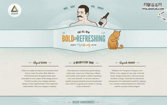
Forever Heavy is another mainly centered design, with its design components more or less centered and reflected horizontally. However, note how asymmetrical items are used to punctuate the general symmetry the layout has.
這又是一個以居中為主的設計,頁面元素居中並水平反射。我們要學習的是,如何使用不對稱的元素讓整體性對稱布局更出彩。
Summary
小結:
Symmetry (or lack thereof) can be a very strong tool in design projects. It can create or maintain balance, calmness, and stability. It can communicate integrity, professionalism, and solidarity. Asymmetry, on the other hand, can develop strong points of interest, uniqueness, and character. Using symmetry and asymmetry in their various forms can do a lot for our designs.
對稱是設計中非常有用的一種工具。對稱設計傳達出頁面的平衡、安靜和穩定,同時表達了完整性、專業性和一致性。不對稱可以營造強烈的興趣點,顯示獨特和個性。總之,對稱和不對稱的運用能夠幫助設計者設計出更完美的作品。
 本文作者Kayla Knight是一位網頁設計師和網站開發員。她做為一名自由職業者從事設計和開發工作。了解更多,請訪問她的主頁。http://kaylaknight.com/