CSS3打造磨砂玻璃背景效果
編輯:關於CSS
簡介
這個效果是在看CSS Secrets這書上看到的,感覺很不錯;
實現原理也挺簡單的;
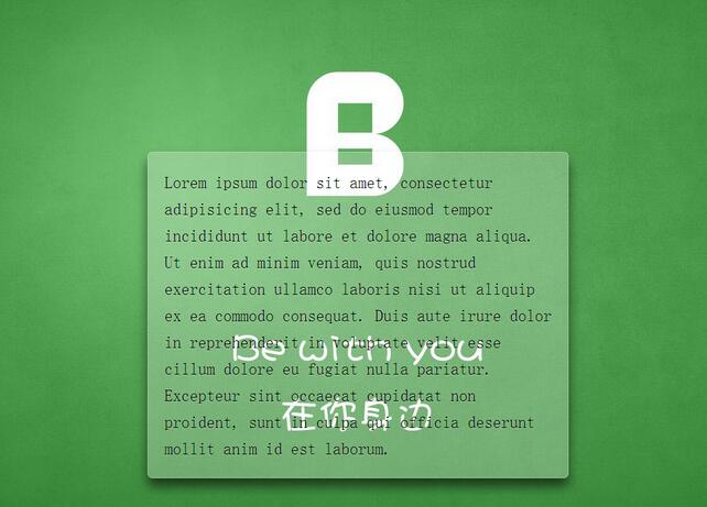
效果圖及實現
效果圖
代碼實現
CSS Code復制內容到剪貼板- <!DOCTYPE html>
- <html lang="en">
- <head>
- <meta charset="UTF-8">
- <title>Document</title>
- <style>
- /**
- * 設置背景圖全屏覆蓋及固定
- * 設置內部元素偏移
- */
- body {
- /*此處背景圖自行替換*/
- background: url(demo.jpg) no-repeat center center fixed;
- background-size: cover;
- min-height: 100vh;
- box-sizing: border-box;
- margin: 0;
- padding-top: calc(50vh - 6em);
- font: 150%/1.6 Baskerville, Palatino, serif;
- }
- /**
- * 整體居中功能;
- * 背景透明虛化
- * 溢出隱藏
- * 邊緣圓角化
- * 文字增加淡陰影
- */
- .description{
- position: relative;
- margin: 0 auto;
- padding: 1em;
- max-width: 23em;
- background: hsla(0,0%,100%,.25) border-box;
- overflow: hidden;
- border-radius: .3em;
- box-shadow: 0 0 0 1px hsla(0,0%,100%,.3) inset,
- 0 .5em 1em rgba(0, 0, 0, 0.6);
- text-shadow: 0 1px 1px hsla(0,0%,100%,.3);
- }
- /*使用濾鏡模糊邊緣*/
- .description::before{
- content: '';
- position: absolute;
- top: 0; rightright: 0; bottombottom: 0; left: 0;
- margin: -30px;
- z-index: -1;
- -webkit-filter: blur(20px);
- filter: blur(20px);
- }
- </style>
- </head>
- <body>
- <p class="description">
- Lorem ipsum dolor sit amet, consectetur adipisicing elit, sed do eiusmod
- tempor incididunt ut labore et dolore magna aliqua. Ut enim ad minim veniam,
- quis nostrud exercitation ullamco laboris nisi ut aliquip ex ea commodo
- consequat. Duis aute irure dolor in reprehenderit in voluptate velit esse
- cillum dolore eu fugiat nulla pariatur. Excepteur sint occaecat cupidatat non
- proident, sunt in culpa qui officia deserunt mollit anim id est laborum.
- </p>
- </body>
- </html>
總結
這種實現模式是考慮了性能來寫的,以及維護上的考慮
- 比如使用了em,可以很輕松的放大縮小整體大小
- 這裡使用了hsla,這是我第一次使用這個顏色值;以前只在ps調整這個,很不錯的顏色模式.和RGBA大同小異,但是HSLA更符合人類眼睛的觀看;
- 還學到了一種新的背景縮寫方式
- /*分開寫*/
- background-color:#ff0;
- background-image:url(background.gif);
- background-repeat:no-repeat;
- background-attachment:fixed;
- background-position:0 0;
- background-size:cover;
- /*簡寫*/
- background: #ff0 url(background.gif) no-repeat / fixed cover;
- /*設置background-size必須用單斜槓隔開*/
以上就是本文的全部內容,希望對大家的學習有所幫助,也希望大家多多支持。
- 上一頁:CSS3模擬IOS滑動開關效果
- 下一頁:利用CSS3實現折角效果實例源碼
小編推薦
熱門推薦