空心三角形的簡單實現(必看篇)
編輯:關於CSS
背景: 項目過程中有個tab切換需要用到空心三角形的效果。作為一名後端工程師,實在是不知道怎麼寫,在網上找了一些看了一下別人的實現方式,發現大多數都是實心三角。後來終於發現一個實現空心三角的,頓時熱淚盈眶啊。實現效果比較粗略,不過還是思路還是比較清晰的,借鑒了一下,在原有的基礎上做了一些改進,增加一些效果
空心三角原理:主要利用元素偽類(:before,:after)實現
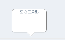
效果圖:
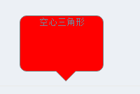
ps:移入換色
實現代碼:
CSS Code復制內容到剪貼板- <style>
- #talkbubble {
- width: 120px;
- height: 80px;
- position: relative;
- -moz-border-radius: 10px;
- -webkit-border-radius: 10px;
- border-radius: 10px;
- border: 1px #808080 solid;
- background-color: #fff;
- }
- #talkbubble:before {
- content: " ";
- position: absolute;
- top: 100%;
- left: 50px;
- width: 0;
- height: 0;
- border-left: 15px solid transparent;
- border-top: 15px solid #808080;
- border-right: 15px solid transparent;
- }
- .inlayer:after {
- content: " ";
- position: absolute;
- top: 100%;
- left: 51px;
- width: 0;
- height: 0;
- border-left: 14px solid transparent;
- border-top: 14px solid #fff;
- border-right: 14px solid transparent;
- }
- #talkbubble:hover {
- background-color: #ff0000;
- }
- .inlayer:hover:after {
- width: 0;
- height: 0;
- border-left: 14px solid transparent;
- border-top: 14px solid #ff0000;
- border-right: 14px solid transparent;
- }
- </style>
- <!-- html -->
- <div id="talkbubble" class="inlayer">
- 空心三角形
- </div>
以上這篇空心三角形的簡單實現(必看篇)就是小編分享給大家的全部內容了,希望能給大家一個參考,也希望大家多多支持。
小編推薦
熱門推薦