前幾天在互聯網上看到alexwolfe制作的Button庫,覺得很有意思,特意花了些時間學習了一下這個庫的源碼與使用。今天花了點時間將期整理與大家分享。
Button庫並不是簡單的一個CSS制作的Button庫,在這裡alexwolfe大師采用了SASS和Compass進行開發和維護的。或許有些同學看到這兩個東東會覺得很蛋疼,不知道怎麼使用,其實沒有那麼恐怖的,只要你略懂CSS,就完全可以使用這個按鈕庫,大不了直接git下來他的CSS到你的項目中,這樣也能使用,只不過你要按你的設計風格來調整就略會麻煩些。
接下來我們就不說太多的廢話,先了簡單的了解這個Button包含哪些東東吧,這才是大家最為關心和想知道的。
Buttons中主要包括以下幾種按鈕形狀:
- 默認按鈕,使用類名“button”
- "Rounded"按鈕,使用類名“button-rounded”
- "Flat"按鈕,使用類名“button-flat”
- "Pill"按鈕,使用類名“button-pill”
- "Circle"按鈕,使用類名“button-circle”
Buttons中主要包括以下幾種按鈕大小:
- 大按鈕,使用類名"button-large"
- 小按鈕,使用類名“button-small”
- 微小按鈕,使用類名“button-tiny”
在Button中除了以上幾種按鈕類型之外,Buttons庫中還有幾種用來裝飾性的按鈕,例如,圖標按鈕、塊按鈕,外包按鈕等。
Demo下載
效果如下圖所示:
Buttons的使用
要能正常的使用Buttons庫,其實很簡單,只要你按下面三個步驟執行,你就能正常的使用這個Buttons。
- 下載Buttons庫代碼
- 在你的項目頁面的"<head></head>"調用下載下來的Buttons庫中的CSS樣式文件
- 在你的項目頁面中創建按鈕的Html標簽
下載Buttons庫源碼
你可以直接到Buttons的官網上點擊Download按鈕下載,或者你可以到GitHub下載。並把下載下來的Buttons.zip文件解壓縮,獲取裡面的樣式代碼文件buttons.css、font-awesome.min.CSS和獲取裡面的font字體庫,並將這些文件直接插入到您的項目中。例如在我的項目中:
+ Buttons_project + ----css + --------buttons.css + --------font-awesome.min.CSS + ----font + --------fontawesome-webfont.eot + --------fontawesome-webfont.svg + --------fontawesome-webfont.ttf + --------fontawesome-webfont.woff + --------FontAwesome.otf + ----index.Html 調用Buttons庫文件
只下載文件下來,不調用也是無效的,至於如何調用Buttons的文件,這裡簡單的列出兩種常見的調用方法,至於哪種好,哪種不好,大家自己識別。
link調用
使用<link>標簽調用樣式,很簡單,你只需要在你的Web頁中<head></head>中通過 <link>調用需要的兩個樣式文件:
<link rel="stylesheet" href="css/font-awesome.min.css" /> <link rel="stylesheet" href="css/buttons.CSS" /> 這現個樣式文件,最好放在你自定義樣式文件前面。
@import調用
另外一種調用的方式,使用@import方式調用樣式。使用這種方式調用樣式文件,需要在你自定義樣式文件中的開頭,使用@import來調用樣式:
/*在你自己定義樣式文件,如style.css*/ @import "font-awesome.min.css"; @import "buttons.CSS" Html的使用規則
在Web中制作按鈕,更多的時候是使用表單中的input[type="submit"]、 input[type="button"]或者button標簽。除了這些標簽之外,還常常使用<a>標簽來制作。至於為什麼?大家都懂的。當然,您還可以使用Html中的其他標簽來制作,比如說:<span>標簽、<div>標簽等等,只是使用這些標簽從語義化的角度出發,不太完美,而且你還需要添加一些JavaScript來實現一些其他功能。
在這裡我們不花太多的時間來糾結使用什麼標簽,我想大家更想知道的是使用Buttons庫應該怎樣在自己的項目中寫結構,方便借用Buttons庫直接生成按鈕效果。
在實際項目是使用Buttons庫,我們可以直接在Html結構中使用下面的標簽:
<a>我是一個按鈕 </a> <input type="submit" value="我是一個按鈕" /> <button type="submit">我是一個按鈕</button> 僅在您的項目中插入上面的Html代和樣式文件,在您浏覽器中呈現的僅是一些普通的鏈接或者按鈕,並不是您想要的。如果想要在您的浏覽器中呈現Buttons庫中的按鈕風格,我們還有一個很關鍵的步驟——按需在您的元素中添加對應的按鈕類名。
默認按鈕風格
前面說過,只調用樣式,無結構,也得不到想要的按鈕;反之有結構,無樣式,也同樣得不到想要的按鈕。在實際中就是這麼現實,接下來我們分別來看看各種風格按鈕的調用。
在Buttons庫中,只要你加載了,並且在你的代碼中調用了.button類名,你就能得到一個默認的按鈕風格:
<a class="button">a標簽按鈕 </a> <input type="submit" value="input標簽按鈕" class="button" /> <button type="submit" class="button">button標簽按鈕</button>
對應的CSS樣式:
/*button的默認樣式*/ .button { -webkit-box-shadow: inset 0px 1px 0px rgba(255, 255, 255, 0.5), 0px 1px 2px rgba(0, 0, 0, 0.2); -moz-box-shadow: inset 0px 1px 0px rgba(255, 255, 255, 0.5), 0px 1px 2px rgba(0, 0, 0, 0.2); box-shadow: inset 0px 1px 0px rgba(255, 255, 255, 0.5), 0px 1px 2px rgba(0, 0, 0, 0.2); background-color: #eeeeee; background: -webkit-gradient(linear, 50% 0%, 50% 100%, color-stop(0%, #fbfbfb), color-stop(100%, #e1e1e1)); background: -webkit-linear-gradient(top, #fbfbfb, #e1e1e1); background: -moz-linear-gradient(top, #fbfbfb, #e1e1e1); background: -o-linear-gradient(top, #fbfbfb, #e1e1e1); background: linear-gradient(top, #fbfbfb, #e1e1e1); display: -moz-inline-stack; display: inline-block; vertical-align: middle; *vertical-align: auto; zoom: 1; *display: inline; border: 1px solid #d4d4d4; height: 32px; line-height: 32px; padding: 0px 25.6px; font-weight: 300; font-size: 14px; font-family: "HelveticaNeue-Light", "Helvetica Neue Light", "Helvetica Neue", Helvetica, Arial, "Lucida Grande", sans-serif; color: #666666; text-shadow: 0 1px 1px white; margin: 0; text-decoration: none; text-align: center; } /*按鈕懸浮狀態*/ .button:hover { background-color: #eeeeee; background: -webkit-gradient(linear, 50% 0%, 50% 100%, color-stop(0%, #ffffff), color-stop(100%, #dcdcdc)); background: -webkit-linear-gradient(top, #ffffff, #dcdcdc); background: -moz-linear-gradient(top, #ffffff, #dcdcdc); background: -o-linear-gradient(top, #ffffff, #dcdcdc); background: linear-gradIEnt(top, #ffffff, #dcdcdc); } /*按鈕點擊狀態*/ .button:active { -webkit-box-shadow: inset 0px 1px 3px rgba(0, 0, 0, 0.3), 0px 1px 0px white; -moz-box-shadow: inset 0px 1px 3px rgba(0, 0, 0, 0.3), 0px 1px 0px white; box-shadow: inset 0px 1px 3px rgba(0, 0, 0, 0.3), 0px 1px 0px white; text-shadow: 0px 1px 0px rgba(255, 255, 255, 0.4); background: #eeeeee; color: #bbbbbb; }
注:上面代碼是使用SASS轉譯出來的樣式代碼,所以在書寫是沒有考慮一些簡寫規范,另外其中box-shadow、border-radius在現代浏覽器中已支持標准規范,不需要添加浏覽器的私有屬性。另外GradIEnt語法最近也有更新。
默認按鈕效果,如下圖所示:

不過在’<button>‘和"input[type="submit"]"標簽制作的按鈕,需要對他高的設置另做一點處理,在這個庫裡,重置了他們的高度值:
input.button, button.button { height: 34px;/*在其他標簽制作按鈕高2px*/ cursor: pointer; }
如果您的按鈕要處理禁用狀態,讓用戶不能點擊你的按鈕,可以在類名中添加"disabled"類,如果是表單按鈕,直接使用"disabled"屬性:
<a class="button disabled">a標簽按鈕 </a> <input type="submit" value="input標簽按鈕" class="button" disabled /> <button type="submit" class="button" disabled>button標簽按鈕</button>
對應的樣式如下:
.button.disabled, .button.disabled:hover, .button.disabled:active, input.button:disabled, button.button:disabled { -webkit-box-shadow: 0px 1px 2px rgba(0, 0, 0, 0.1); -moz-box-shadow: 0px 1px 2px rgba(0, 0, 0, 0.1); box-shadow: 0px 1px 2px rgba(0, 0, 0, 0.1); background: #EEE; border: 1px solid #dddddd; text-shadow: 0 1px 1px white; color: #CCC; cursor: default; }
效果如下圖所示:

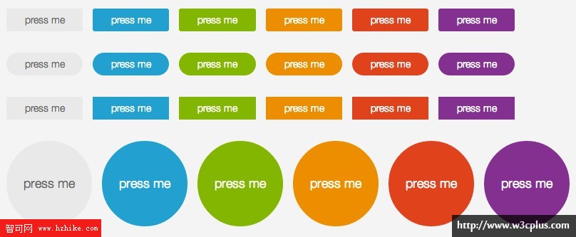
彩色按鈕
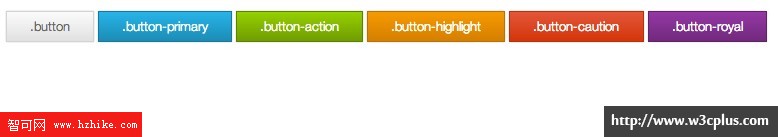
默認的按鈕僅是一種色彩,在這個多色世界中,他無法讓你滿足,那麼需要一些其他的顏色來補充您的需求,在Buttons庫中也是一樣的,裡面提供了幾種不同顏色的按鈕,其主要區別是通過類名來控制不同的顏色:
- 色調一,使用類名"button-primary",從“#00b5e5”漸變到“#008db2”;
- 色調二,使用類名’button-action‘,從“#8fcf00”漸變到“#6b9c00”;
- 色調三,使用類名"button-highlight",從“#fa9915”漸變到“#d87e04”;
- 色調四,使用類名"button-caution",從“#eb6855”漸變到“#d9331a”;
- 色調五,使用類名"button-royal",從“#ab3eb2”漸變到“#752a79”。
在Buttons庫中主要實現了五種顏色的效果,當然這幾種顏色不能滿足所有的設計需求,不過Buttons庫中提供了自定義按鈕(通過Sass來完成,稍後會介紹),你就可以輕松得到各種顏色風格按鈕。同樣,在每一種顏色風格下都供了對應的不同狀態按鈕風格。整個代碼如下所示:
/*button-primary style*/ .button-primary { background: -webkit-gradient(linear, 50% 0%, 50% 100%, color-stop(0%, #00b5e5), color-stop(100%, #008db2)); background: -webkit-linear-gradient(top, #00b5e5, #008db2); background: -moz-linear-gradient(top, #00b5e5, #008db2); background: -o-linear-gradient(top, #00b5e5, #008db2); background: linear-gradient(top, #00b5e5, #008db2); background-color: #00a1cb; border-color: #007998; color: white; text-shadow: 0 -1px 1px rgba(0, 40, 50, 0.35); } .button-primary:hover { background-color: #00a1cb; background: -webkit-gradient(linear, 50% 0%, 50% 100%, color-stop(0%, #00c9fe), color-stop(100%, #008db2)); background: -webkit-linear-gradient(top, #00c9fe, #008db2); background: -moz-linear-gradient(top, #00c9fe, #008db2); background: -o-linear-gradient(top, #00c9fe, #008db2); background: linear-gradient(top, #00c9fe, #008db2); } .button-primary:active { background: #1495b7; color: #005065; } /* button-action style */ .button-action { background: -webkit-gradient(linear, 50% 0%, 50% 100%, color-stop(0%, #8fcf00), color-stop(100%, #6b9c00)); background: -webkit-linear-gradient(top, #8fcf00, #6b9c00); background: -moz-linear-gradient(top, #8fcf00, #6b9c00); background: -o-linear-gradient(top, #8fcf00, #6b9c00); background: linear-gradient(top, #8fcf00, #6b9c00); background-color: #7db500; border-color: #5a8200; color: white; text-shadow: 0 -1px 1px rgba(19, 28, 0, 0.35); } .button-action:hover { background-color: #7db500; background: -webkit-gradient(linear, 50% 0%, 50% 100%, color-stop(0%, #a0e800), color-stop(100%, #6b9c00)); background: -webkit-linear-gradient(top, #a0e800, #6b9c00); background: -moz-linear-gradient(top, #a0e800, #6b9c00); background: -o-linear-gradient(top, #a0e800, #6b9c00); background: linear-gradient(top, #a0e800, #6b9c00); } .button-action:active { background: #76a312; color: #374f00; } /* button-highlight */ .button-highlight { background: -webkit-gradient(linear, 50% 0%, 50% 100%, color-stop(0%, #fa9915), color-stop(100%, #d87e04)); background: -webkit-linear-gradient(top, #fa9915, #d87e04); background: -moz-linear-gradient(top, #fa9915, #d87e04); background: -o-linear-gradient(top, #fa9915, #d87e04); background: linear-gradient(top, #fa9915, #d87e04); background-color: #f18d05; border-color: #bf7004; color: white; text-shadow: 0 -1px 1px rgba(91, 53, 2, 0.35); } .button-highlight:hover { background-color: #f18d05; background: -webkit-gradient(linear, 50% 0%, 50% 100%, color-stop(0%, #fba42e), color-stop(100%, #d87e04)); background: -webkit-linear-gradient(top, #fba42e, #d87e04); background: -moz-linear-gradient(top, #fba42e, #d87e04); background: -o-linear-gradient(top, #fba42e, #d87e04); background: linear-gradient(top, #fba42e, #d87e04); } .button-highlight:active { background: #d8891e; color: #8d5303; } /* button-caution style */ .button-caution { background: -webkit-gradient(linear, 50% 0%, 50% 100%, color-stop(0%, #e8543f), color-stop(100%, #d9331a)); background: -webkit-linear-gradient(top, #e8543f, #d9331a); background: -moz-linear-gradient(top, #e8543f, #d9331a); background: -o-linear-gradient(top, #e8543f, #d9331a); background: linear-gradient(top, #e8543f, #d9331a); background-color: #e54028; border-color: #c22d18; color: white; text-shadow: 0 -1px 1px rgba(103, 24, 13, 0.35); } .button-caution:hover { background-color: #e54028; background: -webkit-gradient(linear, 50% 0%, 50% 100%, color-stop(0%, #eb6855), color-stop(100%, #d9331a)); background: -webkit-linear-gradient(top, #eb6855, #d9331a); background: -moz-linear-gradient(top, #eb6855, #d9331a); background: -o-linear-gradient(top, #eb6855, #d9331a); background: linear-gradient(top, #eb6855, #d9331a); } .button-caution:active { background: #cd5240; color: #952312; } /* button-royal style */ .button-royal { background: -webkit-gradient(linear, 50% 0%, 50% 100%, color-stop(0%, #99389f), color-stop(100%, #752a79)); background: -webkit-linear-gradient(top, #99389f, #752a79); background: -moz-linear-gradient(top, #99389f, #752a79); background: -o-linear-gradient(top, #99389f, #752a79); background: linear-gradient(top, #99389f, #752a79); background-color: #87318c; border-color: #632466; color: white; text-shadow: 0 -1px 1px rgba(26, 9, 27, 0.35); } .button-royal:hover { background-color: #87318c; background: -webkit-gradient(linear, 50% 0%, 50% 100%, color-stop(0%, #ab3eb2), color-stop(100%, #752a79)); background: -webkit-linear-gradient(top, #ab3eb2, #752a79); background: -moz-linear-gradient(top, #ab3eb2, #752a79); background: -o-linear-gradient(top, #ab3eb2, #752a79); background: linear-gradIEnt(top, #ab3eb2, #752a79); } .button-royal:active { background: #764479; color: #3e1740; }
效果如下所示:
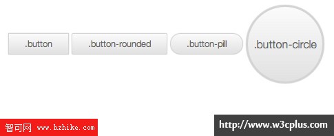
按鈕形狀類型
在Buttons按鈕庫中還有一個特色,通過不同的類名實現不同的按鈕形狀。在平時的制作中,我們常見的按鈕形狀有圓角(小圓角,大圓角),還有圓形按鈕。在這裡通過三個不同的類名來實現不同的按鈕形狀:"button-rounded"、"button-pill"和’button-circle‘:
<a class="button">.button</a> <a class="button button-rounded">.button-rounded</a> <a class="button button-pill">.button-pill</a> <a class="button button-circle">.button-circle</a>
樣式在".button-rounded"、".button-pill"和".button-circle"上定義不同的圓角大小,從而實現不同風格的按鈕形狀:
/* .button-rounded style */ .button-rounded { -webkit-border-radius: 3px; -moz-border-radius: 3px; -ms-border-radius: 3px; -o-border-radius: 3px; border-radius: 3px; } /* .button-pill style */ .button-pill { -webkit-border-radius: 50px; -moz-border-radius: 50px; -ms-border-radius: 50px; -o-border-radius: 50px; border-radius: 50px; } /* .button-circle style */ .button-circle { -webkit-border-radius: 240px; -moz-border-radius: 240px; -ms-border-radius: 240px; -o-border-radius: 240px; border-radius: 240px; -webkit-box-shadow: inset 0px 1px 1px rgba(255, 255, 255, 0.5), 0px 1px 2px rgba(0, 0, 0, 0.2); -moz-box-shadow: inset 0px 1px 1px rgba(255, 255, 255, 0.5), 0px 1px 2px rgba(0, 0, 0, 0.2); box-shadow: inset 0px 1px 1px rgba(255, 255, 255, 0.5), 0px 1px 2px rgba(0, 0, 0, 0.2); width: 120px; line-height: 120px; height: 120px; padding: 0px; border-width: 4px; font-size: 18px; }
對於圓形按鈕,其"border-radius"可設置值為“50%”,利於擴展,在不同圓形按鈕下,都可以實現一個圓形。
效果如下圖所示:
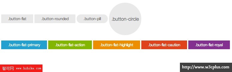
Flat按鈕
今年是一個Flat Design流行年,很多網站的改變都趨於Flat Design。Buttons庫也不示弱,在庫中已擴展了Flat Design的按鈕風格。在使用Flat按鈕,只需要在button中添加一個類名’button-flat‘:
<a class="button button-flat">.button-flat</a>
Flat Design對應的樣式代碼如下:
.button-flat { -webkit-transition-property: background, color; -moz-transition-property: background, color; -o-transition-property: background, color; transition-property: background, color; -webkit-transition-duration: 0.3s; -moz-transition-duration: 0.3s; -o-transition-duration: 0.3s; transition-duration: 0.3s; -webkit-box-shadow: none; -moz-box-shadow: none; box-shadow: none; background: #e9e9e9; border: none; text-shadow: none; } .button-flat:hover { background: #fbfbfb; } .button-flat:active { background: #eeeeee; color: #bbbbbb; } .button-flat.disabled { -webkit-box-shadow: none; -moz-box-shadow: none; box-shadow: none; }
在Flat Design按鈕中,去掉了陰影、邊框等漸變效果。具體效果如下所示:

同樣的,在Flat Design按鈕中,也可以通過類名’button-rounded‘、"button-pill"和"button-circle"實現。當然也可以通過添加不同類名來制作彩色按鈕效果,和前面不同的是,在Flat Design按鈕中是通過添加類名“button-flat-代表色彩的名”,比如“primary”對應的是’button-flat-primary‘;"action"對應的是"button-flat-action",依此類推:
<!-- Flat design type --> <a class="button button-flat">.button-flat</a> <a class="button button-flat button-rounded">.button-rounded</a> <a class="button button-flat button-pill">.button-pill</a> <a class="button button-flat button-circle">.button-circle</a> <!-- Flat design color for button --> <a class="button button-flat button-flat-primary">.button-flat-primary</a> <a class="button button-flat button-flat-action">.button-flat-action</a> <a class="button button-flat button-flat-highlight">.button-flat-highlight</a> <a class="button button-flat button-flat-caution">.button-flat-caution</a> <a class="button button-flat button-flat-royal">.button-flat-royal</a>
Flat Design對應的顏色按鈕樣式代碼如下所示:
/* button-flat-primary */ .button-flat-primary { -webkit-transition-property: background, color; -moz-transition-property: background, color; -o-transition-property: background, color; transition-property: background, color; -webkit-transition-duration: 0.3s; -moz-transition-duration: 0.3s; -o-transition-duration: 0.3s; transition-duration: 0.3s; -webkit-box-shadow: none; -moz-box-shadow: none; box-shadow: none; background: #00a1cb; color: white; text-shadow: none; border: none; } .button-flat-primary:hover { background: #00b5e5; } .button-flat-primary:active { background: #1495b7; color: #00647f; } .button-flat-primary.disabled { -webkit-box-shadow: none; -moz-box-shadow: none; box-shadow: none; } /* button-flat-action */ .button-flat-action { -webkit-transition-property: background, color; -moz-transition-property: background, color; -o-transition-property: background, color; transition-property: background, color; -webkit-transition-duration: 0.3s; -moz-transition-duration: 0.3s; -o-transition-duration: 0.3s; transition-duration: 0.3s; -webkit-box-shadow: none; -moz-box-shadow: none; box-shadow: none; background: #7db500; color: white; text-shadow: none; border: none; } .button-flat-action:hover { background: #8fcf00; } .button-flat-action:active { background: #76a312; color: #486900; } .button-flat-action.disabled { -webkit-box-shadow: none; -moz-box-shadow: none; box-shadow: none; } /* button-flat-highlight */ .button-flat-highlight { -webkit-transition-property: background, color; -moz-transition-property: background, color; -o-transition-property: background, color; transition-property: background, color; -webkit-transition-duration: 0.3s; -moz-transition-duration: 0.3s; -o-transition-duration: 0.3s; transition-duration: 0.3s; -webkit-box-shadow: none; -moz-box-shadow: none; box-shadow: none; background: #f18d05; color: white; text-shadow: none; border: none; } .button-flat-highlight:hover { background: #fa9915; } .button-flat-highlight:active { background: #d8891e; color: #a66103; } .button-flat-highlight.disabled { -webkit-box-shadow: none; -moz-box-shadow: none; box-shadow: none; } /*button-flat-caution*/ .button-flat-caution { -webkit-transition-property: background, color; -moz-transition-property: background, color; -o-transition-property: background, color; transition-property: background, color; -webkit-transition-duration: 0.3s; -moz-transition-duration: 0.3s; -o-transition-duration: 0.3s; transition-duration: 0.3s; -webkit-box-shadow: none; -moz-box-shadow: none; box-shadow: none; background: #e54028; color: white; text-shadow: none; border: none; } .button-flat-caution:hover { background: #e8543f; } .button-flat-caution:active { background: #cd5240; color: #ac2815; } .button-flat-caution.disabled { -webkit-box-shadow: none; -moz-box-shadow: none; box-shadow: none; } /* button-flat-royal */ .button-flat-royal { -webkit-transition-property: background, color; -moz-transition-property: background, color; -o-transition-property: background, color; transition-property: background, color; -webkit-transition-duration: 0.3s; -moz-transition-duration: 0.3s; -o-transition-duration: 0.3s; transition-duration: 0.3s; -webkit-box-shadow: none; -moz-box-shadow: none; box-shadow: none; background: #87318c; color: white; text-shadow: none; border: none; } .button-flat-royal:hover { background: #99389f; } .button-flat-royal:active { background: #764479; color: #501d53; } .button-flat-royal.disabled { -webkit-box-shadow: none; -moz-box-shadow: none; box-shadow: none; }
其效果如下圖所示:
按鈕尺寸
按鈕在實際應用中大小不可能是完全一樣的,這樣一來就涉及到按鈕尺寸擴展功能。在Buttons庫裡就具有這樣的擴展功能,默認情況之下按鈕大小是一個中等尺寸,在這個尺寸的基礎上向上浮了一個點變成大按鈕,向下浮了兩個點,小按鈕和超小按鈕。為了方便調用不同尺寸的按鈕,在Buttons中使用不同的類名來實現,大按鈕使用類名button-large,小按鈕使用類名button-small和超小按鈕使用類名button-tiny。
<a class="button button-rounded button-large">.button-large</a> <a class="button button-rounded ">.button</a> <a class="button button-rounded button-small">.button-small</a> <a class="button button-rounded button-tiny">.button-large</a>
在設計按鈕尺寸時,Buttons庫並沒有做過多的修改,只是重置了按鈕的高度和行高:
/* button-large */ .button-large { font-size: 19px; height: 38.4px; line-height: 38.4px; padding: 0px 30.72px; } input.button-large, button.button-large { height: 40.4px; } /* button-small */ .button-small { font-size: 12px; height: 25.6px; line-height: 25.6px; padding: 0px 20.48px; } input.button-small, button.button-small { height: 27.6px; } /* button-tiny */ .button-tiny { font-size: 11px; height: 22.4px; line-height: 22.4px; padding: 0px 17.92px; } input.button-tiny, button.button-tiny { height: 24.4px; } 其效果如下圖所示:

其他按鈕風格
在Buttons庫中除了上述的幾種按鈕風格之外,還有其他幾種按鈕風格,比如說塊按鈕、icon按鈕和按鈕外添加一些裝飾效果。
塊狀按鈕
默認狀態下,按鈕是一個行內塊狀的模式,但有很多時間,需要按鈕的寬度能自適應於容器的寬度,這個時候我們就需要一個長按鈕。在Buttons庫中,實現這種風格的按鈕,只需要在類中添加類名:button-block。
<a class="button button-rounded button-block">.button-block</a>
對應的設置button-block的樣式:
.button-block { display: block; } 效果如下圖所示:

發光按鈕
Buttons中還使用CSS3的Animation屬性,制作了一個外圈發光按鈕。使用方法有前面介紹的類似,只需要給結構中添加類名:glow:
<a class="button button-rounded glow">.glow</a>
發光按鈕有一個關鍵樣式,先要使用keyframes定義一個動畫,然後通過animation將定義好的動畫引用到樣式中:
@keyframes glowing { from { box-shadow: 0px 0px 0px rgba(44, 154, 219, 0.3), 0px 1px 2px rgba(0, 0, 0, 0.2); } 50% { box-shadow: 0px 0px 16px rgba(44, 154, 219, 0.8), 0px 1px 2px rgba(0, 0, 0, 0.2); } to { box-shadow: 0px 0px 0px rgba(44, 154, 219, 0.3), 0px 1px 2px rgba(0, 0, 0, 0.2); } } 注:為了節省篇幅,上面只寫了一個標准用法,如果你需要兼容所有現代浏覽器,需要在添加各浏覽器的私有屬性:-webkit- 、-moz-、-o- 和 -ms-。
定義好動畫後,在.glow引用這個動畫:
.button.glow { -webkit-animation-duration: 3s; -moz-animation-duration: 3s; -ms-animation-duration: 3s; -o-animation-duration: 3s; animation-duration: 3s; -webkit-animation-iteration-count: infinite; -khtml-animation-iteration-count: infinite; -moz-animation-iteration-count: infinite; -ms-animation-iteration-count: infinite; -o-animation-iteration-count: infinite; animation-iteration-count: infinite; -webkit-animation-name: glowing; -kHtml-animation-name: glowing; -moz-animation-name: glowing; -ms-animation-name: glowing; -o-animation-name: glowing; animation-name: glowing; } .button.glow:active { -webkit-animation-name: none; -moz-animation-name: none; -ms-animation-name: none; -o-animation-name: none; animation-name: none; -webkit-box-shadow: inset 0px 1px 3px rgba(0, 0, 0, 0.3), 0px 1px 0px white; -moz-box-shadow: inset 0px 1px 3px rgba(0, 0, 0, 0.3), 0px 1px 0px white; box-shadow: inset 0px 1px 3px rgba(0, 0, 0, 0.3), 0px 1px 0px white; } 其效果如下圖所示:

有外圈的按鈕
給按鈕周圍添加一個外圈,用來裝飾按鈕。實現這種按鈕效果,需要結構做一定的調整:
<span class="button-wrap"><a href="#" class="button button-circle">周邊加圈</a></span> <span class="button-wrap"><a href="#" class="button button-circle button-primary">周邊加圈</a></span> <span class="button-wrap"><a href="#" class="button button-pill ">周邊加圈</a></span> <span class="button-wrap"><a href="#" class="button button-pill button-primary">周邊加圈</a></span> 然後給容器button-wrap設置一個樣式:
.button-wrap { background: -webkit-gradient(linear, 50% 0%, 50% 100%, color-stop(0%, #e3e3e3), color-stop(100%, #f2f2f2)); background: -webkit-linear-gradient(top, #e3e3e3, #f2f2f2); background: -moz-linear-gradient(top, #e3e3e3, #f2f2f2); background: -o-linear-gradient(top, #e3e3e3, #f2f2f2); background: linear-gradIEnt(top, #e3e3e3, #f2f2f2); -webkit-border-radius: 200px; -moz-border-radius: 200px; -ms-border-radius: 200px; -o-border-radius: 200px; border-radius: 200px; -webkit-box-shadow: inset 0px 1px 3px rgba(0, 0, 0, 0.04); -moz-box-shadow: inset 0px 1px 3px rgba(0, 0, 0, 0.04); box-shadow: inset 0px 1px 3px rgba(0, 0, 0, 0.04); padding: 10px; display: inline-block; } 效果如下圖所示:

Icon按鈕
制作ICON按鈕是時常有的事情,在Buttons庫中同樣也有這樣的效果。在整個Buttons庫中制作ICON按鈕也是使用@font-face制作字體圖標。其中也是采用了著名字體庫Font Awesome。
<a class="button button-rounded"><i class="icon-github"></i>Github</a>
至於如何使用Font Awesome實現ICON圖標,可以詳細參閱Font Awesome官網。當然你在查閱如何實現ICON圖標,你還需要知道@font-face屬性的使用方法。如果你對這個屬性感興趣,可以點擊這裡。
自定義Buttons
如果你閱讀到這裡的時候,你或許會說,這Button制作的是很不錯,很靓,可我的項目中顏色之類,大小之類和這個不太一致,想用也用不上,怎麼辦?其實不用太擔心,在這個Buttons庫中,我們可以自定義Buttons。
自定義Buttons的步驟
自定義Buttons使用的不是在線工具,也不是第三方插件,而是使用的CSS預處理器語言——SASS。使用Sass我們可以很輕量的根據Buttons提供的一些變量參數,生成我們需要的按鈕。其實現主要有以下幾步:
從Github上將Buttons庫客隆下來。如果您還不了解如何客隆,可以參閱——《Git——簡易指南》。
確保你的電腦上已經安裝了SASS和Compass。如果您還未接觸過這兩個東東,也不知道如何安裝的話,請您移步這裡,輕松幫您安裝Sass,裝完SASS之後,你需要把compass安裝好。如果這些東東對你來說有一定的難度,你可以考慮使用第三方插件。
安裝好Sass和Compass,你就可以直接來編輯Buttons庫中的_options.CSS這個變量文件,根據自己的需求重新定義變量:
//基本樣式變量 $namespace: ".button"; //定義類名 $glow_namespace: ".glow";//發光按鈕類似 $glow_color: #2c9adb;//定義發光顏色 $bgcolor: #EEE;//定義背景色 $height: 32px;//定義按鈕高度 //排版變量 $font-color: #666;//定義前景色 $font-size: 14px;//定義字號 $font-weight: 300;//定義文字粗細 $font-family: "HelveticaNeue-Light", "Helvetica Neue Light", "Helvetica Neue", Helvetica, Arial, "Lucida Grande", sans-serif;//定義字體 //按鈕參數 // 定義你喜歡的背景色和前景色 $button_actions: ("primary" #00A1CB #FFF) ("action" #7db500 #FFF) ("highlight" #F18D05 #FFF)("caution" #E54028 #FFF) ("royal" #87318C #FFF); $button_styles: "rounded" "pill" "circle";//定義按鈕形狀 $button_sizes: "large" "small" "tiny";//定義按鈕大小 $circle-size: 120px; //定義圓形按鈕大小 //下接按鈕變量參數 $dropdown-background: #fcfcfc; $dropdown-link-color: #333; $dropdown-link-hover: #FFF; $dropdown-link-hover-background: #3c6ab9; 根據自己需求,修改好_options.sCSS後,在命令行中運行Compass的watch命令,將代碼轉譯出來。詳細轉譯SASS代碼,可以參閱——SASS編譯。
經過轉譯之後,需要的buttons.CSS就已更新,這個時候你按前面的方法使用buttons.CSS你就可以輕松得到你自定義後的按鈕。
要通過SASS來自定義自己需要的Buttons,您需要具備一些SASS的基本知識,這樣你才能根據自己需求去修改Buttons庫的SASS文件。
總結
本文從實用的角度出發,主要介紹了如何在實際項目中使用Buttons庫,並且簡章介紹了通過Sass和Compass庫來實現自定義按鈕。希望這篇文章對大家制作屬於自己的按鈕庫有所幫助。