如果你是一名前端開發工程師,一般px和em使用頻率比較高。但是今天本文的重點是介紹一些我們使用很少、甚至麼有聽說的單位。
一、重溫em
1 2 3 4 5 6 7 8 9 10 11 12 13 14 15 <style type="text/css"> body {font-size: 12px;} div {font-size: 1.5em;} </style> <body> <div> Test-01 (12px * 1.5 = 18px) <div> Test-02 (18px * 1.5 = 27px) <div> Test-03 (27px * 1.5 = 41px) </div> </div> </div> </body>因為font-size具有繼承性,所以層數越深字體越大。
二、rem
雖然上面使用em的情況可能會在開發中用到,但是我們有時候想有一個基准來擴展。遇到這種需求時,我們可以使用rem單位,rem中的“r”代表“root”,這意味著設置當前元素的字體大小為根元素,大多數情況下,我們會設置在html元素上。
1 2 3 4 5 6 7 8 9 10 11 12 13 14 15 <style type="text/css"> html {font-size: 12px;} div {font-size: 1.5rem;} </style> <body> <div> Test-01 (12px * 1.5 = 18px) <div> Test-02 (12px * 1.5 = 18px) <div> Test-03 (12px * 1.5 = 18px) </div> </div> </div> </body>當然,rem單位不僅應用在字體上,還可以實現到CSS 網格系統中。
三、vh 和 vw
在進行響應式布局時,我們常常會使用百分比來布局,然而CSS的百分比不總是解決每個問題的最佳方案,CSS的寬度相對於離它最近的父元素的寬度。如果你想使用視口的寬度、高度而不是父元素的寬高,可以使用vh和vw單位。 1vh = viewportHeight * 1/100; 1vw = viewportWidth * 1/100; 使用vh、vw就可以保證元素的寬高適應不同設備。
四、vmin 和 vmax
vw和vh對應於viewport的width和height,而vmin和vmax分別對應於width、height中的最小值和最大值,例如如果浏覽器的寬/高被設置為1000px/600px,那麼
1vmin = 600 * 1/100;
1vmax = 1000 * 1/100;
下面我們來看看幾個實例:
4.1 一個正方形元件總是觸摸至少兩個屏的邊緣
1 2 3 4 5 6 7 8 9 10 11 <style type="text/css"> .box { height: 100vmin; width : 100vmin; } </style> <body> <div class="box" style="background-color: #f00"> fdasjfdlas </div> </body>
4.2 覆蓋全屏
1 2 3 4 5 6 7 8 9 10 11 12 13 14 15 <style type="text/css"> body { margin: 0; padding:0; } .box { /*寬屏顯示器width > height*/ height: 100vmin; width : 100vmax; } </style> <div class="box" style="background-color: #f00"> fdasjfdlas </div>五、ex 和 ch
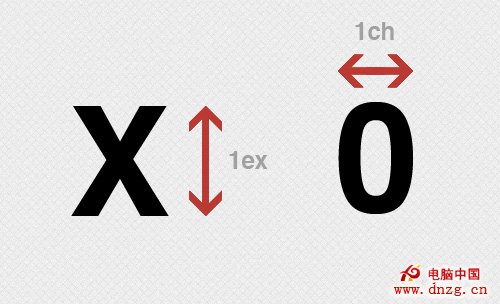
ex、ch單位與em、rem相似之處在於都依賴於font-size,但是ex、ch還依賴於font-family,基於font-specific來計算。 引用w3C規范:
ex unit Equal to the used x-height of the first available font. [CSS3-FONTS] The x-height is so called because it is often equal to the height of the lowercase "x". However, an ‘ex’ is defined even for fonts that do not contain an "x". The x-height of a font can be found in different ways. Some fonts contain reliable metrics for the x-height. If reliable font metrics are not available, UAs may determine the x-height from the height of a lowercase glyph. One possible heuristic is to look at how far the glyph for the lowercase "o" extends below the baseline, and subtract that value from the top of its bounding box. In the cases where it is impossible or impractical to determine the x-height, a value of 0.5em must be assumed.
ch unit Equal to the used advance measure of the "0" (ZERO, U+0030) glyph found in the font used to render it.
用一副圖來解釋這兩種單位的含義:
這兩種單位,有許多用途,大部分是用於印刷時的微調整。例如,sup、sub元素分別顯示上標和下標,但是我們可以使用position和bottom模擬:
1 2 3 4 5 6 7 8 9 10 11 12 13 14 15 16 17 18 <style type="text/css"> body { margin: 0; padding:0; } .sup { position: relative; bottom: 1ex; } .sub { position: relative; bottom: -1ex; } </style> <div> AaB<span class="sup">b</span>CcXxD<span class="sub">d</span>EeFf </div>六、參考鏈接
CSS Values and Units Module Level 3
What is the value of the css 'ex' unit?
Defining ‘ch’
A Rundown of CSS3 Units and their uses(Support)
7 CSS Units You Might Not Know About
轉載聲明:
本文標題:你可能不知道的7個CSS單位
本文鏈接:http://www.zuojj.com/archives/1079.html,轉載請注明轉自Benjamin-專注前端開發和用戶體驗
- 上一頁:網站性能優化整理
- 下一頁:CSS實現背景透明,文字不透明,兼容所有浏覽器