網頁制作WEB文章簡介:利用 CSS 來實現對象的垂直居中有許多不同的方法,比較難的是選擇那個正確的方法。我下面說明一下我看到的好的方法和怎麼來創建一個好的居中網站。
利用 CSS 來實現對象的垂直居中有許多不同的方法,比較難的是選擇那個正確的方法。我下面說明一下我看到的好的方法和怎麼來創建一個好的居中網站。
使用 CSS 實現垂直居中並不容易。有些方法在一些浏覽器中無效。下面我們看一下使對象垂直集中的5種不同方法,以及它們各自的優缺點。(可以看看 測試頁面 ,有簡短解釋。)
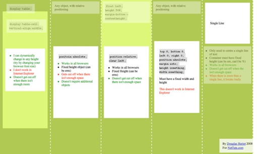
方法一
這個方法把一些 div 的顯示方式設置為表格,因此我們可以使用表格的 vertical-align property 屬性。
<div id="wrapper">
<div id="cell">
<div class="content">
Content goes here</div>
</div>
</div>
#wrapper {display:table;}
#cell {display:table-cell; vertical-align:middle;}
優點:
content 可以動態改變高度(不需在 CSS 中定義)。當 wrapper 裡沒有足夠空間時, content 不會被截斷
缺點:
Internet Explorer(甚至 IE8 beta)中無效,許多嵌套標簽(其實沒那麼糟糕,另一個專題)
方法二:
這個方法使用絕對定位的 div,把它的 top 設置為 50%,top margin 設置為負的 content 高度。這意味著對象必須在 CSS 中指定固定的高度。
因為有固定高度,或許你想給 content 指定 overflow:auto,這樣如果 content 太多的話,就會出現滾動條,以免content 溢出。
<div class="content">
Content goes here</div>
#content {
position:absolute;
top:50%;
height:240px;
margin-top:-120px; /* negative half of the height */
}
優點:
適用於所有浏覽器
不需要嵌套標簽
缺點:
沒有足夠空間時,content 會消失(類似div 在 body 內,當用戶縮小浏覽器窗口,滾動條不出現的情況)
網頁制作WEB文章簡介:利用 CSS 來實現對象的垂直居中有許多不同的方法,比較難的是選擇那個正確的方法。我下面說明一下我看到的好的方法和怎麼來創建一個好的居中網站。
方法三
這種方法,在 content 元素外插入一個 div。設置此 div height:50%; margin-bottom:-contentheight;。
content 清除浮動,並顯示在中間。
<div id="floater">
<div id="content">
Content here</div>
</div>
#floater {float:left; height:50%; margin-bottom:-120px;}
#content {clear:both; height:240px; position:relative;}
優點:
適用於所有浏覽器
沒有足夠空間時(例如:窗口縮小) content 不會被截斷,滾動條出現
缺點:
唯一我能想到的就是需要額外的空元素了(也沒那麼糟,又是另外一個話題)
方法四
這個方法使用了一個 position:absolute,有固定寬度和高度的 div。這個 div 被設置為 top:0; bottom:0;。但是因為它有固定高度,其實並不能和上下都間距為 0,因此 margin:auto; 會使它居中。使用 margin:auto;使塊級元素垂直居中是很簡單的。
<div id="content">
Content here</div>
#content {
position:absolute;
top:0;
bottom:0;
left:0;
right:0;
margin:auto;
height:240px;
width:70%;
}
優點:簡單
缺點:
IE(IE8 beta)中無效
無足夠空間時,content 被截斷,但是不會有滾動條出現
方法五
這個方法只能將單行文本置中。只需要簡單地把 line-height 設置為那個對象的 height 值就可以使文本居中了。
<div id="content">
Content here</div>
#content {height:100px; line-height:100px;}
優點:
適用於所有浏覽器
無足夠空間時不會被截斷
缺點:
只對文本有效(塊級元素無效)
多行時,斷詞比較糟糕
這個方法在小元素上非常有用,例如使按鈕文本或者單行文本居中。
網頁制作WEB文章簡介:利用 CSS 來實現對象的垂直居中有許多不同的方法,比較難的是選擇那個正確的方法。我下面說明一下我看到的好的方法和怎麼來創建一個好的居中網站。
哪個方法?
我最喜歡的是方法三,缺點不多。因為 content 會清除浮動,所以可以在它上面放置別的元素,並且當窗口縮放時,
居中的 content 不會把另外的元素蓋住。看 例子。
<div id="top">
<h1>Title</h1>
</div>
<div id="content">
Content Here</div>
#floater {float:left; height:50%; margin-bottom:-120px;}
#top {float:right; width:100%; text-align:center;}
#content {clear:both; height:240px; position:relative;}
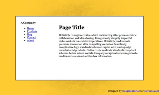
現在你知道是怎麼回事了,現在我們開始創建一個簡單但是有趣的網站。最終的樣子是這樣的:

步驟一
以語義化標簽開始是很好的。下面是我們的頁面構成:
#floater/*把 content 置中*/
#contred/*centre 盒*/
#side
#logo
#nav/*無序列表*/
#content
#bottom/*放置版權等*/
這是我用到的 xhtml 代碼:
A Centred Company
<div id="centered">
<div id="side">
<div id="logo">
<strong><span>A</span> Company</strong></div>
<ul id="nav">
<li><a href="#">Home</a></li>
<li><a href="#">Products</a></li>
<li><a href="#">Blog</a></li>
<li><a href="#">Contact</a></li>
<li><a href="#">About</a></li>
</ul>
</div>
<div id="content">
<h1>Page Title</h1>
Holisticly re-engineer value-added outsourcing after process-centric collaboration and idea-sharing.
Energistically simplify impactful niche markets via enabled imperatives.
Holisticly predominate premium innovation after compelling scenarios.
Seamlessly recaptiualize high standards in human capital with leading-edge manufactured products.
Distinctively syndicate standards compliant schemas before robust vortals.
Uniquely recaptiualize leveraged web-readiness vis-a-vis out-of-the-box information.
<h2>Heading 2</h2>
Efficiently embrace customized web-readiness rather than customer directed processes.
Assertively grow cross-platform imperatives vis-a-vis proactive technologies.
Conveniently empower multidisciplinary meta-services without enterprise-wide interfaces.
Conveniently streamline competitive strategic theme areas with focused e-markets.
Phosfluorescently syndicate world-class communities vis-a-vis value-added markets.
Appropriately reinvent holistic services before robust e-services.</div>
</div>
<div id="bottom">
Copyright notice goes here</div>
網頁制作WEB文章簡介:利用 CSS 來實現對象的垂直居中有許多不同的方法,比較難的是選擇那個正確的方法。我下面說明一下我看到的好的方法和怎麼來創建一個好的居中網站。
步驟二:
現在我們開始用一些基本的 CSS 來給頁面添加樣式。把以下代碼放入在我們的 html 頁面頂部被引入的 style.css。
html, body {
margin:0; padding:0;
height:100%;
}
body {
background:url('page_bg.jpg') 50% 50% no-repeat #FC3;
font-family:Georgia, Times, serifs;
}
#floater {
position:relative; float:left;
height:50%; margin-bottom:-200px;
width:1px;
}
#centered {
position:relative; clear:left;
height:400px; width:80%; max-width:800px; min-width:400px;
margin:0 auto;
background:#fff;
border:4px solid #666;
}
#bottom {
position:absolute;
bottom:0; right:0;
}
#nav {
position:absolute; left:0; top:0; bottom:0; right:70%;
padding:20px; margin:10px;
}
#content {
position:absolute; left:30%; right:0; top:0; bottom:0;
overflow:auto; height:340px;
padding:20px; margin:10px;
}
在我們能夠把 content 垂直居中之前, body 和 html 應該被拉伸到 100% 的高度。由於 height在 padding 和 margin 之內,所以我們要把它們設成 0 以防止因為很小的 margin 出現滾動條。
floater 的 margin-bottom 是 content 高度(400px)的一半,-200px。
現在可以看到一下效果:
#centred 的寬度為 80%。這可以市網頁隨著顯示器的大小而變化。一般稱作流體布局。設置 min-width 和max-width 以避免網頁過大或者過小。 但是 IE 不支持 min/max-width。顯然可以用固定寬度來代替。
因為 #centred 是相對定位的,在它裡面我們可以用絕對定位來定位元素。設置 #content 的 overflow:auto;以避免滾動條的出現。IE 不怎麼喜歡 overflow:auto; 除非我們指定高度(不是 top 和 bottom 的定位,也不是 %)因此我們給它指定高度。
網頁制作WEB文章簡介:利用 CSS 來實現對象的垂直居中有許多不同的方法,比較難的是選擇那個正確的方法。我下面說明一下我看到的好的方法和怎麼來創建一個好的居中網站。
步驟三
最後要做的就是再添加點樣式,讓頁面好看點。從目錄開始吧。
#nav ul {
list-style:none;
padding:0; margin:20px 0 0 0; text-indent:0;
}
#nav li {
padding:0; margin:3px;
}
#nav li a {
display:block; background-color:#e8e8e8;
padding:7px; margin:0;
text-decoration:none; color:#000;
border-bottom:1px solid #bbb;
text-align:right;
}
#nav li a::after {
content:'»'; color:#aaa; font-weight:bold;
display:inline; float:right;
margin:0 2px 0 5px;
}
#nav li a:hover, #nav li a:focus {
background:#f8f8f8;
border-bottom-color:#777;
}
#nav li a:hover::after {
margin:0 0 0 7px; color:#f93;
}
#nav li a:active {
padding:8px 7px 6px 7px;
}
需要注意的是 #centred 的圓角。 CSS3 中,應該有 border-radius 屬性來設定圓角的半徑(可參考 CSS3之旅: border-radius(圓角) - 糖伴西紅柿)。現在的流行的浏覽器都還不支持,除非用 -moz(Molilla Firefox) 或者 -webit(Safari/Webkit) 前綴.
兼容性注意事項
如你所想,IE 是唯一添麻煩的浏覽器。
- #floater 必須指定寬度,否則在任意版本 IE 中,它都啥也不干
- IE 6 中目錄被周圍太多的空間打斷
- IE 8 有多余空間(作者遺漏)
更多的想法
利用居中的網頁可以做很多有意思的事情。我在重新設計 SWFObject Generator 2.0 (使用 SWFObject2.0 生成代碼)使用了這個想法。這裡有另外的一個想法。
資料
以下是我參考的一些資料,推薦閱讀。
Understanding vertical-align, or “How (Not) To Vertically Center Content”
Vertical centering using CSS
Vertical Centering in CSS
糖伴西紅柿說:
水平居中經常用,其實垂直居中也很有用的。平時用的最多的應該是方法五了,算是個小技巧吧。