在開發微信小程序的時候,遇到圓形進度條的需求。使用canvas繪圖比較麻煩:
1、為了實現在不同屏幕上面的適配,必須動態的計算進度條的大小;
2、在小程序中,canvas的畫布具有最高的層級,不易於擴展。
但使用css3和js實現進度條就很容易的避免了這方面的問題。
注:這篇文章裡面使用jquery實現,但原理是一樣的,在小程序中只要定義並改變相應的變量就行了
一、進度條樣式的樣式
在平時的開發中,經常使用元素的border來顯示圓形圖案,在使用css3實現圓形進度條時,同樣也是使用這個技巧。為了實現上面的圓形邊框,動態的覆蓋下面圓形邊框,總共需要一個圓形,2個長方形和2個半圓形:一個圓形用來顯示底層背景,兩個半圓形用來覆蓋底層背景顯示進度,另外兩個長方形用來覆蓋不需要顯示的進度。如下圖:
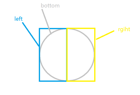
最下面的bottom圓形是進度條的背景,在bottom上面有left和right兩個長方形,用來覆蓋不要顯示的進度條。在兩個長方形的裡面分別有一個半圓形用來顯示進度。正常情況下,使用正方形繪制出來的半圓,直徑和水平下都是有45度夾角的。為了能使兩個半圓剛好可以覆蓋整個圓形,就需要使用css3中的rotate使原有正方形旋轉,達到覆蓋整個背景的效果。如下圖(為了顯示清楚,這裡用正方形表示):
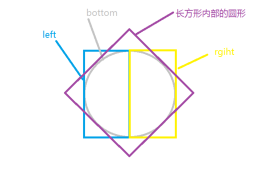
如圖,將長方形內部的半圓向右(順時針)旋轉45度,就可以得到進度覆蓋整個背景的圖像。將半圓向左(逆時針)旋轉135度就能得到只有進度條背景的圖像。為什麼又要向左旋轉,而不是一直向右旋轉,當然是因為要實現的效果是:進度是從頂部開始,順時走完的。到這裡,思路就很清晰了,只需要再按百分比的多少來控制左邊和右邊進度的顯示就可以了。
實現這部分的html和css代碼如下:
html代碼
<div class="progressbar">
    <div class="left-container">
        <div class="left-circle"></div>
    </div>
    <div class="right-container">
        <div class="right-circle"></div>
    </div>
</div>
css代碼:
.progressbar{
    position: relative;
    margin: 100px auto;
    width: 100px;
    height: 100px;
    border: 20px solid #ccc;
    border-radius: 50%;
}
.left-container,.right-container{
    position: absolute;
    width: 70px;
    height: 140px;
    top:-20px;
    overflow: hidden;
    z-index: 1;
}
.left-container{
    left: -20px;
}
.right-container{
    right: -20px;
}
.left-circle,.right-circle{
    position: absolute;
    top:0;
    width: 100px;
    height: 100px;
    border:20px solid transparent;
    border-radius: 50%;
    transform: rotate(-135deg);
    transition: all .5s linear;
    z-index: 2;
}
.left-circle{
    left: 0;
    border-top-color: 20px solid blue;
    border-left-color: 20px solid blue;
}
.right-circle{
    border-right-color: 20px solid blue;
    border-bottom-color: 20px solid blue;
    right: 0;
}
二:控制進度條的js
為了使進度條的邏輯更健壯,js部分的實現需要考慮四中情況:
1、基礎值個更改後的值在同在右邊進度,
2、基礎值在右邊,更改後的值在左邊,
3、基礎值更改後的值同在左邊,
4、基礎值在左邊,更改後的值在右邊。
不管在那種情況下,核心需要考慮只有兩點:角度的變化和使用時間的多少。
第一種情況下,比較簡單,可以很簡單計算出角度的變化和使用時間的多少。首先,需要設定改變整個半圓的所需的時間值。設定之後,只要根據比例計算出改變的角度所需要的時間值即刻。代碼如下:
time = (curPercent - oldPercent)/50 * baseTime;
     //確定時間值為正
     curPercent - oldPercent > 0 ? '' : time = - time;
     deg = curPercent/50*180-135;
第二種情況,稍微麻煩一點。因為中間有一個從右邊進度,到左邊進度的過渡。為了讓進度順暢的改變,這裡我們需要使用定時器,在改變完右邊的部分之後,再修改左邊的部分。代碼如下:
//設置右邊的進度
  time = (50 - oldPercent)/50 * baseTime;
deg = (50 - oldPercent)/50*180-135;
$rightBar .css({
    transform: 'rotate('+ deg+ 'deg)',
    transition : 'all '+ time + 's linear'
})
//延時設置左邊進度條的改變
setTimeout(function(){
    time = (curPercent - 50)/50;
    deg = (curPercent - 50)/50*180 -135;

    $leftBar.css({
        transform: 'rotate('+ deg+ 'deg)',
        transition : 'all '+ time + 's linear'
    })
}, Math.floor(time*1000));000));
第三種情況和第四種情況同前面情況類似,這裡不再討論。
完整的控制進度條的函數的代碼如下(使用jQuery實現):
/**
    *設置進度條的變化
    *@param {number} oldPercent    進度條改變之前的半分比
    *@param {number} curPercent    進度條當前要設置的值
    *@return {boolean} 設置成功返回 true,否則,返回fasle
    */
    function setProgessbar(oldPercent, curPercent){
        var $leftBar = $('#left-bar');
        var $rightBar = $('#right-bar');
        //將傳入的參數轉換,允許字符串表示的數字
        oldPercent =  + oldPercent;
        curPercent =  + curPercent;
        //檢測參數,如果不是number類型或不在0-100,則不執行
        if(typeof oldPercent ==='number' && typeof curPercent ==='number'
            && oldPercent >= 0 && oldPercent <= 100 && curPercent <= 100 && curPercent >= 0){

            var baseTime = 1;    //默認改變半圓進度的時間,單位秒
            var time = 0;    //進度條改變的時間
            var deg = 0;     //進度條改變的角度
            if(oldPercent > 50){//原來進度大於50
                if(curPercent>50){
                    //設置左邊的進度
                    time = (curPercent - oldPercent)/50 * baseTime;
                    //確定時間值為正
                    curPercent - oldPercent > 0 ? '' : time = - time;
                    deg = curPercent/50*180-135;
                    $leftBar .css({
                        transform: 'rotate('+ deg+ 'deg)',
                        transition : 'all '+ time + 's linear'
                    })

                }else{
                    //設置左邊的進度
                    time = (oldPercent - 50)/50 * baseTime;
                    deg = (oldPercent - 50)/50*180-135;
                    $leftBar .css({
                        transform: 'rotate('+ deg+ 'deg)',
                        transition : 'all '+ time + 's linear'
                    })
                    //延時設置右邊進度條的改變
                    setTimeout(function(){
                        time = (50 - curPercent)/50;
                        deg = (50 - curPercent)/50*180 -135;
                        $rightBar.css({
                            transform: 'rotate('+ deg+ 'deg)',
                            transition : 'all '+ time + 's linear'
                        })
                    }, Math.floor(time*1000));
                }
            }else{//原來進度小於50時

                if(curPercent>50){
                    //設置右邊的進度
                    time = (50 - oldPercent)/50 * baseTime;
                    deg = (50 - oldPercent)/50*180-135;
                    $rightBar .css({
                        transform: 'rotate('+ deg+ 'deg)',
                        transition : 'all '+ time + 's linear'
                    })
                    //延時設置左邊進度條的改變
                    setTimeout(function(){
                        time = (curPercent - 50)/50;
                        deg = (curPercent - 50)/50*180 -135;

                        $leftBar.css({
                            transform: 'rotate('+ deg+ 'deg)',
                            transition : 'all '+ time + 's linear'
                        })
                    }, Math.floor(time*1000));
                }else{
                    //設置右邊的進度
                    time = (curPercent - oldPercent)/50 * baseTime;
                    //確定時間值為正
                    curPercent - oldPercent > 0 ? '' : time = - time;
                    deg = curPercent/50*180-135;
                    $rightBar .css({
                        transform: 'rotate('+ deg+ 'deg)',
                        transition : 'all '+ time + 's linear'
                    })

                }
                return true;
            }
        }else{
            return false;
        }
    }
以上就是本文的全部內容,希望對大家的學習有所幫助,也希望大家多多支持。
- 上一頁:css3邊框
- 下一頁:CSS自適應導航菜單的實例代碼