背景(background)是css中一個重要的的部分,也是需要知道的css的基礎知識之一。這篇文章將會涉及css背景(background)的基本用法,包括諸如 background-attachment 等的屬性,也會介紹一些有關背景(background)的常用技巧,以及 CSS3 中的 背景(background)(包含4個新的背景(background)屬性)。
CSS2 中的背景(background)
概述
CSS2 中有5個主要的背景(background)屬性,它們是:
* background-color: 指定填充背景的顏色。
* background-image: 引用圖片作為背景。
* background-position: 指定元素背景圖片的位置。
* background-repeat: 決定是否重復背景圖片。
* background-attachment: 決定背景圖是否隨頁面滾動。
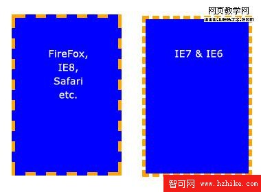
這些屬性可以全部合並為一個縮寫屬性: background。需要注意的一個要點是背景占據元素的所有內容區域,包括 padding 和 border,但是不包括元素的 margin。它在 Firefox, Safari ,Opera 以及 IE8 中工作正常,但是 IE6 和 IE7 中,background 沒把 border 計算在內。
基本屬性
背景色(background-color)
background-color 屬性用純色來填充背景。有許多方式指定這個顏色,以下方式都得到相同的結果。
background-color: blue;
background-color: rgb(0, 0, 255);
background-color: #0000ff;
background-color 也可被設置為透明(transparent),這會使得其下的元素可見。
背景圖(background-image)
background-image 屬性允許指定一個圖片展示在背景中。可以和 background-color 連用,因此如果圖片不重復地話,圖片覆蓋不到地地方都會被背景色填充。代碼很簡單,只需要記住,路徑是相對於樣式表的,因此以下的代碼中,圖片和樣式表是在同一個目錄中的。
background-image: url(image.jpg);
但是如果圖片在一個名為 images 的子目錄中,就應該是:
background-image: url(images/image.jpg);
糖伴西紅柿:使用 ../ 表示上一級目錄,比如 background-image: url(../images/image.jpg); 表示圖片位於樣式表的上級目錄中的 images 子目錄中。有點繞,不過這個大家應該都知道了,我就不詳說了。前端觀察 版權所有,轉載請保留鏈接。
背景平鋪(background-repeat)
設置背景圖片時,默認把圖片在水平和垂直方向平鋪以鋪滿整個元素。這也許是你需要的,但是有時會希望圖片只出現一次,或者只在一個方向平鋪。以下為可能的設置值和結果:
background-repeat: repeat; /* 默認值,在水平和垂直方向平鋪 */
background-repeat: no-repeat; /* 不平鋪。圖片只展示一次。 */
background-repeat: repeat-x; /* 水平方向平鋪(沿 x 軸) */
background-repeat: repeat-y; /* 垂直方向平鋪(沿 y 軸) */
background-repeat: inherit; /* 繼承父元素的 background-repeat 屬性*/
背景定位(background-position)
background-position 屬性用來控制背景圖片在元素中的位置。技巧是,實際上指定的是圖片左上角相對於元素左上角的位置。
下面的例子中,設置了一個背景圖片並且用 background-position 屬性來控制它的位置,同時也設置了 background-repeat 為 no-repeat。計量單位是像素。第一個數字表示 x 軸(水平)位置,第二個是 y 軸(垂直) 位置。
/* 例 1: 默認值 */
background-position: 0 0; /* 元素的左上角 */

/* 例 2: 把圖片向右移動 */
background-position: 75px 0;

/* 例 3: 把圖片向左移動 */
background-position: -75px 0;

/* 例 4: 把圖片向下移動 */
background-position: 0 100px;
background-position 屬性可以用其它數值,關鍵詞和百分比來指定,這比較有用,尤其是在元素尺寸不是用像素設置時。
關鍵詞是不用解釋的。x 軸上:
- * left
- * center
- * right
y 軸上:
- * top
- * center
- * bottom
順序方面和使用像素值時的順序幾乎一樣,首先是 x 軸,其次是 y 軸,像這樣:
background-position: top right;
使用百分數時也類似。需要主要的是,使用百分數時,浏覽器是以元素的百分比數值來設置圖片的位置的。看例子就好理解了。假設設定如下:
background-position: 100% 50%;
This goes 100% of the way across the image (i.e. the very right-hand edge) and 100% of the way across the element (remember, the starting point is always the top-left corner), and the two line up there. It then goes 50% of the way down the image and 50% of the way down the element to line up there. The result is that the image is aligned to the right of the element and exactly half-way down it.
糖伴西紅柿:這一段沒想到合適的翻譯,保留原文,意譯。前端觀察 版權所有,轉載請保留鏈接。
注意原點總是左上角,最終的效果是笑臉圖片被定位在元素的最右邊,離元素頂部是元素的一半,效果和 background-position: right center; 一樣。
背景附著
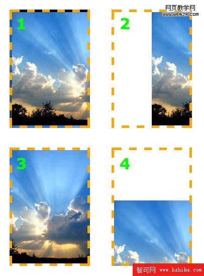
background-attachment 屬性決定用戶滾動頁面時圖片的狀態。三個可用屬性為 scroll(滾動),fixed(固定) 和 inherit(繼承)。inherit 單純地指定元素繼承他的父元素的 background-attachment 屬性。
為了正確地理解 background-attachment,首先需要明白頁面(page)和視口(view port)是如何協作地。視口(vIEw port)是浏覽器顯示網頁的部分(就是去掉工具欄的浏覽器)。視口(vIEw port)的位置固定,不變動。
當向下滾動網頁時,視口(view port)是不動的,而頁面的內容向上滾動。看起來貌似視口(vIEw port)向頁面下方滾動了。如果設置 background-attachment: scroll,就設置了當元素滾動時,元素背景也必需隨著滾動。簡而言之,背景是緊貼元素的。這是 background-attachment 默認值。
用一個例子來更清楚地描述下:
background-image: url(test-image.jpg);

background-position: 0 0;
background-repeat: no-repeat;
background-attachment: scroll;
當向下滾動頁面時,背景向上滾動直至消失。
但是當設置 background-attachment 為 fixed 時,當頁面向下滾動時,背景要待在它原來的位置(相對於浏覽器來說)。也就是不隨元素滾動。
用另一個例子描述下:
background-image: url(test-image.jpg);
background-position: 0 100%;
background-repeat: no-repeat;
background-attachment: fixed;
頁面已經向下滾動了,但是圖像仍然保持可見。
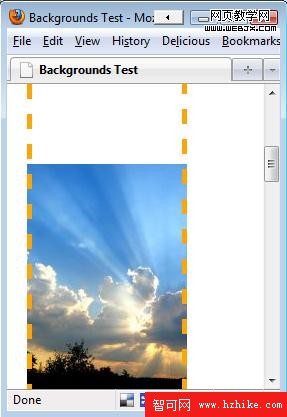
需要重視的一點是背景圖只能出現在它父元素能達到的區域。即使圖片是相對於視口(view port)定位地,如果它的父元素不可見,圖片就會消失。參見下面的例子。此例中,圖片位於視口(vIEw port)的左下方,但是只有元素內的圖片部分是可見的。
background-image: url(test-image.jpg);
background-position: 0 100%;
background-repeat: no-repeat;
background-attachment: fixed;
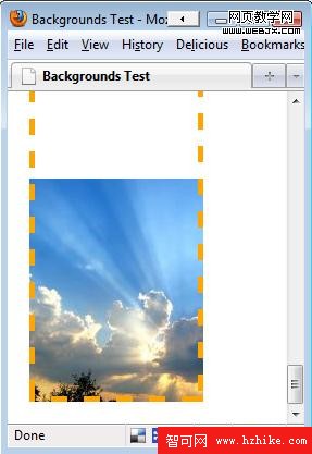
因為圖片開始在元素之外,一部分圖片被切除了。
背景的簡寫屬性
可以把背景的各個屬性合為一行,而不用每次都單獨把他們寫出來。格式如下:
background: <color> <image> <position> <attachment> <repeat>
例如,下面的聲明
background-color: transparent;
background-image: url(image.jpg);
background-position: 50% 0 ;
background-attachment: scroll;
background-repeat: repeat-y;
可以合為單獨一行:
background: transparent url(image.jpg) 50% 0 scroll repeat-y;
而且不需要指定每一個值。如果省略值地話,就使用屬性地默認值。例如,上面那行和下面這個效果一樣:
background: url(image.jpg) 50% 0 repeat-y;
背景的一般用法
除了可以用來使元素更加優雅這類顯然的用法之外,背景也可以用於其它的目的。
仿欄
當使用 CSS 的 float 屬性來定位布局元素時,要確保兩欄或多欄有相同的長度是比較困難的。如果長度不同,其中一欄的背景會比另外的短,這會破壞整個設計。
仿欄是個非常簡單的背景技巧,這個技巧最早發表在A List Apart 。思路很簡單:不再給每列單獨設置背景,而是給各列的父元素設置一個背景圖。所有欄的設計都包含在這張圖片之中。
文本替換
在網頁上,對於字體的選擇是相當有限的。可以使用 sIFR 之類的工具來定制字體,但是這需要用戶啟用 JavaScript 。一個適用於任意浏覽器的簡單方法是,用想用的字體來做一張文本圖片,並用這張圖片作為背景。這樣,文本依然出現在文檔標記中以供搜索引擎檢索和屏幕浏覽器識別,但是在浏覽器中就會顯示首選的字體。
例如,Html 標記可能是這樣的:
<h3>Blogroll</h3>
假如有一個 200 乘 75 的圖片,上面有更好看的字體,就可以用如下方式來替換文本:
h3.blogroll {
width: 200px;
height: 75px; /* So that the element will show the whole image. */
background:url(blogroll-text.jpg) 0 0 no-repeat; /* Sets the background image */
text-indent: -9999px; /* Hides the regular text by moving it 9999 pixels to the left */
}
簡單的圓點
無需列表中的圓點看起來很難看。不用再處理所有不同的 list-style 屬性,只需要簡單地把他們隱藏並用背景圖代替就可以了。因為圖片可以隨意選擇,這些圓點就可以看起來更漂亮。
下面,我們把一個無需列表改造成有圓滑圓點的:
ul {
list-style: none; /* Removes default bullets. */
}

ul li {
padding-left: 40px; /* Indents list items, leaving room for background image on the left. */
background: url(bulletpoint.jpg) 0 0 no-repeat;
}
CSS3 中的背景
CSS3 中的背景有較多改進。最顯著的是多背景圖片的選項,同時也增加了4個新屬性。
多背景
CSS3 中,可以對一個元素應用一個或多個圖片作為背景。代碼和 CSS2 中的一樣,只需要用逗號來區別各個圖片。第一個聲明的圖片定位在元素頂部,其它的圖片按序在其下排列,例如:
background-image: url(top-image.jpg), url(middle-image.jpg), url(bottom-image.jpg);
新屬性:背景修剪(background-clip)
這又把我們帶回了文章開始討論的那個關於邊框內圖片顯示的話題。它被描述為“背景描繪區”。
background-clip 屬性用來增強背景顯示位置的控制能力。可能的值為:
* background-clip: border-box;
背景顯示在邊框內。
* background-clip: padding-box;
背景顯示在內補白(padding)內,而不是邊框內。
* background-clip: content-box;
只在內容內顯示背景,而不是內補白(padding)和邊框內。
* background-clip: no-clip;
默認值,和 border-box 一樣。
新屬性:背景原點(background-origin)
這個屬性和 background-position 結合起來使用。可以從邊框,內補白或者內容盒子開始計算 background-position (類似於 background-clip)。
* background-origin: border-box;
以邊框為原點開始計算 background-position.
* background-origin: padding-box;
以內補白為原點開始計算 background-position
* background-origin: content-box;
以內容盒子為原點開始計算 background-position
對於 background-clip 和 background-origin 不同的一個解釋參看 CSS3.info
新屬性: 背景尺寸(background-size)
background-size 用來調整背景圖的大小。有好幾個可能值:
* background-size: contain;
縮小圖片來適應元素的尺寸(保持像素的長寬比)
* background-size: cover;
擴展圖片來填滿元素(保持像素的長寬比)
* background-size: 100px 100px;
調整圖片到指定大小
* background-size: 50% 100%;
調整圖片到指定大小。百分比是相對於包含元素的尺寸的。
可以看一下 CSS3規則 網站上的幾個例子。
新屬性:(background-break)
CSS3 中,元素可以被分成幾個獨立的盒子(例如 使內聯元素 span 跨越多行)。background-break 屬性用來控制背景怎樣在這些不同的盒子中顯示。
可能值為:
* Background-break: continuous;
默認值。忽略盒之間的距離(也就是像元素沒有分成多個盒子,依然是一個整體一樣)
* Background-break: bounding-box;
把盒之間的距離計算在內
* Background-break: each-box;
為每個盒子單獨重繪背景
背景色(background-color)的改進
background-color 在 CSS3 中有了稍許改進。除了設置背景顏色之外,如果元素底層的背景圖不可用,還可以設置一個“回退色”。
通過在回退色之前增加一個斜槓(/)來實現,例如:
background-color: green / blue;
此例中,背景色應該是綠色(green)。然而,如果底層背景圖不能使用的話,背景色就是藍色而不是綠色。如果在斜槓前不指定顏色,默認為透明(transparent)。
背景平鋪(background-repeat)的改進
CSS2中當圖片平鋪時,會被元素在末端截斷。CSS3 引入了兩個屬性來修正這個問題:
* space: 應用同等數量的空白到圖片之間,直到填滿整個元素
* round: 縮小圖片直到正好平鋪滿元素
關於 background-repeat: space; 的一個例子,可以在 CSS3 規則網站看到。
背景附著(background-attachment)的改進
background-attachment 屬性增加了一個新值:local。這是用來配合可以滾動的元素的(設置為 overflow: scroll; 的元素)。當 background-attachment 設置為滾動(scroll)時,背景圖不會隨元素內容的滾動而滾動。
設置為 background-attachment :local; 時,背景圖會隨內容的滾動而滾動。
總結
總結一下,CSS 中關於背景有許多需要知道的知識。但是一旦把這些知識融會貫通了,這些技術和命名約定就變得非常有意義而且很快就會成為潛意識行為了。
如果剛接觸 css,主要不斷聯系就可以較快地掌握背景的要點了。如果是老手,我希望你可以和我一樣期待 CSS3 。
關於作者
Michael Martin 的文章大多涉及網頁設計,WordPress 並為 Pro Blog Design 工作。可以查看更多關於博客設計的文章或者在 twitter 上關注他。
- 上一頁:“自動定位”的應用
- 下一頁:RDFa讓你的頁面更好的被機器所理解