js實現超酷的照片牆展示效果圖附源碼下載
編輯:關於JavaScript
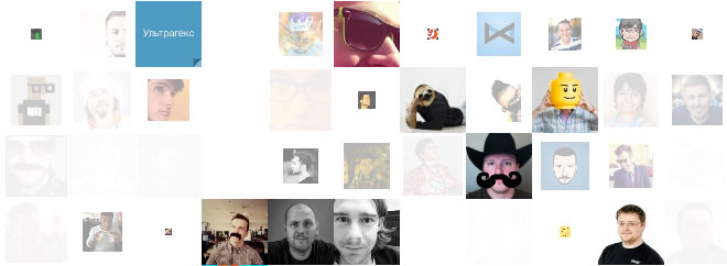
這是一個超酷的照片牆展示效果,很多照片結合淡入淡出、旋轉、縮放、傾斜及3D效果,照片快速從左側切入,做旋轉3D效果,最後在照片牆上整齊排列,為用戶展示了超酷的照片牆展示效果。
查看演示 下載源碼
HTML
本文結合實例給大家分享超酷的照片牆效果,該效果依賴jQuery和easing插件,因此首先載入這兩個文件。
<script src="jquery.min.js"></script>
<script src="jquery.easing.1.3.js"></script>
接著,我們在需要展示照片牆的位置放置如下代碼:
<div class="grid"></div>
<div class="animate">點擊看效果</div>
CSS
CSS定義了照片牆基本樣式,照片排列以及按鈕樣式。
.grid {
  width: 600px; height: 300px; margin: 100px auto 50px auto;
  perspective: 500px; /*For 3d*/
}
.grid img {width: 60px; height: 60px; display: block; float: left;}

.animate {
  text-transform: uppercase;
  background: rgb(0, 100, 0); color: white;
  padding: 10px 20px; border-radius: 5px;
  cursor: pointer;margin:10px auto;width:100px;text-align:center;
}
.animate:hover {background: rgb(0, 75, 0);}
JS
首先我們在頁面上動態載入50張照片,照片源來自網絡。
var images = "", count = 50;
for(var i = 1; i <= count; i++)
  images += '<img src="http://thecodeplayer.com/u/uifaces/'+i+'.jpg" />';
   $(".grid").append(images);
當點擊按鈕時,50張圖片做不同程度的變形縮放轉換淡出效果,因為要切入下一個照片牆了,當這些動作全部完成時,開始切入照片牆動畫效果,調用了storm()函數。
var d = 0; //延時
var ry, tz, s; //定義轉換參數
$(".animate").on("click", function(){
  $("img").each(function(){
    d = Math.random()*1000; //1ms to 1000ms delay
    $(this).delay(d).animate({opacity: 0}, {
      step: function(n){
        s = 1-n; //scale - will animate from 0 to 1
        $(this).css("transform", "scale("+s+")");
      },
      duration: 1000
    })
  }).promise().done(function(){
    storm(); //淡出效果全部完成時調用
  })
})
自定義函數storm()完成了將每張照片進行角度旋轉和Z軸位移動作,結合CSS3使得產生3D效果,然後調用easing實現緩沖效果,讓整個照片牆切入十分流暢,請看代碼:
function storm(){
  $("img").each(function(){
    d = Math.random()*1000;
    $(this).delay(d).animate({opacity: 1}, {
      step: function(n){
        //rotating the images on the Y axis from 360deg to 0deg
        ry = (1-n)*360;
        //translating the images from 1000px to 0px
        tz = (1-n)*1000;
        //applying the transformation
        $(this).css("transform", "rotateY("+ry+"deg) translateZ("+tz+"px)");
      },
      duration: 3000,
      easing: 'easeOutQuint'
    })
  })
}
小編推薦
熱門推薦