使用bootstrap3開發響應式網站
編輯:關於JavaScript
本文實例為大家分享了bootstrap3響應式網站開發代碼,供大家參考,具體內容如下
第一次使用bootstrap3,發現對移動支持得不錯,可以很快的開發出一個支持移動和PC端的網站。
下面就是本文的實例,具體代碼:
時間線來自國外網站,使用到的css如下
.timeline {
list-style: none;
padding: 20px 0 20px;
position: relative;
}
.timeline:before {
top: 0;
bottom: 0;
position: absolute;
content: " ";
width: 3px;
background-color: #eeeeee;
left: 50%;
margin-left: -1.5px;
}
.timeline > li {
margin-bottom: 20px;
position: relative;
}
.timeline > li:before,
.timeline > li:after {
content: " ";
display: table;
}
.timeline > li:after {
clear: both;
}
.timeline > li:before,
.timeline > li:after {
content: " ";
display: table;
}
.timeline > li:after {
clear: both;
}
.timeline > li > .timeline-panel {
width: 46%;
float: left;
border: 1px solid #d4d4d4;
border-radius: 2px;
padding: 20px;
position: relative;
-webkit-box-shadow: 0 1px 6px rgba(0, 0, 0, 0.175);
box-shadow: 0 1px 6px rgba(0, 0, 0, 0.175);
}
.timeline > li > .timeline-panel:before {
position: absolute;
top: 26px;
right: -15px;
display: inline-block;
border-top: 15px solid transparent;
border-left: 15px solid #ccc;
border-right: 0 solid #ccc;
border-bottom: 15px solid transparent;
content: " ";
}
.timeline > li > .timeline-panel:after {
position: absolute;
top: 27px;
right: -14px;
display: inline-block;
border-top: 14px solid transparent;
border-left: 14px solid #fff;
border-right: 0 solid #fff;
border-bottom: 14px solid transparent;
content: " ";
}
.timeline > li > .timeline-badge {
color: #fff;
width: 50px;
height: 50px;
line-height: 50px;
font-size: 1.4em;
text-align: center;
position: absolute;
top: 16px;
left: 50%;
margin-left: -25px;
background-color: #999999;
z-index: 100;
border-top-right-radius: 50%;
border-top-left-radius: 50%;
border-bottom-right-radius: 50%;
border-bottom-left-radius: 50%;
}
.timeline > li.timeline-inverted > .timeline-panel {
float: right;
}
.timeline > li.timeline-inverted > .timeline-panel:before {
border-left-width: 0;
border-right-width: 15px;
left: -15px;
right: auto;
}
.timeline > li.timeline-inverted > .timeline-panel:after {
border-left-width: 0;
border-right-width: 14px;
left: -14px;
right: auto;
}
.timeline-badge.primary {
background-color: #2e6da4 !important;
}
.timeline-badge.success {
background-color: #3f903f !important;
}
.timeline-badge.warning {
background-color: #f0ad4e !important;
}
.timeline-badge.danger {
background-color: #d9534f !important;
}
.timeline-badge.info {
background-color: #5bc0de !important;
}
.timeline-title {
margin-top: 0;
color: inherit;
}
.timeline-body > p,
.timeline-body > ul {
margin-bottom: 0;
}
.timeline-body > p + p {
margin-top: 5px;
}
@media (max-width: 767px) {
ul.timeline:before {
left: 40px;
}
ul.timeline > li > .timeline-panel {
width: calc(100% - 90px);
width: -moz-calc(100% - 90px);
width: -webkit-calc(100% - 90px);
}
ul.timeline > li > .timeline-badge {
left: 15px;
margin-left: 0;
top: 16px;
}
ul.timeline > li > .timeline-panel {
float: right;
}
ul.timeline > li > .timeline-panel:before {
border-left-width: 0;
border-right-width: 15px;
left: -15px;
right: auto;
}
ul.timeline > li > .timeline-panel:after {
border-left-width: 0;
border-right-width: 14px;
left: -14px;
right: auto;
}
}
<ul class="timeline">
<li>
<div class="timeline-badge"><i class="ion-leaf"></i></div>
<div class="timeline-panel" style="width: 46%;">
<div class="timeline-heading">
<h4 class="timeline-title">安東尼羅賓·簡介</h4>
<p><small class="text-muted"><i class="glyphicon glyphicon-time"></i></small></p>
</div>
<div class="timeline-body">
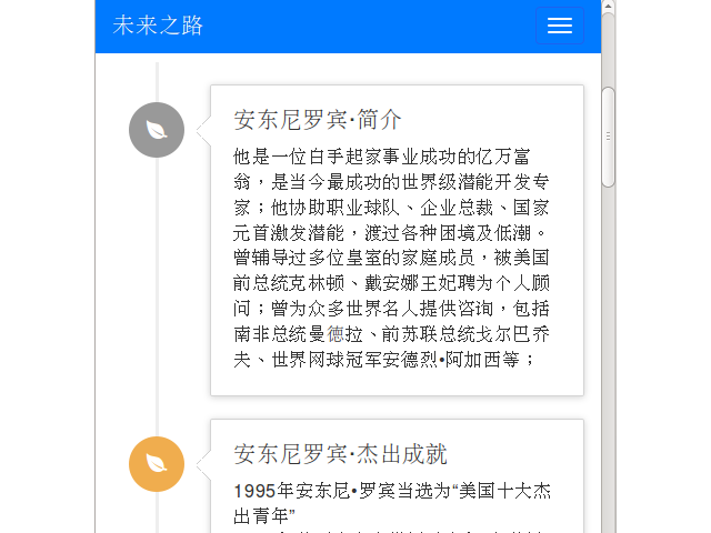
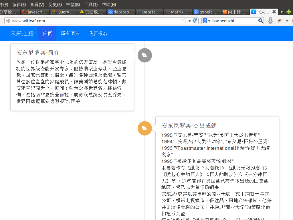
<p>他是一位白手起家事業成功的億萬富翁,是當今最成功的世界級潛能開發專家;他協助職業球隊、企業總裁、國家元首激發潛能,渡過各種困境及低潮。曾輔導過多位皇室的家庭成員,被美國前總統克林頓、戴安娜王妃聘為個人顧問;曾為眾多世界名人提供咨詢,包括南非總統曼徳拉、前蘇聯總統戈爾巴喬夫、世界網球冠軍安德烈•阿加西等;
</p>
</div>
</div>
</li>
<li>......................</li>
</ul>
做的過程中發現Android 4.0 上對width: -webkit-calc(100% - 90px); 支持得不是很好,時間線顯示不正常,後來用JS來解決了
 $(function() {
 $(window).resize(function() {
  initTimePanelSize();
 });
 initTimePanelSize();
 function initTimePanelSize(){
  width = $(this).width();
  //alert(width);
  if (width <= 767) {
   $('div.timeline-panel').width($(this).width() - 90);
  } else {
   $('div.timeline-panel').css('width', '46%');
  }
  }
 });
效果圖:
如果大家還想深入學習,可以點擊這裡進行學習,再為大家附兩個精彩的專題:Bootstrap學習教程 Bootstrap實戰教程
以上就是bootstrap3響應式網站關鍵制作代碼,希望能給大家一個參考,也希望大家多多支持。
- 上一頁:基於BootStrap Metronic開發框架經驗小結【四】Bootstrap圖標的提取和利用
- 下一頁:基於BootStrap Metronic開發框架經驗小結【三】下拉列表Select2插件的使用
小編推薦
熱門推薦