Bootstrap所支持的表單控件如下所示:
Bootstrap 支持最常見的表單控件,主要是 input、textarea、checkbox、radio 和 select。
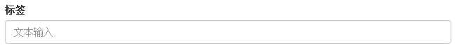
輸入框(Input)
最常見的表單文本字段是輸入框 input。用戶可以在其中輸入大多數必要的表單數據。Bootstrap 提供了對所有原生的 HTML5 的 input 類型的支持,包括:text、password、datetime、datetime-local、date、month、time、week、number、email、url、search、tel 和 color。適當的 type 聲明是必需的,這樣才能讓 input 獲得完整的樣式。
<!DOCTYPE html>
<html>
<head>
<title>Bootstrap 實例 - 輸入框</title>
<link rel="stylesheet" href="http://apps.bdimg.com/libs/bootstrap/3.3.0/css/bootstrap.min.css">
<script src="http://apps.bdimg.com/libs/jquery/2.1.1/jquery.min.js"></script>
<script src="http://apps.bdimg.com/libs/bootstrap/3.3.0/js/bootstrap.min.js"></script>
</head>
<body>
<form role="form">
<div class="form-group">
<label for="name">標簽</label>
<input type="text" class="form-control" placeholder="文本輸入">
</div>
</form>
</body>
</html>
結果如下所示:
文本框(Textarea)
當您需要進行多行輸入的時,則可以使用文本框 textarea。必要時可以改變 rows 屬性。
<!DOCTYPE html>
<html>
<head>
<title>Bootstrap 實例 - 文本框</title>
<link rel="stylesheet" href="http://apps.bdimg.com/libs/bootstrap/3.3.0/css/bootstrap.min.css">
<script src="http://apps.bdimg.com/libs/jquery/2.1.1/jquery.min.js"></script>
<script src="http://apps.bdimg.com/libs/bootstrap/3.3.0/js/bootstrap.min.js"></script>
</head>
<body>
<form role="form">
<div class="form-group">
<label for="name">文本框</label>
<textarea class="form-control" rows="3"></textarea>
</div>
</form>
</body>
</html>
結果如下所示:

復選框((Checkbox)和單選框(Radio)
復選框和單選按鈕用於讓用戶從一系列預設置的選項中進行選擇。
當創建表單時,如果您想讓用戶從列表中選擇若干個選項時,請使用 checkbox。如果您限制用戶只能選擇一個選項,請使用 radio。
對一系列復選框和單選框使用 .checkbox-inline 或 .radio-inline class,控制它們顯示在同一行上。
下面的實例演示了這兩種類型(默認和內聯):
<!DOCTYPE html>
<html>
<head>
<title>Bootstrap 實例 - 復選框和單選按鈕</title>
<link rel="stylesheet" href="http://apps.bdimg.com/libs/bootstrap/3.3.0/css/bootstrap.min.css">
<script src="http://apps.bdimg.com/libs/jquery/2.1.1/jquery.min.js"></script>
<script src="http://apps.bdimg.com/libs/bootstrap/3.3.0/js/bootstrap.min.js"></script>
</head>
<body>
<label for="name">默認的復選框和單選按鈕的實例</label>
<div class="checkbox">
<label><input type="checkbox" value="">選項 1</label>
</div>
<div class="checkbox">
<label><input type="checkbox" value="">選項 2</label>
</div>
<div class="radio">
<label>
<input type="radio" name="optionsRadios" id="optionsRadios1"
value="option1" checked> 選項 1
</label>
</div>
<div class="radio">
<label>
<input type="radio" name="optionsRadios" id="optionsRadios2"
value="option2">
選項 2 - 選擇它將會取消選擇選項 1
</label>
</div>
<label for="name">內聯的復選框和單選按鈕的實例</label>
<div>
<label class="checkbox-inline">
<input type="checkbox" id="inlineCheckbox1" value="option1"> 選項 1
</label>
<label class="checkbox-inline">
<input type="checkbox" id="inlineCheckbox2" value="option2"> 選項 2
</label>
<label class="checkbox-inline">
<input type="checkbox" id="inlineCheckbox3" value="option3"> 選項 3
</label>
<label class="checkbox-inline">
<input type="radio" name="optionsRadiosinline" id="optionsRadios3"
value="option1" checked> 選項 1
</label>
<label class="checkbox-inline">
<input type="radio" name="optionsRadiosinline" id="optionsRadios4"
value="option2"> 選項 2
</label>
</div>
</body>
</html>
結果如下所示:

復選框和單選按鈕
當您想讓用戶從多個選項中進行選擇,但是默認情況下只能選擇一個選項時,則使用選擇框。
使用 <select> 展示列表選項,通常是那些用戶很熟悉的選擇列表,比如州或者數字。
使用 multiple="multiple" 允許用戶選擇多個選項。
下面的實例演示了這兩種類型(select 和 multiple):
<!DOCTYPE html>
<html>
<head>
<title>Bootstrap 實例 - 選擇框</title>
<link rel="stylesheet" href="http://apps.bdimg.com/libs/bootstrap/3.3.0/css/bootstrap.min.css">
<script src="http://apps.bdimg.com/libs/jquery/2.1.1/jquery.min.js"></script>
<script src="http://apps.bdimg.com/libs/bootstrap/3.3.0/js/bootstrap.min.js"></script>
</head>
<body>
<form role="form">
<div class="form-group">
<label for="name">選擇列表</label>
<select class="form-control">
<option>1</option>
<option>2</option>
<option>3</option>
<option>4</option>
<option>5</option>
</select>
<label for="name">可多選的選擇列表</label>
<select multiple class="form-control">
<option>1</option>
<option>2</option>
<option>3</option>
<option>4</option>
<option>5</option>
</select>
</div>
</form>
</body>
</html>
結果如下所示:

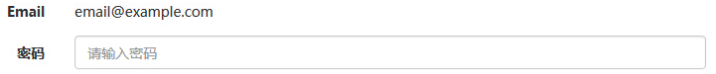
靜態控件
當您需要在一個水平表單內的表單標簽後放置純文本時,請在 <p> 上使用 class .form-control-static。
<!DOCTYPE html>
<html>
<head>
<title>Bootstrap 實例 - 靜態控件</title>
<link rel="stylesheet" href="http://apps.bdimg.com/libs/bootstrap/3.3.0/css/bootstrap.min.css">
<script src="http://apps.bdimg.com/libs/jquery/2.1.1/jquery.min.js"></script>
<script src="http://apps.bdimg.com/libs/bootstrap/3.3.0/js/bootstrap.min.js"></script>
</head>
<body>
<form class="form-horizontal" role="form">
<div class="form-group">
<label class="col-sm-2 control-label">Email</label>
<div class="col-sm-10">
<p class="form-control-static">email@example.com</p>
</div>
</div>
<div class="form-group">
<label for="inputPassword" class="col-sm-2 control-label">密碼</label>
<div class="col-sm-10">
<input type="password" class="form-control" id="inputPassword"
placeholder="請輸入密碼">
</div>
</div>
</form>
</body>
</html>
結果如下所示:
表單控件狀態
除了 :focus 狀態(即,用戶點擊 input 或使用 tab 鍵聚焦到 input 上),Bootstrap 還為禁用的輸入框定義了樣式,並提供了表單驗證的 class。
輸入框焦點
當輸入框 input 接收到 :focus 時,輸入框的輪廓會被移除,同時應用 box-shadow。
禁用的輸入框 input
如果您想要禁用一個輸入框 input,只需要簡單地添加 disabled 屬性,這不僅會禁用輸入框,還會改變輸入框的樣式以及當鼠標的指針懸停在元素上時鼠標指針的樣式。
禁用的字段集 fieldset
對 <fieldset> 添加 disabled 屬性來禁用 <fieldset> 內的所有控件。
驗證狀態
Bootstrap 包含了錯誤、警告和成功消息的驗證樣式。只需要對父元素簡單地添加適當的 class(.has-warning、 .has-error 或 .has-success)即可使用驗證狀態。
<!DOCTYPE html>
<html>
<head>
<title>Bootstrap 實例 - 表單控件狀態</title>
<link rel="stylesheet" href="http://apps.bdimg.com/libs/bootstrap/3.3.0/css/bootstrap.min.css">
<script src="http://apps.bdimg.com/libs/jquery/2.1.1/jquery.min.js"></script>
<script src="http://apps.bdimg.com/libs/bootstrap/3.3.0/js/bootstrap.min.js"></script>
</head>
<body>
<form class="form-horizontal" role="form">
<div class="form-group">
<label class="col-sm-2 control-label">聚焦</label>
<div class="col-sm-10">
<input class="form-control" id="focusedInput" type="text"
value="該輸入框獲得焦點...">
</div>
</div>
<div class="form-group">
<label for="inputPassword" class="col-sm-2 control-label">
禁用
</label>
<div class="col-sm-10">
<input class="form-control" id="disabledInput" type="text"
placeholder="該輸入框禁止輸入..." disabled>
</div>
</div>
<fieldset disabled>
<div class="form-group">
<label for="disabledTextInput" class="col-sm-2 control-label">
禁用輸入(Fieldset disabled)
</label>
<div class="col-sm-10">
<input type="text" id="disabledTextInput" class="form-control"
placeholder="禁止輸入">
</div>
</div>
<div class="form-group">
<label for="disabledSelect" class="col-sm-2 control-label">
禁用選擇菜單(Fieldset disabled)
</label>
<div class="col-sm-10">
<select id="disabledSelect" class="form-control">
<option>禁止選擇</option>
</select>
</div>
</div>
</fieldset>
<div class="form-group has-success">
<label class="col-sm-2 control-label" for="inputSuccess">
輸入成功
</label>
<div class="col-sm-10">
<input type="text" class="form-control" id="inputSuccess">
</div>
</div>
<div class="form-group has-warning">
<label class="col-sm-2 control-label" for="inputWarning">
輸入警告
</label>
<div class="col-sm-10">
<input type="text" class="form-control" id="inputWarning">
</div>
</div>
<div class="form-group has-error">
<label class="col-sm-2 control-label" for="inputError">
輸入錯誤
</label>
<div class="col-sm-10">
<input type="text" class="form-control" id="inputError">
</div>
</div>
</form>
</body>
</html>
結果如下所示:

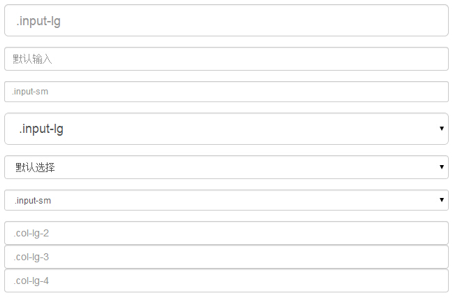
表單控件大小
可以分別使用 class .input-lg 和 .col-lg-* 來設置表單的高度和寬度。下面的實例演示了這點:
<!DOCTYPE html>
<html>
<head>
<title>Bootstrap 實例 - 表單控件大小</title>
<link rel="stylesheet" href="http://apps.bdimg.com/libs/bootstrap/3.3.0/css/bootstrap.min.css">
<script src="http://apps.bdimg.com/libs/jquery/2.1.1/jquery.min.js"></script>
<script src="http://apps.bdimg.com/libs/bootstrap/3.3.0/js/bootstrap.min.js"></script>
</head>
<body>
<form role="form">
<div class="form-group">
<input class="form-control input-lg" type="text"
placeholder=".input-lg">
</div>
<div class="form-group">
<input class="form-control" type="text" placeholder="默認輸入">
</div>
<div class="form-group">
<input class="form-control input-sm" type="text"
placeholder=".input-sm">
</div>
<div class="form-group">
</div>
<div class="form-group">
<select class="form-control input-lg">
<option value="">.input-lg</option>
</select>
</div>
<div class="form-group">
<select class="form-control">
<option value="">默認選擇</option>
</select>
</div>
<div class="form-group">
<select class="form-control input-sm">
<option value="">.input-sm</option>
</select>
</div>
<div class="row">
<div class="col-lg-2">
<input type="text" class="form-control" placeholder=".col-lg-2">
</div>
<div class="col-lg-3">
<input type="text" class="form-control" placeholder=".col-lg-3">
</div>
<div class="col-lg-4">
<input type="text" class="form-control" placeholder=".col-lg-4">
</div>
</div>
</form>
</body>
</html>
結果如下所示:
小編給大家推薦相關專題:
BootStrap組件操作技巧
Bootstrap 相關知識匯總
以上就是bootstrap所支持的表單控件。大家都看明白了,有任何疑問歡迎給我留言,小編會及時回復大家的,同時也非常感謝大家對網站的支持