使用media來判斷屏幕寬度遇到的問題:
ios上當我旋轉屏幕的時候可行,但是安卓機上沒反應,橫屏顯示的還是我豎屏的樣式。
查了一下資料,css3的media如果要在移動端有較好的顯示效果,需要在頁頭加上這段代碼
<meta name="viewport" content="width=device-width, initial-scale=1.0, maximum-scale=1.0, user-scalable=no">
可是這段代碼我不能用。因為我的頁面是做了適配的。可以根據屏幕的大小來顯示字號和樣式的大小。如果我加了這段代碼的話,我的適配就不能用了。所以要用其他方法
解決辦法:
移動端的設備提供了一個事件:orientationChange事件
這個事件是蘋果公司為safari中添加的。以便開發人員能夠確定用戶何時將設備由橫向查看切換為縱向查看模式。
在設備旋轉的時候,會觸發這個事件,
// Listen for orientation changes
window.addEventListener("orientationchange", function() {
// Announce the new orientation number
alert(window.orientation);
}, false);
只要用戶改變了設備的查看模式,就會觸發 orientationChange事件。此時的event對象不包含任何有價值的信息,
因為唯一相關信息可以通過window.orientation訪問到
orientation屬性
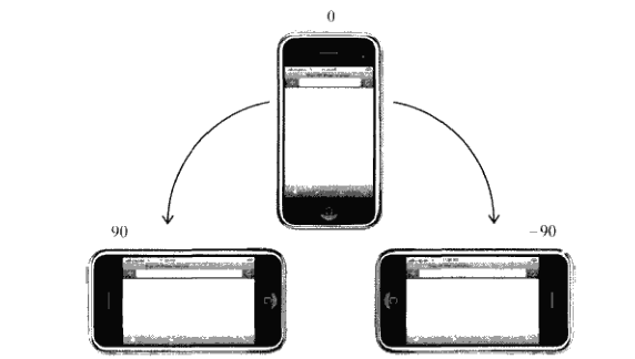
它有三個值:0,90,-90
0為豎屏模式(portrait),-90意味著該設備橫向旋轉到右側的橫屏模式(landscape),而90表示該設備是橫向旋轉到左邊的橫屏模式(landscape)。
還有一個是180,表示豎屏但是是翻轉過來的豎屏模式。但這種模式至今尚未得到支持。
如圖所示:
因此,結合這個orientationChange事件和window的orientation屬性,我們就比較好判斷設備是處於橫屏還是豎屏了
(function(){
var init = function(){
var updateOrientation = function(){
var orientation = window.orientation;
switch(orientation){
case 90:
case -90:
orientation = 'landscape'; //這裡是橫屏
break;
default:
orientation = 'portrait'; //這裡是豎屏
break;
}
//html根據不同的旋轉狀態,加上不同的class,橫屏加上landscape,豎屏
//加上portrait
document.body.parentNode.setAttribute('class',orientation);
};
// 每次旋轉,調用這個事件。
window.addEventListener('orientationchange',updateOrientation,false);
// 事件的初始化
updateOrientation();
};
window.addEventListener('DOMContentLoaded',init,false);
})();
因此可以根據不同的旋轉狀態加上class,所以我們的css就可以這樣寫了
/**豎屏 body顯示紅色**/
.portrait body div{
background: red;
}
/**橫屏 body顯示藍色**/
.landscape body div{
background: blue;
}
另外一種寫法是,借助 media queries
@media all and (orientation: portrait) {
body div {background: red;}
}
@media all and (orientation: landscape) {
body div {background: blue; }
}
這個orientation media query 在ios3.2+和安卓2.0+上還有其他浏覽器上有效。
相對來說,這種代碼更加的簡潔一點。跟上面的js+css,這種代碼是純css。當設備旋轉的時候,就會根據設備旋轉的方向來調用改方向的css
兼容性
有些設備並沒有提供orientationchange事件,但不觸發窗口的resize事件。並且media queries也不支持的情況下,我們該怎麼辦呢?
可以用resize事件來判斷。用innerWidth , innerHeight,可以檢索得到屏幕大小。依據寬和高的大小比較判斷,寬小於高為豎屏,寬大與高就是橫屏。
代碼如下:
(function(){
var updateOrientation = function(){
var orientation = (window.innerWidth > window.innerHeight) ? 'landscape' : 'portrait';
document.body.parentNode.setAttribute('class',orientation);
};
var init = function(){
updateOrientation();
//監聽resize事件
window.addEventListener('resize',updateOrientation,false);
};
window.addEventListener('DOMContentLoaded',init,false);
})();
這樣,我們就可以在浏覽器中看到屏幕旋轉帶來樣式的變化了。
兩種檢測方法的結合,代碼如下:
(function(){
var supportOrientation = (typeof window.orientation === 'number' &&
typeof window.onorientationchange === 'object');
var init = function(){
var htmlNode = document.body.parentNode,
orientation;
var updateOrientation = function(){
if(supportOrientation){
orientation = window.orientation;
switch(orientation){
case 90:
case -90:
orientation = 'landscape';
break;
default:
orientation = 'portrait';
break;
}
}else{
orientation = (window.innerWidth > window.innerHeight) ? 'landscape' : 'portrait';
}
htmlNode.setAttribute('class',orientation);
};
if(supportOrientation){
window.addEventListener('orientationchange',updateOrientation,false);
}else{
//監聽resize事件
window.addEventListener('resize',updateOrientation,false);
}
updateOrientation();
};
window.addEventListener('DOMContentLoaded',init,false);
})();
利用這個方法,就可以解決掉煩人的移動端設備橫豎屏的檢測了。