現在很多公司開發中都在使用bootstrap這個框架,bootstrap是Twitter公司的一個團隊的作品,大大簡化了我們的前端的開發。(後面會總結一些less的使用)
學習使用API我建議直接查看官網的API,地址:http://www.bootcss.com/
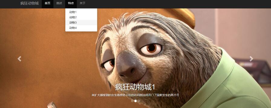
下面是部分目標效果圖:
下面我就總結一個小Demo中的技巧和原理:
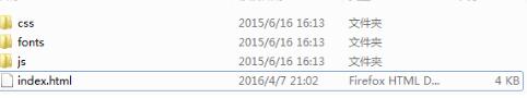
第一步、http://www.bootcss.com/下載bootstrap的壓縮包,新建index.html,使用sublime或其它編輯器打開index頁面,解壓後目錄是
第二步、拷貝官網http://v3.bootcss.com/getting-started/的一個基本模板,方便後續的開發,
<!DOCTYPE html>
<html lang="zh-CN">
 <head>
 <meta charset="utf-8">
 <meta http-equiv="X-UA-Compatible" content="IE=edge">
 <meta name="viewport" content="width=device-width, initial-scale=1">
 <!-- 上述3個meta標簽*必須*放在最前面,任何其他內容都*必須*跟隨其後! -->
 <title>Bootstrap 101 Template</title>

 <!-- Bootstrap -->
 <link href="css/bootstrap.min.css" rel="stylesheet">

 <!-- HTML5 shim and Respond.js for IE8 support of HTML5 elements and media queries -->
 <!-- WARNING: Respond.js doesn't work if you view the page via file:// -->
 <!--[if lt IE 9]>
 <script src="//cdn.bootcss.com/html5shiv/3.7.2/html5shiv.min.js"></script>
 <script src="//cdn.bootcss.com/respond.js/1.4.2/respond.min.js"></script>
 <![endif]-->
 </head>
 <body>
 <h1>你好,世界!</h1>

 <!-- jQuery (necessary for Bootstrap's JavaScript plugins) -->
 <script src="//cdn.bootcss.com/jquery/1.11.3/jquery.min.js"></script>
 <!-- Include all compiled plugins (below), or include individual files as needed -->
 <script src="js/bootstrap.min.js"></script>
 </body>
</html>
1)、注意:jquery.js的引用一定要在bootstrap.min.js的前面,並且最好手動下載一個jquery.js,放在js路徑下,<script src="js/jquery.min.js"></script>
因為後來我在仿真的時候發現下拉和carousel的動畫效果都沒有了,發現基本模板的jquery文件是下載的,可能沒有聯網,所以沒有下載下來,最好自己引用本地。
2)、注意:css引用放頁面上方,js引用放頁面下方,因為css需要先加載渲染頁面,而js需要在頁面渲染完畢後加載執行;並且適應移動設備的meta語句:<meta name="viewport" content="width=device-width, initial-scale=1">
第三步、導航條
1)居中效果:container-fluent需要改成container
2)白色改成反差效果的黑色: <nav class="navbar navbar-default navbar-inverse">
3)導航條固定到頂部,增加時類屬性: navbar-fixed-top
 <nav class="navbar navbar-default navbar-fixed-top navbar-inverse ">
 <div class="container">
 <!-- Brand and toggle get grouped for better mobile display -->
 <div class="navbar-header">
 <button type="button" class="navbar-toggle collapsed" data-toggle="collapse" data-target="#bs-example-navbar-collapse-1" aria-expanded="false">
 <span class="sr-only">Toggle navigation</span>
 <span class="icon-bar"></span>
 <span class="icon-bar"></span>
 <span class="icon-bar"></span>
 </button>
 <a class="navbar-brand" href="#">瘋狂動物城</a>
 </div>

 <!-- Collect the nav links, forms, and other content for toggling -->
 <div class="collapse navbar-collapse" id="bs-example-navbar-collapse-1">
 <ul class="nav navbar-nav">
 <li class="active"><a href="#">首頁 <span class="sr-only">(current)</span></a></li>
 <li><a href="#">簡述</a></li>
 <li><a href="#">特點</a></li>
 <li><a href="#">關於</a></li>

 </div><!-- /.navbar-collapse -->
 </div><!-- /.container-fluid -->
 </nav>
4)導航條會遮蓋body的頂部,所以增加樣式
<style type="text/css">
 body{
 padding-top: 50px;
 }
 </style>
5)特點的導航項目增加下拉菜單
<li class="dropdown"><a href="#" class="dropdown-toggle" data-toggle="dropdown">特點</a>
 <ul class="dropdown-menu">
 <li><a href="#">動物1</a></li>
 <li><a href="#">動物2</a></li>
 <li><a href="#">動物3</a></li>
 <li><a href="#">動物4</a></li>
 </ul>
 </li>
注意,子菜單的內容均嵌套在最外層的li標簽裡,並且li標簽有類 dropdown,子菜單也是一個ul標簽,類為dropdown-menu,具體映射關系見上面。
第四步、增加輪轉效果,復制修改bootstrap組件的carousel模塊:
<div id="carousel-example-generic" class="carousel slide" data-ride="carousel">
 <!-- Indicators -->
 <ol class="carousel-indicators">
 <li data-target="#carousel-example-generic" data-slide-to="0" class="active"></li>
 <li data-target="#carousel-example-generic" data-slide-to="1"></li>
 <li data-target="#carousel-example-generic" data-slide-to="2"></li>
 </ol>

 <!-- Wrapper for slides -->
 <div class="carousel-inner" role="listbox">
 <div class="item active">
 <img src="image/1.jpg" alt="...">
 <div class="carousel-caption">
 <h1>瘋狂動物城1</h1>
 <p>來擴大感受到的女生看房名卡位的訪問怒法師開門了國家發生的兩個號</p>
 </div>
 </div>
 <div class="item">
 <img src="image/2.jpg" alt="...">
 <div class="carousel-caption">
 <h1>瘋狂動物城1</h1>     <p>來擴大感受到的女生看房名卡位的訪問怒法師開門了國家發生的兩個號</p>
 </div>
 </div>
 <div class="item">
 <img src="image/3.jpg" alt="...">
 <div class="carousel-caption">
 <h1>瘋狂動物城1</h1>     <p>來擴大感受到的女生看房名卡位的訪問怒法師開門了國家發生的兩個號</p>
 </div>
 </div>
 </div>

 <!-- Controls -->
 <a class="left carousel-control" href="#carousel-example-generic" role="button" data-slide="prev">
 <span class="glyphicon glyphicon-chevron-left" aria-hidden="true"></span>
 <span class="sr-only">上一頁</span>
 </a>
 <a class="right carousel-control" href="#carousel-example-generic" role="button" data-slide="next">
 <span class="glyphicon glyphicon-chevron-right" aria-hidden="true"></span>
 <span class="sr-only">下一頁</span>
 </a>
 </div>
1)為了輪轉圖片的時候沒有留白或間隙,增加樣式
 .carousel{
 height: 500px;
 background-color: #000;
 }

 .carousel .item{
 height: 500px;
 background-color: #000;
 } .carousel img{ width: 100%; }
2)為了文字設置樣式,更加美觀
 .casousel-caption p{
 margin-bottom: 20px;
 font-size: 20px;
 line-height: 1.8;
 }
目前的效果如下

咱們繼續:(打碼更新中。。。)
第二部分更新了,在基於bootstrap的前端開發案例Demo(二)
以上就是本文的全部內容,希望對大家的學習有所幫助,也希望大家多多支持。
如果大家還想深入學習,可以點擊這裡進行學習,再為大家附一個精彩的專題:Bootstrap學習教程