CSS3可按進度變色的進度條
編輯:HTML5詳解
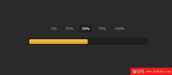
今天是周末,看到一款利用CSS3實現的進度條應用,覺得非常棒,就將它分享給大家,並且將這款CSS3進度條的實現過程大致整理了一下,實現的關鍵是根據當前的進度需要能改變進度條的背景顏色。下面是效果圖:
查看在線演示
從外觀上來看,這款進度條還是比較優雅的,有jQuery UI的風格。下面我們來看看具體實現的過程。主要是兩部分代碼,Html和CSS3。
Html代碼:
<input type="radio" class="radio" name="progress" value="five" id="five">
    <label for="five" class="label">5%</label>

    <input type="radio" class="radio" name="progress" value="twentyfive" id="twentyfive" checked>
    <label for="twentyfive" class="label">25%</label>

    <input type="radio" class="radio" name="progress" value="fifty" id="fifty">
    <label for="fifty" class="label">50%</label>

    <input type="radio" class="radio" name="progress" value="seventyfive" id="seventyfive">
    <label for="seventyfive" class="label">75%</label>

    <input type="radio" class="radio" name="progress" value="onehundred" id="onehundred">
    <label for="onehundred" class="label">100%</label>

    <div class="progress">
      <div class="progress-bar"></div>
    </div>
主要由兩部分,一部分是選擇進度的按鈕,點擊按鈕即會讓進度條跳轉到相應進度的位置並顯示對應的背景顏色。
還有一部分Html則是進度條的容器,進度條就在這個容器中發生各種變化。
CSS3代碼:
.container {
  margin: 80px auto;
  width: 640px;
  text-align: center;
}
.container .progress {
  margin: 0 auto;
  width: 400px;
}

.progress {
  padding: 4px;
  background: rgba(0, 0, 0, 0.25);
  border-radius: 6px;
  -webkit-box-shadow: inset 0 1px 2px rgba(0, 0, 0, 0.25), 0 1px rgba(255, 255, 255, 0.08);
  box-shadow: inset 0 1px 2px rgba(0, 0, 0, 0.25), 0 1px rgba(255, 255, 255, 0.08);
}

.progress-bar {
  position: relative;
  height: 16px;
  border-radius: 4px;
  -webkit-transition: 0.4s linear;
  -moz-transition: 0.4s linear;
  -o-transition: 0.4s linear;
  transition: 0.4s linear;
  -webkit-transition-property: width, background-color;
  -moz-transition-property: width, background-color;
  -o-transition-property: width, background-color;
  transition-property: width, background-color;
  -webkit-box-shadow: 0 0 1px 1px rgba(0, 0, 0, 0.25), inset 0 1px rgba(255, 255, 255, 0.1);
  box-shadow: 0 0 1px 1px rgba(0, 0, 0, 0.25), inset 0 1px rgba(255, 255, 255, 0.1);
}
.progress-bar:before, .progress-bar:after {
  content: "";
  position: absolute;
  top: 0;
  left: 0;
  right: 0;
}
.progress-bar:before {
  bottom: 0;
  background: url("../img/stripes.png") 0 0 repeat;
  border-radius: 4px 4px 0 0;
}
.progress-bar:after {
  z-index: 2;
  bottom: 45%;
  border-radius: 4px;
  background-image: -webkit-linear-gradient(top, rgba(255, 255, 255, 0.3), rgba(255, 255, 255, 0.05));
  background-image: -moz-linear-gradient(top, rgba(255, 255, 255, 0.3), rgba(255, 255, 255, 0.05));
  background-image: -o-linear-gradient(top, rgba(255, 255, 255, 0.3), rgba(255, 255, 255, 0.05));
  background-image: linear-gradIEnt(to bottom, rgba(255, 255, 255, 0.3), rgba(255, 255, 255, 0.05));
}
上面的CSS代碼是對進度條的樣式進行定義,並采用漸變的CSS3屬性來讓進度條的背景顏色更加時尚。
接下來是關鍵的按鈕選擇進度的CSS代碼:
#five:checked ~ .progress > .progress-bar {
  width: 5%;
  background-color: #f63a0f;
}

#twentyfive:checked ~ .progress > .progress-bar {
  width: 25%;
  background-color: #f27011;
}

#fifty:checked ~ .progress > .progress-bar {
  width: 50%;
  background-color: #f2b01e;
}

#seventyfive:checked ~ .progress > .progress-bar {
  width: 75%;
  background-color: #f2d31b;
}

#onehundred:checked ~ .progress > .progress-bar {
  width: 100%;
  background-color: #86e01e;
}

.radio {
  display: none;
}

.label {
  display: inline-block;
  margin: 0 5px 20px;
  padding: 3px 8px;
  color: #aaa;
  text-shadow: 0 1px black;
  border-radius: 3px;
  cursor: pointer;
}
.radio:checked + .label {
  color: white;
  background: rgba(0, 0, 0, 0.25);
}
用上面的CSS3代碼就可以取代JS來實現點擊選中的事件,非常方便。
實現的方式大致就是這樣,你也可以下載源碼自己研究。下載地址>>
小編推薦
熱門推薦