最近我想修改一下這個網站,我想在上面放置一個提示框。這是很容易,但我想讓提示框上有一個三角形的箭頭。可是,一想到這需要使用圖片,並且各種顏色,各種方向的箭頭要准備無數種,這幾乎是一種災難。幸運的是,MooTools的核心開發著Darren Waddell告訴了我一個非常棒
使用純CSS,你只需要很少的代碼就可以創作出各種浏覽器都兼容的三角形箭頭!
CSS代碼
復制代碼
代碼如下:
/* create an arrow that points up */
div.arrow-up {
width: 0;
height: 0;
border-left: 5px solid transparent; /* left arrow slant */
border-right: 5px solid transparent; /* right arrow slant */
border-bottom: 5px solid #2f2f2f; /* bottom, add background color here */
font-size: 0;
line-height: 0;
}
/* create an arrow that points down */
div.arrow-down {
width: 0;
height: 0;
border-left: 5px solid transparent;
border-right: 5px solid transparent;
border-top: 5px solid #2f2f2f;
font-size: 0;
line-height: 0;
}
/* create an arrow that points left */
div.arrow-left {
width: 0;
height: 0;
border-bottom: 5px solid transparent; /* left arrow slant */
border-top: 5px solid transparent; /* right arrow slant */
border-right: 5px solid #2f2f2f; /* bottom, add background color here */
font-size: 0;
line-height: 0;
}
/* create an arrow that points right */
div.arrow-right {
width: 0;
height: 0;
border-bottom: 5px solid transparent; /* left arrow slant */
border-top: 5px solid transparent; /* right arrow slant */
border-left: 5px solid #2f2f2f; /* bottom, add background color here */
font-size: 0;
line-height: 0;
}
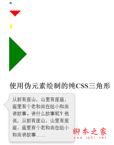
繪制這些三角形的關鍵在於,你要讓箭頭所指方向的兩個側邊有很粗的邊框。而背向箭頭方向的一邊也是同樣粗的邊框,而這條邊的顏色就是你的三角形的顏色。邊框越粗,三角形越大。用這種方法你可以繪制出各種顏色、各種大小、各種朝向的箭頭。最妙的是,你只需要幾行CSS代碼就能實現這種效果。
使用:before和:after繪制CSS三角形
上面的CSS例子使用的是真正的頁面元素進行繪制,但有時候這個真正的元素還有它用,你不能走上面直接進行操作,這是怎麼辦?純CSS的三角形其實還可以使用偽元素(pseudo-element)進行繪制。下面就是繪制方法:
復制代碼
代碼如下:
div.tooltip {
/* tooltip content styling in here; nothing to do with arrows */
}
/* shared with before and after */
div.tooltip:before, div.tooltip:after {
content: ' ';
height: 0;
position: absolute;
width: 0;
border: 10px solid transparent; /* arrow size */
}
/* these arrows will point up */
/* top-stacked, smaller arrow */
div.tooltip:before {
border-bottom-color: #fff; /* arrow color */
/* positioning */
position: absolute;
top: -19px;
left: 255px;
z-index: 2;
}
/* arrow which acts as a background shadow */
div.tooltip:after {
border-bottom-color: #333; /* arrow color */
/* positioning */
position: absolute;
top: -24px;
left: 255px;
z-index: 1;
}
背向箭頭的那一側的邊框的顏色就是三角形箭頭的顏色。畫這個箭頭並不需要同時使用:before和:after兩個偽元素——一個就夠了。而另外一個,你可以把它用作前一個的背景陰影或背景邊。
真應該早點知道這種技術!我相信在將來做界面改進時這種簡潔省事的技術將派上大用途