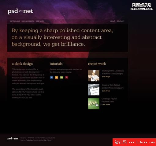
第一步
下面是我們將要動手制作的設計圖。在這篇教程裡我們只制作首頁,不過你可以以此為基礎用相同的布局制作內頁。
第二步
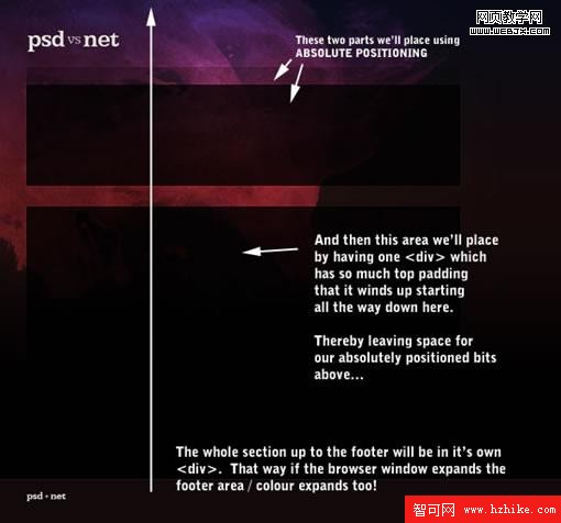
首先要做的是確定頁面結構。隨著你對CSS布局的逐步學習,這個過程會變得越來越簡單。通過運用大量絕對定位和大幅背景圖片,我們可以非常簡單地完成這個設計。
什麼是絕對定位?
一個Html元素(比如<div>、<p>等等)被放入頁面時具有一個天生的位置,這個位置是由之前放入的元素確定的。例如,你放入一個填充了文字的<p></p>標簽,接著放入另一個<p></p>,它會自然出現在第一個<p>下方。每個元素相對於上一個元素流動。
絕對定位則不同,它給一個對象指定精確的位置使它脫離常規的元素流。如果你像之前一樣放入第一個<p></p>,然後絕對定位第二個<p></p>為 left:500px; top:500px,那它就會無視第一個<p>准確無誤地出現在指定的位置。
你可以像這樣設置絕對定位:
.className {
position:absolute;
top:0px;
left:0px;
}
絕對定位的缺點
使用絕對定位的主要問題是你的元素們不會真正地相互關聯。例如,你在靠近頁面頂端的地方放置了一個文本塊,然後稍靠下放置另一個,當每一個塊的文本都較短時這看上去很好。但如果頂部的塊內是一篇長文,它就會越過第二個塊,而不是把第二個塊推向下方。
所以絕對定位只對那些尺寸固定並且不需要與其他元素互動的元素真正有效。
為什麼本例中我們要用絕對定位?
因為絕對定位的好處就在於,它真的、真的非常簡單!你告訴浏覽器東西往哪兒放它就往哪兒放!更棒的是,當你使用絕對定位時,浏覽器兼容性問題會大大減少。畢竟不管你用的是Firefox、Internet Explorer還是Safari,100px總歸是100px。
嗯...該開始我們的布局了
我們將要制作網站的方法是:
- 使用大尺寸的背景圖片
- 絕對定位Logo、菜單和頭部面板,讓它們精確地出現該出現的地方
- 將content(內容)放入慣用的<div>標簽,但設置很高的padding-top(頂部內邊距)好讓content向下推到該出現的地方
- 讓footer(頁腳)坐鎮底部
如果上述說明還不能讓你有一個整體的感覺,先別著急,當你看到網站成型的時候就會了解了!
第三步
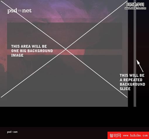
現在,我們需要兩張背景圖片。一張大的,存成JPG後大約56kb。這個尺寸在過去稍嫌太大,不過現在這不足為道。
另一張窄條圖片,作為主體區域的背景,將不斷重復向右,拖動浏覽器窗口時它也會隨之向外平鋪。
(注意:下圖中的Logo不應該顯示在背景圖片裡,抱歉這是張不太好的截圖)
你可以分別在 這裡 和 這裡 看到我創建的兩張圖片。
第四步
好了,我們現在開始寫Html。首先我們列出一些基本代碼:
<!DOCTYPE html PUBLIC "-//W3C//DTD XHtml 1.0 Strict//EN"
"http://www.w3.org/TR/xhtml1/DTD/xHtml1-strict.dtd">
<html XMLns="http://www.w3.org/1999/xHtml" XML:lang="en" lang="en">
<head>
<title>PSD vs NET</title>
<link rel="stylesheet" href="step1_style.css" _fcksavedurl=""step1_style.css"" _fcksavedurl=""step1_style.css"" _fcksavedurl=""step1_style.css"" type="text/CSS" media="screen" />
</head>
<body>
<div id="outside_container">
<div id="container">
<!-- The Main Area -->
</div>
</div>
<div id="footer">
<img src="images/footer_logo.jpg" />
<span id="footer_text">
Made for a PSDTUTS and NETTUTS tutorial by Collis!
See the <a href="Photoshop>http://psdtuts.com">Photoshop Tutorial</a>,
see the <a href="Web>http://nettuts.com">Web Tutorial</a>
</span>
</div>
</body>
</Html>
通常,我們最好由外向內進行布局。我在這裡置入3個主要的<div>,前兩個是outside_container / container,另外一個是footer. 這需要一些說明:
- 我同時創建outside_container 和 container是為了實現雙重背景圖像——一張小圖平鋪,一張大圖置頂。在outside_container裡我將放入平鋪背景,在container 裡我將放入大幅的主背景圖,而container將出現在outside_container頂部。
- footer需要置於兩個container之外,是為了讓footer在浏覽器窗口縱向延伸時不停向下。既然它自己有一個背景,就不能在container之內,若非如此,你可能會在把窗口拉到某個程度時看到container的背景而不是footer的!
你還看到我在footer裡加了一些內容——小logo和一段文字。我把這段文字包在一個<span>標簽裡以便後續操作。而既然footer裡只有一張圖片,我們沒理由再給<img>標簽一個id或class,只要稱之為#footer img就可以了。這樣可以讓我們的Html更簡單一些。
第五步
到目前為止我們的代碼所需的CSS:
body {
margin:0px; padding:0px;
background-color:#11090a;
font-family:Arial, Helvetica, sans-serif;
}
#outside_container {
background:url(images/background_slice.jpg) repeat-x #000000;
}
#container {
background:url(images/background_main.jpg) no-repeat;
min-height:800px;
}
#footer {
border-top:1px solid #3f2324;
padding:30px 50px 80px 50px;
}
一條一條來看:
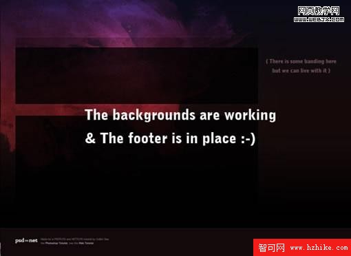
- 首先我們重新定義了body標簽。我差不多總是會先做這件事。我們除去默認的margin和padding,設置頁面背景顏色和字體。注意,這裡的背景顏色實際上也是footer的背景顏色。如前所述,這樣做是為了讓你在縱向拉伸窗口時也能一直看到footer。
- 然後,我用那張窄條背景圖片填充outside_container標簽,圖片只沿x軸(即從左向右)重復,沒有背景圖的地方我們會直接看到黑色 (#000000)。由於我們只橫向平鋪,頁面拉長時我們不會看到向下延續的圖片,而是看到黑色的背景。漸變成黑色的平鋪圖片讓這一切表現完美!
- 接下來輪到container了。我們將大背景圖設為不重復的,它只出現一次。注意,因為這個<div>標簽在前一個的內部,會伸展至將其填滿,所以我們沒有指定背景顏色。如果指定的話它將覆蓋我們的outside_container,而不是像現在這樣,在頁面頂部的背景圖外圍你仍可以看到outside_container的背景。
- 我還賦予了container一個最小高度,這樣我們可以大致看到有內容的網頁會是什麼樣子。 稍後這個最小高度可以由我們的內容來產生。
- footer基本上只有一個單線border加一些padding,沒必要再賦予它背景顏色,因為我們已經在<body>裡設置過了。記住,padding的定義方法如下padding: top right bottom left(順時針方向!)
我們現在到這兒了...
第六步
接下來我們加上其他一些樣式來結束footer的定義:
/*
Footer
*/
#footer {
border-top:1px solid #3f2324;
padding:30px 50px 80px 50px;
color:#674f5d;
font-size:9px;
line-height:14px;
}
#footer img {
float:left;
margin-right:10px;
}
#footer span {
display:block;
float:left;
width:250px;
}
#footer a {
color:#9e8292;
text-decoration:none;
}
#footer a:hover { color:#ffffff; }
如上,我在#footer樣式裡加了點東西並創建了幾個新的樣式。還是一條一條來看:
首先,位於/*和*/之間的這些玩意兒是CSS注釋。添加注釋有利於劃分CSS文件使其便於理解。實際上我發現如果不加注意,大型項目中的CSS文件相當可能變得失去控制。盡早形成好習慣吧:正確命名你的選擇器,添加注釋,聚合相似的樣式,為大型項目拆分出多個CSS文件等等。
在#footer中,我在之前的定義上添加了font color(字體顏色)、font size(字體尺寸)和line-height(行間距)。line-height是非常有用的文本屬性,它可以幫你間隔文本。沒有定義好行間距的文本看上去擠成一團難以閱讀。但過大的行間距也會讓文本隔得太開,看上去怪怪的。你可能要多試試看不同的字體和尺寸適合多大的行距。本例中14px似乎剛剛好。
接下來我把#footer img和#footer span都設為float:left,從而使兩個標簽緊挨著排成兩列。我將在下文中深入探討浮動和列的問題。
最後,我們告訴浏覽器怎麼處理出現在footer裡的<a>標簽(即鏈接):沒有下劃線,在鼠標懸停時要變色。
加上這些後我們到了這裡:
第七步
解決了footer部分,現在我們來給主container區域加入更多內容。首先我們需要兩張來自PSD圖檔的新圖片。
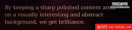
注意,我使用了圖片來表現文本塊。一般說來,直接用文字是最好的,這樣能讓網頁更容易被搜索到同時也被實踐證明是比較好的做法。但如果要用文字實現圖中的效果我們必須使用一些難得多的Flash和SIRr技術。既然本文是篇簡明易懂的教程,我還是寧願用一副大圖片。:-)
下面是一小段Html代碼,只有container部分的:
<div id="outside_container">
<div id="container">
<a href="#"><img src="images/logo.jpg" id="logo" /></a>
<ul id="menu">
<li><a href="#">Retouching</a></li>
<li><a href="#">Digital Effects</a></li>
<li><a href="#">Web Work</a></li>
</ul>
<ul id="right_menu">
<li><a href="#">About</a></li>
<li><a href="#">Contact</a></li>
</ul>
<img src="images/panel_home.jpg" id="panel" />
<div id="content">
<!-- THE CONTENT GOES IN HERE -->
</div>
</div>
</div>
在container區域我們加了五項內容:
- 我們的logo:加了鏈接,點擊可到達首頁,id=“logo”
- 主菜:很簡單的一個無序列表,id="menu"
- 右側菜單:除了id="right_menu"外,和前一個菜單沒兩樣
- 大文本圖片:這是我們主要的頭部文本,存成了圖片, id="panel"
- Content(內容) Div:我們待會兒要把頁面的所有內容放在這裡。但現在我只寫了一句Html注釋,先讓它留空。
在我們開始設計樣式前,現在的頁面值得一看,所有的內容像這樣堆在一起:
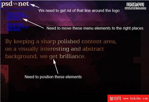
你也看見了,我們得來個乾坤大挪移好讓一切歸位。你還應該想起來,我們要用絕對定位來簡單快捷地完成這個任務。
第八步
以下是讓元素們各就各位要增加的CSS:
#container {
background:url(images/background_main.jpg) no-repeat;
min-height:800px;
width:1000px;
position:relative;
}
/*
Logo / Menu / Panel Positioning
*/
#logo { position:absolute; top:58px; left:51px; }
#panel { position:absolute; top:165px; left:51px; }
ul#menu {
margin:0px; padding:0px;
position:absolute; top:145px; left:75px;
}
ul#right_menu {
margin:0px; padding:0px;
position:absolute; top:145px; right:75px;
}
我們再一次...一條一條看:
- 首先,你看到一段熟悉的代碼——container,這次多了兩行:width:1000px和position:relative。把position(位置)設為relative(相對的)很重要,這樣內部元素的絕對定位就是相對於container標簽的。這也意味著我可以在已知container寬為1000px的條件下來定位盒子裡的元素,例如right_menu(右側菜單)。
- 接著,我用一句注釋來給這個新CSS分段。
- 給logo和panel絕對定位。我怎麼知道定位屬性值該多大呢?很簡單,拿出原始PSD圖來量一下就行!你看,屬性定義一簡單,絕對定位也就很容易。
- 然後給兩個菜單絕對定位。這裡我加了margin:0px; padding:0px;來清除無序菜單默認的margin和padding。
- 接下來請注意,我指定right_menu的絕對定位為right:75px,讓它出現在距容器右邊界75px的位置。通常浏覽器窗口被用作參照物,但前面我已將container設為position:relative,這就讓75px從<div id="container"></div>的右邊界開始算起了。
你這時可能會想:這有啥用?我用left屬性定位不就行了?當然,你可以這麼做,但如果你要給右側菜單增加選項,你就得一遍又一遍地重新定位好讓它距離右邊界75px。而用上right,選項就會自動左移。試試看吧!
看看咱們干到哪兒了:
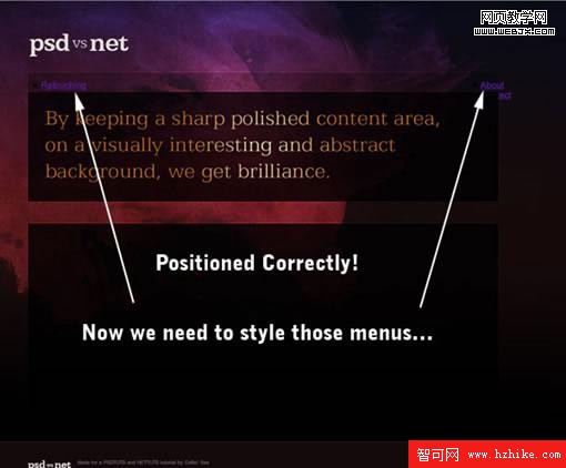
第九步
上圖中,logo和頭部元素看上去擺在了正確的位置,但菜單還有點兒怪怪的。設計樣式前我們先說一下logo和大文本圖片的事。你可能在想,既然它倆都是圖片為什麼不放在背景圖片裡就好了?
這是因為我們需要給logo加上鏈接,點擊可返回首頁(讓網站更好用)。而大文本圖片可能要隨頁面而變,把它做成單獨的圖片我們就可以讓大量Html頁面使用同一個CSS樣式表,只要換上文字不同的圖片就可以了。
現在咱們來設計那兩個菜單,讓頁面真正開始成型。要用到的CSS如下:
ul#menu {
margin:0px; padding:0px;
position:absolute; top:138px; left:75px;
}
ul#right_menu {
margin:0px; padding:0px;
position:absolute; top:138px; rightright:110px;
}
ul#menu li, ul#right_menu li {
margin:0px; padding:0px;
list-style:none;
margin-right:10px;
font-size:9px;
text-transform:uppercase;
display:inline;
}
ul#menu li a, ul#right_menu li a {
text-decoration:none;
color:#bd92b2;
}
ul#menu li a:hover, ul#right_menu li a:hover {
text-decoration:none;
color:#ffffff;
}
頭兩條代碼和之前一樣(除了稍微調整了定位讓它們仍然正確顯示)。注意,因為兩個菜單的位置不一樣,這兩條定義是分開的,但菜單選項的樣式是相同的,所以我們把後面兩條定義並成了一條。把兩個屬性一起定義的格式是:
.myClass, .myClass2 { ... }
這和下面的定義是完全不同的:
.myClass .myClass2 { ... }
因為第二個定義聲明的對象是位於class="myClass"的標簽內的所有class="myClass2"的元素
回到我們的樣式表,看一遍重要的幾點:
- 和前面一樣,我們把<ul>元素設為0 margin和0 padding,並絕對定位。
- 然後我們為<ul>內部所有的<li>元素做出聲明,讓它們沒有列表樣式(即沒有圓點),9px大小,統統大寫,最重要的,讓它們display:inline(譯者注:行內顯示)。行內顯示意味著它們排成一行,而不是一個接在另一個下面。
- 接下來的定義聲明了<li>內部的<a>鏈接們應該是某個顏色的並且沒有下劃線。這裡的<li>包括<ul id="menu"> 和<ul id="right_menu">內的所有<li>。
加上這些定義,我們的頁面現在看上去相當不錯啦!
第十步
現在該增加內容了!我們先寫些偽文本來形成列。下面是Html:
<div id="outside_container">
<div id="container">
<a href="#"><img src="images/logo.jpg" id="logo" /></a>
<ul id="menu">
<li><a href="#">Retouching</a></li>
<li><a href="#">Digital Effects</a></li>
<li><a href="#">Web Work</a></li>
</ul>
<ul id="right_menu">
<li><a href="#">About</a></li>
<li><a href="#">Contact</a></li>
</ul>
<img src="images/panel_home.jpg" id="panel" />
<div id="content">
<div class="column1">
<h2>a sleek design</h2>
<p>Dummy Text: This design was produced for a Photoshop and web development tutorial. You can see the first part up at PSDTUTS.com where you learn how to create a beautiful, but simple design using an abstract background and type.</p>
<p>The second part of the tutorial is available via NETTUTS.com where we do a quick build of the PSD into a viable, working Html/CSS site.</p>
<p>This design was produced for a Photoshop and web development tutorial. You can see the first part up at PSDTUTS.com where you learn how to create a beautiful, but simple design using an abstract background and type.</p>
<p>The second part of the tutorial is available via NETTUTS.com where we do a quick build of the PSD into a viable, working Html/CSS site.</p>
</div>
<div class="column2">
<h2>tutorials</h2>
<p>Dummy Text: This design was produced for a Photoshop and web development tutorial. You can see the first part up at PSDTUTS.com where you learn how to create a beautiful, but simple design using an abstract background and type.</p>
<p>The second part of the tutorial is available via NETTUTS.com where we do a quick build of the PSD into a viable, working Html/CSS site.</p>
<p>This design was produced for a Photoshop and web development tutorial. You can see the first part up at PSDTUTS.com where you learn how to create a beautiful, but simple design using an abstract background and type.</p>
<p>The second part of the tutorial is available via NETTUTS.com where we do a quick build of the PSD into a viable, working Html/CSS site.</p>
</div>
<div class="column3">
<h2>recent work</h2>
<p>Dummy Text: This design was produced for a Photoshop and web development tutorial. You can see the first part up at PSDTUTS.com where you learn how to create a beautiful, but simple design using an abstract background and type.</p>
<p>The second part of the tutorial is available via NETTUTS.com where we do a quick build of the PSD into a viable, working Html/CSS site.</p>
<p>This design was produced for a Photoshop and web development tutorial. You can see the first part up at PSDTUTS.com where you learn how to create a beautiful, but simple design using an abstract background and type.</p>
<p>The second part of the tutorial is available via NETTUTS.com where we do a quick build of the PSD into a viable, working Html/CSS site.</p>
</div>
</div>
</div>
</div>
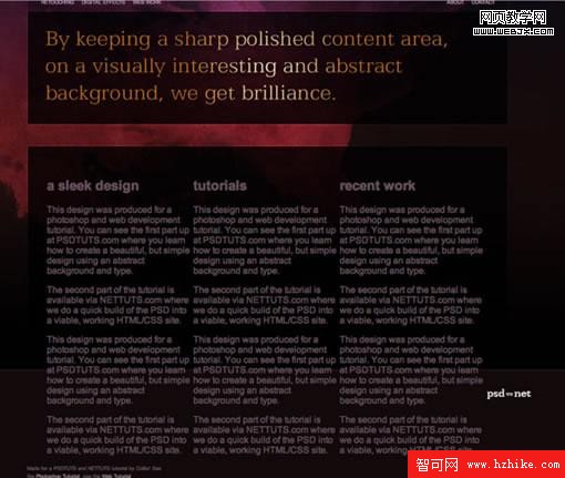
在這段代碼中,你可以看到我在內容區域加了3個新的<div>,每一個<div>包含一個<h2>標題元素和一些文本。他們的class名稱是column1、column2、column3(列1、列2、列3)。加上文本是為了展示怎樣形成列。
為了讓他們看上去像列的樣子我們先來添加一段CSS:
/*
Content
*/
#content {
padding-top:435px;
padding-left:85px;
width:815px;
color:#674f5d;
font-size:13px;
line-height:20px;
}
.column1 { float:left; width:230px; margin-right:30px; }
.column2 { float:left; width:230px; margin-right:30px; }
.column3 { float:left; width:270px; }
我用一句注釋為新的CSS段落起頭,然後為#content設置樣式。注意padding-top值....435px!設這麼大是為了給之前絕對定位的元素空出地方。與絕對定位的元素不同,content是從屬於頁面正常流的。
這是因為你還要在content中加入更多內容,把footer推到下面去。絕對定位會讓它覆蓋在footer上方。
然後我給三個column分別設置寬度並加上float:left,這可以讓它們漂向頁面左邊,與其他向左浮動的元素對齊。為了不讓他們緊挨在一起,我給前兩個column賦予了右外邊距。
浮動一個元素會讓它漂到左側或右側,並使其它元素環繞在其四周。加入另一個浮動元素,二者會並排成列。基本上你看到的列布局都運用了float(浮動)。
不幸的是,浮動元素會出現一個怪問題——它們跟自己的容器不對付,並且會漂到下一個元素上方而不是把它往下推。解決這個問題的方法就是給浮動元素後面的某個元素加上屬性clear:both。
Clear(清理)屬性可以阻止元素環繞浮動的<div>,這有點兒不好解釋,我們直接看看清理和不清理分別會出現什麼狀況吧。
不清理
布局看上去會像這樣:
幾個列漂在footer上方,footer環繞著列。這可不對!
清理
方法相當簡單,我們只需要在三個列後面加上一個<div>,如下:
<div id="content">
<div class="column1">
<h2>a sleek design</h2>
<p>This design was produced for a Photoshop and web development tutorial. You can see the first part up at PSDTUTS.com where you learn how to create a beautiful, but simple design using an abstract background and type.</p>
<p>The second part of the tutorial is available via NETTUTS.com where we do a quick build of the PSD into a viable, working Html/CSS site.</p>
</div>
<div class="column2">
<h2>tutorials</h2>
<p>This design was produced for a Photoshop and web development tutorial. You can see the first part up at PSDTUTS.com where you learn how to create a beautiful, but simple design using an abstract background and type.</p>
<p>The second part of the tutorial is available via NETTUTS.com where we do a quick build of the PSD into a viable, working Html/CSS site.</p>
</div>
<div class="column3">
<h2>recent work</h2>
<p>This design was produced for a Photoshop and web development tutorial. You can see the first part up at PSDTUTS.com where you learn how to create a beautiful, but simple design using an abstract background and type.</p>
<p>The second part of the tutorial is available via NETTUTS.com where we do a quick build of the PSD into a viable, working Html/CSS site.</p>
</div>
<div style="clear:both"></div>
</div>
看到底部的<div style="clear:both"></div>了嗎?只用一個聲明清理那三個列的空<div>,就解決了我們的問題。