牛逼的css3:動態過渡與圖形變換
編輯:CSS特效代碼
寫css3的屬性的時候,最好加上浏覽器內核標識,進行兼容。 -ms-transform:scale(2,4); /* IE 9 */ -moz-transform:scale(2,4); /* Firefox */ -webkit-transform:scale(2,4); /* Safari and Chrome */ -o-transform:scale(2,4); /* Opera */
1.圓角(常用:略)
2.邊框陰影 box-shadow 屬性向框添加一個或多個陰影。box-shadow: h-shadow v-shadow blur spread color inset;
h-shadow 必需。水平陰影的位置。允許負值。
v-shadow 必需。垂直陰影的位置。允許負值
blur 可選。模糊距離。
spread 可選。陰影的尺寸
color 可選。陰影的顏色
inset 可選。將外部陰影 (outset) 改為內部陰影。

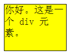
div
{
box-shadow: 10px 10px 5px 5px #888888;
}
 3.邊框圖片
border-image 屬性是一個簡寫屬性
3.邊框圖片
border-image 屬性是一個簡寫屬性- border-image-source 用在邊框的圖片的路徑。 - border-image-slice 圖片邊框向內偏移。 - border-image-width 圖片邊框的寬度。 - border-image-outset 邊框圖像區域超出邊框的量。 - border-image-repeat 圖像邊框是否應平鋪(repeated)、鋪滿(rounded)或拉伸(stretched) 4.設定背景的繪制區域(background-clip)
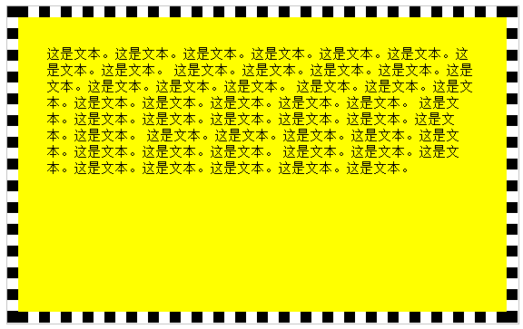
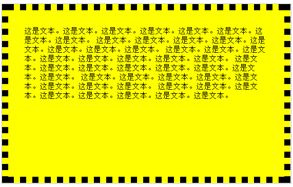
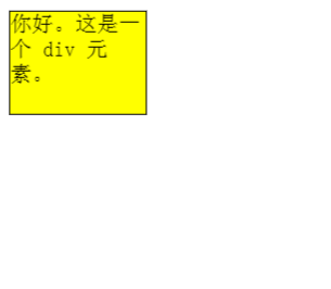
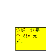
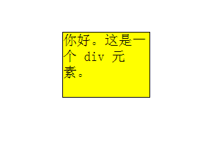
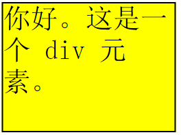
三個值:background-clip: border-box|padding-box|content-box;
div
{
background-color:yellow;
background-clip:content-box;
}

div
{
background-color:yellow;
background-clip:padding-box;
}

div
{
background-color:yellow;
background-clip:border-box;
}
 5.設定背景圖的尺寸(background-size)
在 CSS3 之前,背景圖片的尺寸是由圖片的實際尺寸決定的。在 CSS3 中,可以規定背景圖片的尺寸,這就允許我們在不同的環境中重復使用背景圖片。
background-size: length|percentage|cover|contain;
length:設置背景圖像的高度和寬度。第一個值為寬度,第二只是高度
div
{
background:url(img_flwr.gif);
background-size:80px 60px;
background-repeat:no-repeat;
}
6.css3字體(@font-face)
在新的 @font-face 規則中,您必須首先定義字體的名稱(比如 myFirstFont),然後指向該字體文件。
如需為 HTML 元素使用字體,請通過 font-family 屬性來引用字體的名稱 (myFirstFont):
<style>
@font-face
{
font-family: myFirstFont;
src: url('Sansation_Light.ttf'),
     url('Sansation_Light.eot'); /* IE9+ */
}

div
{
font-family:myFirstFont;
}
</style>
7.2D轉換(transform) translate() 改變元素位置 rotate() 旋轉元素 sacle() 放大縮小元素 skew() 元素翻轉 matrix() transform 該屬性允許我們對元素進行旋轉、縮放、移動或傾斜。
8.過渡 CSS3 過渡是元素從一種樣式逐漸改變為另一種的效果。
要實現這一點,必須規定兩項內容:
- 規定您希望把效果添加到哪個 CSS 屬性上 - 規定效果的時長 例一:鼠標放在div上,div寬度緩慢變化到指定寬度。移除鼠標,div寬度還原。div
{
width:100px;
height:100px;
transition:width 2s;
}
div:hover
{
width:300px;
}
這裡的css屬性也可以是位置等。。。
例二:鼠標放在div上,div緩慢移動到另一個位置。
div
{
width:100px;
height:100px;
background:yellow;
transition:margin-left 2s;
}

div:hover
{
margin-left:300px;
}
</style>
例三:當然你也可以將兩個效果結合起來。
div
{
width:100px;
height:100px;
background:yellow;
transition:margin-left 2s,width 1s;    //多個要改變的屬性之間用,分割
}

div:hover
{
margin-left:300px;
width:300px;
}
例四:transition是屬性的簡寫。 transition-property 規定應用過渡的 CSS 屬性的名稱。
transition-duration 定義過渡效果花費的時間。默認是 0。
transition-timing-function 規定過渡效果的時間曲線。默認是 "ease"。
linear 規定以相同速度開始至結束的過渡效果 ease 規定慢速開始,然後變快,然後慢速結束的過渡效果
ease-in 規定以慢速開始的過渡效果 ease-out 規定以慢速結束的過渡效果 ease-in-out 規定以慢速開始和結束的過渡效果 cubic-bezier(n,n,n,n) 在 cubic-bezier 函數中定義自己的值。可能的值是 0 至 1 之間的數值 transition-delay 規定過渡效果何時開始。默認是 0。
9.2D轉換與過渡的結合。 例一:與rotate-在原位置進行旋轉
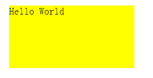
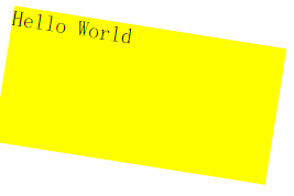

div
{
margin:30px;
width:200px;
height:100px;
background-color:yellow;
transition:transform 2s;    //只是加了一個過渡效果
}
div:hover{
transform:rotate(9deg);    //這是最終狀態
}
例二:與translate-沿著x與Y進行移動
div
{
width:100px;
height:75px;
background-color:yellow;
border:1px solid black;
transition:transform 2s;
}
div:hover{
 transform:translate(50px,100px);    //left(x 坐標) 和 top(y 坐標)
}
例三:與scale-鼠標放再div上,div寬高均放大至原來的兩倍。

div
{
width:100px;
height:75px;
background-color:yellow;
border:1px solid black;
transition:transform 1s;
}
div:hover{
transform:scale(2,2);    //寬度,高度
}
例四:與skew-圍繞 X 軸把元素翻轉 30 度,圍繞 Y 軸翻轉 20 度
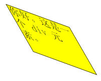

div
{
width:100px;
height:75px;
background-color:yellow;
border:1px solid black;
transition:transform 2S;
}
div:hover{
transform:skew(30deg,20deg);    //圍繞 X 軸把元素翻轉 30 度,圍繞 Y 軸翻轉 20 度
}
http://www.cnblogs.com/zqzjs/
小編推薦
熱門推薦