本文示例源代碼或素材下載

這次要完成的是導航欄,這是頁面中比較復雜的區域。
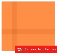
先在 Microsoft Expression Design 中繪制導航欄的背景圖案:
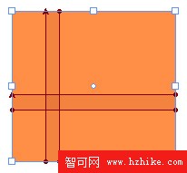
導出為barback.xaml,增加其填充規則:
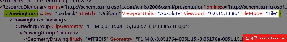
ViewportUnits="Absolute"VIEwport="0,0,15,13.86"TileMode="Tile"
完成後的代碼如下:
Code
<?XMLversion="1.0"encoding="utf-8"?>
<ResourceDictionaryxmlns="http://schemas.microsoft.com/winfx/2006/xaml/presentation"XMLns:x="http://schemas.microsoft.com/winfx/2006/xaml">
<DrawingBrushx:Key="barback"Stretch="Uniform"ViewportUnits="Absolute"VIEwport="0,0,15,13.86"TileMode="Tile">
    <DrawingBrush.Drawing>
      <DrawingGroupClipGeometry="F1M0,0L15,0L15,13.8571L0,13.8571L0,0">
        <DrawingGroup.Children>
          <GeometryDrawingBrush="#FF8E45"Geometry="F1M0,-3.05176e-005L15,-3.05176e-005L15,13.8571L0,13.8571L0,-3.05176e-005Z"/>
          <GeometryDrawingBrush="#0D882900"Geometry="F1M3.02855,-3.05176e-005L4.28571,-3.05176e-005L4.28571,13.8571L3.02855,13.8571L3.02855,-3.05176e-005Z"/>
          <GeometryDrawingBrush="#0D882900"Geometry="F1M1.52588e-005,7.65891L15,7.65891L15,9.07321L1.52588e-005,9.07321L1.52588e-005,7.65891Z"/>
        </DrawingGroup.Children>
      </DrawingGroup>
    </DrawingBrush.Drawing>
  </DrawingBrush>
</ResourceDictionary>
在Page資源中引用:
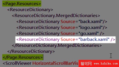
<ResourceDictionarySource="barback.xaml"/>
將Channel區塊的背景改為“{StaticResource barback}”:

接下來要在Channel中添加一個Grid並實現如下布局:

代碼如下:
<Grid>
<Grid.ColumnDefinitions>
<ColumnDefinitionWidth="28"/>
<ColumnDefinitionWidth="Auto"/>
<ColumnDefinitionWidth="Auto"/>
<ColumnDefinitionWidth="Auto"/>
<ColumnDefinitionWidth="Auto"/>
<ColumnDefinitionWidth="Auto"/>
<ColumnDefinitionWidth="Auto"/>
<ColumnDefinitionWidth="Auto"/>
<ColumnDefinitionWidth="*"/>
<ColumnDefinitionWidth="28"/>
</Grid.ColumnDefinitions>
<Grid.Background>
<LinearGradIEntBrushEndPoint="0.5,1"StartPoint="0.5,0">
<GradIEntStopColor="#26000000"Offset="0.95"/>
<GradIEntStopColor="#00000000"Offset="0.8"/>
<GradIEntStopColor="#00000000"Offset="0.2"/>
<GradIEntStopColor="#26000000"Offset="0"/>
</LinearGradIEntBrush>
</Grid.Background>
</Grid>
它的背景是不透明度很低的黑色漸變,用於實現上下邊緣處的陰影效果。
現在我們要在Grid中加入的是一條橫向填滿整個Grid的1像素白線,它緊貼Grid底部:
<PathVerticalAlignment="Bottom"Grid.ColumnSpan="10"Height="1"Stretch="Fill"StrokeLineJoin="Round"Stroke="#FFFFFFFF"Data="F1M52,307L252.003,307"/>
這是干什麼用的呢?我們把畫面放大到700%,看看我們將要實現的效果:

請看我鼠標所指的位置,這就是那條線,我們實現這個標簽效果的原理就是:未選中的標簽向下產生1像素外邊距,從而使這條白線顯示出來;而被選中的標簽向下為0像素外邊距,就蓋住了這條白線,產生與頁面中部內容區接合的效果。
OK,了解了原理先不著急實現,現在再加入兩個矩形來產生左右邊緣的陰影效果:
<RectangleOpacity="0.7"Grid.Column="0"Width="28" Fill="{StaticResourceShadowLeft}"/>
<RectangleOpacity="0.7"Grid.Column="9"Width="28" Fill="{StaticResourceShadowRight}"/>
然後我們就來做這個標簽了,對於這種有狀態的單選標簽,我個人認為最合理的應該就是使用 RadioButton 來實現吧,雖然他們的長相大相徑庭,但是WPF絕妙的樣式定義功能就是可以這樣化腐朽為神奇滴。
先來添加一堆 RadioButton :
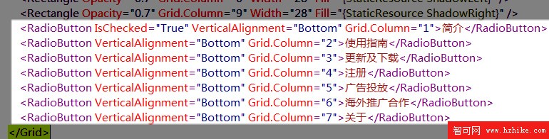
<RadioButtonIsChecked="True"VerticalAlignment="Bottom"Grid.Column="1">簡介</RadioButton>
<RadioButtonVerticalAlignment="Bottom"Grid.Column="2">使用指南</RadioButton>
<RadioButtonVerticalAlignment="Bottom"Grid.Column="3">更新及下載</RadioButton>
<RadioButtonVerticalAlignment="Bottom"Grid.Column="4">注冊</RadioButton>
<RadioButtonVerticalAlignment="Bottom"Grid.Column="5">廣告投放</RadioButton>
<RadioButtonVerticalAlignment="Bottom"Grid.Column="6">海外推廣合作</RadioButton>
<RadioButtonVerticalAlignment="Bottom"Grid.Column="7">關於</RadioButton>
每個RadioButton 占據一列,橫向排開,現在的效果嘛...是這樣:
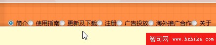
嗯!簡直太惡心了!火速進行樣式定義:
Code
<Grid.Resources>
<StyleTargetType="RadioButton">
<SetterProperty="VerticalAlignment"Value="Bottom"/>
<SetterProperty="Cursor"Value="Hand"/>
<SetterProperty="Foreground"Value="#CFFF"/>
<SetterProperty="FontSize"Value="16"/>
<SetterProperty="Margin"Value="0,0,8,0"/>
<SetterProperty="Template">
<Setter.Value>
<ControlTemplateTargetType="RadioButton">
<Borderx:Name="tag"Margin="0,0,0,1"BorderThickness="1,1,1,0"CornerRadius="3,3,0,0"Padding="18,4,18,3">
<Border.BorderBrush>
<LinearGradIEntBrushStartPoint="0,0"EndPoint="0,1">
<GradIEntStopColor="#FFEF7300"Offset="0"/>
<GradIEntStopColor="#FFC55300"Offset="0.2"/>
</LinearGradIEntBrush>
</Border.BorderBrush>
<Border.Background>
<LinearGradIEntBrushEndPoint="0.5,1"StartPoint="0.5,0">
<GradIEntStopColor="#FFD04B00"Offset="1"/>
<GradIEntStopColor="#FFFF7816"Offset="0.5"/>
<GradIEntStopColor="#FFF26802"Offset="0.5"/>
<GradIEntStopColor="#FFFF9D56"Offset="0"/>
</LinearGradIEntBrush>
</Border.Background>
<TextBlockText="{TemplateBindingContent}"/>
</Border>
<ControlTemplate.Triggers>
<TriggerProperty="IsChecked"Value="True">
<SetterProperty="Foreground"Value="#B84901"/>
<SetterTargetName="tag"Property="Margin"Value="0"/>
<SetterTargetName="tag"Property="Padding"Value="18,4"/>
<SetterTargetName="tag"Property="Background">
<Setter.Value>
<LinearGradIEntBrushEndPoint="0.5,1"StartPoint="0.5,0">
<GradIEntStopColor="#FFF1D1"Offset="1"/>
<GradIEntStopColor="#FFF7E5"Offset="0.5"/>
<GradIEntStopColor="#FFF1D0"Offset="0.5"/>
<GradIEntStopColor="#FFF9EA"Offset="0"/>
</LinearGradIEntBrush>
</Setter.Value>
</Setter>
<SetterTargetName="tag"Property="BorderBrush"Value="#FFFBF0"/>
</Trigger>
</ControlTemplate.Triggers>
</ControlTemplate>
</Setter.Value>
</Setter>
</Style>
</Grid.Resources>
簡單說,上面這些就是一個上面圓角下面直角的Border,裡面嵌入文字,並在被選中後改變一下顏色和向下的外邊距(Margin),且為了保持高度不變,內邊距(Padding)也隨之進行了調整。

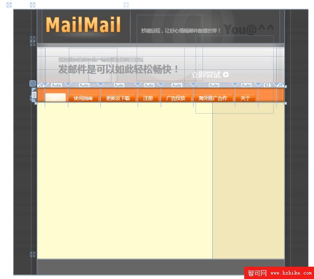
現在的設計視圖完整效果:
至此,主頁面完整代碼:
Code
<Page
 XMLns="http://schemas.microsoft.com/winfx/2006/xaml/presentation"
 XMLns:x="http://schemas.microsoft.com/winfx/2006/xaml"
 WindowTitle="MailMail"
 FontFamily="微軟雅黑"
 Background="#FF424242"
 SnapsToDevicePixels="True">
  <Page.Resources>
    <ResourceDictionary>
      <ResourceDictionary.MergedDictionarIEs>
        <ResourceDictionarySource="back.xaml"/>
        <ResourceDictionarySource="logo.xaml"/>
        <ResourceDictionarySource="go.xaml"/>
        <ResourceDictionarySource="barback.xaml"/>
      </ResourceDictionary.MergedDictionarIEs>
    </ResourceDictionary>
  </Page.Resources>
  <ScrollVIEwerHorizontalScrollBarVisibility="Auto"VerticalScrollBarVisibility="Auto">
    <GridMinHeight="900"MinWidth="1000"Background="{StaticResourceback}">
      <Grid.ColumnDefinitions>
        <ColumnDefinitionWidth="8*"/>
        <ColumnDefinitionWidth="84*"/>
        <ColumnDefinitionWidth="8*"/>
      </Grid.ColumnDefinitions>
      <Grid.Resources>
        <LinearGradIEntBrushx:Key="LightLeft"StartPoint="0,0"EndPoint="1,0">
          <GradIEntStopColor="#00FFFFFF"Offset="0.1"/>
          <GradIEntStopColor="#08FFFFFF"Offset="0.4"/>
          <GradIEntStopColor="#08FFFFFF"Offset="0.6"/>
          <GradIEntStopColor="#00FFFFFF"Offset="1"/>
        </LinearGradIEntBrush>
        <LinearGradIEntBrushx:Key="LightRight"StartPoint="1,0"EndPoint="0,0">
          <GradIEntStopColor="#00FFFFFF"Offset="0.1"/>
          <GradIEntStopColor="#08FFFFFF"Offset="0.4"/>
          <GradIEntStopColor="#08FFFFFF"Offset="0.6"/>
          <GradIEntStopColor="#00FFFFFF"Offset="1"/>
        </LinearGradIEntBrush>
        <LinearGradIEntBrushx:Key="ShadowLeft"StartPoint="0,0"EndPoint="1,0">
          <GradIEntStopColor="#00000000"Offset="0.1"/>
          <GradIEntStopColor="#18000000"Offset="0.4"/>
          <GradIEntStopColor="#18000000"Offset="0.6"/>
          <GradIEntStopColor="#00000000"Offset="1"/>
        </LinearGradIEntBrush>
        <LinearGradIEntBrushx:Key="ShadowRight"StartPoint="1,0"EndPoint="0,0">
          <GradIEntStopColor="#00000000"Offset="0.1"/>
          <GradIEntStopColor="#18000000"Offset="0.4"/>
          <GradIEntStopColor="#18000000"Offset="0.6"/>
          <GradIEntStopColor="#00000000"Offset="1"/>
        </LinearGradIEntBrush>
      </Grid.Resources>
      <RectangleWidth="20"Grid.Column="0"HorizontalAlignment="Right"Margin="0,0,0,0">
        <Rectangle.Fill>
          <LinearGradIEntBrushStartPoint="1,0"EndPoint="0,0">
            <GradIEntStopColor="#00000000"Offset="1"/>
            <GradIEntStopColor="#20000000"Offset="0"/>
          </LinearGradIEntBrush>
        </Rectangle.Fill>
      </Rectangle>
      <RectangleWidth="20"Grid.Column="3"HorizontalAlignment="Left"Margin="0,0,0,0">
        <Rectangle.Fill>
          <LinearGradIEntBrushStartPoint="1,0"EndPoint="0,0">
            <GradIEntStopColor="#00000000"Offset="0"/>
            <GradIEntStopColor="#20000000"Offset="1"/>
          </LinearGradIEntBrush>
        </Rectangle.Fill>
      </Rectangle>
      <DockPanelBackground="#FFF"Grid.Column="1">
        <DockPanelx:Name="Head"DockPanel.Dock="Top"Background="#FF4A4A4A"Height="115">
          <RectangleDockPanel.Dock="Left"Width="16"Fill="{StaticResourceLightLeft}"/>
          <RectangleDockPanel.Dock="Right"Width="16"Fill="{StaticResourceLightRight}"/>
          <RectangleFill="{StaticResourcelogo}"Margin="0"Width="300"Height="125"DockPanel.Dock="Left"/>
          <RectangleHeight="75"Width="1"DockPanel.Dock="Left">
            <Rectangle.Fill>
              <LinearGradIEntBrushStartPoint="0,0"EndPoint="0,1">
                <GradIEntStopColor="#03FFFFFF"Offset="0"/>
                <GradIEntStopColor="#5DFFFFFF"Offset="0.5"/>
                <GradIEntStopColor="#00FFFFFF"Offset="1"/>
              </LinearGradIEntBrush>
            </Rectangle.Fill>
          </Rectangle>
          <CanvasClipToBounds="True">
            <Canvas.Background>
              <RadialGradientBrushRadiusX="0.395548"RadiusY="0.952428"Center="0.343334,0.578031"GradIEntOrigin="0.543334,0.578031">
                <RadialGradientBrush.GradIEntStops>
                  <GradIEntStopColor="#23FFFCE5"Offset="0"/>
                  <GradIEntStopColor="#00FFFFFF"Offset="1"/>
                </RadialGradientBrush.GradIEntStops>
                <RadialGradIEntBrush.RelativeTransform>
                  <TransformGroup>
                    <SkewTransformCenterX="0.343334"CenterY="0.578031"AngleX="-6.15299"AngleY="0"/>
                    <RotateTransformCenterX="0.343334"CenterY="0.578031"Angle="-6.59875"/>
                  </TransformGroup>
                </RadialGradIEntBrush.RelativeTransform>
              </RadialGradIEntBrush>
            </Canvas.Background>
            <LabelMargin="52,-177,0,0"Foreground="#09FFFFFF"FontFamily="Nina"FontWeight="Bold"FontSize="354">
              <Label.RenderTransform>
                <RotateTransformAngle="0"CenterX="172"CenterY="240"/>
              </Label.RenderTransform>
              <Label.Triggers>
                <EventTriggerRoutedEvent="FrameworkElement.Loaded">
                  <EventTrigger.Actions>
                    <BeginStoryboard>
                      <Storyboard>
                        <DoubleAnimationTo="360"Duration="0:0:10"RepeatBehavior="Forever"Storyboard.TargetProperty="(Label.RenderTransform).(RotateTransform.Angle)"/>
                      </Storyboard>
                    </BeginStoryboard>
                  </EventTrigger.Actions>
                </EventTrigger>
              </Label.Triggers>
              @
            </Label>
            <LabelMargin="312,35,0,0"Foreground="#61000000"FontFamily="Nina"FontWeight="Bold"FontSize="44">You@^^</Label>
            <LabelMargin="32,57,0,0"Foreground="#AFC3C3C3"FontWeight="Bold"FontSize="16">