網頁設計制作之改進超級鏈接效果
編輯:HTML和Xhtml
超鏈接可以使訪問者從一個頁面跳轉至另外一個頁面,或從一個站點跳轉至另外一個站點。但是,這種頻繁的跳轉可能使人們產生焦慮。
To help users browse with confidence, links should be absolutely clear and explicit.
為了方便用戶更好的浏覽頁面,超鏈接必須絕對的簡潔明了。
Principles
法則
1. Text hyperlinks should be clearly distinguishable from normal text.
超鏈接文字必須與普通的內容文字相區別
2. Any mouseover behaviour should have a highlighting effect.
鼠標移動到超鏈接上時必須要顯示突出效果
3.Hyperlink content should be as short as possible, yet long enough to identify either:
超鏈接的具體內容必須要言簡意赅(短而精):
<!--[if !supportLists]-->· <!--[endif]-->Where you'll go [跳轉地址]
<!--[if !supportLists]-->· <!--[endif]-->What you'll get [希望獲取什麼內容]
<!--[if !supportLists]-->· <!--[endif]-->What you want to happen [希望產生什麼效果]
4. Hyperlinks with different targets should be clearly distinguishable.
指向不同目標的超鏈接必須要清晰可辨
5. Hyperlinks should give an indication of any unanticipated consequences, e.g.:
對點擊超鏈接後會出現的特殊情況加以解釋,如:
<!--[if !supportLists]-->· <!--[endif]-->Links to files [鏈接至一個文件]
<!--[if !supportLists]-->· <!--[endif]-->Links that open or close windows [點擊鏈接後會打開或關閉窗口]
What do you make a link?
考慮一下制作這個超鏈接的目的是什麼
Hyperlink content example: Amapproved.com
超鏈接內容舉例:Amapproved.com
A site for locating approved Aston Martins, and it's good on the whole. This is the search results screen. Guess how you get from search results to see the details on a particular vehicle? The only link is the vehicle model (in the Vehicle summary column).
這個案例是Aston Martins [阿斯頓·馬丁] 汽車的網站。可以這樣說,它的整體外觀設計堪稱經典。這是一個搜索結果顯示頁面。那麼現在,你想象一下,該如何通過搜索結果的方式來查閱有關車輛的詳細介紹。這裡僅有的超鏈接就是關於“Vehicle summary column [車輛基本列表]”中的“vehicle model[車輛模型]”。
The first, and biggest problem, is that you can't distinguish the hyperlinks, breaking Principle 1. You don't know where to click to get more information: you have to guess.
首先所面臨的最大問題就是,你不能區分那個是超鏈接。這違反了法則1,即:你不知道該點擊那裡來獲取更多的信息,因此,你必須先考慮這個問題
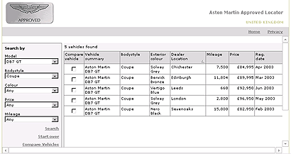
The second problem is: The links look the same although they point to completely different targets (each one is a different used Aston Martin). This breaks Principle 4. Because all the links on this page have the same content (the vehicle model), it's even less obvious that they might be the link.
第二個問題是:盡管這些鏈接指向完全不同的目標(每個不同的鏈接都使用了名稱“Aston Martin”),但它們看上去幾乎一樣,這就違反了上述的法則4;再加上所有的鏈接都包含了相同的內容 (vehicle model [車輛類型]),這就使得超鏈接更加不明顯。
If I click on "Aston Martin DB7 GT", I would expect to get general information about the Aston Martin DB7 GT car. This breaks Principle 3, because the link is not accurately describing what I'll get if I click it.
如果我點擊“Aston Martin DB7 GT”這個鏈接,希望獲取關於“Aston Martin DB7 GT”型汽車的大體信息。但是,我發現最終獲取的信息和鏈接的描述存在出入。那麼,這就違反了法則3。
What should they do?
網站該如何改進?
The "thing you get" is the information about a particular car. The thing that represents the particular car is the entire table row. There is no other unique identifier for the car (mileage, price etc. aren't necessarily unique). Therefore, the whole row should be the clickable hyperlink. (It would also be helpful if the row changed colour/tone on mouseover).
“thing you get [你所獲取的資料]”應該是與一輛汽車相關的信息,這些代表特定車型的信息應該占據整個表格列;同時,因為這裡沒有包含具體車型信息(如:英裡數、價格等)的確認對象,所以,表格的整列必須作為可點擊的超鏈接對象。(如果鼠標移至超鏈接上能夠產生變色效果的話,將更有助於辨認)。
Expressing size in hyperlinks
描述超鏈接對象的尺寸大小
It's quite common to find computers putting out this kind of information to set user's expectations when linking to a file:
當鏈接到一個文件時,我們通常會發現超鏈接上包含一段關於文件大小尺寸的描述,這有助於用戶決定自己的意願(即:是否點擊該文件鏈接)。
如:PDF (46,764 bytes)
Thinking about the user's goals, what they need is to know roughly how long the download will take: will it be a few seconds, or minutes? That's generally as accurate as it needs to be.
好好思考一下用戶的目標是什麼,通常情況下,他們需要知道下載需要花去多長時間:是幾秒鐘,還是幾分鐘?因此,我們應該對其作出盡可能精准的描述。
What should it be?
應該怎樣描述上述的文件尺寸呢?
There's no benefit at all in showing more than two significant figures in file sizes. Above should be 47KB. Also, only ever use kilobytes or megabytes for file sizes online. (Good, useful file sizes to 2 significant figures run: 4.7KB, 47KB, 470KB, 4.7MB etc.)
對文件尺寸的描述最好不要超過兩位有效數字。上述文件尺寸應該寫成47KB。因此,網絡上應盡可能地使用千字節(kb)或兆字節(mb)對文件進行描述。(我們推薦的2位數字描述法如下:4.7KB, 47KB, 470KB, 4.7MB等等)
Formatting hyperlinks
對超鏈接定義格式
If we have to differentiate text hyperlinks from other text, should this be done with colour or formatting such as underlining/emboldening?
如果我們需要在一個文本中區分不同的文字鏈接,我們應該對超鏈接的部分使用不同於普通文本的顏色,或者對超鏈的文字加上下劃線,或者加粗。
The de facto convention has been that hyperlinks are rendered in blue with underlines, that they turn red when clicked, and that visited links are purple.
默認的超鏈接動作對應的顏色變化是:起初,超鏈接是藍色的,並帶有下劃線;當點擊時,它會變成紅色;訪問過的超鏈接將會以紫色顯示。
The most readable way to render most text is black on a white background, and making text hyperlinks blue (#
最常用的增加超鏈接可讀性的方法是:整體頁面為黑字白底,文字超鏈接為藍色(#
超鏈接的顏色可以有灰色替代藍色,帶不帶有下劃線均可。
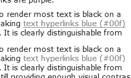
It's appropriate to ask if differentiating by colour alone will work for people who are colourblind. The image above is a screen capture of this page, totally desaturated. It shows that, even without colour, there is sufficient tonal difference between black and blue to make the hyperlink clear. The underlined version is a little bit clearer, but showing underline on hover would serve a similar purpose.
同時你還要考慮到如果僅僅依靠顏色的變化來區分超鏈接狀態的話,那麼色盲們可以接受嗎?最好是詢問一下他們是否能辨別這些顏色。上面的圖片是頁面截圖,從上面的圖片中你可以看到,即使不使用超鏈接的顏色變化效果,僅使用黑色和藍色也能夠很清楚的辨認出超鏈接。給超鏈接加上下劃線將更有助於用戶辨認超鏈接;或者是當鼠標經過超鏈接時出現下劃線,這樣也能達到同樣的效果。
超鏈接是否需要帶有下劃線?
Underlining works okay for occasional inline links.
對於不經常使用的內置超鏈接可以加上下劃線。
It makes the link stand out a little more than colour alone.
通過對超鏈接使用下劃線(與僅對超鏈接進行顏色變化)更能起到突出超鏈接的作用。
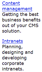
In this example, the underlining works well to distinguish article titles from the sub-title.
在這個案例中,下劃線可以清楚地區分主標題和二級標題。
I think underlining becomes unhelpful when there are numerous inline links in paragraphs, in lists of links, and when there are lots of sets of links on a page.
如果段落中、鏈接列表中或頁面中的超鏈接過多,那對這些鏈接使用下劃線將起不到任何突出作用。
下面兩組超鏈接效果的對比。左邊的超鏈接包含下劃線,右邊則不包含下劃線,具體如下:
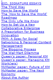
Notice how it's quicker and easier to read the non-underlined blocks of text.
請注意:如果像上面這樣的鏈接列表,那麼不使用下劃線將更有助於快速、簡便地閱讀。
In this second example, I have also adjusted the line spacing to make the related words clearer.
在第二個案例中,我還調整了單詞之間的間距以使其看上去更加清晰。
Consistency
一致性
It is important that hyperlink formats behave consistently across pages.
還有一點很重要,就是所有頁面的超鏈接格式最好保持一致。
Obviously, where some text links are on different backgrounds, such as in navigation bars, they may need to use special colours or treatments.
很顯然,當超鏈接位於不同的背景時,如:位於導航條內,那麼我們將對其使用特別的顏色和效果。
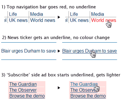
The above snippets are taken from the Guardian Online homepage
上面的片斷來自於Guardian Online的首頁。
While most links look similar (#036, mainly not underlined, there are several very different styles applied on the hover, when the mouse pointer moves over the active link.
上面的超鏈接格式看上去基本相同(字體顏色#036,超鏈接基本上不帶下劃線,當鼠標經過超鏈接時產生的效果各不相同)。
The psychological effect is disconcerting: you are left doubting whether all links will do similar things (i.e. go to another page on this site), or whether you might be taken unexpectedly somewhere else. I think that this schizophrenic behaviour weakens the brand experience, as well as diminishing usability.
從心裡學角度講,這樣的效果處理會讓人感到不安;同時,你會對此留有疑慮:是否所用的鏈接全是這樣(包括其它頁面);是否會鏈接到一個出乎意料的地方。我認為,這種讓人感到精神分裂的效果處理方法將削弱用戶對該網站品牌的映像,同時,網站的可用性也將大打折扣。
There is no good reason to treat all the hyperlinks differently. The third example also breaks the second principle, because its colour change makes it weaker, less noticeable, which is not 'highlighting'.
我們不可以對所有的超鏈接都使用不同的效果。上面的第三個案例違反了第二個法則;因為不同的顏色變化使超變得毫無重點,根本起不到突出的作用
Conclusion
結論
On balance, it seems that the predominant convention in the industry is to keep #
總而言之,最具特點的超鏈接顏色效果變化是:使用 #
I think that this provides the best balance of functionality when applied consistently to inline hyperlinks and grouped hyperlinks.
我認為:對所有的內置超鏈接和群組超鏈接使用相同的效果變化能夠在其功能性保持最好的平衡。
小編推薦
熱門推薦