上一篇中我進行了一下效果展示和概述,此篇開始將重現我此次嘗試的步驟,我想大家通過閱讀這些步驟,可以了解到XAML網頁排版的方法。
下面就開始編寫XAML,首先來定義一下頁面的屬性:
<Page
 XMLns="http://schemas.microsoft.com/winfx/2006/xaml/presentation"
 XMLns:x="http://schemas.microsoft.com/winfx/2006/xaml"
 WindowTitle="MailMail"
 FontFamily="微軟雅黑"
 Background="#FF424242"
 SnapsToDevicePixels="True"></Page>
WindowTitle就是頁面標題。
SnapsToDevicePixels屬性很重要,它會使我們的圖像自動進行像素對齊,從而去除模糊的邊緣,這可以使我們的網頁看起來更像傳統網頁。
接下來這一點很有趣,我們要在頁面中放置ScrollViewer,否則我們的網頁超出屏幕的時候不會顯示滾動條,連這個都要我們自助使用了: <ScrollViewer HorizontalScrollBarVisibility="Auto" VerticalScrollBarVisibility="Auto"></ScrollVIEwer>
把橫向和縱向滾動條的顯示屬性都設為Auto是個比較好的方案,這樣在不需要的時候就會自動隱藏了。
ScrollVIEwer中要放置一個Grid用於總體布局:
    <Grid MinHeight="900" MinWidth="1000">
      <Grid.ColumnDefinitions>
        <ColumnDefinition Width="8*"/>
        <ColumnDefinition Width="84*"/>
        <ColumnDefinition Width="8*"/>
      </Grid.ColumnDefinitions>
    </Grid>
其中定義了三個列,兩邊8%留作空白,中間84%是頁面主體。
在Grid裡放置DockPanel用於細化布局:
<DockPanel Background="#FFF" Grid.Column="1"></DockPanel>
DockPanel中裝載的就是頁面的各個區塊了:
        <DockPanel x:Name="Head" DockPanel.Dock="Top" Background="#FF4A4A4A" Height="115"></DockPanel>
        <Border x:Name="HeadLine" Background="#888" BorderThickness="0,1" DockPanel.Dock="Top" Height="15"></Border>
        <Grid x:Name="Show" Background="#EEE" DockPanel.Dock="Top" Height="135" ClipToBounds="True"></Grid>
        <Border x:Name="Channel" DockPanel.Dock="Top" Height="50" Background="#FF8E45" BorderThickness="0,1,0,0" BorderBrush="#FFF"></Border>
        <Border x:Name="Footer" Background="#666" BorderBrush="#888" BorderThickness="0,4,0,0" DockPanel.Dock="Bottom" Height="55"></Border>
        <DockPanel x:Name="Body" Background="#FFFFFCD1"></DockPanel>
僅僅通過DockPanel.Dock屬性就可以將各個區塊完美的放置到它所應處的位置,實際應用中可以比這復雜很多,但實現起來依然是非常簡單。
PS:掌握了WPF布局後,再去其他環境中布局,都會有捶牆的沖動~
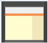
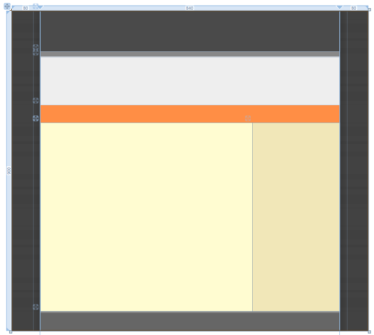
現在我們的界面就是下面這樣了:
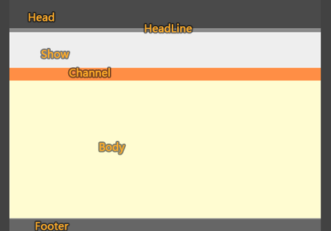
我把每個區塊都命名並對應到此圖上,這只是為了便於理解,並不是必需的。
在Body中加入兩個區塊,即邊欄和內容:
          <DockPanel x:Name="Side" Background="#1E874900" DockPanel.Dock="Right" Width="245"></DockPanel>
          <StackPanel x:Name="Content"></StackPanel>
其實不用Body,直接把這兩個元素放在上層使用也沒有問題,我在這裡是希望它們有一個共同的背景才這樣設計的。
到此為止我們的代碼如下:
Code
<Page
 XMLns="http://schemas.microsoft.com/winfx/2006/xaml/presentation"
 XMLns:x="http://schemas.microsoft.com/winfx/2006/xaml"
 WindowTitle="MailMail"
 FontFamily="微軟雅黑"
 Background="#FF424242"
 SnapsToDevicePixels="True">
   <ScrollVIEwer HorizontalScrollBarVisibility="Auto" VerticalScrollBarVisibility="Auto">
    <Grid MinHeight="900" MinWidth="1000">
      <Grid.ColumnDefinitions>
        <ColumnDefinition Width="8*"/>
        <ColumnDefinition Width="84*"/>
        <ColumnDefinition Width="8*"/>
      </Grid.ColumnDefinitions>
      <DockPanel Background="#FFF" Grid.Column="1">
        <DockPanel x:Name="Head" DockPanel.Dock="Top" Background="#FF4A4A4A" Height="115"></DockPanel>
        <Border x:Name="HeadLine" Background="#888" BorderThickness="0,1" DockPanel.Dock="Top" Height="15"></Border>
        <Grid x:Name="Show" Background="#EEE" DockPanel.Dock="Top" Height="135" ClipToBounds="True"></Grid>
        <Border x:Name="Channel" DockPanel.Dock="Top" Height="50" Background="#FF8E45" BorderThickness="0,1,0,0" BorderBrush="#FFF"></Border>
        <Border x:Name="Footer" Background="#666" BorderBrush="#888" BorderThickness="0,4,0,0" DockPanel.Dock="Bottom" Height="55"></Border>
        <DockPanel x:Name="Body" Background="#FFFFFCD1">
          <DockPanel x:Name="Side" DockPanel.Dock="Right" Width="245"></DockPanel>
          <StackPanel x:Name="Content"></StackPanel>
        </DockPanel>
      </DockPanel>
    </Grid>
  </ScrollVIEwer>
</Page>
它現在只包含了頁面的框架結構和一點簡單的樣式。
接下來要進行一些美化。
打開 Microsoft Expression Design ,先來制作頁面的背景填充圖:
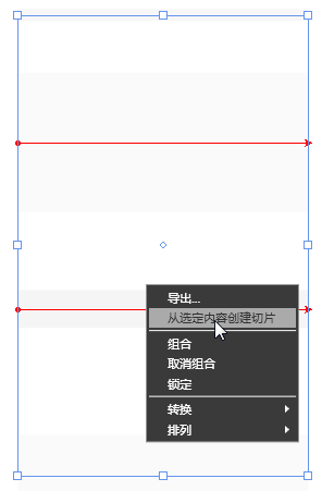
新建一個名為back的層,隨便畫幾條平行的線條,線條顏色設為黑色,然後為它們指定不同的寬度,以及非常低的不透明度,低到你幾乎看不出它們來。
然後選中它們,點擊右鍵 > 從選定內容創建切片,然後這樣設置切片屬性:
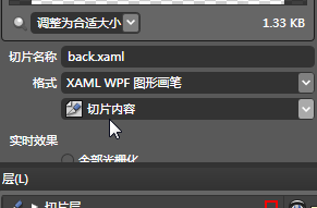
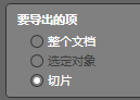
之後執行:文件 > 導出..
在“要導出的項”一欄選中“切片”
選則我們的切片,點擊“全部導出”按鈕右側的箭頭,選擇“導出選定切片”菜單項
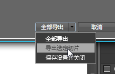
這系列操作可以讓我們把每個切片都保存到獨立的文件中,並且可以控制我們需要導出哪些切片,在以後的導出中都應采用這種方法。
導出的XAML內容如下:
Code
<?XML version="1.0" encoding="utf-8"?>
<ResourceDictionary xmlns="http://schemas.microsoft.com/winfx/2006/xaml/presentation" XMLns:x="http://schemas.microsoft.com/winfx/2006/xaml">
<DrawingBrush x:Key="back" Stretch="Uniform">
<DrawingBrush.Drawing>
<DrawingGroup ClipGeometry="F1 M 0,0L 395.017,0L 395.017,466L 0,466L 0,0">
<DrawingGroup.Children>
<GeometryDrawing Geometry="F1 M 64,5.5L 331.017,5.5">
<GeometryDrawing.Pen>
<Pen Thickness="11" LineJoin="Round" Brush="#08000000"/>
</GeometryDrawing.Pen>
</GeometryDrawing>
<GeometryDrawing Geometry="F1 M 64,122.5L 331.017,122.5">
<GeometryDrawing.Pen>
<Pen Thickness="128" LineJoin="Round" Brush="#06000000"/>
</GeometryDrawing.Pen>
</GeometryDrawing>
<GeometryDrawing Geometry="F1 M 64,428.501L 331.017,428.501">
<GeometryDrawing.Pen>
<Pen Thickness="75" LineJoin="Round" Brush="#06000000"/>
</GeometryDrawing.Pen>
</GeometryDrawing>
<GeometryDrawing Geometry="F1 M 64,275.5L 331.017,275.5">
<GeometryDrawing.Pen>
<Pen Thickness="35" LineJoin="Round" Brush="#0B000000"/>
</GeometryDrawing.Pen>
</GeometryDrawing>
</DrawingGroup.Children>
</DrawingGroup>
</DrawingBrush.Drawing>
</DrawingBrush>
</ResourceDictionary>
我們需要給“<DrawingBrush x:Key="back" Stretch="Uniform">”中加入幾個屬性:
ViewportUnits="Absolute" VIEwport="0,0,55,145" TileMode="FlipXY"
這些屬性控制了圖像的填充方式。
現在回到主文檔,准備載入這個背景,先將其以資源字典的形式引用:
  <Page.Resources>
    <ResourceDictionary>
      <ResourceDictionary.MergedDictionarIEs>
        <ResourceDictionary Source="back.xaml"/>
      </ResourceDictionary.MergedDictionarIEs>
    </ResourceDictionary>
  </Page.Resources>
然後為Grid加入背景屬性設置:
<Grid MinHeight="900" MinWidth="1000" Background="{StaticResource back}">
這樣就完成了頁面背景樣式的設置。
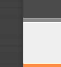
你會發覺頁面主體的部分區塊與頁面背景的邊際不夠明顯:
我們可以使用偽陰影來突出主體,即通過在頁面主題兩側加入兩個黑色到透明的漸變,我們通過在Grid中加入兩個矩形來實現:
      <Rectangle Width="20" Grid.Column="0" HorizontalAlignment="Right" Margin="0,0,0,0">
        <Rectangle.Fill>
          <LinearGradIEntBrush StartPoint="1,0" EndPoint="0,0">
            <GradIEntStop Color="#00000000" Offset="1" />
            <GradIEntStop Color="#20000000" Offset="0" />
          </LinearGradIEntBrush>
        </Rectangle.Fill>
      </Rectangle>
      <Rectangle Width="20" Grid.Column="3" HorizontalAlignment="Left" Margin="0,0,0,0">
        <Rectangle.Fill>
          <LinearGradIEntBrush StartPoint="1,0" EndPoint="0,0">
            <GradIEntStop Color="#00000000" Offset="0" />
            <GradIEntStop Color="#20000000" Offset="1" />
          </LinearGradIEntBrush>
        </Rectangle.Fill>
      </Rectangle>
下面兩圖分別是設計效果和實際效果:
至此我們完成了基本的框架設計,現在設計視圖中的效果如下:
到目前為止的全部代碼:
Code
<Page
 XMLns="http://schemas.microsoft.com/winfx/2006/xaml/presentation"
 XMLns:x="http://schemas.microsoft.com/winfx/2006/xaml"
 WindowTitle="MailMail"
 FontFamily="微軟雅黑"
 Background="#FF424242"
 SnapsToDevicePixels="True">
  <Page.Resources>
    <ResourceDictionary>
      <ResourceDictionary.MergedDictionarIEs>
        <ResourceDictionary Source="back.xaml"/>
      </ResourceDictionary.MergedDictionarIEs>
    </ResourceDictionary>
  </Page.Resources>
  <ScrollVIEwer HorizontalScrollBarVisibility="Auto" VerticalScrollBarVisibility="Auto">
    <Grid MinHeight="900" MinWidth="1000" Background="{StaticResource back}">
      <Grid.ColumnDefinitions>
        <ColumnDefinition Width="8*"/>
        <ColumnDefinition Width="84*"/>
        <ColumnDefinition Width="8*"/>
      </Grid.ColumnDefinitions>
      <Rectangle Width="20" Grid.Column="0" HorizontalAlignment="Right" Margin="0,0,0,0">
        <Rectangle.Fill>
          <LinearGradIEntBrush StartPoint="1,0" EndPoint="0,0">
            <GradIEntStop Color="#00000000" Offset="1" />
            <GradIEntStop Color="#20000000" Offset="0" />
          </LinearGradIEntBrush>
        </Rectangle.Fill>
      </Rectangle>
      <Rectangle Width="20" Grid.Column="3" HorizontalAlignment="Left" Margin="0,0,0,0">
        <Rectangle.Fill>
          <LinearGradIEntBrush StartPoint="1,0" EndPoint="0,0">
            <GradIEntStop Color="#00000000" Offset="0" />
            <GradIEntStop Color="#20000000" Offset="1" />
          </LinearGradIEntBrush>
        </Rectangle.Fill>
      </Rectangle>
      <DockPanel Background="#FFF" Grid.Column="1">
        <DockPanel x:Name="Head" DockPanel.Dock="Top" Background="#FF4A4A4A" Height="115"></DockPanel>
        <Border x:Name="HeadLine" Background="#888" BorderThickness="0,1" DockPanel.Dock="Top" Height="15"></Border>
        <Grid x:Name="Show" Background="#EEE" DockPanel.Dock="Top" Height="135" ClipToBounds="True"></Grid>
        <Border x:Name="Channel" DockPanel.Dock="Top" Height="50" Background="#FF8E45" BorderThickness="0,1,0,0" BorderBrush="#FFF"></Border>
        <Border x:Name="Footer" Background="#666" BorderBrush="#888" BorderThickness="0,4,0,0" DockPanel.Dock="Bottom" Height="55"></Border>
        <DockPanel x:Name="Body" Background="#FFFFFCD1">
          <DockPanel x:Name="Side" Background="#1E874900" DockPanel.Dock="Right" Width="245"></DockPanel>
          <StackPanel x:Name="Content"></StackPanel>
        </DockPanel>
      </DockPanel>
    </Grid>
  </ScrollVIEwer>
</Page>
本篇至此結束,在後續的篇章中將繼續講解頁面主體中各個區塊的制作。
文中如有不妥的地方,歡迎隨時指正,我不介意聽到異議,分歧是交流和進步的開始,我也有太多東西需要向各位學習:)
- 上一頁:用XAML做網頁!!—頁頭
- 下一頁:用XAML做網頁!!—開篇