有開發者表示,HTML5將給個人開發者帶來更多機遇。下面的稿件詳細描述了一個唯美的動畫效果,它實現了在同一個頁面中進行登錄表單和注冊表單的轉換。這些效果,完全由HTML5和CSS3實現。文章後面附上了三種不同風格的顯示轉換效果、以及源碼下載。既可為網頁瘦身,又可實現漂亮的網頁效果,快快收藏吧。
這篇稿件將描述如何在HTML5中,使用CSS3的目標偽類“:target”來創建注冊和登錄兩個表單、並實現它們在同一個頁面中的顯示轉換。此演示目的是向用戶展示從登錄表單點擊標注有“Join us”的按鈕鏈接到注冊表單的動畫效果。我們將在文章末尾附上本實例的源碼下載地址。
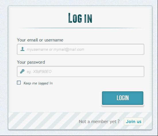
點擊右下方Join us按鈕,登錄表單隱藏,注冊表單顯現
請注意,此實例只用於演示目的,它只能在支持“:target”偽類的浏覽器中正常顯示出來。
HTML部分
在HTML中定義有兩個表單,其中一個表單已用CSS隱藏使之不可見。來看看代碼:
<div id="container_demo" >
<!-- hidden anchor to stop jump http://www.css3create.com/Astuce-Empecher-le-scroll-avec-l-utilisation-de-target#wrap4 -->
<a class="hiddenanchor" id="toregister"></a>
<a class="hiddenanchor" id="tologin"></a>
<div id="wrapper">
<div id="login" class="animate form">
<form action="mysuperscript.php" autocomplete="on">
<h1>Log in</h1>
<p>
<label for="username" class="uname" data-icon="u" > Your email or username </label>
<input id="username" name="
username" required="required" type="text" placeholder="myusername or mymail@mail.com"/>
</p>
<p>
<label for="password" class="youpasswd" data-icon="p"> Your password </label>
<input id="password" name="password" required="required" type="password" placeholder="eg. X8df!90EO" />
</p>
<p class="keeplogin">
<input type="checkbox" name="loginkeeping" id="loginkeeping" value="loginkeeping" />
<label for="loginkeeping">Keep me logged in</label>
</p>
<p class="login button">
<input type="submit" value="Login" />
</p>
<p class="change_link">
Not a member yet ?
<a href="#toregister" class="to_register">Join us</a>
</p>
</form>
</div>
<div id="register" class="animate form">
<form action="mysuperscript.php" autocomplete="on">
<h1> Sign up </h1>
<p>
<label for="usernamesignup" class="uname" data-icon="u">Your username</label>
<input id="usernamesignup" name="
usernamesignup" required="required" type="text" placeholder="mysuperusername690" />
</p>
<p>
<label for="emailsignup" class="youmail" data-icon="e" > Your email</label>
<input id="emailsignup" name="
emailsignup" required="required" type="email" placeholder="mysupermail@mail.com"/>
</p>
<p>
<label for="passwordsignup" class="youpasswd" data-icon="p">Your password </label>
<input id="passwordsignup" name="
passwordsignup" required="required" type="password" placeholder="eg. X8df!90EO"/>
</p>
<p>
<label for="passwordsignup_confirm" class="youpasswd" data-icon="p">Please confirm your password </label>
<input id="passwordsignup_confirm" name="
passwordsignup_confirm" required="required" type="password" placeholder="eg. X8df!90EO"/>
</p>
<p class="signin button">
<input type="submit" value="Sign up"/>
</p>
<p class="change_link">
Already a member ?
<a href="#tologin" class="to_register"> Go and log in </a>
</p>
</form>
</div>
</div>
</div>
可以看到在上面的代碼中,使用了一些HTML5不錯的新功能。比如在input type方面,實現密碼自動隱藏用戶鍵入點替換(當然這取決於浏覽器是否支持)。用浏覽器檢查輸入類型的電子郵件是否是正確格式等。
有兩個環節要記住。你可能已經注意到表單項部的兩個鏈接。當我們點擊並觸發目標偽類時,我們就能通過“錨”標記(HTML中一種跳轉定位方式,一般用於長網頁)在原網頁中跳到合適的位置,而不用另打開一個新網頁。第二個動作與所用圖標、字體相關。我們為顯示的圖標使用一個數據屬性。在HTML中通過設置“icon_character”,就可以選擇一個CSS來控制所有的圖標風格樣式。(這裡對於錨標記的使用可能會有些糊塗,但看到後面就會明白了。)
CSS部分
這裡將會出現一些CSS3的技巧代碼,請注意,可能有的浏覽器目前還不支持CSS3而無法正常顯示。
兩個CSS定義。(後面會說明為什麼要定義兩個CSS的原因。)
首先,為需要顯示的區域定義一個外觀。
#subscribe, #login{ position: absolute; top: 0px; width: 88%; padding: 18px 6% 60px 6%; margin: 0 0 35px 0; background: rgb(247, 247, 247); border: 1px solid rgba(147, 184, 189,0.8); box-shadow: 0pt 2px 5px rgba(105, 108, 109, 0.7), 0px 0px 8px 5px rgba(208, 223, 226, 0.4) inset; border-radius: 5px; } #login{ z-index: 22; }
這裡定義了投影,以及如文章開始的那張圖上所示的藍色輝光。並賦值z-index為22。
下面是關於背景圖片樣式的代碼:
/**** general text styling ****/ #wrapper h1{ font-size: 48px; color: rgb(6, 106, 117); padding: 2px 0 10px 0; font-family: 'FranchiseRegular','Arial Narrow',Arial,sans-serif; font-weight: bold; text-align: center; padding-bottom: 30px; } /** For the moment only webkit supports the background-clip:text; */ #wrapper h1{ background: -webkit-repeating-linear-gradient(-45deg, rgb(18, 83, 93) , rgb(18, 83, 93) 20px, rgb(64, 111, 118) 20px, rgb(64, 111, 118) 40px, rgb(18, 83, 93) 40px); -webkit-text-fill-color: transparent; -webkit-background-clip: text; } #wrapper h1:after{ content:' '; display:block; width:100%; height:2px; margin-top:10px; background: linear-gradient(left, rgba(147,184,189,0) 0%, rgba(147,184,189,0.8) 20%, rgba(147,184,189,1) 53%, rgba(147,184,189,0.8) 79%, rgba(147,184,189,0) 100%); }
注意,由於目前只有WebKit浏覽器支持background-clip: text,為了在適應不同浏覽器,還要創建一個H1標題樣式:帶條紋背景的文本樣式。由於background-clip: text只適用於WebKit,所以這裡用WebKit作前綴,這也是為什麼要把CSS分成兩部分,並只使用來定義的原因。用WebKit作前綴是不太好的做法,僅用於這種演示示例。現在,WebKit的文本顏色透明度屬性可以派上用場了:它可以實現透明效果的背景樣式。
表單上,標題下方那條水平線的樣式也由一個after偽類控制。這裡使用了一個2px的高度和兩邊淡出的效果。
現在,接著進行樣式定義。
/**** advanced input styling ****/ /* placeholder */ ::-webkit-input-placeholder { color: rgb(190, 188, 188); font-style: italic; } input:-moz-placeholder, textarea:-moz-placeholder{ color: rgb(190, 188, 188); font-style: italic; } input { outline: none; }
為輸入樣式定義outline屬性,以便用戶能迅速輸入正確信息。如果你不打算定義outline,那也應該使用 :active 和 :focus來定義這些輸入樣式的狀態。
/* all the input except submit and checkbox */ #wrapper input:not([type="checkbox"]){ width: 92%; margin-top: 4px; padding: 10px 5px 10px 32px; border: 1px solid rgb(178, 178, 178); box-sizing : content-box; border-radius: 3px; box-shadow: 0px 1px 4px 0px rgba(168, 168, 168, 0.6) inset; transition: all 0.2s linear; } #wrapper input:not([type="checkbox"]):active, #wrapper input:not([type="checkbox"]):focus{ border: 1px solid rgba(91, 90, 90, 0.7); background: rgba(238, 236, 240, 0.2); box-shadow: 0px 1px 4px 0px rgba(168, 168, 168, 0.9) inset; }
這裡我們並不全是用偽類去定義輸入樣式,除了checkbox。因為刪除了outline屬性,所以這裡使用了 a :focus 和:active 狀態定義。自從不再為輸入樣式使用:before 和 :after偽類後,就使用圖標的label標簽進行設置。這裡使用了fontomas庫中的一些漂亮圖標。還記得data-icon 的屬性嗎?要把信息傳遞到正確的地方。這裡使用data-icon=’u’ 來表示用戶, ‘e’ 表示email, ‘p’ 表示密碼。一旦確定的信件,下載字體,用fontsquirrel字體引擎將這些信息轉換成@font-face兼容格式。
@font-face { font-family: 'FontomasCustomRegular'; src: url('fonts/fontomas-webfont.eot'); src: url('fonts/fontomas-webfont.eot?#iefix') format('embedded-opentype'), url('fonts/fontomas-webfont.woff') format('woff'), url('fonts/fontomas-webfont.ttf') format('truetype'), url('fonts/fontomas-webfont.svg#FontomasCustomRegular') format('svg'); font-weight: normal; font-style: normal; } /** the magic icon trick ! **/ [data-icon]:after { content: attr(data-icon); font-family: 'FontomasCustomRegular'; color: rgb(106, 159, 171); position: absolute; left: 10px; top: 35px; width: 30px; }
不用為每個圖標指定一個類,而是使用content: attr(data-icon) 來檢查data-icon屬性信息。所以只需要定義字體、顏色和位置。
現在,為兩個表單中的提交按鈕定義樣式。
/*styling both submit buttons */ #wrapper p.button input{ width: 30%; cursor: pointer; background: rgb(61, 157, 179); padding: 8px 5px; font-family: 'BebasNeueRegular','Arial Narrow',Arial,sans-serif; color: #fff; font-size: 24px; border: 1px solid rgb(28, 108, 122); margin-bottom: 10px; text-shadow: 0 1px 1px rgba(0, 0, 0, 0.5); border-radius: 3px; box-shadow: 0px 1px 6px 4px rgba(0, 0, 0, 0.07) inset, 0px 0px 0px 3px rgb(254, 254, 254), 0px 5px 3px 3px rgb(210, 210, 210); transition: all 0.2s linear; } #wrapper p.button input:hover{ background: rgb(74, 179, 198); } #wrapper p.button input:active, #wrapper p.button input:focus{ background: rgb(40, 137, 154); position: relative; top: 1px; border: 1px solid rgb(12, 76, 87); box-shadow: 0px 1px 6px 4px rgba(0, 0, 0, 0.2) inset; } p.login.button, p.signin.button{ text-align: right; margin: 5px 0; }
這裡是一個創建邊框投影的技巧,你可以隨意設置一條或多條邊框投影。這裡使用length value來創建一個“假”的第二條邊框,寬度為3px,無模糊效果。接著定義復選框的樣式:
/* styling the checkbox "keep me logged in"*/ .keeplogin{ margin-top: -5px; } .keeplogin input, .keeplogin label{ display: inline-block; font-size: 12px; font-style: italic; } .keeplogin input#loginkeeping{ margin-right: 5px; } .keeplogin label{ width: 80%; }
為表單使用重復線性漸變的樣式,以實現條紋背景效果。
p.change_link{ position: absolute; color: rgb(127, 124, 124); left: 0px; height: 20px; width: 440px; padding: 17px 30px 20px 30px; font-size: 16px ; text-align: right; border-top: 1px solid rgb(219, 229, 232); border-radius: 0 0 5px 5px; background: rgb(225, 234, 235); background: repeating-linear-gradient(-45deg, rgb(247, 247, 247) , rgb(247, 247, 247) 15px, rgb(225, 234, 235) 15px, rgb(225, 234, 235) 30px, rgb(247, 247, 247) 30px ); } #wrapper p.change_link a { display: inline-block; font-weight: bold; background: rgb(247, 248, 241); padding: 2px 6px; color: rgb(29, 162, 193); margin-left: 10px; text-decoration: none; border-radius: 4px; border: 1px solid rgb(203, 213, 214); transition: all 0.4s linear; } #wrapper p.change_link a:hover { color: rgb(57, 191, 215); background: rgb(247, 247, 247); border: 1px solid rgb(74, 179, 198); } #wrapper p.change_link a:active{ position: relative; top: 1px; }
現在,我們已經定義了兩個漂亮的樣式了,但在一個時間段裡,只需要顯示一個。所以,現在用動畫效果來實現。
創建切換動畫
首先是將不透明度設為0以隱藏表單:
#register{ z-index: 21; opacity: 0; }
還記得嗎?前面登錄表單中z-index的值為22。上面這段代碼的動作是把z-index的值定義為21,讓它可以處在登錄表單的上一層(指顯示順序,數字小的顯示在前面)。
重點部分:target目標偽類。這裡將使用“錨”進行兩個表單間的顯示過渡。“錨”鏈接的一般用法,是在頁面上的兩處實現跳轉。但這裡並不希望跳轉到別處,只需要表單顯示的切換。這裡的訣竅在於表單頂部的兩個小環節中,當點擊“錨”標記時,觸發第一個表單的顯示設置“none”。這樣,就避免了任何的頁面跳轉。
#toregister:target ~ #wrapper #register, #tologin:target ~ #wrapper #login{ z-index: 22; animation-name: fadeInLeft; animation-delay: .1s; }
當點擊登錄表單上的“Join us”按鈕時,就會觸發 #toregister,然後通過選擇找到#register,激活動畫fadeInLeft。使隱藏的表單慢慢顯現出來,並同時改變其z-index值,讓這個表單出現在其它表單的上面。
下面是實現這種動畫樣式的代碼。
.animate{ animation-duration: 0.5s; animation-timing-function: ease; animation-fill-mode: both; } @keyframes fadeInLeft { 0% { opacity: 0; transform: translateX(-20px); } 100% { opacity: 1; transform: translateX(0); } }
表單用“disappearing”的動畫形式從左邊淡出:
#toregister:target ~ #wrapper #login, #tologin:target ~ #wrapper #register{ animation-name: fadeOutLeftBig; } @keyframes fadeOutLeft { 0% { opacity: 1; transform: translateX(0); } 100% { opacity: 0; transform: translateX(-20px); } }
上面的動畫實現代碼來自Dan Eden的 animate.css,把其中的動畫名稱修改為自己的表單對象就可以實現。裡面還有一些其他的自定義動畫。
(需要注意的是,有些浏覽器還不支持background-clip: text。IE9中,過渡和動畫效果就無法顯示,IE8及更低版本的浏覽器還不支持CSS3中的偽類。)