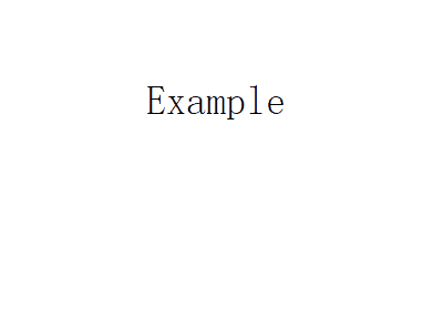
首先來看看要實現的效果圖
實現方法如下
我首先想到的是border屬性,可是border屬性不能設置長度。如果用border實現,需要用其他元素來模擬,比較麻煩。後來突然想起以前在網上看到有人用CSS3的多背景來模擬邊框,就試了一下。
css3 背景
CSS3對於background做了一些修改,最明顯的一個就是采用設置多背景,不但添加了4個新屬性,並且還對目前的屬性進行了調整增強。
1、 多個背景圖片
在css3裡面,你可以再一個標簽元素裡應用多個背景圖片。代碼類似與css2.0版本的寫法,但引用圖片之間需用“,”逗號隔開。第一個圖片是定位在元素最上面的背景,後面的背景圖片依次在它下面顯示,如下:
background-image: url(top-image.jpg), url(middle-image.jpg), url(bottom-image.jpg);
2、新屬性:Background Clip
此討論讓我們回到文章開始提到的關於背景被border邊框遮擋的問題。background-clip的添加讓我們完全能夠控制背景顯示的位置。
屬性值如下:
background-clip: border; 背景在border邊框下開始顯示
background-clip: padding; 背景在padding下開始顯示,而不是border邊框下開始
background-clip: content; 背景在內容區域下開始顯示,而不是border邊框下開始或padding下開始。
background-clip: no-clip; 默認屬性值,類似與background-clip: border;
3、新屬性: Background Origin
此屬性需要與background-position配合使用。你可以用background-position計算定位是從border,padding或content boxes內容區域算起。(類似background-clip)
background-origin:border; 從border邊框位置算起
background-origin:padding; 從padding位置算起
background-origin:content; 從content-box內容區域位置算起;
background-clip和background-origin的不同之處www.CSS3.info網站給做了很好的分析講解。
4、新屬性:Background Size
Background Size屬性用來重設你的背景圖片。
有幾個屬性值:
background-size: contain; 縮小背景圖片使其適應標簽元素(主要是像素方面的比率)
background-size: cover; 讓背景圖片放大延伸到整個標簽元素大小(主要是像素方面的比率)
background-size: 100px 100px; 標明背景圖片縮放的尺寸大小
background-size: 50% 100%; 百分比是根據內容標簽元素大小,來縮放圖片的尺寸大小
你可以去CSS 3 specifications站點看一下簡單的案例說明。
5、新屬性:Background Break
css3裡標簽元素能被分在不同區域(如:讓內聯元素span跨多行),background-break屬性能夠控制背景在不同區域顯示。
屬性值:
Background-break: continuous; 此屬性是默認值,忽視區域之間的間隔空隙(給它們應用圖片就好像把它們看成一個區域一樣)
Background-break: bounding-box; 重新考慮區域之間的間隔
Background-break: each-box; 對每一個獨立的標簽區域進行背景的重新劃分。
6、背景顏色的調整
background-color屬性在css3版本裡面稍微做了增強,除了指定background color背景顏色之外,還可以對不使用的標簽元素背景圖片進行去色處理。
background-color: green / blue;此例子裡,這背景顏色可能是綠色,然而,如果底部背景圖片無效的話,藍色將代替綠色來顯示。如果你沒有指定某個顏色的話,它將其視為透明。
7、背景重復的調整
css2裡當設置背景的時候,它經常被標簽元素截取而顯示不全,css3介紹了2個新屬性來修復此問題。 space:圖片以相同的間距平鋪且填充整個標簽元素 round:圖片自動縮放直到適應且填充整個標簽元素
CSS 3 specifications網站對background-repeat: space的使用就是一個現成的例子。
8、Background Attachment 的調整
Background Attachment有了一個新屬性值:local,當標簽元素滾動時它才有效(如設置overflow:scroll;),當background-attachment設置為scroll時,背景圖片是不隨內容滾條滾動的。現在,有了background-attachment:local,就可以做到讓背景隨元素內容滾動而滾動了。
css3 多背景模擬元素邊框
我們這裡主要使用了background-img、background-size 和 background-position 三個屬性。
background-image: [background-image], [background-image], [background-image];
background-position: [background-position], [background-position], [background-position];
background-repeat: [background-repeat], [background-repeat], [background-repeat];
簡寫形式如下:
background: [background-image] [background-position] [background-repeat],
[background-image] [background-position] [background-repeat],
[background-image] [background-position] [background-repeat];
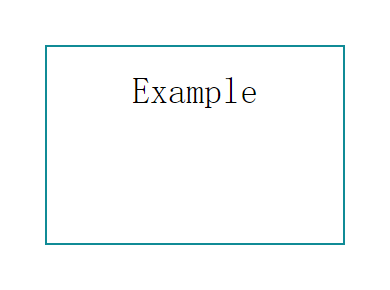
現在我們用多背景來模擬一個元素的邊框
/*CSS*/
.exammple {
    background: linear-gradient(0, #108b96 2px, #108b96 2px) no-repeat,
                linear-gradient(-90deg, #108b96 2px, #108b96 2px) no-repeat,
                linear-gradient(-180deg, #108b96 2px, #108b96 2px) no-repeat,
                linear-gradient(-270deg, #108b96 2px, #108b96 2px) no-repeat;
    background-size: 100% 2px, 2px 100%, 100% 2px, 2px 100%;
    background-position: left top, right top, right bottom, left bottom;
}
<div class="exammple"></div>
我們用四個漸變的背景來模擬四個邊框(為什麼我們要用漸變而不是直接的Color呢?這是由於Css的多背景只能是background-image, background-color不支持多個值,所有即便是純色的邊框,我們也只能使用漸變)。
接下來我們讓邊框動起來
/*CSS*/
.exammple {
    transition: ease-in .3s;
    background: linear-gradient(0, #108b96 2px, #108b96 2px) no-repeat,
                linear-gradient(-90deg, #108b96 2px, #108b96 2px) no-repeat,
                linear-gradient(-180deg, #108b96 2px, #108b96 2px) no-repeat,
                linear-gradient(-270deg, #108b96 2px, #108b96 2px) no-repeat;
    background-size: 0 2px, 2px 0, 0 2px, 2px 0;
    background-position: left top, right top, right bottom, left bottom;
}
.exammple:hover {
    background-size: 100% 2px,  2px 100%, 100% 2px, 2px 100%;
}
相比border屬性,用background的模擬邊框的優勢在於可以控制邊框的寬高,運動方向等,實現很多border不能實現的效果,劣勢在於不能實現border的圓角。
總結
以上就是這篇文章的全部內容了,希望本文的內容對大家學習或者使用Css3能有所幫助,如果有疑問大家可以留言交流。
- 上一頁:CSS邊界線消失的問題詳解
- 下一頁:IE6下兼容性常見的幾個問題與解決方法