下面是在線演示,把鼠標放在按鈕上試試,有驚喜哦!(溫馨提示:如果不顯示請刷新頁面,在 Chrome,Firefox 和 Safari 浏覽器中效果最佳。)
在線演示地址:http://jsfiddle.net/lhb25/9EcuV/8/embedded/result/
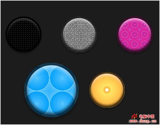
HTML 部分非常簡單,五種效果對應的class為:praticle、cells、jelly、blobbs、chase,代碼如下:
1. <section>
2. <div class="particle"></div>
3. <div class="cells"></div>
4. <div class="jelly"></div>
5. <div class="blobbs"></div>
6. <div class="chase"></div>
7. </section>這些精美的效果用到了 CSS3 border-radius(圓角)、box-shadow(陰影)、transition(變形)、transform(轉換)和 animation(動畫)等特性,公共部分的完整代碼如下:
1. section > div {
2. display: inline-block;
3. position: relative;
4. width: 200px;
5. height: 200px;
6. margin: 0px auto;
7. border-radius: 50%;
8. border: 10px solid hsla(0,0%,0%,。7);
9. box-shadow: inset 0 15px 15px -5px hsla(0,0%,100%,。7),
10. inset 0 -5px 10px 3px hsla(0,0%,0%,。6),
11. 0 8px 10px 2px hsla(0,0%,0%,。3);
12.
13. background-position: center;
14.
15. -webkit-transform: scale3d(。66,。66,1);
16. -moz-transform: scale(。66);
17. -ms-transform: scale(。66);
18. -o-transform: scale(。66);
19. transform: scale(。66);
20.
21. -webkit-transition: -webkit-transform .5s cubic-bezier(。32,0,。15,1);
22. -moz-transition: -moz-transform .5s cubic-bezier(。32,0,。15,1);
23. -ms-transition: -ms-transform .5s cubic-bezier(。32,0,。15,1);
24. -o-transition: -o-transform .5s cubic-bezier(。32,0,。15,1);
25. transition: transform .5s cubic-bezier(。32,0,。15,1);
26. }
27.
28. section > div:hover {
29. cursor: none;
30. -webkit-transform: scale3d(1,1,1);
31. -moz-transform: scale(1);
32. -ms-transform: scale(1);
33. -o-transform: scale(1);
34. transform: scale(1);
35.
36. -webkit-transition: -webkit-transform .2s cubic-bezier(。32,0,。15,1);
37. -moz-transition: -moz-transform .2s cubic-bezier(。32,0,。15,1);
38. -ms-transition: -ms-transform .2s cubic-bezier(。32,0,。15,1);
39. -o-transition: -o-transform .2s cubic-bezier(。32,0,。15,1);
40. transition: transform .2s cubic-bezier(。32,0,。15,1);
41. }這段代碼看起來很長很復雜,其實大部分是兼容性代碼,精簡以後的代碼如下:
1. section > div {
2. display: inline-block;
3. position: relative;
4. width: 200px;
5. height: 200px;
6. margin: 0px auto;
7. /*對於正方形元素border-radius設置為50%剛好變成圓形*/
8. border-radius: 50%;
9. /*寬度為10px的、不透明度為0.7的黑色邊框效果*/
10. border: 10px solid hsla(0,0%,0%,。7);
11. /*通過邊框陰影實現立體按鈕效果,inset是內陰影效果*/
12. box-shadow: inset 0 15px 15px -5px hsla(0,0%,100%,。7),
13. inset 0 -5px 10px 3px hsla(0,0%,0%,。6),
14. 0 8px 10px 2px hsla(0,0%,0%,。3);
15. background-position: center;
16. /*初始縮放0.66倍*/
17. transform: scale(。66);
18. /*在失去焦點時根據自定義的貝塞爾時間曲線做動畫變換效果*/
19. transition: transform .5s cubic-bezier(。32,0,。15,1);
20. }
21.
22. section > div:hover {
23. cursor: none;
24. /*懸停時恢復原始大小*/
25. transform: scale(1);
26. /*鼠標懸停時根據自定義的貝塞爾時間曲線做動畫變換效果*/
27. transition: transform .2s cubic-bezier(。32,0,。15,1);
28. }
上面的代碼中用到了貝塞爾曲線,在數學的數值分析領域中,貝塞爾曲線又稱貝賽爾曲線(Bézier曲線)是電腦圖形學中相當重要的參數曲線。更高維度的廣泛化貝塞爾曲線就稱作貝塞爾曲面,其中貝塞爾三角是一種特殊的實例。
貝塞爾曲線於1962年,由法國工程師皮埃爾。貝塞爾(Pierre Bézier)所廣泛發表,他運用貝塞爾曲線來為汽車的主體進行設計。貝塞爾曲線最初由Paul de Casteljau於1959年運用de Casteljau算法開發,以穩定數值的方法求出貝塞爾曲線。
- 上一頁:不可不知的css十大密技
- 下一頁:你需要知道的三個CSS技巧