css的cubic-bezier(0,0,0,0)解析
編輯:CSS特效代碼
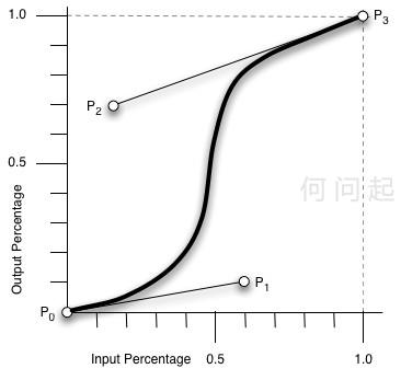
cubic-bezier即為貝茲曲線中的繪制方法。圖上有四點,P0-3,其中P0、P3是默認的點,對應了[0,0], [1,1]。而剩下的P1、P2兩點則是我們通過cubic-bezier()自定義的。cubic-bezier(x1, y1, x2, y2) 為自定義,x1,x2,y1,y2的值范圍在[0, 1]。
預留的幾個特效:
ease: cubic-bezier(0.25, 0.1, 0.25, 1.0)
linear: cubic-bezier(0.0, 0.0, 1.0, 1.0)
ease-in: cubic-bezier(0.42, 0, 1.0, 1.0)
ease-out: cubic-bezier(0, 0, 0.58, 1.0)
ease-in-out: cubic-bezier(0.42, 0, 0.58, 1.0)
也就是說第四個n是y2,和x2共同決定P2的位置
主要的作用是在制作css動畫時,定義動畫各個階段的速度。
作為animation屬性的值
實例代碼:
<style>
        div.hovertreemusic {
            width: 45px;
            height: 45px;
            animation: hovertreerotate 2s cubic-bezier(0.42, 0, 0.58, 1.0) infinite;
            -webkit-animation: hovertreerotate 2s linear cubic-bezier(0.42, 0, 0.58, 1.0); /*Safari and Chrome*/
            margin: 2px;
            background-image: url(http://hovertree.com/wx/hwq/10/css/music_note_big.png);
        }

         div.myhovertree {
            width: 45px;
            height: 45px;
            animation: hovertreerotate 2s cubic-bezier(0.15, 0, 0.28, 1.0) infinite;
            -webkit-animation: hovertreerotate 2s linear cubic-bezier(0.42, 0, 0.58, 1.0); /*Safari and Chrome*/
            margin: 2px;
            background-image: url(http://hovertree.com/wx/hwq/10/css/music_note_big.png);
        }

        div.hwq2 {
            width: 45px;
            height: 45px;
            animation: hovertreerotate 2s cubic-bezier(0.65, 0.5, 0.68, 0.8) infinite;
            -webkit-animation: hovertreerotate 2s linear cubic-bezier(0.42, 0, 0.58, 1.0); /*Safari and Chrome*/
            margin: 2px;
            background-image: url(http://hovertree.com/wx/hwq/10/css/music_note_big.png);
        }

        @keyframes hovertreerotate {
            from {

                margin-left:10px;
            }

            to {

                margin-left:400px;
            }
        }

        @-webkit-keyframes hovertreerotate /*Safari and Chrome*/
        {
            from {
                 margin-left:10px;
            }

            to {
                margin-left:400px;
            }
        }

    </style><div class="hovertreemusic"></div>
    <div class="myhovertree"></div>
    <div class="hwq2"></div>
效果:
小編推薦
熱門推薦