譯自:CSS3 Image Styles
中文:CSS3圖片樣式
請尊重版權,轉載請注明來源,多謝~~
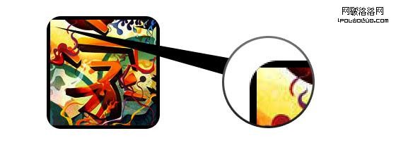
直接在圖片元素上直接應用CSS3 inset box-shadow 或 border-radius時,浏覽器並不能完美的渲染它們。不過,如果把這個圖片用作背景圖,你就可以可以給它添加任何樣式了,浏覽器也會很好地渲染。Darcy Clarke和我做了一個簡單的教程,講解如何使用jQuery來動態地制作完美的圓角圖片。今天我將重溫這個主題然後向你展示使用background-image的方法可以實現多少效果。我將向你展示如何使用box-shadow、border-radius 和 transition 來創作不同的圖片風格。
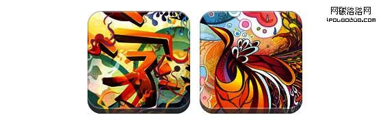
先看下demo
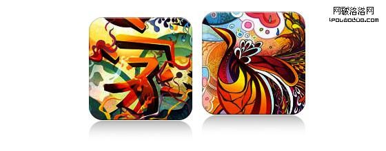
問題 (見 demo)
看一下demo,請注意在第一行的圖片中使用了border-radius和inset box-shadow。Firefox會直接在圖片元素上渲染border-radius,但不會渲染inset box-shadow。chrome/safari則兩者都不渲染。
解決方案
要讓 border-radius 和 inset box-shadow 正常工作,解決方案就是將實際圖片變作background-image.
動態方法
要想動態實現,可以簡單的使用jQuery為每個圖片元素外面包一個背景圖片。下面的jQuery代碼會將所有圖片外面包一個span標簽然後將圖片用作其背景圖片(jQuery代碼由Darcy Clarke編寫)。
1
2
3
4
5
6
7
8
9
10
11
12
13
<script type="text/javascript" src="http://ajax.googleapis.com/ajax/libs/jquery/1.5/jquery.min.js"></script>
<script type="text/javascript">
$(document).ready(function(){

	$("img").load(function() {
		$(this).wrap(function(){
			return '<span class="image-wrap ' + $(this).attr('class') + '"
				style="position:relative; display:inline-block; background:url(' + $(this).attr('src') + ') no-repeat center center; width: ' + $(this).width() + 'px; height: ' + $(this).height() + 'px;" />';
		});
		$(this).css("opacity","0");
	});
});
</script>
輸出
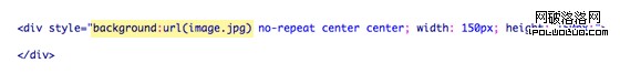
上面的腳本將會輸出下面的HTML代碼:
1
2
3
<span class="image-wrap " style="position:relative; display:inline-block; background:url(image.jpg) no-repeat center center; width: 150px; height: 150px;">
	<img src="image.jpg" style="opacity: 0;">
</span>
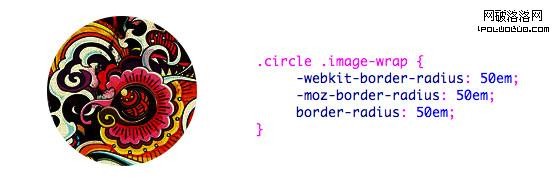
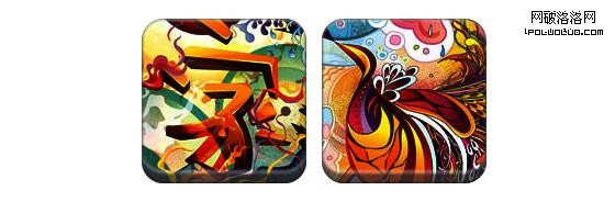
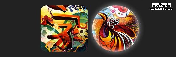
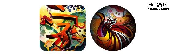
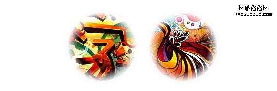
圓形圖片(見 demo)
現在,圖片被用作背景圖了,你可以給它添加任意你想要的樣式上去。下面是一個簡單的使用border-radius實現的圓形圖片。如果你對CSS3不太了解,可以閱讀下Basics of CSS3,也可以搜索一下前端觀察。
CSS
1
2
3
4
5
.circle .image-wrap {
	-webkit-border-radius: 50em;
	-moz-border-radius: 50em;
	border-radius: 50em;
}
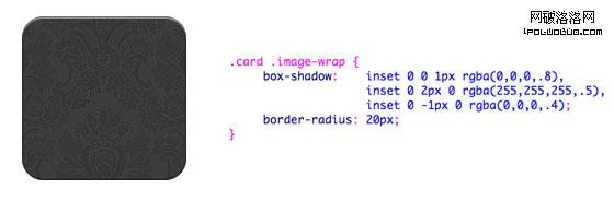
卡片風格(見 demo)
下面是一個像卡片的圖片風格,用了多個inset box-shadow。
CSS
1
2
3
4
5
6
7
8
9
.card .image-wrap {
	-webkit-box-shadow: inset 0 0 1px rgba(0,0,0,.8), inset 0 2px 0 rgba(255,255,255,.5), inset 0 -1px 0 rgba(0,0,0,.4);
	-moz-box-shadow: inset 0 0 1px rgba(0,0,0,.8), inset 0 2px 0 rgba(255,255,255,.5), inset 0 -1px 0 rgba(0,0,0,.4);
	box-shadow: inset 0 0 1px rgba(0,0,0,.8), inset 0 2px 0 rgba(255,255,255,.5), inset 0 -1px 0 rgba(0,0,0,.4);

	-webkit-border-radius: 20px;
	-moz-border-radius: 20px;
	border-radius: 20px;
}
浮雕風格 (見 demo)
通過一點兒改變,我可以將卡片風格轉換為浮雕。。。
CSS
1
2
3
4
5
6
7
8
9
.embossed .image-wrap {
	-webkit-box-shadow: inset 0 0 2px rgba(0,0,0,.8), inset 0 2px 0 rgba(255,255,255,.5), inset 0 -7px 0 rgba(0,0,0,.6), inset 0 -9px 0 rgba(255,255,255,.3);
	-moz-box-shadow: inset 0 0 2px rgba(0,0,0,.8), inset 0 2px 0 rgba(255,255,255,.5), inset 0 -7px 0 rgba(0,0,0,.6), inset 0 -9px 0 rgba(255,255,255,.3);
	box-shadow: inset 0 0 2px rgba(0,0,0,.8), inset 0 2px 0 rgba(255,255,255,.5), inset 0 -7px 0 rgba(0,0,0,.6), inset 0 -9px 0 rgba(255,255,255,.3);

	-webkit-border-radius: 20px;
	-moz-border-radius: 20px;
	border-radius: 20px;
}
軟浮雕風格 (見 demo)
和浮雕風格真的很像,我只是加了1px的虛化~~
CSS
1
2
3
4
5
6
7
8
9
.soft-embossed .image-wrap {
	-webkit-box-shadow: inset 0 0 4px rgba(0,0,0,1), inset 0 2px 1px rgba(255,255,255,.5), inset 0 -9px 2px rgba(0,0,0,.6), inset 0 -12px 2px rgba(255,255,255,.3);
	-moz-box-shadow: inset 0 0 4px rgba(0,0,0,1), inset 0 2px 1px rgba(255,255,255,.5), inset 0 -9px 2px rgba(0,0,0,.6), inset 0 -12px 2px rgba(255,255,255,.3);
	box-shadow: inset 0 0 4px rgba(0,0,0,1), inset 0 2px 1px rgba(255,255,255,.5), inset 0 -9px 2px rgba(0,0,0,.6), inset 0 -12px 2px rgba(255,255,255,.3);

	-webkit-border-radius: 20px;
	-moz-border-radius: 20px;
	border-radius: 20px;
}
剪貼畫風格(見 demo)
同樣只是inset box-shadow,我可以讓它看起來像剪貼畫。
CSS
1
2
3
4
5
6
7
8
9
.cut-out .image-wrap {
	-webkit-box-shadow: 0 1px 0 rgba(255,255,255,.2), inset 0 4px 5px rgba(0,0,0,.6), inset 0 1px 0 rgba(0,0,0,.6);
	-moz-box-shadow: 0 1px 0 rgba(255,255,255,.2), inset 0 4px 5px rgba(0,0,0,.6), inset 0 1px 0 rgba(0,0,0,.6);
	box-shadow: 0 1px 0 rgba(255,255,255,.2), inset 0 4px 5px rgba(0,0,0,.6), inset 0 1px 0 rgba(0,0,0,.6);

	-webkit-border-radius: 20px;
	-moz-border-radius: 20px;
	border-radius: 20px;
}
變形和發光 (見 demo)
這個例子中,我為圖片外容器增加了變形。mouseover的時候,它將從圓角形狀變為圓形,然後增加了發光效果。發光效果通過多重box-shadow實現。
CSS
1
2
3
4
5
6
7
8
9
10
11
12
13
14
15
16
17
18
19
.morphing-glowing .image-wrap {
	-webkit-transition: 1s;
	-moz-transition: 1s;
	transition: 1s;

	-webkit-border-radius: 20px;
	-moz-border-radius: 20px;
	border-radius: 20px;
}

.morphing-glowing .image-wrap:hover {
	-webkit-box-shadow: 0 0 20px rgba(255,255,255,.6), inset 0 0 20px rgba(255,255,255,1);
	-moz-box-shadow: 0 0 20px rgba(255,255,255,.6), inset 0 0 20px rgba(255,255,255,1);
	box-shadow: 0 0 20px rgba(255,255,255,.6), inset 0 0 20px rgba(255,255,255,1);

	-webkit-border-radius: 60em;
	-moz-border-radius: 60em;
	border-radius: 60em;
}
發光遮罩 (見 demo)
發光漸變遮罩是通過:after偽元素實現的。。。
CSS
1
2
3
4
5
6
7
8
9
10
11
12
13
14
15
16
17
18
19
20
21
22
23
24
25
26
.glossy .image-wrap {
	-webkit-box-shadow: inset 0 -1px 0 rgba(0,0,0,.5);
	-moz-box-shadow: inset 0 -1px 0 rgba(0,0,0,.5);
	box-shadow: inset 0 -1px 0 rgba(0,0,0,.5);

	-webkit-border-radius: 20px;
	-moz-border-radius: 20px;
	border-radius: 20px;
}

.glossy .image-wrap:after {
	position: absolute;
	content: ' ';
	width: 100%;
	height: 50%;
	top: 0;
	left: 0;

	-webkit-border-radius: 20px;
	-moz-border-radius: 20px;
	border-radius: 20px;

	background: -moz-linear-gradient(top, rgba(255,255,255,0.7) 0%, rgba(255,255,255,.1) 100%);
	background: -webkit-gradient(linear, left top, left bottom, color-stop(0%,rgba(255,255,255,0.7)), color-stop(100%,rgba(255,255,255,.1)));
	background: linear-gradient(top, rgba(255,255,255,0.7) 0%,rgba(255,255,255,.1) 100%);
}
倒影 (見 demo)
這個例子中,我將遮罩漸變移動到底部,於是它就成了倒影。。。
CSS
1
2
3
4
5
6
7
8
9
10
11
12
13
14
15
16
17
18
19
20
21
22
23
24
.reflection .image-wrap:after {
	position: absolute;
	content: ' ';
	width: 100%;
	height: 30px;
	bottom: -31px;
	left: 0;

	-webkit-border-top-left-radius: 20px;
	-webkit-border-top-right-radius: 20px;
	-moz-border-radius-topleft: 20px;
	-moz-border-radius-topright: 20px;
	border-top-left-radius: 20px;
	border-top-right-radius: 20px;

	background: -moz-linear-gradient(top, rgba(0,0,0,.3) 0%, rgba(255,255,255,0) 100%);
	background: -webkit-gradient(linear, left top, left bottom, color-stop(0%,rgba(0,0,0,.3)), color-stop(100%,rgba(255,255,255,0)));
	background: linear-gradient(top, rgba(0,0,0,.3) 0%,rgba(255,255,255,0) 100%);
}

.reflection .image-wrap:hover {
	position: relative;
	top: -8px;
}
光澤和倒影(見 demo)
這個例子中,我同時使用了:before和:after偽元素來實現帶倒影的光澤效果。
CSS
1
2
3
4
5
6
7
8
9
10
11
12
13
14
15
16
17
18
19
20
21
22
23
24
25
26
27
28
29
30
31
32
33
34
35
36
37
38
39
40
41
42
43
44
45
46
47
48
49
50
.glossy-reflection .image-wrap {
	-webkit-box-shadow: inset 0 -1px 0 rgba(0,0,0,.5), inset 0 1px 0 rgba(255,255,255,.6);
	-moz-box-shadow: inset 0 -1px 0 rgba(0,0,0,.5), inset 0 1px 0 rgba(255,255,255,.6);
	box-shadow: inset 0 -1px 0 rgba(0,0,0,.5), inset 0 1px 0 rgba(255,255,255,.6);

	-webkit-transition: 1s;
	-moz-transition: 1s;
	transition: 1s;

	-webkit-border-radius: 20px;
	-moz-border-radius: 20px;
	border-radius: 20px;
}

.glossy-reflection .image-wrap:before {
	position: absolute;
	content: ' ';
	width: 100%;
	height: 50%;
	top: 0;
	left: 0;

	-webkit-border-radius: 20px;
	-moz-border-radius: 20px;
	border-radius: 20px;

	background: -moz-linear-gradient(top, rgba(255,255,255,0.7) 0%, rgba(255,255,255,.1) 100%);
	background: -webkit-gradient(linear, left top, left bottom, color-stop(0%,rgba(255,255,255,0.7)), color-stop(100%,rgba(255,255,255,.1)));
	background: linear-gradient(top, rgba(255,255,255,0.7) 0%,rgba(255,255,255,.1) 100%);
}

.glossy-reflection .image-wrap:after {
	position: absolute;
	content: ' ';
	width: 100%;
	height: 30px;
	bottom: -31px;
	left: 0;

	-webkit-border-top-left-radius: 20px;
	-webkit-border-top-right-radius: 20px;
	-moz-border-radius-topleft: 20px;
	-moz-border-radius-topright: 20px;
	border-top-left-radius: 20px;
	border-top-right-radius: 20px;

	background: -moz-linear-gradient(top, rgba(230,230,230,.3) 0%, rgba(230,230,230,0) 100%);
	background: -webkit-gradient(linear, left top, left bottom, color-stop(0%,rgba(230,230,230,.3)), color-stop(100%,rgba(230,230,230,0)));
	background: linear-gradient(top, rgba(230,230,230,.3) 0%,rgba(230,230,230,0) 100%);
}
膠帶風格(見 demo)
這裡使用了:after偽元素來在圖片頂部實現了膠帶風格的漸變。
CSS
1
2
3
4
5
6
7
8
9
10
11
12
13
14
15
16
17
18
19
20
21
.tape .image-wrap {
	-webkit-box-shadow: inset 0 0 2px rgba(0,0,0,.7), inset 0 2px 0 rgba(255,255,255,.3), inset 0 -1px 0 rgba(0,0,0,.5), 0 1px 3px rgba(0,0,0,.4);
	-moz-box-shadow: inset 0 0 2px rgba(0,0,0,.7), inset 0 2px 0 rgba(255,255,255,.3), inset 0 -1px 0 rgba(0,0,0,.5), 0 1px 3px rgba(0,0,0,.4);
	box-shadow: inset 0 0 2px rgba(0,0,0,.7), inset 0 2px 0 rgba(255,255,255,.3), inset 0 -1px 0 rgba(0,0,0,.5), 0 1px 3px rgba(0,0,0,.4);
}

.tape .image-wrap:after {
	position: absolute;
	content: ' ';
	width: 60px;
	height: 25px;
	top: -10px;
	left: 50%;
	margin-left: -30px;
	border: solid 1px rgba(137,130,48,.2);

	background: -moz-linear-gradient(top, rgba(254,243,127,.6) 0%, rgba(240,224,54,.6) 100%);
	background: -webkit-gradient(linear, left top, left bottom, color-stop(0%,rgba(254,243,127,.6)), color-stop(100%,rgba(240,224,54,.6)));
	background: linear-gradient(top, rgba(254,243,127,.6) 0%,rgba(240,224,54,.6) 100%);
	-webkit-box-shadow: inset 0 1px 0 rgba(255,255,255,.3), 0 1px 0 rgba(0,0,0,.2);
}
變形和著色 (見 demo)
在下面的這個例子中,我用了 :after元素來在mouseover的時候添加發光漸變。
CSS
1
2
3
4
5
6
7
8
9
10
11
12
13
14
15
16
17
18
19
20
21
22
23
24
25
26
27
28
29
30
31
32
33
34
35
36
37
38
.morphing-tinting .image-wrap {
	position: relative;

	-webkit-transition: 1s;
	-moz-transition: 1s;
	transition: 1s;

	-webkit-border-radius: 20px;
	-moz-border-radius: 20px;
	border-radius: 20px;
}

.morphing-tinting .image-wrap:hover {
	-webkit-border-radius: 30em;
	-moz-border-radius: 30em;
	border-radius: 30em;
}

.morphing-tinting .image-wrap:after {
	position: absolute;
	content: ' ';
	width: 100%;
	height: 100%;
	top: 0;
	left: 0;

	-webkit-transition: 1s;
	-moz-transition: 1s;
	transition: 1s;

	-webkit-border-radius: 30em;
	-moz-border-radius: 30em;
	border-radius: 30em;
}
.morphing-tinting .image-wrap:hover:after  {
	background: -webkit-gradient(radial, 50% 50%, 40, 50% 50%, 80, from(rgba(0,0,0,0)), to(rgba(0,0,0,1)));
	background: -moz-radial-gradient(50% 50%, circle, rgba(0,0,0,0) 40px, rgba(0,0,0,1) 80px);
}
羽化邊緣的圓形(見demo)
發散漸變也可以用作遮罩層來實現圓形羽化效果。
CSS
1
2
3
4
5
6
7
8
9
10
11
12
13
14
15
16
17
18
19
.feather .image-wrap {
	position: relative;

	-webkit-border-radius: 30em;
	-moz-border-radius: 30em;
	border-radius: 30em;
}

.feather .image-wrap:after  {
	position: absolute;
	content: ' ';
	width: 100%;
	height: 100%;
	top: 0;
	left: 0;

	background: -webkit-gradient(radial, 50% 50%, 50, 50% 50%, 70, from(rgba(255,255,255,0)), to(rgba(255,255,255,1)));
	background: -moz-radial-gradient(50% 50%, circle, rgba(255,255,255,0) 50px, rgba(255,255,255,1) 70px);
}
浏覽器支持
本文的方法可以在支持border-radius、box-shadow、:before和:after偽元素的浏覽器上,比如Chrome/Safari/Firefox等,而在一些落後的浏覽器比如IE9(包括IE9)則不能完全支持——IE6/7/8沒有任何表現,IE9會有普通的圓角。
發揮你的創造力
正如你看到的,你幾乎可以使用:before和:after偽元素實現任何效果。如果你有用CSS3實現更多的創意圖片效果,歡迎通過評論與大家分享。
PS,本文中使用:before/:after來實現偽元素,其實我更建議使用雙冒號來實現,雖然單冒號有更多的浏覽器支持,但是對於這些CSS3實現的效果來說,雙冒號更安全一些。