前不久,做了一個H5項目,需要在橫豎屏變化時,做一些處理。毫無疑問,需要使用orientationchange來監聽橫豎屏的變化。
方案一:
// 監聽 orientation changes
window.addEventListener("orientationchange", function(event) {
 // 根據event.orientation|screen.orientation.angle等於0|180、90|-90度來判斷橫豎屏
}, false);
代碼添加上後,就各種兼容性問題。這裡兼容性問題出現在兩個地方:
orientationchange
event.orientation|screen.orientation.angle
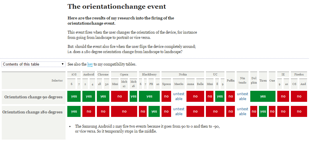
如下是orientationchange事件的兼容性:
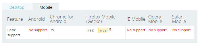
如下是screen.orientation的兼容性:
上述方案不行,只能另行他法了。google一下,了解到可以通過resize配合(window.inner/outerWidth, window.inner/outerHeight)來實現:
window.addEventListener("resize", function(event) {
var orientation=(window.innerWidth > window.innerHeight)? "landscape":"portrait";
if(oritentation === 'portrait'){
// do something ……
} else {
// do something else ……
}
}, false);
這種方案基本滿足大部分項目的需求,但是還是有些不足之處:
只要window的size變化,就會不斷觸發觸發resize事件。可以使用setTimeout來優化一下
如果有多個地方需要監聽橫豎屏,就需要注冊多個window.addEventListener("resize", function(event) {……})。能不能通過訂閱與發布模式來改進一下,只注冊一個resize負責監聽橫豎屏變化,只要橫豎發生變化就發布通知訂閱的對象。其他需要監聽橫豎屏的地方只需訂閱一下即可。
關鍵代碼如下:
var resizeCB = function(){
   if(win.innerWidth > win.innerHeight){//初始化判斷
    meta.init = 'landscape';
    meta.current = 'landscape';
   } else {
    meta.init = 'portrait';
    meta.current = 'portrait';
   }
   return function(){
    if(win.innerWidth > win.innerHeight){
     if(meta.current !== 'landscape'){
      meta.current = 'landscape';
      event.trigger('__orientationChange__', meta);
     }
    } else {
     if(meta.current !== 'portrait'){
      meta.current = 'portrait';
      event.trigger('__orientationChange__', meta);
     }
    }
   }
  }();
完整代碼猛擊這裡
方案三:
不過個人覺得通過window.innerWidth > window.innerHeight來實現的是一種偽檢測,有點不可靠。 可不可以通過浏覽器來實現檢測?如基於CSS3@media媒體查詢來實現。
如下@media兼容性:
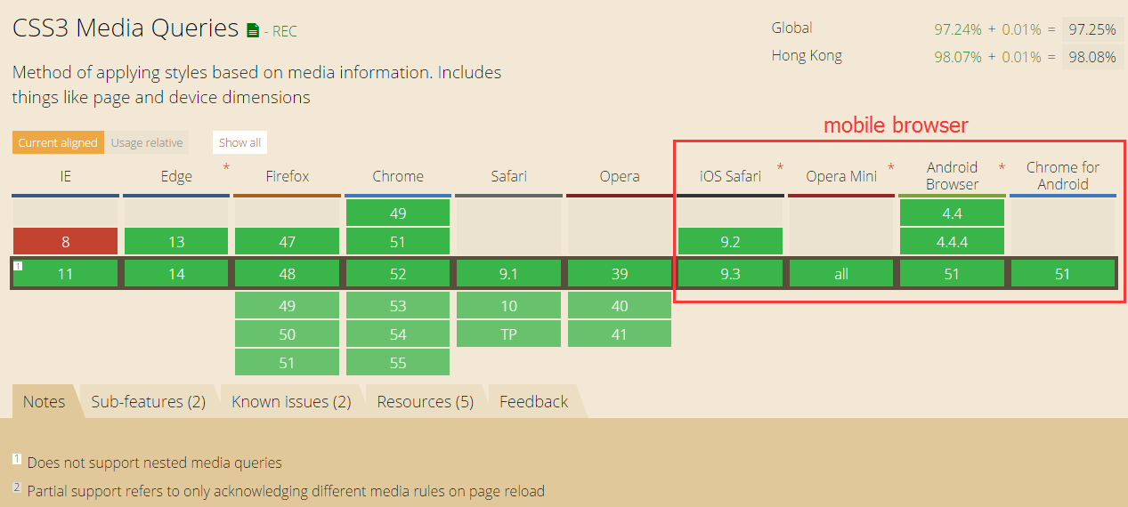
如上上圖所示,移動端浏覽器都支持CSS3 media。
實現思路:
創建包含標識橫豎屏狀態的特定css樣式
通過JS向頁面中注入CSS代碼
resize回調函數中獲取橫豎屏的狀態
這裡我選擇<html></html>的節點font-family作為檢測樣式屬性。理由如下:
選擇<html></html>主要為了避免reflow和repaint
選擇font-family樣式,主要是因為font-family有如下特性:
- 優先使用排在前面的字體。
- 如果找不到該種字體,或者該種字體不包括所要渲染的文字,則使用下一種字體。
- 如果所列出的字體,都無法滿足需要,則讓操作系統自行決定使用哪種字體。
這樣我們就可以指定特定標識來標識橫豎屏的狀態,不過需要將指定的標識放置在其他字體的前面,這樣就不會引起hmtl字體的變化。
關鍵代碼如下:
// callback
  var resizeCB = function() {
    var hstyle = win.getComputedStyle(html, null),
      ffstr = hstyle['font-family'],
      pstr = "portrait, " + ffstr,
      lstr = "landscape, " + ffstr,
      // 拼接css
      cssstr = '@media (orientation: portrait) { .orientation{font-family:' + pstr + ';} } @media (orientation: landscape) { .orientation{font-family:' + lstr + ';}}';
    // 載入樣式
    loadStyleString(cssstr);
    // 添加類
    html.className = 'orientation' + html.className;
    if (hstyle['font-family'] === pstr) { //初始化判斷
      meta.init = 'portrait';
      meta.current = 'portrait';
    } else {
      meta.init = 'landscape';
      meta.current = 'landscape';
    }
    return function() {
      if (hstyle['font-family'] === pstr) {
        if (meta.current !== 'portrait') {
          meta.current = 'portrait';
          event.trigger('__orientationChange__', meta);
        }
      } else {
        if (meta.current !== 'landscape') {
          meta.current = 'landscape';
          event.trigger('__orientationChange__', meta);
        }
      }
    }
  }();
完整代碼猛擊這裡
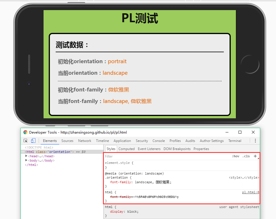
測試效果
portrait效果:
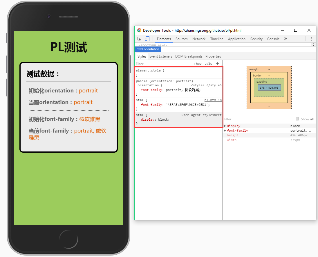
landscape效果:
方案四:
可以再改進一下,在支持orientationchange時,就使用原生的orientationchange,不支持則使用方案三。
關鍵代碼如下:
// 是否支持orientationchange事件
var isOrientation = ('orientation' in window && 'onorientationchange' in window);
// callback
var orientationCB = function(e) {
  if (win.orientation === 180 || win.orientation === 0) {
    meta.init = 'portrait';
    meta.current = 'portrait';
  }
  if (win.orientation === 90 || win.orientation === -90) {
    meta.init = 'landscape';
    meta.current = 'landscape';
  }
  return function() {
    if (win.orientation === 180 || win.orientation === 0) {
      meta.current = 'portrait';
    }
    if (win.orientation === 90 || win.orientation === -90) {
      meta.current = 'landscape';
    }
    event.trigger(eventType, meta);
  }
};
var callback = isOrientation ? orientationCB() : (function() {
  resizeCB();
  return function() {
    timer && win.clearTimeout(timer);
    timer = win.setTimeout(resizeCB, 300);
  }
})();
// 監聽
win.addEventListener(isOrientation ? eventType : 'resize', callback, false);
完整代碼猛擊這裡
方案五:
目前,上述幾種方案都是通過自定制的訂閱與發布事件模式來實現的。這裡可以基於浏覽器的事件機制,來模擬orientationchange。即對orientationchange的不兼容進行修復。
關鍵代碼如下:
var eventType = 'orientationchange';
// 觸發原生orientationchange
var fire = function() {
  var e;
  if (document.createEvent) {
    e = document.createEvent('HTMLEvents');
    e.initEvent(eventType, true, false);
    win.dispatchEvent(e);
  } else {
    e = document.createEventObject();
    e.eventType = eventType;
    if (win[eventType]) {
      win[eventType]();
    } else if (win['on' + eventType]) {
      win['on' + eventType]();
    } else {
      win.fireEvent(eventType, e);
    }
  }
}
完整代碼猛擊這裡
通過上述5種方案,自己對移動端橫豎屏檢測有了更進一步的認識,有些東西只有自己親身經歷過才知道為什麼要這麼寫,自己也把其中緣由記錄在文章中,希望對大家有幫助。經過5種方案的演變得到了最終orientationchange-fix,github地址:https://github.com/zhansingsong/orientationchange-fix
以上就是本文的全部內容,希望對大家的學習有所幫助,也希望大家多多支持。
- 上一頁:JS簡單去除數組中重復項的方法
- 下一頁:JS實現頁面數據無限加載