Bootstrap CSS布局之表格
編輯:關於JavaScript
表格組件中,BootStrap提供了
1種基礎.table樣式
4種附加樣式(.table-striped/.table-bordered/.table-hover/.table-condensed)
1種支持響應式布局的.table-responsive
table樣式
//源碼
table {
 background-color: transparent;
}
caption {
 padding-top: 8px;
 padding-bottom: 8px;
 color: #777;
 text-align: left;
}
th {
 text-align: left;
}
.table {
 width: 100%;
 max-width: 100%;
 margin-bottom: 20px;
}
.table > thead > tr > th,
.table > tbody > tr > th,
.table > tfoot > tr > th,
.table > thead > tr > td,
.table > tbody > tr > td,
.table > tfoot > tr > td {
 padding: 8px;
 line-height: 1.42857143;
 vertical-align: top;
 border-top: 1px solid #ddd;
}
.table > thead > tr > th {
 vertical-align: bottom;
 border-bottom: 2px solid #ddd;
}
.table > caption + thead > tr:first-child > th,
.table > colgroup + thead > tr:first-child > th,
.table > thead:first-child > tr:first-child > th,
.table > caption + thead > tr:first-child > td,
.table > colgroup + thead > tr:first-child > td,
.table > thead:first-child > tr:first-child > td {
 border-top: 0;
}
.table > tbody + tbody {
 border-top: 2px solid #ddd;
}
.table .table {
 background-color: #fff;
}
table.striped樣式–帶背景條紋的表格
//源碼
.table-striped > tbody > tr:nth-of-type(odd) {
 background-color: #f9f9f9;
}
table.bordered樣式–帶邊框的表格
為表格所有的單元格提供1條1像素寬的邊框
//源碼
.table-bordered {
 border: 1px solid #ddd;
}
.table-bordered > thead > tr > th,
.table-bordered > tbody > tr > th,
.table-bordered > tfoot > tr > th,
.table-bordered > thead > tr > td,
.table-bordered > tbody > tr > td,
.table-bordered > tfoot > tr > td {
 border: 1px solid #ddd;
}
.table-bordered > thead > tr > th,
.table-bordered > thead > tr > td {
 border-bottom-width: 2px;
}
table.hover樣式–鼠標懸停高亮的表格
table.condensed樣式–緊湊型的表格
//源碼
.table-condensed > thead > tr > th,
.table-condensed > tbody > tr > th,
.table-condensed > tfoot > tr > th,
.table-condensed > thead > tr > td,
.table-condensed > tbody > tr > td,
.table-condensed > tfoot > tr > td {
 padding: 5px;
}
行級元素樣式
Bootstrap為表格的tr元素提供了5種額外的樣式,用於控制tr的背景顏色。active、success、info、warning、danger
//源碼
.table > thead > tr > td.active,
.table > tbody > tr > td.active,
.table > tfoot > tr > td.active,
.table > thead > tr > th.active,
.table > tbody > tr > th.active,
.table > tfoot > tr > th.active,
.table > thead > tr.active > td,
.table > tbody > tr.active > td,
.table > tfoot > tr.active > td,
.table > thead > tr.active > th,
.table > tbody > tr.active > th,
.table > tfoot > tr.active > th {
 background-color: #f5f5f5;
}
.table-hover > tbody > tr > td.active:hover,
.table-hover > tbody > tr > th.active:hover,
.table-hover > tbody > tr.active:hover > td,
.table-hover > tbody > tr:hover > .active,
.table-hover > tbody > tr.active:hover > th {
 background-color: #e8e8e8;
}
.table > thead > tr > td.success,
.table > tbody > tr > td.success,
.table > tfoot > tr > td.success,
.table > thead > tr > th.success,
.table > tbody > tr > th.success,
.table > tfoot > tr > th.success,
.table > thead > tr.success > td,
.table > tbody > tr.success > td,
.table > tfoot > tr.success > td,
.table > thead > tr.success > th,
.table > tbody > tr.success > th,
.table > tfoot > tr.success > th {
 background-color: #dff0d8;
}
.table-hover > tbody > tr > td.success:hover,
.table-hover > tbody > tr > th.success:hover,
.table-hover > tbody > tr.success:hover > td,
.table-hover > tbody > tr:hover > .success,
.table-hover > tbody > tr.success:hover > th {
 background-color: #d0e9c6;
}
.table > thead > tr > td.info,
.table > tbody > tr > td.info,
.table > tfoot > tr > td.info,
.table > thead > tr > th.info,
.table > tbody > tr > th.info,
.table > tfoot > tr > th.info,
.table > thead > tr.info > td,
.table > tbody > tr.info > td,
.table > tfoot > tr.info > td,
.table > thead > tr.info > th,
.table > tbody > tr.info > th,
.table > tfoot > tr.info > th {
 background-color: #d9edf7;
}
.table-hover > tbody > tr > td.info:hover,
.table-hover > tbody > tr > th.info:hover,
.table-hover > tbody > tr.info:hover > td,
.table-hover > tbody > tr:hover > .info,
.table-hover > tbody > tr.info:hover > th {
 background-color: #c4e3f3;
}
.table > thead > tr > td.warning,
.table > tbody > tr > td.warning,
.table > tfoot > tr > td.warning,
.table > thead > tr > th.warning,
.table > tbody > tr > th.warning,
.table > tfoot > tr > th.warning,
.table > thead > tr.warning > td,
.table > tbody > tr.warning > td,
.table > tfoot > tr.warning > td,
.table > thead > tr.warning > th,
.table > tbody > tr.warning > th,
.table > tfoot > tr.warning > th {
 background-color: #fcf8e3;
}
.table-hover > tbody > tr > td.warning:hover,
.table-hover > tbody > tr > th.warning:hover,
.table-hover > tbody > tr.warning:hover > td,
.table-hover > tbody > tr:hover > .warning,
.table-hover > tbody > tr.warning:hover > th {
 background-color: #faf2cc;
}
.table > thead > tr > td.danger,
.table > tbody > tr > td.danger,
.table > tfoot > tr > td.danger,
.table > thead > tr > th.danger,
.table > tbody > tr > th.danger,
.table > tfoot > tr > th.danger,
.table > thead > tr.danger > td,
.table > tbody > tr.danger > td,
.table > tfoot > tr.danger > td,
.table > thead > tr.danger > th,
.table > tbody > tr.danger > th,
.table > tfoot > tr.danger > th {
 background-color: #f2dede;
}
.table-hover > tbody > tr > td.danger:hover,
.table-hover > tbody > tr > th.danger:hover,
.table-hover > tbody > tr.danger:hover > td,
.table-hover > tbody > tr:hover > .danger,
.table-hover > tbody > tr.danger:hover > th {
 background-color: #ebcccc;
}
響應式表格
隨著響應式設計的大量需求,Bootstrap為表格提供了一個響應式設計的容器(.table-responsive),將.table-responsive樣式包裝在.table樣式外部即可創建響應式表格
在小屏幕(<768px)水平滾動,大屏幕上水平滾動條消失
<div class="table-responsive">
 <table class="table">
 </table>
</div>
//源碼
.table-responsive {
min-height: .01%;
overflow-x: auto;
}
//把原有.table樣式得底部外邊距margin-bottom從20px改成了0px,目的是消除滾動條帶來的上下高度差
//並在.table-responsive樣式上設置了一個margin-bottom:15px,避免和容器外部的下一個元素重疊
@media screen and (max-width: 767px) {
.table-responsive {
width: 100%;
margin-bottom: 15px;
overflow-y: hidden;
-ms-overflow-style: -ms-autohiding-scrollbar;
border: 1px solid #ddd;
}
.table-responsive > .table {
margin-bottom: 0;
}
.table-responsive > .table > thead > tr > th,
.table-responsive > .table > tbody > tr > th,
.table-responsive > .table > tfoot > tr > th,
.table-responsive > .table > thead > tr > td,
.table-responsive > .table > tbody > tr > td,
.table-responsive > .table > tfoot > tr > td {
white-space: nowrap;
}
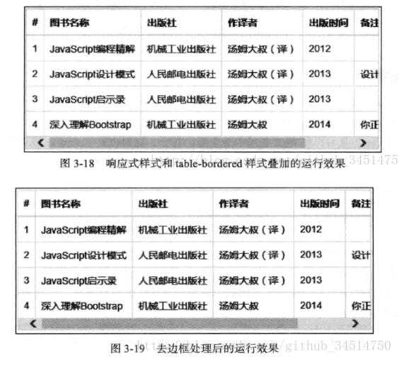
.table-responsive > .table-bordered {
border: 0;
}
//可以看到table-responsive給自己加了一個1px的外邊框,如果在table上在使用table-bordered樣式得話,就會和表格的外邊框重合,就會變粗,所以進行了以下代碼的編寫
.table-responsive > .table-bordered > thead > tr > th:first-child,
.table-responsive > .table-bordered > tbody > tr > th:first-child,
.table-responsive > .table-bordered > tfoot > tr > th:first-child,
.table-responsive > .table-bordered > thead > tr > td:first-child,
.table-responsive > .table-bordered > tbody > tr > td:first-child,
.table-responsive > .table-bordered > tfoot > tr > td:first-child {
border-left: 0;//所有tr的第一個單元格(最左邊的一列)的左邊框設置為0px
}
.table-responsive > .table-bordered > thead > tr > th:last-child,
.table-responsive > .table-bordered > tbody > tr > th:last-child,
.table-responsive > .table-bordered > tfoot > tr > th:last-child,
.table-responsive > .table-bordered > thead > tr > td:last-child,
.table-responsive > .table-bordered > tbody > tr > td:last-child,
.table-responsive > .table-bordered > tfoot > tr > td:last-child {
border-right: 0;//所有tr的最後一個單元格(最右邊的一列)的左邊框設置為0px
}
.table-responsive > .table-bordered > tbody > tr:last-child > th,
.table-responsive > .table-bordered > tfoot > tr:last-child > th,
.table-responsive > .table-bordered > tbody > tr:last-child > td,
.table-responsive > .table-bordered > tfoot > tr:last-child > td {
border-bottom: 0;//最後一行tr裡的單元格的底部邊框設置為0px
}
}
以上就是本文的全部內容,希望對大家的學習有所幫助,也希望大家多多支持。
小編推薦
熱門推薦