純CSS3制作風車旋轉動畫並控制速度
編輯:網頁特效代碼
以前制作網頁動畫一般使用javascript,現在已經有越來越多動動畫使用純CSS實現,並且動畫的控制也可以使用CSS3實現,因為CSS 3來了,CSS 3的動畫功能確實強大。以下是一個純CSS3制作的風車旋轉動畫,而且也用CSS 3控制速度。
體驗效果:
http://hovertree.com/texiao/css3/40/
效果圖:
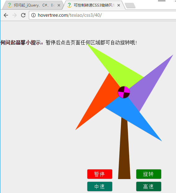
可以看到,風車的葉片是三角形,使用css畫各種圖形請參考:
http://hovertree.com/h/bjaf/jtkqnsc1.htm
http://hovertree.com/h/bjaf/ltgc20vn.htm
css制作動畫是用到了animation屬性,請參考:
http://hovertree.com/h/bjaf/i309b77d.htm
http://hovertree.com/h/bjaf/fwck53gt.htm
http://hovertree.com/h/bjaf/xpxgjfap.htm
http://hovertree.com/h/bjaf/kqud99m6.htm
扇葉的旋轉使用到了transform屬性,參考:
http://hovertree.com/h/bjaf/c3bshswk.htm
http://hovertree.com/h/bjaf/lxsexx3m.htm
本示例用到了CSS 3的選擇器nth-of-type,參考:
http://hovertree.com/h/bjaf/c2c0k0tf.htm
下面給出本示例的代碼:
使用圖片扇葉的風車:
http://hovertree.com/h/bjaf/h9tb5itb.htm
體驗效果:
http://hovertree.com/texiao/css3/40/
效果圖:
可以看到,風車的葉片是三角形,使用css畫各種圖形請參考:
http://hovertree.com/h/bjaf/jtkqnsc1.htm
http://hovertree.com/h/bjaf/ltgc20vn.htm
css制作動畫是用到了animation屬性,請參考:
http://hovertree.com/h/bjaf/i309b77d.htm
http://hovertree.com/h/bjaf/fwck53gt.htm
http://hovertree.com/h/bjaf/xpxgjfap.htm
http://hovertree.com/h/bjaf/kqud99m6.htm
扇葉的旋轉使用到了transform屬性,參考:
http://hovertree.com/h/bjaf/c3bshswk.htm
http://hovertree.com/h/bjaf/lxsexx3m.htm
本示例用到了CSS 3的選擇器nth-of-type,參考:
http://hovertree.com/h/bjaf/c2c0k0tf.htm
下面給出本示例的代碼:
<!DOCTYPE html>
<html lang="zh-CN">
<head>
<meta charset="UTF-8"><meta name="viewport" content="width=device-width, initial-scale=1" />
<title>可控制轉速CSS3旋轉風車特效 - 何問起</title>
<link rel="stylesheet" href="http://hovertree.com/texiao/css3/40/style/hovertreespin.css">
</head>
<body>
<div class="wrapper">
	<div class="pin-layout">
		<a href="#" class="control">暫停</a>
		<a href="#" class="control">旋轉</a>
		<a href="#" class="control">中速</a>
		<a href="#" class="control">高速</a>
		<div class="pillar">
			<div class="dot"></div>
			<span class="item1"></span>
			<span class="item2"></span>
			<span class="item3"></span>
			<span class="item4"></span>
		</div>
	</div>
	<p><b>何問起溫馨小提示:</b>暫停後點擊頁面任何區域都可自動旋轉哦!</p>
</div><!-- end wrapper -->
<div style="text-align:center;margin:100px 0; font:normal 14px/24px 'MicroSoft YaHei';">
<p>適用於支持CSS3的浏覽器。</p>
<p>來源:<a href="http://hovertree.com/" target="_blank">何問起</a> <a href="http://hovertree.com/h/bjag/efqb2w4s.htm" target="_blank">說明</a></p>
</div>
</body>
</html>*{margin:0; padding:0;}
body{background:#eee;width:100%; height:100%;}
.wrapper{
position: relative;
width: 800px;
height:450px;
margin:60px auto 0;
}
.wrapper .pin-layout{
position: absolute;
bottom: 0;
left: calc(50% - 20px);
width:40px;
height:280px;
}
.wrapper .pin-layout::after{
position:absolute;
bottom:0;
left: calc(50% - 20px);
content:"";
height:0;
width:10px;
border-width: 0px 15px 280px 15px;
border-style:solid;
border-color:transparent transparent #6B3500 transparent;
}
.wrapper .pin-layout .pillar{
position: absolute;
top: -18px;
left: calc(50% - 18px);
width:36px;
height:36px;
z-index: 9;
transform: rotateZ(45deg);
transition:all .9s linear;
animation: hovertreespin 3s linear 0s infinite;
}
.pin-layout .control:hover::after{
position: absolute;
left: 0;
content: "";
width: 100%;
height:100%;
background: rgba(0,0,0,.3);
}
.pin-layout .control{
position: absolute;
bottom:0;
width: 80px;
height:30px;
line-height:30px;
border: 1px solid #ADADAD;
border-radius: 4px;
text-align:center;
text-decoration:none;
letter-spacing:2px;
color: white;
background: red;
}
.pin-layout .control:nth-of-type(1){
left: -100px;
}
.pin-layout .control:nth-of-type(3):focus ~ .pillar{
animation-duration:.8s;
}
.pin-layout .control:nth-of-type(4):focus ~ .pillar{
animation-duration:.2s;
}
.pin-layout .control:nth-of-type(2){
right: -100px;
background: green;
}
.pin-layout .control:nth-of-type(3){
bottom: -40px;
left: -100px;
background: #037862;
}
.pin-layout .control:nth-of-type(4){
bottom: -40px;
right: -100px;
background: #036B3E;
}
.pin-layout .control:nth-of-type(1):focus ~ .pillar{
animation-play-state:paused;
}
.pin-layout .control:nth-of-type(2):focus ~ .pillar{
animation-play-state:running;
}
.pin-layout .pillar span[class^="item"]{
position: absolute;
top: calc(-200px + 18px);
left: 18px;
border-width:0px 80px 200px 0px;
border-style:solid;
}
.pin-layout .pillar span[class^="item"]:nth-of-type(1){
z-index:1;
border-color:transparent transparent dodgerblue transparent;
/*border-color:green red gray blue;*/
}
.pin-layout .pillar span[class^="item"]:nth-of-type(2){
z-index:2;
border-color:transparent transparent orangered transparent;
transform-origin:left bottom;
transform: rotateZ(90deg);
}
.pin-layout .pillar span[class^="item"]:nth-of-type(3){
z-index:3;
border-color:transparent transparent greenyellow transparent;
transform-origin:left bottom;
transform: rotateZ(180deg);
}
.pin-layout .pillar span[class^="item"]:nth-of-type(4){
z-index:4;
border-color:transparent transparent mediumpurple transparent;
transform-origin:left bottom;
transform: rotateZ(270deg);
}
.wrapper .pin-layout .pillar .dot{
position: absolute;
top: 0;
left: 0;
border-width: 19px;
border-style: solid;
border-color: #3C0505 transparent #3C0505 transparent;
border-radius:50%;
background:#F505EE;
z-index:1999;
box-shadow:0 0 2px #1A0505;
}
@keyframes hovertreespin {
0%{
transform: rotate(0deg)
}
100%{
transform:rotate(360deg);
}
}使用圖片扇葉的風車:
http://hovertree.com/h/bjaf/h9tb5itb.htm
小編推薦
熱門推薦