CSS3和jQuery實現的自定義美化Checkbox
編輯:網頁特效代碼
效果圖:
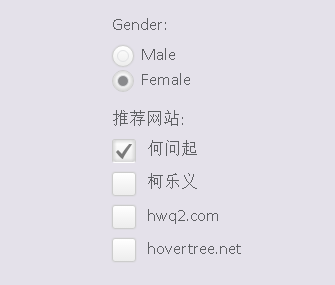
是不是比默認的好看多了,個人的審美觀應該還是可以的。
當然我們可以在這裡查看DEMO演示。
接下來我們一起來看看實現這款美化版Checkbox的源代碼。主要思路是利用隱藏原來的checkbox和radiobox,用一個div來模擬checkbox/radiobox,並使用jQuery來完成選擇切換時的動畫效果。
先來看看HTML代碼:
<div class="wrapper">
        <ul>
            <li>
                <p>Gender:</p>
            </li>
            <li>
                <input type="radio" name="radio-btn" />Male
            </li>
            <li>
                <input type="radio" name="radio-btn" />Female
            </li>
        </ul>
        <ul>
            <li>
                <p>推薦網站:</p>
            </li>
            <li>
                <input type="checkbox" name="check-box" /> <span>何問起</span>

            </li>
            <li>
                <input type="checkbox" name="check-box" /> <span></span>

            </li>
            <li>
                <input type="checkbox" name="check-box" /> <span>hwq2.com</span>

            </li>
            <li>
                <input type="checkbox" name="check-box" /> <span>hovertree.net</span>

            </li>
        </ul>
    </div>
然後我們用jQuery代碼來為每一個checkbox和radiobox創建一個div,這個div的classname為check-box和radio-btn。
$("input[name="radio-btn"]").wrap("<div class="radio-btn"><i></i></div>");
$("input[name="check-box"]").wrap("<div class="check-box"><i></i></div>");
那麼我們接下來要讓原來的checkbox隱藏,同時設置模擬div的樣式:
.radio-btn input[type="radio"], .check-box input[type="checkbox"] {
visibility: hidden;
}
.check-box {
    width: 22px;
    height: 22px;
    cursor: pointer;
    display: inline-block;
    margin: 2px 7px 0 0;
    position: relative;
    overflow: hidden;
    box-shadow: 0 0 1px #ccc;
    -webkit-border-radius: 3px;
    -moz-border-radius: 3px;
    border-radius: 3px;
    background: rgb(255, 255, 255);
    background: -moz-linear-gradient(top, rgba(255, 255, 255, 1) 0%, rgba(246, 246, 246, 1) 47%, rgba(237, 237, 237, 1) 100%);
    background: -webkit-gradient(linear, left top, left bottom, color-stop(0%, rgba(255, 255, 255, 1)), color-stop(47%, rgba(246, 246, 246, 1)), color-stop(100%, rgba(237, 237, 237, 1)));
    background: -webkit-linear-gradient(top, rgba(255, 255, 255, 1) 0%, rgba(246, 246, 246, 1) 47%, rgba(237, 237, 237, 1) 100%);
    background: -o-linear-gradient(top, rgba(255, 255, 255, 1) 0%, rgba(246, 246, 246, 1) 47%, rgba(237, 237, 237, 1) 100%);
    background: -ms-linear-gradient(top, rgba(255, 255, 255, 1) 0%, rgba(246, 246, 246, 1) 47%, rgba(237, 237, 237, 1) 100%);
    background: linear-gradient(to bottom, rgba(255, 255, 255, 1) 0%, rgba(246, 246, 246, 1) 47%, rgba(237, 237, 237, 1) 100%);
    filter: progid:DXImageTransform.Microsoft.gradient(startColorstr="#ffffff", endColorstr="#ededed", GradientType=0);
    border: 1px solid #ccc;
}
.check-box i {
    background: url("http://hovertree.com/texiao/html5/32/css/check_mark.png") no-repeat center center;
    position: absolute;
    left: 3px;
    bottom: -15px;
    width: 16px;
    height: 16px;
    opacity: .5;
    -webkit-transition: all 400ms ease-in-out;
    -moz-transition: all 400ms ease-in-out;
    -o-transition: all 400ms ease-in-out;
    transition: all 400ms ease-in-out;
    -webkit-transform:rotateZ(-180deg);
    -moz-transform:rotateZ(-180deg);
    -o-transform:rotateZ(-180deg);
    transform:rotateZ(-180deg);
}
.checkedBox {
    -moz-box-shadow: inset 0 0 5px 1px #ccc;
    -webkit-box-shadow: inset 0 0 5px 1px #ccc;
    box-shadow: inset 0 0 5px 1px #ccc;
    border-bottom-color: #fff;
}
.checkedBox i {
    bottom: 2px;
    -webkit-transform:rotateZ(0deg);
    -moz-transform:rotateZ(0deg);
    -o-transform:rotateZ(0deg);
    transform:rotateZ(0deg);
}
/*Custom radio button*/
 .radio-btn {
    width: 20px;
    height: 20px;
    display: inline-block;
    float: left;
    margin: 3px 7px 0 0;
    cursor: pointer;
    position: relative;
    -webkit-border-radius: 100%;
    -moz-border-radius: 100%;
    border-radius: 100%;
    border: 1px solid #ccc;
    box-shadow: 0 0 1px #ccc;
    background: rgb(255, 255, 255);
    background: -moz-linear-gradient(top, rgba(255, 255, 255, 1) 0%, rgba(246, 246, 246, 1) 47%, rgba(237, 237, 237, 1) 100%);
    background: -webkit-gradient(linear, left top, left bottom, color-stop(0%, rgba(255, 255, 255, 1)), color-stop(47%, rgba(246, 246, 246, 1)), color-stop(100%, rgba(237, 237, 237, 1)));
    background: -webkit-linear-gradient(top, rgba(255, 255, 255, 1) 0%, rgba(246, 246, 246, 1) 47%, rgba(237, 237, 237, 1) 100%);
    background: -o-linear-gradient(top, rgba(255, 255, 255, 1) 0%, rgba(246, 246, 246, 1) 47%, rgba(237, 237, 237, 1) 100%);
    background: -ms-linear-gradient(top, rgba(255, 255, 255, 1) 0%, rgba(246, 246, 246, 1) 47%, rgba(237, 237, 237, 1) 100%);
    background: linear-gradient(to bottom, rgba(255, 255, 255, 1) 0%, rgba(246, 246, 246, 1) 47%, rgba(237, 237, 237, 1) 100%);
    filter: progid:DXImageTransform.Microsoft.gradient(startColorstr="#ffffff", endColorstr="#ededed", GradientType=0);
}
.checkedRadio {
    -moz-box-shadow: inset 0 0 5px 1px #ccc;
    -webkit-box-shadow: inset 0 0 5px 1px #ccc;
    box-shadow: inset 0 0 5px 1px #ccc;
}
.radio-btn i {
    border: 1px solid #E1E2E4;
    width: 10px;
    height: 10px;
    position: absolute;
    left: 4px;
    top: 4px;
    -webkit-border-radius: 100%;
    -moz-border-radius: 100%;
    border-radius: 100%;
}
.checkedRadio i {
    background-color: #898A8C;
}/* 何問起 hovertree.com */
上面這段CSS3代碼就是用樣式來自定義div,讓div的樣式和checkbox和radiobox一樣。
最後我們來模擬點擊選中和取消選中,這部分也是用jQuery來實現:
$(".radio-btn").on("click", function () {
    var _this = $(this),
        block = _this.parent().parent();
    block.find("input:radio").attr("checked", false);
    block.find(".radio-btn").removeClass("checkedRadio");
    _this.addClass("checkedRadio");
    _this.find("input:radio").attr("checked", true);
});


$.fn.toggleCheckbox = function () {
    this.attr("checked", !this.attr("checked"));
}
$(".check-box").on("click", function () {
    $(this).find(":checkbox").toggleCheckbox();
    $(this).toggleClass("checkedBox");
});/* 何問起 hovertree.com */
在線演示:http://hovertree.com/texiao/html5/32/
小編推薦
熱門推薦