通過前面兩篇文章的簡單介紹,大致對於Bootstrap有了初步的了解。由於自己也只是想通過Bootstrap官網來進行簡單的學習,自己能夠隨便搞個不是太搓的頁面就可以了。所以如果你是新手或許可以來看看,對你還有那麼一點兒幫助,高手請飄過。
《Bootstrap3.0學習筆記》中也只是簡單的介紹了如何下載文件,及進行引用下載的文件,還沒有真正的進入前端的設計學習中。我也看到了廣大網友們對Bootstrap3.0也具有很大的興趣,有之前就使用過的大牛,也有和我一樣正打算學習一下的盆友、小菜。至於回復中比較多的就是:希望能有個系列,當然我也很希望自己能很好的規劃列一個系列,然後按照這個大綱進行即可。不過本人能力有限,所以只好跟隨自己的喜好來進行學習了。
聲明:寫作能力真是不濟,還望各位看官見諒。如有錯誤,請及時通知,本人必會在最短的時間進行更正,當然更希望能有更多的人來一起學習。
柵格系統(布局)
Bootstrap內置了一套響應式、移動設備優先的流式柵格系統,隨著屏幕設備或視口(viewport)尺寸的增加,系統會自動分為最多12列。
我在這裡是把Bootstrap中的柵格系統叫做布局。它就是通過一系列的行(row)與列(column)的組合創建頁面布局,然後你的內容就可以放入到你創建好的布局當中。下面就簡單介紹一下Bootstrap柵格系統的工作原理:
行(row)必須包含在.container中,以便為其賦予合適的排列(aligment)和內補(padding)。使用行(row)在水平方向創建一組列(column)。你的內容應當放置於列(column)內,而且,只有列(column)可以作為行(row)的直接子元素。類似Predefined grid classes like .rowand .col-xs-4這些預定義的柵格class可以用來快速創建柵格布局。Bootstrap源碼中定義的mixin也可以用來創建語義化的布局。通過設置padding從而創建列(column)之間的間隔(gutter)。然後通過為第一和最後一樣設置負值的margin從而抵消掉padding的影響。柵格系統中的列是通過指定1到12的值來表示其跨越的范圍。例如,三個等寬的列可以使用三個.col-xs-4來創建。DW6編碼實現
Okay勒,下面開始寫代碼了額。首先上一張圖看看我使用的編輯器,之前在學校學習Html+CSS的時候使用較多的工具。
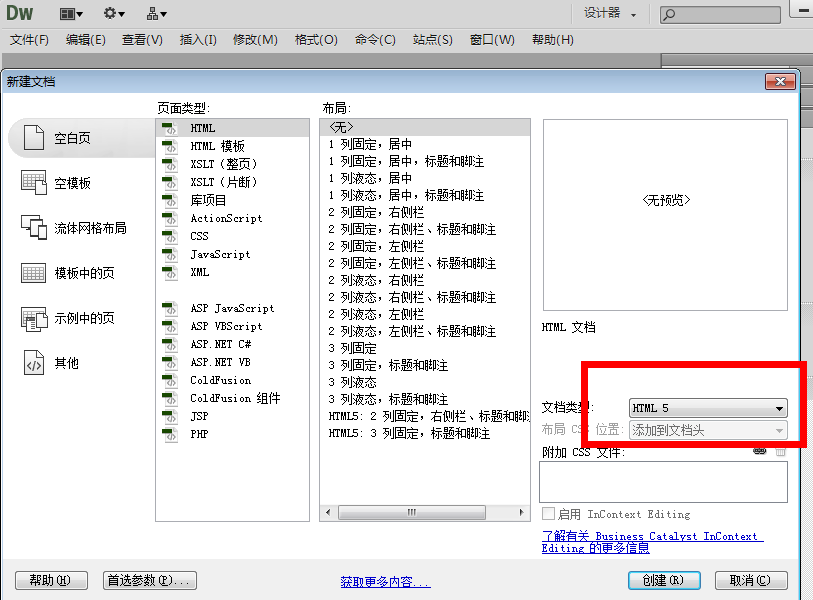
然後新建一個HTML文檔,選擇類型HTML5
創建好後,另存為與上一節的講解中js、css文件夾的同一目錄下。
layout.html就是我剛剛創建的文件。Bootstrap.html也是上一節中創建的第一個html頁面。
現在可以將Bootstrap.html中的代碼全部Copy到layout.html頁面。
然後在body標簽下添加如下代碼
復制代碼代碼如下:
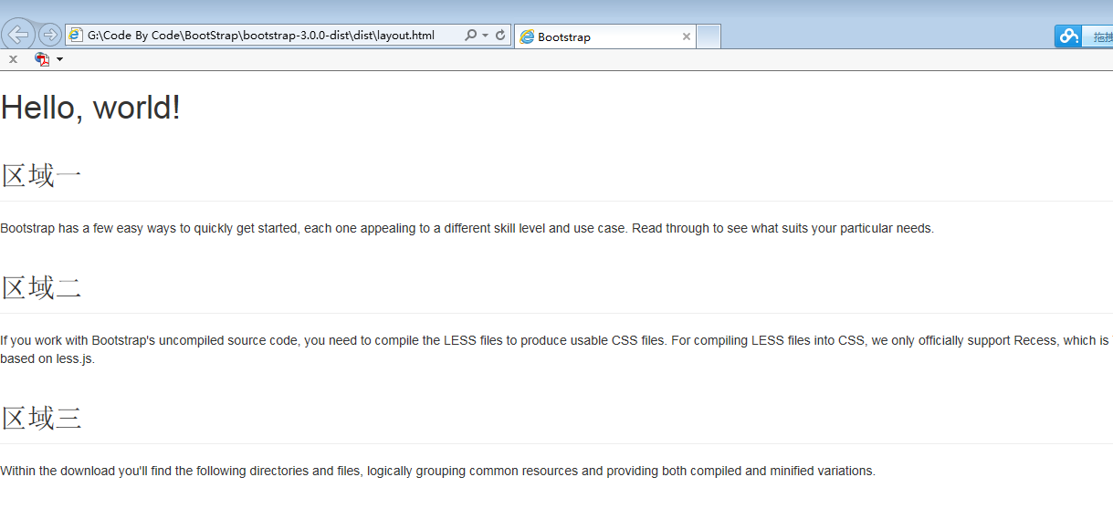
<h1>Hello, world!</h1>
<h2 class="page-header">區域一</h2>
<p>Bootstrap has a few easy ways to quickly get started, each one appealing to a different skill level and use case. Read through to see what suits your particular needs.</p>
<h2 class="page-header">區域二</h2>
<p>If you work with Bootstrap's uncompiled source code, you need to compile the LESS files to produce usable CSS files. For compiling LESS files into CSS, we only officially support Recess, which is Twitter's CSS hinter based on less.js.</p>
<h2 class="page-header">區域三</h2>
<p>Within the download you'll find the following directories and files, logically grouping common resources and providing both compiled and minified variations.</p>
這幾個標簽大家應該都能看的明白,最基礎最簡單的。
添加完後layout.html頁面所有代碼如下
復制代碼代碼如下:
<!DOCTYPE html>
<html>
<head>
<title>Bootstrap</title>
<meta name="viewport" content="width=device-width, initial-scale=1.0">
<!-- Bootstrap -->
<link href="css/bootstrap.min.css" rel="stylesheet" media="screen"> <pre></pre> <pre><font face="Arial"><!-- HTML5 Shim and Respond.js IE8 support of HTML5 elements and media queries -->
<!-- WARNING: Respond.js doesn't work if you view the page via file:// --> <!--[if lt IE 9]>
<script src="<a href="https://oss.maxcdn.com/libs/html5shiv/3.7.0/html5shiv.js"></script">https://oss.maxcdn.com/libs/html5shiv/3.7.0/html5shiv.js"></script</a>>
<script src="<a href="https://oss.maxcdn.com/libs/respond.js/1.3.0/respond.min.js"></script">https://oss.maxcdn.com/libs/respond.js/1.3.0/respond.min.js"></script</a>>
<![endif]-->
</head>
<body>
<h1>Hello, world!</h1>
<h2 class="page-header">區域一</h2>
<p>Bootstrap has a few easy ways to quickly get started, each one appealing to a different skill level and use case. Read through to see what suits your particular needs.</p>
<h2 class="page-header">區域二</h2>
<p>If you work with Bootstrap's uncompiled source code, you need to compile the LESS files to produce usable CSS files. For compiling LESS files into CSS, we only officially support Recess, which is Twitter's CSS hinter based on less.js.</p>
<h2 class="page-header">區域三</h2>
<p>Within the download you'll find the following directories and files, logically grouping common resources and providing both compiled and minified variations.</p> <script src="js/jquery-2.0.3.min.js"></script>
<script src="js/bootstrap.min.js"></script>
</body>
</html>
當然效果也很簡單,我還是把截圖放上,可以進行對比。
優化一:可以發現上圖的頁面效果占滿全屏,我們可以通過Bootstrap 樣式類對上面的內容進行居中。
復制代碼代碼如下:
<div class="container"> .........之前上面添加在body標簽下的代碼 </div>
效果如下
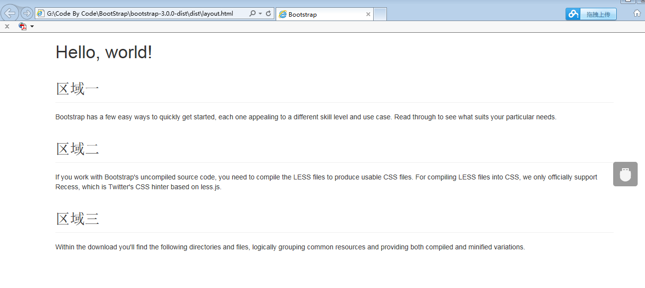
可以發現container這個類設置了寬度,並且可以讓內容顯示在頁面的中間。
優化二:將三個區域顯示在同一排,並且平均分成三欄。
首先為三個區域添加一個容器,可以使用div,並且為div添加一個類 <div >.
然後我們為每個小的區域也添加一個容器div,並且為div添加一個類<div >
簡單代碼實現如下
復制代碼代碼如下:
<div class="container"> <h1>Hello, world!</h1> <div class="row"> <div class="col-xs-4"> <h2 class="page-header">區域一</h2> <p>Bootstrap has a few easy ways to quickly get started, each one appealing to a different skill level and use case. Read through to see what suits your particular needs.</p> </div> <div class="col-xs-4"> <h2 class="page-header">區域二</h2> <p>If you work with Bootstrap's uncompiled source code, you need to compile the LESS files to produce usable CSS files. For compiling LESS files into CSS, we only officially support Recess, which is Twitter's CSS hinter based on less.js.</p> </div> <div class="col-xs-4"> <h2 class="page-header">區域三</h2> <p>Within the download you'll find the following directories and files, logically grouping common resources and providing both compiled and minified variations.</p> </div> </div> </div>
效果如下
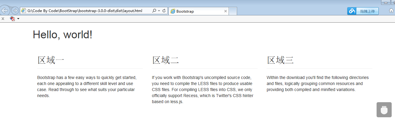
的確排成一列,然後分成三欄。再結合一下上面柵格系統的6部原理。是不是懂一點了,反正我自己懂了很多。通過同樣的方式可以創建出比較復雜的網格布局頁面。只需要在布局使用的容器上面添加相應的網格布局的類。比如說如果內容占用6個網格,那麼就添加一個col-xs-6的類、占用四個網格就添加一個col-xs-4的類,然後在同一排的周圍進行使用帶有row類的容器。
總結
本節主要學習的布局(柵格系統),通過簡單的實例來理解它的工作原理。
使用過的類有:
1..container:用.container包裹頁面上的內容即可實現居中對齊。在不同的媒體查詢或值范圍內都為container設置了max-width,用以匹配柵格系統。
2..col-xs-4:這個類通過"-"分為三個部分,第三個部分的數字作為一個泛指,它的范圍是1到12。就是可以把一個區域分為12個欄,這個要和row類聯合使用。
其實這個布局很像HTMl中的Table布局TR行和TD列吧。
暫時的理解就這些,代碼直接復制粘貼就可以看效果,當然首先要把預先的css、js文件進行准備。