HTML+CSS實現動態背景登錄頁面
編輯:關於CSS
1. 實現背景圖片的動態變換
首先在HTML頁面body板塊中,添加圖片div,代碼如下:
<body>
<div class="bgk">
<div class="bgk-image" style="background-image: url('${pageContext.request.contextPath}/img/1.jpg')"></div>
<div class="bgk-image" style="background-image: url('${pageContext.request.contextPath}/img/2.jpg')"></div>
<div class="bgk-image" style="background-image: url('${pageContext.request.contextPath}/img/3.jpg')"></div>
<div class="bgk-image" style="background-image: url('${pageContext.request.contextPath}/img/4.jpg')"></div>
</body>
再對圖片進行css設計。你要對圖片進行大小定位,那麼以下代碼肯定要首先編寫:
`.bgk {
margin: auto;
position: absolute;
width: 1366px;
height: 672px;
overflow: hidden;   /*溢出部分隱藏*/
}`
位置設定ok以後,那麼再對裡面的圖片進行設置。為了使圖片能足夠大覆蓋頁面,則代碼必須有 background-size: cover;
要實現動態效果,那麼你的css代碼中必須有動畫的設計:
-webkit-animation-name: kenburns;       /*-animation-name:為@keyframes 動畫規定名稱,必須與-animation-duration同時使用,否則無動畫效果*/
animation-name: kenburns;               /*或者:後面值為需要綁定到選擇器上的keyframe名稱*/
-webkit-animation-duration: 16s;    /*定義動畫完成一個周期所需時間*/
animation-duration: 16s;
-webkit-animation-timing-function: linear;  /*規定動畫從頭到尾以相同速度播放,還有其他幾個速度值*/
animation-timing-function: linear;
-webkit-animation-iteration-count: infinite;    /*規定動畫播放次數,infinite為無限次*/
animation-iteration-count: infinite;
-webkit-transform: scale(1.2);      /*規定動畫的縮放特效,scale:規定2D縮放*/
transform: scale(1.2);
-webkit-filter: blur(10px);       /*定義圖片的模糊程度,顯示為毛玻璃效果*/
filter: blur(10px);
在綁定每個子元素選擇器,有幾張圖片就綁定幾個選擇器:
.bgk-image:nth-child(1) {
-webkit-animation-name: kenburns-1;       /*選擇器上的名稱*/
animation-name: kenburns-1;
z-index: 3;         /*動畫堆疊順序,值越大表示越先播放,離用戶越近*/
}
.bgk-image:nth-child(2) {
-webkit-animation-name: kenburns-2;
animation-name: kenburns-2;
z-index: 2;
}
.bgk-image:nth-child(3) {
-webkit-animation-name: kenburns-3;
animation-name: kenburns-3;
z-index: 1;
}
.bgk-image:nth-child(4) {
-webkit-animation-name: kenburns-4;
animation-name: kenburns-4;
z-index: 0;
}
創建好選擇器以後,你就可以預覽你的動態背景圖片變換了
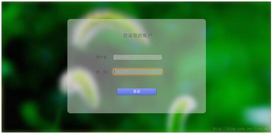
2. 對登錄表單的設計
在之前HTML頁面中繼續添加一個表單
<div class="form_login_div">
<form class="form_login" action="" method="post">
<label class="login_title">登錄您的賬戶</label>
<label class="username">用戶名</label><input class="input_username" id="input_username" type="text" name="username" placeholder="郵箱/手機號"/>
<label class="password">密 碼</label><input class="input_password" id="input_password" type="password" name="password" placeholder="請輸入密碼"/>
<input type="submit" value="登錄"/><br/>
</form>
</div>
添加完表單之後,就要進行表單的樣式設計。首先你得對表單規定一個圈子,限制它的寬度和高度
.form_login{
    margin: auto;
    width:700px;
    height: 480px;
    top: 90px;
    left: 333px;
    position: absolute;
    border-radius: 15px;
    background: rgba(216,216,216,0.5);      /*設置form表單透明度*/
    text-align: center;
    overflow: hidden;
}
然後對表單裡面的各個label進行定位和樣式設計,這裡可以自由設計。
對輸入框的設計,我只貼出主要樣式代碼
outline:none;       /*outline (輪廓)是繪制於元素周圍的一條線,位於邊框邊緣的外圍,可起到突出元素的作用。*/
border:1px solid rgba(0,0,0,.49);       /*輸入框邊框的大小,實線,rgba(red,green,blue,a為透明度),透明度處於0-1之間*/
-webkit-background-clip: padding-box;   /*background-clip 規定背景的繪制區域,padding-box為內容被裁減到內邊距框*/
background-clip: padding-box;
background:rgba(216,216,216,0.4) ;
border-radius:6px;      /*對輸入框進行圓角*/
padding:7px;       /*輸入框中光標位置*/
當聚焦輸入框的時候,可以增加一點絢麗色彩
.form_login input[type="text"]:focus,input[type="password"]:focus{
    -webkit-transition:border linear .2s,-webkit-box-shadow linear .5s;     /*對邊框顏色的逐步過渡高亮顯示,後面是對陰影的逐步過渡*/
    border-color:rgba(255,128,0,.75);
}
最後進行提交按鈕的設計
text-shadow:0px -1px 0px #5b6ddc;       /*文字陰影設置*/
outline:none;
border:1px solid rgba(0,0,0,0.49);       /*按鈕邊框顏色與透明度設置*/
-webkit-background-clip: padding-box;   /*規定內容的繪制區域,padding-box為內邊框距*/
background-clip: padding-box;
border-radius:6px;
cursor:pointer;     /*光標形狀,pointer為一只手的形狀*/
background-color:#768ee4;       /*按鈕背景顏色*/
當鼠標放在提交按鈕上面時,你可以適當進行一些動畫效果設計
.form_login input[type="submit"]:hover{
    background-color:#5f73e9;
    background-image:-webkit-linear-gradient(bottom,#5f73e9 0%,#859bef 100%);
    background-image:-moz-linear-gradient(bottom,#5f73e9 0%,#859bef 100%);
    background-image:-ms-linear-gradient(bottom,#5f73e9 0%,#859bef 100%);
    background-image:-o-linear-gradient(bottom,#5f73e9 0%,#859bef 100%);
    -webkit-box-shadow: inset 0px 1px 0px #aab9f4;      /*當鼠標放在按鈕上個時邊框的陰影*/
    box-shadow: inset 0px 1px 0px #aab9f4;
    margin-top:22px;
}
最後整個設計完成,你可以看見你最終的效果了
以上所述是小編給大家介紹的HTML+CSS實現動態背景登錄頁面,希望對大家有所幫助,如果大家有任何疑問請給我留言,小編會及時回復大家的。在此也非常感謝大家對網站的支持!
- 上一頁:CSS中margin和padding的區別淺析 No
小編推薦
熱門推薦