高度相等列在Web頁面設計中永遠是一個網頁設計師的需求。如果所有列都有相同的背景色,高度相等還是不相等都無關緊要,因為你只要在這些列的父元素中設置一個背景色就可以了。但是,如果一個或多個列需要單獨設置自己的背景色,那麼它的視覺完整性的設計就顯得非常重要了。大家都知道當初Table實現等高列布局是多麼的簡單,但是我們使用CSS來創建等高列布局並非是那麼容易的事情。
如果一個設計是固定寬度(非流體的寬度設計),那麼實現多列等高效果是相當的容易。最好的技術就是使用Dan Cederholm的Faux Columns技術。只要制作一張合適的背景圖片,在你多列的父元素中進行垂直鋪放,從而達到一種假像(假的多列等高布局效果)。但是在流體布局中要用CSS實現多列等高的設計那就不是那麼容易的事情,因為我們沒有辦法在使用背景圖片來實現多列等高的假像了,那麼是不是就沒有辦法實現了呢?那當然不是那麼回事了,不管是實現固定布局還是流體布局的等多列等高視覺效果,方法還是蠻多的,這些方法體現了CSS的不同技術,也各有千秋,下面我們就一起來探討Web頁面中的多列等高的實現技術。
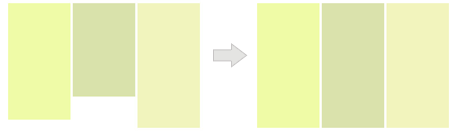
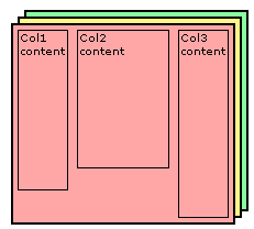
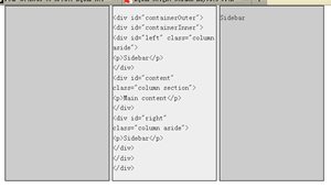
下面要介紹的方法都是讓我們的布局如何實現多列的等高視覺效果,正如下圖所示:
一、假等高列
這種方法是我們實現等高列最早使用的一種方法,就是使用背景圖片,在列的父元素上使用這個背景圖進行Y軸的鋪放,從而實現一種等高列的假像:
Html Markup
				<div class=”container clearfix”>
					<div class=”left”></div>
					<div  class=”content”></div>
					<div class=”right”></div>
				</div>
在制作樣式之前需要一張類似下面的背景圖:

CSS Code:
				.container {
					background: url("column.png") repeat-y;
					width: 960px;
					margin: 0 auto;
					}
					.left {
					float: left;
					width: 220px;
					}
					.content {
					float: left;
					width: 480px;
					}
					.right {
					float:left;
					width: 220px;
					}
優點:
實現方法簡單,兼容性強,不需要太多的css樣式就可以輕松實現。
缺點:
使用這種方法不適合流體布局等高列的布局,另外如果你需要更換背景色或實現其他列數的等高列時,都需要重新制作過背景圖。
二、給容器div使用單獨的背景色(固定布局)
這種方法實現有點復雜,如果你理解其實現過程也是相當的簡單。這種方法我們主要給每一列的背景設在單獨的<div>元素上。這種方法的實現的原則是:任何<div>元素的最大高度來撐大其他的<div>容器高度。如下圖所示:
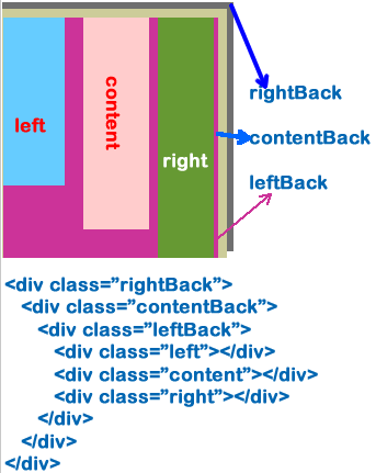
上圖中,不管我們哪一列的高度最高,那麼其三個容器“rightBack,contentBack,leftBack”的高度相應會隨最高列的高列變化,下面我們一起來看其實現過程:
Html Markup
							<div class="container">
								<div class="rightWrap">
									<div class="contentWrap">
										<div class="leftWrap">
											<div class="aside column leftSidebar" id="left"></div>
											<div id="content" class="column section"></div>

											<div class="aside rightSidebat column" id="right"></div>
										</div>
									</div>
								</div>
							</div>
CSS Code:
							<style type="text/css">
								.container {
									width: 960px;
									margin: 0 auto;
								}
								.rightWrap {
									width: 100%;
									float: left;
									background: green;
									overflow: hidden;
									position: relative;
								}

								.contentWrap {
									float: left;
									background: orange;
									width: 100%;
									position: relative;
									right: 320px;/*此值等於rightSidebar的寬度*/
								}

								.leftWrap{
									width: 100%;
									background: lime;
									float:left;
									position: relative;
									right: 420px;/*此值等於Content的寬度*/
								}
								#left {
									float: left;
									width: 220px;
									overflow: hidden;
									position: relative;
									left: 740px;
								}
								#content {
									float: left;
									width: 420px;
									overflow: hidden;
									position:relative;
									left: 740px;
								}
								#right {
									float: left;
									overflow: hidden;
									width: 320px;
									position: #333;
									position: relative;
									left: 740px;
								}
							</style>
看起來蠻復雜吧?其實你只要了解了它是如何的工作原理就會變得非常簡單,你只要理解並掌握以下幾點:
- “div.rightWrap”、“div.contentWrap”、“div.leftWrap”都是一個封閉的容器;而“div#left”、“div#content”、“div#right”就是我們所說的列,裡面放了內容;
- 每一個容器對應一列的背景色(用來放置背景色或背景圖片);此例對應的是:“div.rgithWrap”用來實現“div#right”列的背景色;“div.contentWrap”用來實現“div#content”列的背景色;“div.leftWrap”用來實現“div#left”列的背景色;
- 除了最外面的容器(也就是對應的最左列容器)外,我都都對他們進行相對定位,並且設置其“right”值,此值並和相對應的列寬相等。此例中“div.contentWrap”對應的剛好是“div#right”的寬度;而“div.leftWrap”對應用的剛好是“div#content”的寬度;
- 給每列進行左浮動,並設置其列寬
- 給每一列設置相對定位,並進行“left”設置,而且“left”的值等於除第一列的所有列寬的和。此例中“left”的值等於“div#right”和“div#content”兩列的寬度之和,也就是320px+420=740px
用兩幅圖來展示其實現的過程:
下圖是實現上面的第二步對應的示例圖,也就是容器“div.rightWrap”,“div.contentWrap”,“div.leftWrap”進行相對定位(position: releative),並展示了如何設置對應的“right”值。
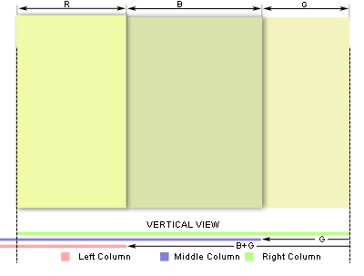
上圖虛線代表的范圍是可視范圍,其中有兩列背景將會溢出,解決這個只需要在最外層容器“div.rightWrap”加上“overflow:hidden”就可以進行隱藏溢出的其他背景色。接下來下圖所展示的是上面所說的第五步:
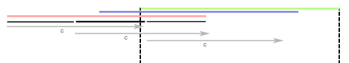
前面我們對三個內容元素都進行了相對定位,現在只需要按第五步將其定位回去,如上圖所示。其實說到最後,你只要理解了這兩幅,你就什麼都清楚了。
優點:
這種方法是不需要借助其他東西(javascript,背景圖等),而是純CSS和HTML實現的等高列布局,並且能兼容所有浏覽器(包括IE6),並且可以很容易創建任意列數。
缺點:
這種方法不像其他方法一樣簡單明了,給你理解會帶來一定難度,但是只要你理解清楚了,將能幫你創建任意列數的等高布局效果。
三、給容器div使用單獨的背景色(流體布局)
這種布局可以說是就是第二種布局方法,只是這裡是一種多列的流體等高列的布局方法。前面也說過了,其實現原理就是給每一列添加相對應用的容器,並進行相互嵌套,並在每個容器中設置背景色。這裡需要提醒大家你有多少列就需要多少個容器,比如說我們說的三列,那麼你就需要使用三個容器。如下圖所示:
HTML Markup
								<div id="container3">
									<div id="container2">
											<div id="container1">
													<div id="col1">Column 1</div>
													<div id="col2">Column 2</div>

													<div id="col3">Column 3</div>
											</div>
									</div>
								</div>
CSS Code:
								<style type="text/css">
									#container3 {
										float: left;
										width: 100%;
										background: green;/**/
										overflow: hidden;
										position: relative;
									}

									#container2 {
										float: left;
										width: 100%;
										background: yellow;
										position: relative;
										right: 30%; /*大小等於col3的寬度*/
									}

									#container1 {
										float: left;
										width: 100%;
										background: orange;
										position: relative;
										right: 40%;/*大小等於col2的寬度*/
									}

									#col1 {
										float:left;
										width:26%;/*增加了2%的padding,所以寬度減少4%*/
										position: relative;
										left: 72%;/*距左邊呀增加2%就成72%*/
										overflow: hidden;
									}
									#col2 {
										float:left;
										width:36%;/*增加了2%的padding,所以寬度減少4%*/
										position: relative;
										left: 76%;/*距左邊有三個padding為2%,所以距離變成76%*/
										overflow: hidden;
									}
									#col3 {
										float:left;
										width:26%;/*增加了2%的padding,所以寬度減少4%*/
										position: relative;
										left: 80%;/*距左邊5個padding為2%,所以距離變成80%*/
										overflow: hidden;
									}
								</style>
上面展示的是三列的,下面我們在來看一下兩列和更多列的模板:
兩列的HTML Markup:
					<div id="container2">
						<div id="container1">

							<div id="col1">Column 1</div>
							<div id="col2">Column 2</div>
						</div>
					</div>
兩列的CSS Code:
					<style type="text/css">
						#container2 {
							float: left;
							width: 100%;
							background: orange;
							position: relative;
							overflow: hidden;
						}
						#container1 {
							float: left;
							width: 100%;
							background: green;
							position: relative;
							right: 30%;
						}

						#col1 {
							width: 66%;
							float: left;
							position: relative;
							left: 32%;
						}

						#col2 {
							width: 26%;
							float: left;
							position: relative;
							left: 36%;
						}
					</style>
四列的HTML Markup:
							<div id="container4">
								<div id="container3">

									<div id="container2">
										<div id="container1">
											<div id="col1">col1</div>
											<div id="col2">col2</div>
											<div id="col3">col3</div>

											<div id="col4">col4</div>
										</div>
									</div>
								</div>
							</div>
四列的CSS Code:
							<style type="text/css">
								#container4 {
									float: left;
									width: 100%;
									background: green;
									position: relative;
									overflow: hidden;
								}

								#container3 {
									float: left;
									width: 100%;
									background: #B2F0F9;
									position: relative;
									right: 20%;/*此值等於col4的寬度*/
								}

								#container2 {
									float: left;
									width: 100%;
									background: #89FFA2;
									position: relative;
									right: 30%;/*此值等於col3的寬度*/
								}

								#container1 {
									float: left;
									width: 100%;
									background: #369;
									position: relative;
									right: 30%;/*此值等於col2的寬度*/
								}

								#col1 {
									width: 18%;/*1%的padding*/
									float: left;
									position: relative;
									left: 81%;
									overflow: hidden;
								}

								#col2 {
									float: left;
									width: 28%;
									position: relative;
									left: 83%;
									overflow: hidden;
								}

								#col3 {
									float: left;
									width: 28%;
									position: relative;
									left: 85%;
									overflow: hidden;
								}

								#col4 {
									float: left;
									width: 18%;
									position: relative;
									left: 87%;
									overflow: hidden;
								}
							</style>
下面來看其實現過程,如果你理解了第二制作方法,那麼這個你不用想一下就知道他們是一樣的道理,如果你對第二種方法還不夠清楚,那麼你接著看這下面的內容,你會更清楚他們是怎麼一回事的。下面我們一起來看三列的實現過程:
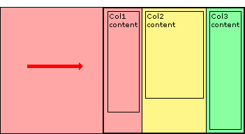
上圖展示了,我們有三列,並且也說過了,這三列內容都放在了三個容器的div中,我們每一列的背景色不是放在內容列中,而是放置在容器中,現在我們需要通過對容器進行相對定位,把背景顯示出來,而且我們這個容器是最外層的不能進行相對定位的移動,具體的請看下圖:
上面我們把容器進行了相對定位,這樣一來,我們內容也相應的做了移動,現在我們需要對頁面列的內容也進行相對定位,並把內容和容器進行相反方向的定位,這樣內容和容器背景色就能對應上了,請看下圖所展示的:
接下來我們需要把溢出的部分切掉去,和前面一相,在最外面的容器加上overflow:hidden;這樣就OK了。
最後為了讓你的效果更加好看一點,你可以嘗試給他們加上padding,比如說每列加上2%的padding值,具體實現可以簡單從下圖中得到:
優點:
兼容各浏覽器,可以制作流體等高列,交無列數限制。
缺點:
標簽使用較多,結構過於復雜,不易於理解,不過你掌握了其原理也就不難了,這也不算太大缺點。
三、創建帶邊框的現列等高布局
平常在制作中,我們需要制作兩列的等高效果,並且有一條邊框效果,那麼這個實例我們就一起來看其實現方法:
Html Code
				<div id="wrapper">
					<div id="sidebar">
						.....
					</div>
					<div id="main">
						....
					</div>

				</div>
CSS Code:
				<style type="text/css">
					html {
						background: #45473f;
						height: auto;
					}

					body {
						width: 960px;
						margin: 20px auto;
						background: #ffe3a6;
						border: 1px solid #efefef;
					}

					#wrapper {
						display: inline-block;
						border-left: 200px solid #d4c376;
						position: relative;
						vertical-align: bottom;
					}

					#sidebar {
						float: left;
						width: 200px;
						margin-left: -200px;
						margin-right: -1px;
						border-right: 1px solid #888;
						position: relative;
					}

					#main {
						float: left;
						border-left: 1px solid #888;
					}

					#maing,
					#sidebar{
						padding-bottom: 2em;
					}
				</style>
優點:
可以制作帶有邊框的兩列等高布局,並能兼容所有浏覽器,結構簡單明了。
缺點:
不適合於更多列的應用,比如說三列以上,這樣的方法就行不通了。
四、使用正padding和負margin對沖實現多列布局方法
這種方法很簡單,就是在所有列中使用正的上、下padding和負的上、下margin,並在所有列外面加上一個容器,並設置overflow:hiden把溢出背景切掉。下面一起來看代碼:
HTML Markup:
						<div id="container">
							<div id="left" class="column aside">
								<p>Sidebar</p>
							</div>
							<div id="content" class="column section">

								<p>Main content</p>
							</div>
							<div id="right" class="column aside">
								<p>Sidebar</p>
							</div>
						</div>
CSS Code:
					<style type="text/css">

						#container {
							margin: 0 auto;
							overflow: hidden;
							width: 960px;
						}

						.column {
							background: #ccc;
							float: left;
							width: 200px;
							margin-right: 5px;
							margin-bottom: -99999px;
							padding-bottom: 99999px;
						}

						#content {
							background: #eee;
						}

						#right {
							float: right;
							margin-right: 0;
						}
					</style>
優點:
這種可能實現多列等高布局,並且也能實現列與列之間分隔線效果,結構簡單,兼容所有浏覽器
缺點:
這種方法存在一個很大的缺陷,那就是如果要實現每列四周有邊框效果,那麼每列的底部(或頂部)將無法有邊框效果。
下面我們就針對這個缺陷來介紹兩種解決辦法,第一種是使用背景圖來模仿底部(或頂部)邊框;第二種方法是使用div來模仿列的邊框,下面我們來看這兩種方法:
1、背景圖模仿邊框效果:
Html Code:
					<div id="containerOuter">
						<div id="containerInner">
							<div id="left" class="column aside">
								<p>Sidebar</p>
							</div>

							<div id="content" class="column section">
								<p>Main content</p>
							</div>
							<div id="right" class="column aside">
								<p>Sidebar</p>

							</div>
						</div>
					</div>
CSS Code:
					<style type="text/css">
						#containerOuter {
							background: url("images/bg.gif") no-repeat center bottom;
							width: 616px;
							margin: 0 auto;
							padding-bottom: 1px;
							overflow: hidden;
						}

						#containerInner {
							float: left;
							overflow: hidden;
							margin-right: -5px;
						}

						.column {
							background: #ccc;
							border: 1px solid #000;
							float: left;
							width: 200px;
							margin-right: 5px;
							margin-bottom: -99999px;
							padding-bottom: 99999px;
						}

						#content {
							background: #eee;
						}
					</style>
這種方法我們需要在外面增加一個層,並將背景圖放置在這個層的底部,而且需要制作一張和列邊框色一致,並且要先排列好他們之間的間距,如下圖所示:
這種方法有一個最大的不足之處就是,如果我們更改了列的邊框的顏色,或者改變了他們之間的間距,都需要重新制作過一張背景圖來重新模仿這樣的效果,下面一起來看看這種方法帶來的最後效果:
2、使用div來模仿列的邊框
我們這種方法是在列裡面添加一個div,用這個div來模仿邊框的效果,具體看代碼吧:
Html Code:
				<div class="wrapper">
					<div class="container">
						<div class="col1">

							<div class="colBottom1"><!-- ie needs this comment for small div heights --></div>
						</div>
						<div class="col2">
							<div class="colBottom2"><!-- ie needs this comment for small div heights --></div>
						</div>

					</div>
				</div>
CSS Code:
				<style type="text/css">
					.wrapper {
						width: 960px;
						margin: 0 auto;
					}
					.container {
						position: relative;
						overflow: hidden;
						zoom: 1;
					} /* zoom fix for ie6 */
					.col1 {
						float: left;
						width: 728px;
						padding-bottom: 32767px;
						margin-bottom: -32767px;
						border: #f36 1px solid;
						background: #AFAFAF;
						}
					.col2 {
						float: right;
						width: 208px;
						padding-bottom: 32767px;
						margin-bottom: -32767px;
						border: #f36 1px solid;
						background: #6F6F6F;
					}
					.colBottom1 {
						position: absolute; /*相對於div.container*/
						bottom: 0;
						left: 0px;/*如果第一列左浮動就設置left:0;*/
						height: 1px; /*當前列的邊框寬度*/
						width: 730px;/*當前列寬度+邊框寬度*2 */
						background: #f36;/*當前列的邊框顏色*/
						}
					.colBottom2 {
						position: absolute; /*相對於div.container*/
						bottom: 0;
						right: 0px; /*如果第二列右浮動就設置left:0;*/
						height: 1px; /*當前列的邊框寬度*/
						width: 210px; /*當前列寬度+邊框寬度*2 */
						background: #f36;/*當前列的邊框顏色*/
					}

				</style>
五、使用邊框和定位模擬列等高
這種方法是使用邊框和絕對定位來實現一個假的高度相等列的效果。假設你需要實現一個兩列等高布局,側欄高度要和主內容高度相等。如:
Html Code:
				<div id="wrapper">
					<div id="mainContent">...</div>
					<div id="sidebar">...</div>

				</div>
CSS Code:
				<style type="text/css">
					#wrapper {
						width: 960px;
						margin: 0 auto;
					}

					#mainContent {
						border-right: 220px solid #dfdfdf;
						position: absolute;
						width: 740px;
					}

					#sidebar {
						background: #dfdfdf;
						margin-left: 740px;
						position: absolute;
						width: 220px;
					}
				</style>
優點:
結構簡單,兼容各浏覽器,容易掌握。
缺點:
這個方法就是無法單獨給主內容列設置背景色,並且實現多列效果效果不佳。
六、邊框模仿等高列
第五種方法我們無法實現主列的背景色設置,針對上面方法,稍作一下改良,這樣就可以實現主內容也設置顏色的效果了
CSS Html:
				<div id="container">
					<div id="content">This is<br />some content</div>
					<div id="right">This is the right</div>
				</div>
CSS Code:
				<style type="text/css">
					#container{
						background-color:#0ff;
						overflow:hidden;
						width:960px;
						margin: 0 auto;
					}
					#content{
						background-color:#0ff;
						width:740px;
						border-right:220px solid #f00; /* 邊框大小和顏色設置和right大小與顏色一樣 */
						margin-right:-220px; /*此負邊距大小與right邊欄寬度一樣*/
						float:left;
					}
					#right{
						background-color:#f00;
						width:220px;
						float:left;
					}
				</style>
下面我們在此基礎上改變流體布局:
HTML Markup
				<div id="container">

					<div id="content">Main content section</div>
					<div id="sidebar">Right Sidebar </div>
				</div>
				<style type="text/css">

					#container{
						background-color:#0ff;
						overflow:hidden;
						margin:0 100px;
						padding-right:220px; /* 寬度大小等與邊欄寬度大小*/
					}
					* html #container{
						height:1%; /* So IE plays nice */
					}
					#content{
						background-color:#0ff;
						width:100%;
						border-right:220px solid #f00;
						margin-right:-220px;
						float:left;
					}
					#sidebar{
						background-color:#f00;
						width:220px;
						float:left;
						margin-right:-220px;
					}
				</style>
上面主要展示了這種方法的二列布局,下面我們在來看看三列布局的用法
HTML Markup
					<div id="containerOuter">
						<div id="container">
							<div id="content">Main content section</div>

							<div id="left">LEFT sidebar</div>
							<div id="right">RIGHT sidebar</div>
						</div>
					</div>
CSS Code:
					<style type="text/css">
						#containerOuter {
							margin: 0 auto;
							width: 960px;
						}
						#container{
							background-color:#0ff;
							float:left;
							width:520px;
							border-left:220px solid #0f0; /* 邊框大小等於左邊欄寬度,顏色和左邊欄背景色一致*/
							border-right:220px solid #f00;/* 邊框大小等於右邊欄寬度,顏色和右邊欄背景色一致*/
						}
						#left{
							float:left;
							width:220px;
							margin-left:-220px;
							position:relative;
						}
						#content{
							float:left;
							width:520px;
							margin-right:-520px;
						}
						#right{
							float:right;
							width:220px;
							margin-right:-220px;
							position:relative;
						}
					</style>
接著在看一個三列自適應布局
Html Markup
				<div id="container">

					<div id="content">Main Content</div>
					<div id="left">Left Sidebar</div>
					<div id="right">Right Sidebar</div>
				</div>
CSS Code
				<style type="text/css">
					body{
					margin:0 100px;
					padding:0 220px 0 220px;
				}
				#container{
					background-color:#0ff;
					float:left;
					width:100%;
					border-left:220px solid #0f0;
					border-right:220px solid #f00;
					margin-left:-220px;
					margin-right:-220px;
					display:inline; /* So IE plays nice */
				}
				#left{
					float:left;
					width:220px;
					margin-left:-220px;
					position:relative;
				}
				#content{
					float:left;
					width:100%;
					margin-right:-100%;
				}
				#right{
					float:right;
					width:220px;
					margin-right:-220px;
					position:relative;
				}
			</style>
優點:
能兼容所有浏覽器效果,結構簡單明了,容易掌握。
缺點:
列數受到極限,超過三列不好控制。
七、模仿表格布局實列等高列效果
這種方法只適合現代浏覽器,本不想介紹的,不過還是順便列出讓大家參考一下吧:
HTML Markup:
						<div class="container table">
							<div class="containerInner tableRow">
								<div class="column tableCell cell1">
									<div class="left aside">
										....
									</div>
								</div>


								<div class="column tableCell cell2">
									<div class="content section">
										...
									</div>
								</div>

								<div class="column tableCell cell3">
									<div class="right aside">

										...
									</div>
								</div>

							</div>
						</div>
CSS Code:
						<style type="text/css">
							.table {
								width: auto;
								min-width: 1000px;
								margin: 0 auto;
								padding: 0;
								display:table;
							}

							.tableRow {
								display: table-row;
							}

							.tableCell {
								display: table-cell;
								width: 33%;
							}

							.cell1 {
								background: #f00;
							}

							.cell2 {
								background: #0f0;
							}

							.cell3 {
								background: #00f;
							}
						</style>
優點:
這是一種非常簡單,易於實現的方法。
缺點:
兼容性不好,在ie6-7無法正常運行。
八、jQuery和javascript大法
最後要給大家介紹的是使用jQuery和javascript方法來實現多列的布局效果。
1、jQuery實現方法:
Html Markup
				<div class="container">
					<div id="left" class="aside leftSidebar"></div>
					<div id="content" class="section"></div>
					<div id="right" class="aside rightSidebar"></div>
				</div>
CSS Code:
				<style type="text/css">
					.contanier {
						width: 960px;
						margin: 0 auto;
					}

					.aside,
					.section {
						float:left;
						width: 33%;
						background: lime;
					}

					.leftSidebar {background: orange;}
					.section { background: green;}
				</style>
jQuery Code:
				<script type="text/javascript">

					$(document).ready(function(){
						//等高列的小插件
						function setEqualHeight(columns) {
							var tallestColumn = 0;
							columns.each(function(){
								currentHeight = $(this).height();
								if(currentHeight > tallestColumn) {
									tallestColumn = currentHeight;
								}
							});
							columns.height(tallestColumn);
						}
						//調用寫好的插件,基中“.container > div”是你需要實現的等高列
						setEqualHeight($(".container > div"));
					});
				</script>
你也可以把上面的jQuery代碼換成下面的
<script type="text/javascript">
$(document).ready(function(){
var currentTallest = 0,
currentRowStart = 0,
rowDivs = new Array(),
$el,
topPosition = 0;
$('.column').each(function() {
$el = $(this);
topPostion = $el.position().top;
if (currentRowStart != topPostion) {
// we just came to a new row. Set all the heights on the completed row
for (currentDiv = 0 ; currentDiv < rowDivs.length ; currentDiv++) {
rowDivs[currentDiv].height(currentTallest);
}
// set the variables for the new row
rowDivs.length = 0; // empty the array
currentRowStart = topPostion;
currentTallest = $el.height();
rowDivs.push($el);
} else {
// another div on the current row. Add it to the list and check if it's taller
rowDivs.push($el);
currentTallest = (currentTallest < $el.height()) ? ($el.height()) : (currentTallest);
}
// do the last row
for (currentDiv = 0 ; currentDiv < rowDivs.length ; currentDiv++) {
rowDivs[currentDiv].height(currentTallest);
}
});
});
</script>
如果你使用上面這個jQuery代碼,你需要在需要實現等高列的div中加上"column"類名,這樣才會有效果的。
2、JavaScript方法
上面是jQuery的實現方法,接下來看看javaScript的實現方法:
Html Markup:
				<div class="contanier">
					<div class="column" id="left"></div>
					<div id="content" class="column"></div>
					<div id="right" class="column"></div>
				</div>
CSS Code:
				<style type="text/css">
					.contanier {
						width: 960px;
						margin: 0 auto;
					}

					#left {
						width: 220px;
						float: left;
						margin-right: 20px;
						background: green;
					}

					#content {
						width: 480px;
						float: left;
						margin-right: 20px;
						background: lime;
					}

					#right {
						width: 220px;
						float: right;
						background: orange;
					}
				</style>
Javascript Code:
				<script type="text/javascript">

					function matchColumns(classname){
						var divs,contDivs,maxHeight,divHeight,d;
						// get all <div> elements in the document
						divs=document.getElementsByTagName('div');
						contDivs=[];
						// initialize maximum height value
						maxHeight=0;
						// iterate over all <div> elements in the document
						for(var i=0;i<divs.length;i++){
								// make collection with <div> elements with class attribute 'container'
								if(new RegExp("b" + classname + "b").test(divs[i].className)){
									d=divs[i];
									contDivs[contDivs.length]=d;
									// determine height for <div> element
									if(d.offsetHeight){
										divHeight=d.offsetHeight;
									}
									else if(d.style.pixelHeight){
										divHeight=d.style.pixelHeight;
									}
									// calculate maximum height
									maxHeight=Math.max(maxHeight,divHeight);
								}
						}
						// assign maximum height value to all of container <div> elements
						for(var i=0;i<contDivs.length;i++){
							contDivs[i].style.height=maxHeight + "px";
						}
				}
				// Runs the script when page loads
				window.onload=function(){
					if(document.getElementsByTagName){

						matchColumns('column'); // class=maincolumn
					}
				}
				</script>
上面八大種方法就是我今天要跟大家一起分享的等高列的布局方法,他們之間更有千秋,希望能給需要的您帶來一定的幫助。篇幅過長,慢慢看吧,上面的代碼都是經過測試的,兼容各大浏覽器,可以直接復制代碼使用。
如需轉載煩請注明出處:W3CPLUS