這是一個很棒的鼠標懸停(hover)效果。從國外的網站上看到了,轉載過來。沒有作任何翻譯與編輯,大家可以償試閱讀英文教程,加油!
注意:此懸停效果在IE6中無效
實例預覽地址:http://www.prukc.com/
I would like to share some insight on a pIEce of CSS I’ve used for the homepage for a website a while ago that I’ve built together with Roger Johansson.
The Html markup
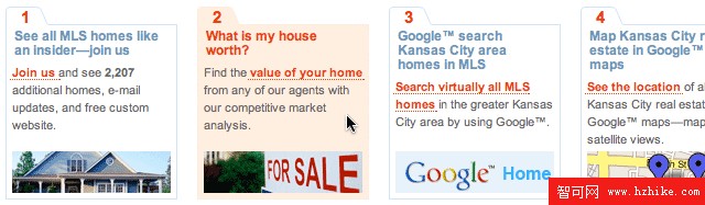
Let’s take a look first at the HTML markup for this. First we need to think about the structure of this pIEce of content. How should it be structured with CSS disabled and still make sense for the user. I think a bullet list makes sense. We sum up the 4 different ways to find your Kansas City Homes for Sale. This is the (X)Html markup:
Html:
<h2>4 different ways to find your Kansas City Homes for Sale</h2><ul id="differences">
<li id="diff-1"><h3><em>1</em><a href="benefits.html">See all MLS homes like an insider—join us</a></h3><div><p><a href="benefits.Html">Join us </a> and see <strong>2,207</strong> additional homes, e-mail updates, and free custom website.</p></div></li>
<li id="diff-2"><h3><em>2</em>What is my house worth?</h3><div><p>Find the <a href="/" title="empty">value of your home</a> from any of our agents with our competitive market analysis.</p></div></li>
<li id="diff-3"><h3><em>3</em>Google™ search Kansas City area homes in MLS</h3><div><p><a href="/" title="empty">Search virtually all MLS homes</a> in the greater Kansas City area by using Google™.</p></div></li>
<li id="diff-4"><h3><em>4</em>Map Kansas City real estate in Google™ maps </h3><div><p> <a href="cma.Html" title="empty">See the location</a> of all Kansas City real estate with Google™ maps—map or satellite vIEws.</p></div></li>
</ul>
If you look ate the page with CSS disabled, I think this markup is well structured and it’s perfect to build the necessary CSS to achIEve the style I have in mind.
The background images
If you look at the final page and the effect I want to achIEve with the tabs, you know that I need to create background images for this that are able to grow if the user enlarges the text. Here is how they look:
diff-tabs-top-wide.gif
diff-tabs-bottom-wide.gif

You'll notice that both the hover background and the default background are saved as 1 gif file. This way the hover effect will go smooth without interuption. The entire image is loaded and the browser doesn’t have to load the hover images on the moment the user hovers the box. To be sure the box can grow we save the bottom part of the box and the top part of the box, making it long enough to be sure there will be no gaps (till a certain enlargement).
The CSS styles
The unordered list “differences”
This is the CSS for the list starting with the unordered list of the 4 boxes. To prevent the margins to collapse I’ve added float:left.
margin:0.5em 0 1.5em 0;
padding:0;
list-style:none;
width:100%;
float:left;
}
The li element styles look like this:
margin:0 18px 0 0;
padding:0;
float:left;
background:url(../images/diff-tabs-top-wide.gif) no-repeat 0 0;
}
I add a right-margin of 18px to create a gutter between each box. The last box in the row doesn’t need this margin. Each li element has an id. The id for the last one is #diff-4. So I add this CSS style:
margin-right:0;
}
Making sure the tabbed boxes can grow
As you’ve noticed, we’ve linked the top part of the background image (the tab shape) to the li element via CSS. To make sure the tabbed boxes can grow if the user enlarges his text, we need to add an extra div in each li element. This way we can link the bottom part of the image to this div via CSS:
font-size:0.94em;
padding:6px;
background:url(../images/diff-tabs-bottom-wide.gif) no-repeat 0 100%;
}
With CSS3 we don’t have to go through this hassle of adding extra divs, because CSS3 allows for multiple background images on one element. This is my top favorite CSS3 feature :)
Creating the hover effect
I’ve used background positioning to create the hover effect on the li element using the :hover pseudo-class. The CSS looks like this:
background-position:-156px 0;
}
#differences li:hover div {
background-position:-156px 100%;
}
The x coordinate is set to -156px. This way the pink orange part of the background image will be shown. The first style represents the top part of the tabbed box and the 2nd one the bottom part. Remember I had to add an extra div to make sure the box can grow (till a certain enlargement).
The page uses a dynamic resolution dependent layout
Not sure if you’ve noticed or not, but if you resize your browser window to less then 750 pixels wide, the page will adjust its layout. This is done using a Javascript created by Kevin Hale of Particle Tree in combination with CSS. I’m using an extra CSS stylesheet that is applIEd if the browser window is resized to less then 750 pixels. By default the page/site uses the wider version, which is aimed to a screen resolution of 1024 x 768. About 90% of the visitors of the Prudential Kansas City visitors are using a screen resolution of at least 1024 x 768 pixels.
Hopefully some of you have learned from this article and are inspired to use CSS in a creative way without overlooking the Accessibility part of it and keeping the right structure in mind for the (X)Html. I’m still creating new templates for this website on an occasional basis. This website is rather big and new features are constantly added by the clIEnt and the developer.
Oh and let’s not forget to mention that it is always great to work together with Roger. He’s picky in what he does, but that’s what I love about working with him, and of course I always challenge him with my designs :)
PrevIEw url: http://www.prukc.com/
- 上一頁:dl,dt,dd標記在網頁中要充分利用
- 下一頁:HTML驗證的好處?