今天我們一起來看看如何創建一個實用並且功能強大的表單,表單使用如今最熱門的技術HTML5和css3來創建,並且可以通過HTML5進行客戶端驗證。
查看預覽下載附件
第一步:策劃表單功能
首先,我們得為我們的表單策劃一下該有什麼功能,用什麼形式表現。在這個示例中,我們就制作一個比較簡單的留言表單。需要的功能如下:
- 名稱
- 電子郵件
- 網站地址
- 提交按鈕
我們都希望用戶能夠填寫正確的信息再提交,要實現這一點,我們可以使用HTML5客戶端驗證新技術。那怎麼樣使用這個功能呢?在這裡簡單的使用服務器驗證,不做進一步的深入了解。
第二步:策劃表單形式
在我心中,憧憬著一個美麗而簡約的提交表單。雖然現在很丑,但是他不是野雞是鳳凰。

就像上圖顯示的,包含下面幾個部分:
- 表格標題(Required fields)
- 表格標簽
- 表格輸入(Placeholder text)
- 表單提示
- 提交按鈕
現在我們已經確定好了表單的形式,就開始創建HTML結構代碼。
第三步:創建HTML結構代碼
根據上面確定的形式來創建最基本的HTML代碼。
<!DOCTYPE html>
<html>
<head>
    <meta charset="utf-8">
    <title>HTML5 Contact Form</title>
    <link rel="stylesheet" media="screen" href="styles.css" rel="external nofollow"  >
</head>
<body>
</body>
</html>
在這裡頁面還是空白的。這只是一個網頁最基本的代碼。
第四步:HTML表單
開始在頁面中創建表單。
<form class="contact_form" action="" method="post" name="contact_form">
</form>
第五步:HTML表單元素
為了更好的理解和維持表單的形式,我們將一步一步的添加表單裡面的元素。
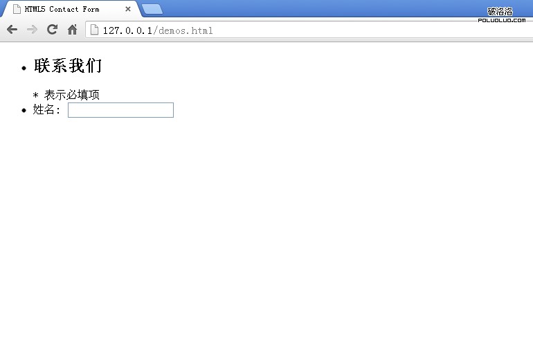
那最先開始的是創建表單表頭和第一個輸入框:
<ul>
    <li>
         <h2>聯系我們</h2>
         <span class="required_notification">* 表示必填項</span>
    </li>
    <li>
        <label for="name">姓名:</label>
        <input type="text" name="name" />
    </li>
</ul>
表單提示
根據我們的策劃圖來看,我們要給表單的“電子郵件”、“網站”增加提示語,所以我們要在input下面增加提示語區域,再將他們統一樣式處理。
<li>
    <label for="email">電子郵件:</label>
    <input type="text" name="email" />
    <span class="form_hint">正確格式為:[email protected]</span>
</li>

其余的表單輸入元素
繼續添加其他的表單輸入元素。
<li>
    <label for="website">網站:</label>
    <input type="text" name="website" />
    <span class="form_hint">正確格式為:http://www.jiawin.com</span>
</li>
<li>
    <label for="message">留言:</label>
    <textarea name="message" cols="40" rows="6" ></textarea>
</li>
<li>
    <button class="submit" type="submit">提交</button>
</li>

第六步:添加占位符屬性
作為HTML5的改進之一的網頁表單可以設置placeholder占位符屬性。占位符字段會在輸入區域為空時或者不處於焦點時顯示的,在以前我們只能用javascript來實現。增加占位符字段可以引導用戶正確的輸入信息。
<input type="text" name="name" placeholder="Javin" />
<input type="text" name="email" placeholder="[email protected]" />
<input type="text" name="website" placeholder="http://www.jiawin.com/" />
提示技巧:placeholder文本風格定義:
這裡給大家一個小技巧,如果你想改變占位符的默認風格,可以通過下面的代碼方式修改(注意浏覽器的前綴):
:-moz-placeholder {
    color: blue;
}
::-webkit-input-placeholder {
    color: blue;
}
在現代的浏覽器中一般都支持placeholder,除了IE9。如果你需要他在所有的浏覽器中都支持的話,可以考慮用javascript解決方案。
第七步:定義基本的CSS
接下來定義下基本的CSS樣式。
1、格式化 :focus 的樣式
Webkit內核浏覽器會自動給添加一些焦點樣式,我們要自定義風格,所以需要把它給去掉默認值。
*:focus {outline: none;}

2、字體排版樣式
添加字體以及字體大小樣式。
body {font: 14px/21px "Lucida Sans", "Lucida Grande", "Lucida Sans Unicode", sans-serif;}
.contact_form h2, .contact_form label {font-family:Georgia, Times, "Times New Roman", serif;}
.form_hint, .required_notification {font-size: 11px;}

3、列表樣式
因為我們的表單結構是用列表,所以定義列表來美化。
.contact_form ul {
    width:750px;
    list-style-type:none;
    list-style-position:outside;
    margin:0px;
    padding:0px;
}
.contact_form li{
    padding:12px;
    border-bottom:1px solid #eee;
    position:relative;
}
此外,我們增加了頂部和底部的邊框線,使用:first-child和:last-child選擇符來實現。這樣子就增加了我們表單的美觀,但是古老的浏覽器不支持這兩個選擇符,不過這不是重點,我們要向前看,只要最流行的現代浏覽器支持就行。
.contact_form li:first-child, .contact_form li:last-child {
    border-bottom:1px solid #777;
}

4、表頭樣式
現在來定義我們的表頭風格,有兩部分,一個是標題標題,另一個是通知的星號(*)表示必填字段。
.contact_form h2 {
    margin:0;
    display: inline;
}
.required_notification {
    color:#d45252;
    margin:5px 0 0 0;
    display:inline;
    float:right;
}

5、表單輸入樣式
表單的輸入元素是表單的核心,用來收集信息。
.contact_form label {
    width:150px;
    margin-top: 3px;
    display:inline-block;
    float:left;
    padding:3px;
}
.contact_form input {
    height:20px;
    width:220px;
    padding:5px 8px;
}
.contact_form textarea {padding:8px; width:300px;}
.contact_form button {margin-left:156px;}

現在再加入一些額外的美化樣式,其中會使用到CSS3,在現代浏覽器中視覺效果會更加。
.contact_form input, .contact_form textarea {
    border:1px solid #aaa;
    box-shadow: 0px 0px 3px #ccc, 0 10px 15px #eee inset;
    border-radius:2px;
}
.contact_form input:focus, .contact_form textarea:focus {
    background: #fff;
    border:1px solid #555;
    box-shadow: 0 0 3px #aaa;
}
/* Button Style */
button.submit {
    background-color: #68b12f;
    background: -webkit-gradient(linear, left top, left bottom, from(#68b12f), to(#50911e));
    background: -webkit-linear-gradient(top, #68b12f, #50911e);
    background: -moz-linear-gradient(top, #68b12f, #50911e);
    background: -ms-linear-gradient(top, #68b12f, #50911e);
    background: -o-linear-gradient(top, #68b12f, #50911e);
    background: linear-gradient(top, #68b12f, #50911e);
    border: 1px solid #509111;
    border-bottom: 1px solid #5b992b;
    border-radius: 3px;
    -webkit-border-radius: 3px;
    -moz-border-radius: 3px;
    -ms-border-radius: 3px;
    -o-border-radius: 3px;
    box-shadow: inset 0 1px 0 0 #9fd574;
    -webkit-box-shadow: 0 1px 0 0 #9fd574 inset ;
    -moz-box-shadow: 0 1px 0 0 #9fd574 inset;
    -ms-box-shadow: 0 1px 0 0 #9fd574 inset;
    -o-box-shadow: 0 1px 0 0 #9fd574 inset;
    color: white;
    font-weight: bold;
    padding: 6px 20px;
    text-align: center;
    text-shadow: 0 -1px 0 #396715;
}
button.submit:hover {
    opacity:.85;
    cursor: pointer;
}
button.submit:active {
    border: 1px solid #20911e;
    box-shadow: 0 0 10px 5px #356b0b inset;
    -webkit-box-shadow:0 0 10px 5px #356b0b inset ;
    -moz-box-shadow: 0 0 10px 5px #356b0b inset;
    -ms-box-shadow: 0 0 10px 5px #356b0b inset;
    -o-box-shadow: 0 0 10px 5px #356b0b inset;
}

第八步:添加CSS3互動
我們一起來添加一下互動效果,當鼠標點中輸入框時,增加輸入框的長度。
.contact_form input:focus, .contact_form textarea:focus { /* add this to the already existing style */
    padding-right:70px;
}
在支持transition的浏覽器中,增加CSS緩慢過渡效果。
.contact_form input, .contact_form textarea { /* add this to the already existing style */
    -moz-transition: padding .25s;
    -webkit-transition: padding .25s;
    -o-transition: padding .25s;
    transition: padding .25s;
}

第九步:增加HTML5 required屬性
我們一直期待的東西,終於要來了,就是HTML5表單處理工具。在HTML5中添加required到input/textarea後,會告訴浏覽器在提交表單前,表單值必須是存在的;因此,如果沒有填入字段,表單將不會被提交。現在我們在需要驗證的輸入框裡面加上required。
<input type="text" name="name" required />
<input type="text" name="email" required />
<input type="text" name="website" required />
<textarea name="message" cols="40" rows="6" required ></textarea>
第十步:定義required字段樣式
這裡定義輸入框輸入文本後的樣式,我們將星號(*)作為背景圖放置到每個必填項,因此我們得先填充右側的空間,防止文字重疊到紅色的星號圖像。
.contact_form input, .contact_form textarea {
    padding-right:30px;
}
使用css的偽類選擇符:required來增加紅色的星號圖像。
input:required, textarea:required {
    background: #fff url(images/red_asterisk.png) no-repeat 98% center;
}

表單提交後會發生什麼呢?
現在的表單提交後,如果表單是不正確的填寫信息或者空白,那麼將會出現不同的顯示效果,這是因為不同的浏覽器之間,提示用戶的彈出框的視覺效果是不一樣的,希望在以後的某一天能夠真正的全部標准化。

你可以查看quirksmode來檢查你的浏覽器是否支持required。
提示技巧:
實際上你可以修改一些浏覽器的彈出框的風格:
::-webkit-validation-bubble-message {
    padding: 1em;
}
第十一步:理解HTML5新的type屬性和客戶端驗證
HTML5的驗證都是根據表單內的type屬性來工作的,在過去的幾年,HTML只支持一小部分的type屬性,例如:type="text",HTML5出現後增加了幾個type新的屬性,其中就包含email和url,這些都將會被使用到我們的表單當中。
通過結合輸入type屬性和新的required屬性,浏覽器現在可以實現驗證表單數據的客戶端。如果浏覽器不支持新的type屬性,例如:type="email",那麼他會被默認成為type="text",這點是非常值得我們興奮的,實質上,這是一種倒退兼容性的表現,在地球上的所有浏覽器都可以與之兼容。
那麼,如果浏覽器不支持新的type屬性,對於移動設備上的浏覽器來說是沒什麼明顯區別的(除非定義了css規則),type="email"屬性將會和type="text"看起來是相同的,然後只有當涉及到用戶界面時,對於移動浏覽器是有差別的。
一個例子:iPhone
蘋果公司的iPhone手機檢測表單類型和動態的改變屏幕上的鍵盤時會提供上下文聯想的字符。例如,所有的電子郵件地址,需要字符:“ @ ”和“ . ”, 那iPhone會在確認輸入類型為電子郵件時,會自動提供這些字符。

第十二步:更改type屬性
我們在本例中到現在為止,設置的表單字段都默認為type="text",現在我們需要改變“電子郵箱”和“網站”這兩個為:type="email"type="url"。
<input type="email" name="email" placeholder="[email protected]" required />
<input type="url" name="website" placeholder="http://www.jiawin.com/" required/>
第十三步:HTML5驗證
正如在前面所說到的,HTML5在默認情況下是通過type來驗證的。這個驗證功能是默認激活狀態的,如果你要關閉這個功能可以用novalidate屬性來實現:
<form novalidate>
    <-- do not validate this form -->
    <input type="text" />
</form>
Name字段
先來看看第一個字段,是“姓名”,要求填寫的是名稱。首先,先定義顯示為錯誤(無效)時的樣式,當鼠標在焦點上的時候,我們就添加一個紅色的邊框和紅色的陰影。最後也顯示一個“無效”的感歎號小圖標。
.contact_form input:focus:invalid, .contact_form textarea:focus:invalid { /* when a field is considered invalid by the browser */
    background: #fff url(images/invalid.png) no-repeat 98% center;
    box-shadow: 0 0 5px #d45252;
    border-color: #b03535
}

如果,用戶填寫的信息是正確的,那我們就定義這時的樣式為綠色的邊框和綠色的陰影以及顯示一個“正確”打勾的小圖標,這時候,不管鼠標是否在焦點上,都要保持正確的狀態。
.contact_form input:required:valid, .contact_form textarea:required:valid { /* when a field is considered valid by the browser */
    background: #fff url(images/valid.png) no-repeat 98% center;
    box-shadow: 0 0 5px #5cd053;
    border-color: #28921f;
}
Email字段和URL字段
因為我們設置了type和required的屬性,所以我們的css樣式和驗證規則已經被運用到浏覽器,會自動根據特有的規則自行驗證。
第十四步:介紹HTML5的pattern屬性
用type="email"屬性來舉例說明,在大部分浏覽器中驗證的字段為@(任意字符 + “@” 符號 + 任意字符)。這顯示是有限的,靠它阻止用戶輸入空格或信息是不能完美解決的。另一個type="url"屬性,在大多數浏覽器中的驗證字段的最低限度為“任意字符加一個冒號”。假如,你輸入的是“H:”,然後進行驗證,這將會通過驗證,但很明顯這不是一個網址,所以我們希望可以更加詳細具體的驗證用戶所輸入的信息,那我們應該在HTML5中怎麼解決使用服務器驗證來實現上述說到的問題呢?
pattern屬性
這個pattern屬性可以接受一個JavaScript的正則表達式,我們可以通過一個正則表達式來驗證字段,最後看看我們的HTML代碼:
<input type="url" name="website" placeholder="http://johndoe.com" required pattern="(http|https)://.+" />
現在我們的“網站”字段將只會接受http://或者https://開頭的字符了。這個正則表達式模式有時候的確讓人難以捉摸,但如果你有時間去學習它,那麼你們將會開闊另一片天地。
第十五步:表單字段的提示語的樣式
現在我們來定義下表單提示語,他們會在用戶使用表單時根據表單驗證規則的正確與否按照特定的提示語顯示出來,最終指引用戶正確提交表單。
.form_hint {
    background: #d45252;
    border-radius: 3px 3px 3px 3px;
    color: white;
    margin-left:8px;
    padding: 1px 6px;
    z-index: 999; /* hints stay above all other elements */
    position: absolute; /* allows proper formatting if hint is two lines */
    display: none;
}
因為在默認表單下,提示語是不會出現的,所以我們先設置為display:none,然後根據表單填寫信息的正確與否來顯示不同風格的提示語。
使用::before選擇符
現在,為了美化提示語的提示框,我們需要一個小的三角形,來指引用戶。小三角形可以用圖片來顯示,但在這裡我們用css來編寫顯示,因為這個三角形在頁面中不是一個很重要的功能,只是一個視覺形式。我們可以使用unicode幾何圖像,再結合::before選擇符來實現最終效果。

在通常情況下,我們在網頁中會使用unicode格式編碼來顯示特殊圖形(如上圖所示)。因為我們要使用css::before選擇符,所以在content:""規則裡面,我們必須要使用三角形所對應的unicode轉義編碼。然後我們通過定位,將它顯示在我們希望顯示的地方。
.form_hint::before {
    content: "\25C0"; /* left point triangle in escaped unicode */
    color:#d45252;
    position: absolute;
    top:1px;
    left:-6px;
}
使用相鄰選擇符
最後,我們使用相鄰選擇符來顯示或者隱藏表單的提示語。相鄰選擇符(x + y)選擇的是緊貼在x元素之後的y元素。根據表單字段驗證後的結果來顯示提示語,然後在使用相鄰選擇符來顯示和隱藏。
.contact_form input:focus + .form_hint {display: inline;}
.contact_form input:required:valid + .form_hint {background: #28921f;} /* change form hint color when valid */
.contact_form input:required:valid + .form_hint::before {color:#28921f;} /* change form hint arrow color when valid */
正如你從css中看到的,我們還設置了隨著判斷一個字段是否正確來顯示不同的風格樣式的提示語。
第十六步:坐下來慢慢的欣賞你美麗的HTML5表單

查看預覽下載附件
結論
正如你所看到的,HTML5表單的特點就是簡潔漂亮,而且具有倒退兼容性,如果運用到你的網站中,它不會破壞你的任何東西。HTML5的驗證功能也越來越接近客戶端的驗證,可以很有效的幫助用戶填寫正確的表單。然而,HTML5的驗證仍然更換不了服務器端驗證。就目前為止,這是最好的處理方法,非常感謝你的閱讀。
-
No
- 下一頁:常用浏覽器選擇因素 你用的是哪款浏覽器?